
Color perception is one of the most complicated aspects of image processing. We see images in the real world, capture them with a camera or maybe scan them, and then we look at them on a screen and perhaps print them. All these stages change the image, rendering the visible colors and the values differently. The purpose of color management is to control these changes so what others see on the screen or in print is the image as we intended them to see it.

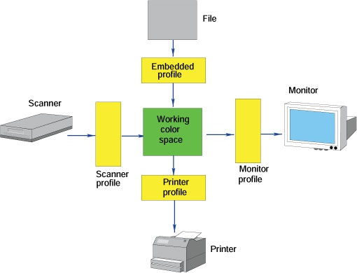
The gamuts of devices (i.e., the sets of colors those devices are able to represent) are inevitably smaller than the gamut of normal human vision. (See Digitalization for an in-depth discussion of image representation.) Furthermore, the digital camera or the scanner that digitalized the image, the monitor that displays it, and the printer that makes a copy all use different color spaces that are characterized by their gamuts and some adjustable parameters. Figure 12-36 shows a diagram of a computer using a device-independent working color space, usually RGB. A working color space includes the color spaces of the most commonly used devices. It should include the color spaces of a scanner and a camera and those of a standard screen and of most printers. The working color space should contain only colors that can be represented on the devices being used. When an image file is loaded from a scanner or a digital camera, it must first be converted from its initial color space to the working one, and a similar conversion must be done when displaying the image on a monitor or printing it.
This conversion process is automatic if we have the necessary information, which is stored as a color profile. A color profile provides the information needed to convert from one color space to another. One profile describes the camera color space and is attached to the image file of a digital photograph. Other profiles specify the color spaces of the scanner, printer, and monitor.
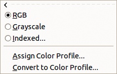

You can assign a color profile to an image if it doesn’t have one or if you want to change the assigned one. The Image: Image > Mode menu (Figure 12-37) contains two entries that allow you to edit the color profile. Select the ASSIGN COLOR PROFILE entry to open the dialog shown in Figure 12-38. In the ASSIGN field, you can choose a previously used profile or search for a profile on the computer. On a GNU/Linux platform, the profiles are generally located in the /usr/share/color/icc/ folder.

Image: Image > Mode > Convert to Color Profile opens the dialog shown in Figure 12-39. In addition to the name of the profile, this dialog allows you to choose the rendering intent and black point compensation, which we’ll discuss in Using Color Management.
Color management can also be used to simulate the result of converting an image to the color space of another device. The gamut of a printer is smaller than the gamut of a monitor. Printers are especially poor at rendering saturated colors, particularly shades of blue and green. A picture that we painstakingly crafted in GIMP may look terrible when printed if the conversion isn’t managed. If you intend to print your image, displaying the image so it looks like the final printed result is best, rather than creating an image that exploits monitor capabilities that aren’t shared by the printer. This technique is called softproofing.
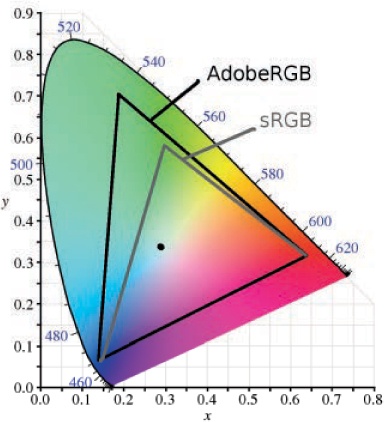
Color profiles are generally known as ICC profiles because they are defined by the International Color Consortium. The two most frequently used profiles are shown in Figure 12-40. Although using the profile with the largest gamut (i.e., Adobe RGB) might seem best, this is generally not the case because color distortion can occur when converting the image to the more restricted printer gamut. Thus, the default color space is usually sRGB.
In fact, if we load an image into GIMP without any embedded color profile, GIMP assumes it’s sRGB, although we can assign another profile. If an embedded profile exists, GIMP will ask whether you want to use it, and generally you should select yes.
Getting the color profile for a device is not always easy. This is especially true for monitors, which often require the purchase of a display calibration device. The retrieval of color profiles is beyond the scope of this book, but if you would like more information, we recommend the excellent website by Norman Koren (http://www.normankoren.com/color_management.html).
You can set the color management parameters in two places in GIMP. One is the Image: Edit > Preferences dialog, described in Color Management. The other is the Image: View > Display Filters tool, described in Display Filters.
Apply rendering intent via the Image: Edit > Preferences dialog. Rendering intent can be used to generate the so-called softproof of an image that you want to print. It specifies how colors are converted from one gamut to another. If no conversion is carried out, the colors in the first gamut that cannot be represented in the second one are simply clipped, leading to ugly distortions. By using a more sophisticated conversion technique, you can often achieve a much more satisfactory result. The two main techniques, perceptual and colorimetric, are shown in Figure 12-41.
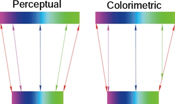
With perceptual intent, the color spectrum is compressed, and so the differences among colors are maintained. This process affects fully saturated colors much more than those with low saturation. If it is done with a large enough color depth, this process is mostly reversible and so is a good choice if you will be converting the image between color spaces multiple times. This is also a good choice if the image contains saturated colors.
Colorimetric intent leaves the colors that belong to both gamuts completely unaltered and clips the others to the nearest color. This process is not reversible, and although it preserves the whites, it often yields poor results for images with saturated colors.