
In this section, we discuss global transformations, which affect an entire photograph.
GIMP offers five important tools for correcting photographs that are tilted, poorly framed, taken from an awkward point of view, and so on. Learning how to use these tools correctly is important. You already used the Rotation tool, the Crop tool, and the Perspective tool in this chapter. We now demonstrate the Scale tool and how to resize an image.
When you scan an image or transfer a file from a digital camera, it may be too large to fit on the monitor. Recall that a 1024 × 768 image, which fills a small screen, will be only 3.4 inches (8.7 cm) wide when printed. This is because screen resolution is 72 or 96 pixels per inch (ppi), whereas in print the standard is 300 ppi. Thus if you want to print your photograph with a 6-inch (15-centimeter) width, your image file must be at least 1800 pixels wide. Note that on an inkjet printer several dots are needed for a pixel, and thus the resolution in dots per inch (dpi) is not equivalent to ppi.
As we reiterate several times in this book, whenever possible, you should take a photograph at the highest resolution available on the camera. The larger files take up more memory, but you’ll use all that extra information when you process the image. If you reduce the file size of your image after you’ve completed the editing process, the final result will look a lot better. We recommend always exporting a photograph at its full original size, preferably in the lossless PNG format. When a smaller file is needed (i.e., for a website), resize a copy of the image to 1024 × 768 or even 800 × 600 and export it as a JPEG. To print a photograph at 300 ppi, compute its new width by multiplying the desired width (in inches) by 300 (or by 118 if the desired width is in centimeters). For example, a 10 × 15 cm print should be 1180 × 1770 pixels. Don’t worry too much about the math, however. The software that controls your printer should be able to resize the print to whatever dimensions you want. Generally, you should adjust the dimensions of an image when printing it via the printing software. This leaves the image file unaltered, preventing the loss of quality that’s inherent in resizing.
That being said, assuming you do want to resize a photograph using GIMP, how would you do it? GIMP has several ways to do this:


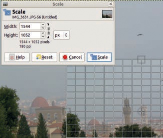
Resize the entire image using Image: Image > Scale Image. Figure 2-25 shows the dialog that appears. Adjust the WIDTH or the HEIGHT of the image. The chain linking width to height preserves the image’s proportions, and leaving the chain intact is generally best. You can also change the X and Y RESOLUTION, but this does not have any effect on the image’s size, and you generally only need to worry about resolution when you print the image. Even then, you can select the resolution using your printing software.
If an image contains only one layer, resize the layer and then resize the canvas to fit. First, select Image: Layer > Scale Layer, which brings up the dialog shown in Figure 2-26. Once the layer has been resized, adjust the canvas size with Image: Image > Fit Canvas to Layers.
You can also use the Scale tool (
 ) to resize layers. Select it and click anywhere in the image. A small dialog appears, and the pointer icon changes. Click and drag the image to resize the layer. In Figure 2-27, we changed the PREVIEW option in the options dialog for the Scale tool to IMAGE+GRID.
Note that you can also change the dimensions directly in the dialog. Click SCALE to complete the scaling. Again, a linked chain preserves the proportions of width to height.
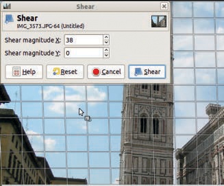
The last transformation tool that we’ll mention is the Shear tool (![]() ). Calling this tool brings up the dialog shown in Figure 2-28. Although you can input a value for both X and Y, only one coordinate (X or Y) can be modified at a time. The first value you adjust is retained, and the other is ignored. For example, if you adjust SHEAR MAGNITUDE Y to 10 and then adjust SHEAR MAGNITUDE X to 10, the image will be sheared in the Y direction. When you apply the Shear tool, the image is tilted and deformed in the chosen direction. This tool is rarely useful, so don’t worry if it’s still a bit confusing.
). Calling this tool brings up the dialog shown in Figure 2-28. Although you can input a value for both X and Y, only one coordinate (X or Y) can be modified at a time. The first value you adjust is retained, and the other is ignored. For example, if you adjust SHEAR MAGNITUDE Y to 10 and then adjust SHEAR MAGNITUDE X to 10, the image will be sheared in the Y direction. When you apply the Shear tool, the image is tilted and deformed in the chosen direction. This tool is rarely useful, so don’t worry if it’s still a bit confusing.

In photography, lighting is vital. Adjustments to lighting can improve the look of an image dramatically. Lighting problems are especially common when you use a scanner to digitize an old photograph or 35mm film. But you might also want to adjust the lighting of a photograph taken with a good digital camera if the wrong settings were used or the subject was poorly or unevenly lit. Some of the most beautiful photographs are taken in difficult lighting conditions.
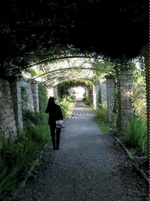
Consider the photograph shown in Figure 2-29. The area under the pergola is too dark, and the detail of the lianas overhead is completely lost. Since the lighting range is full, with a real black in the woman’s clothes and a very clear white in the center of the picture, only some areas of the image need correction.
Use the Free Select tool (![]() ) to select only the areas that need correction. In the options menu, make sure the FEATHER EDGES box is checked and set the RADIUS to 10.0. Trace around the brighter sections of the picture. In this example, there are two bright sections, one in front of the person and another to the right. Turn on Add to Selection by pressing the
) to select only the areas that need correction. In the options menu, make sure the FEATHER EDGES box is checked and set the RADIUS to 10.0. Trace around the brighter sections of the picture. In this example, there are two bright sections, one in front of the person and another to the right. Turn on Add to Selection by pressing the ![]() key. You can make minor adjustments to the selection by using Quick Mask (see Making a Selection). The completed selection can be seen in Figure 2-30.
key. You can make minor adjustments to the selection by using Quick Mask (see Making a Selection). The completed selection can be seen in Figure 2-30.
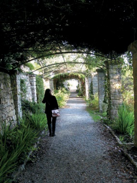

Next invert the selection (![]() ) so you can adjust the lighting in the darker areas of the picture. Use the Image: Colors > Levels tool to brighten those dark areas. Once you’ve selected the Levels tool, simply click the AUTO button to get the results shown in Figure 2-31.
) so you can adjust the lighting in the darker areas of the picture. Use the Image: Colors > Levels tool to brighten those dark areas. Once you’ve selected the Levels tool, simply click the AUTO button to get the results shown in Figure 2-31.
Although the auto adjustment helped a little, the top of the pergola is still much too dark. To lighten it further, repeat the same process. First, select the dark area using the Free Select tool (![]() ). Don’t invert the selection this time. Select the Levels tool, and click the AUTO button once more. You can see the results of this second adjustment in Figure 2-32.
). Don’t invert the selection this time. Select the Levels tool, and click the AUTO button once more. You can see the results of this second adjustment in Figure 2-32.

GIMP has many other ways to improve the lighting of a photograph. Figure 2-33 shows a dim, hazy image. Because this image is so dark, simply using the Levels tool on the entire image wouldn’t be effective: The sky and water would turn out too pale. To effectively brighten those areas, we need to select them first.
This time, call the Fuzzy Select tool to make your selection. Hold down the ![]() key to select multiple areas. Outline all of the light areas in the photograph, as shown in Figure 2-34. Next, invert the selection (
key to select multiple areas. Outline all of the light areas in the photograph, as shown in Figure 2-34. Next, invert the selection (![]() ), hide it (
), hide it (![]() ), and select the Levels tool. Again, press the AUTO button, but this time also move the Gamma (gray) triangle slightly to the left with the Value channel selected and then to the right with the Blue channel selected. These additional adjustments will reduce the color cast.
), and select the Levels tool. Again, press the AUTO button, but this time also move the Gamma (gray) triangle slightly to the left with the Value channel selected and then to the right with the Blue channel selected. These additional adjustments will reduce the color cast.
After adjusting the Levels, we straightened the picture by rotating it and then cropped the image to clean up the edges. The final result appears in Figure 2-35.
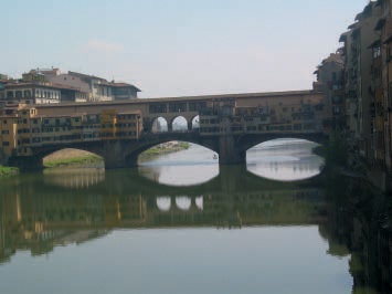
Adjusting colors across an entire photograph is occasionally appropriate, for example, when the use of a flash indoors results in a ubiquitous red cast. Figure 2-12 is a simple example of color correction in which we used the Levels tool to correct a blue cast. GIMP has other tools that you can also use for simple or more complex color correction.
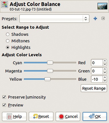
One such tool is Image: Colors > Color Balance(Figure 2-36). To correct a blue cast, push the slider between YELLOW and BLUE to the left. Since PREVIEW is checked, you can observe the result immediately. You can also adjust the color balance with the slider, the mouse wheel, or the small arrows beside the numbers on the right. Notice that this change is not made for the whole image but only for the selected subrange: shadows, midtones, or highlights. This tool is fairly powerful but not very easy to use.
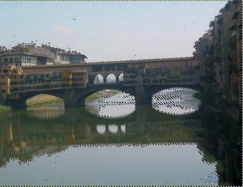
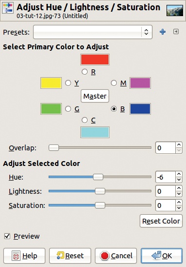
Another color correction tool is Image: Colors > Hue-Saturation. In the dialog for this tool (Figure 2-37), you can choose one of six different color subranges, corresponding to the three primary and the three complementary colors. You can also select the whole subrange by clicking MASTER. Moving the HUE cursor shifts all colors within the selected subrange. For Figure 2-12, we would want to select the blue subrange and shift the HUE cursor to the left.
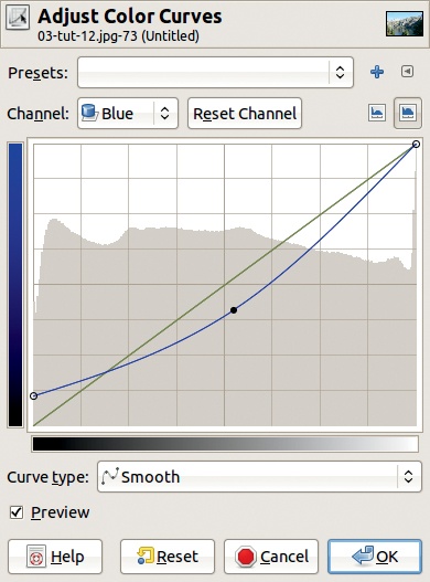
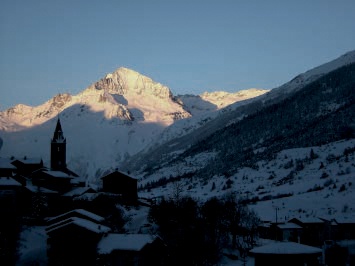
The last tool, Image: Colors > Curves, allows you to make the same adjustments but gives you much more control. As shown in Figure 2-38, you can deform the response curve of the Blue channel to remove a blue cast. Here, push the leftmost point higher, which is equivalent to moving the left black triangle to the right in the Levels tool. This brings out the color in the darkest parts of the image. Adjust the middle point so it’s under the diagonal to reduce the blue cast throughout the image. The rightmost point is left unchanged, so the sky remains blue. You can deform the color curve in many ways, often with strange results.
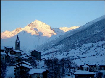
Figure 2-39 shows a photograph with a different color balance issue. The difficult conditions (a very low temperature and early morning light at a high altitude) give this picture a strong blue cast, which isn’t an accurate representation of what you would see if you were actually looking out over this snowy vista.
Duplicating an image layer and applying different transformations to the layers often leads to pleasant, or at least interesting, results. Try the following:
The result is shown in Figure 2-40. Admittedly, the sky is now too dark. The solution is to again duplicate the upper layer, leaving the blending mode and opacity the same. See Figure 2-41.
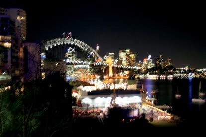
The image shown in Figure 2-42 presents a different set of challenges and possibilities, providing a good demonstration of GIMP’s flexibility. This photograph was taken at night, without a tripod, which caused an obvious motion blur. The camera did assign a true white to the lights in the bottom center and a true black to portions of the sky. Because the whole value range is covered, a global change using the Levels tool would have no effect.

Instead, use the Levels tool to edit the dark areas and the light areas separately. This is easy:
Choose the Select by Color tool (
 ) and click anywhere in the sky. You get the complicated selection shown in Figure 2-43.
Hide this selection (
 ) and select the Levels tool. Click the AUTO button.
Now invert the selection (
 ) to select the unmodified areas. Select the Levels tool again and click the AUTO button.
The result, which appears in Figure 2-44, could be considered a creative interpretation of lights at night.