
The Artistic menu is long and contains many complex filters. The filters in this menu create artistic effects, from simulating canvas to imitating cubist or impressionist paintings. We omit Predator, which refers to the science-fiction film from 1987.


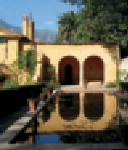
Apply Canvas simulates a canvas texture. The coarseness of the canvas cannot be changed, and the filter has few options.
The dialog, shown in Figure 17-145, contains controls for adjusting the direction of the light and the relief of the canvas. The effect of this filter is shown in Figure 17-146.
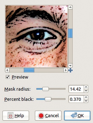
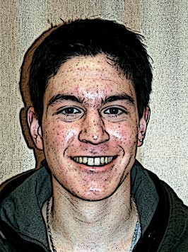
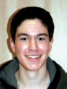
Cartoon simulates a drawing that was done in black ink and then colorized. The filter works by blackening the darkest areas in the image. The Cartoon filter is demonstrated on the photograph shown in Figure 17-147. The filter dialog is shown in Figure 17-148. There are only two parameters:


MASK RADIUS [1 to 50] controls the coarseness of the cartoon drawing, and the optimal value depends on the image size. As a starting point, try a radius that is 1/100 of the length (in pixels) of a side of the image.
PERCENT BLACK [0 to 1] controls the intensity of the effect by changing the amount of black added to the image.
See the result in Figure 17-149.
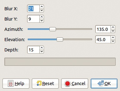
Clothify has an effect similar to that of Apply Canvas, but the cloth is more textured and doesn’t look as much like stretched canvas.
The dialog, shown in Figure 17-150, contains two sets of parameters. The two BLUR parameters control the appearance of the cloth texture, and the last three parameters control the lighting effects: direction and height of the light and depth of the relief.
The result is shown in Figure 17-151.

Cubism simulates the cubist painting style. It builds small squares of semitransparent colors taken from the image and randomly scatters the squares, placing them near the source of the color.
The dialog, shown in Figure 17-152, contains the following parameters:
TILE SIZE [0 to 100] sets the size of the squares.
TILE SATURATION [0 to 10] sets the opacity of the squares, but it also affects their size. With low values, the image is dark and partially transparent, with a few small squares, and is generated very quickly. With high values, the image is colored with large squares and takes a long time to process.
USE BACKGROUND COLOR, when checked, substitutes the background color in place of black below the semitransparent tiles.
Our result is shown in Figure 17-153.


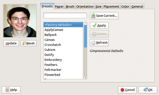
GIMPressionist is the most complex and powerful of all the artistic filters in GIMP, and it is sometimes called the king of the artistic filters. The general idea is that the image is displayed on simulated paper with specific properties, painted with a brush with its own properties. There are many other parameters that can be adjusted as well.
Its dialog appears in Figure 17-154. There are eight tabs, and each one contains a lot of parameter settings, which leads to a gigantic number of possible combinations. Since the filter’s process is very complex, the preview must be updated manually by clicking the UPDATE button. Moreover, the RESET button changes the preview back to the initial image.
The filter comes with a lot of predefined combinations of parameters, and new ones can be added to the list. To create a preset, adjust the parameter values in the various tabs, type the name of the new combination in the field at the top of the Presets tab, and click SAVE CURRENT.
After selecting a preset combination from the list, you must click APPLY before you can change the parameter values in the other seven tabs. The DELETE button is active only if the selected preset is not a predefined one. Finally, the REFRESH button will load any new preset combination that was added to GIMPressionist outside of GIMP.
The preview is only an indication of the possible result, not a preview of the actual outcome of the filter. The real effect depends on the size of the image, which affects how large the brush strokes appear, as it would in reality. The preview would be accurate if the image was the same size as the preview.
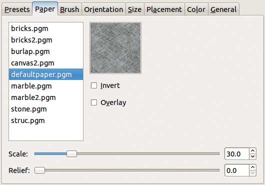
The Paper tab (Figure 17-155) can be used to adjust the texture of the paper that the image will appear to be painted on. There are nine textures to choose from. The preview in the tab is only an approximation, since the image size will impact the effect, and only a generic preview of the texture is shown. The SCALE slider [3 to 150] changes the size of the texture relative to that of the image, and the RELIEF [0 to 100] slider changes the depth of the pattern embossing. The INVERT box, when checked, inverts the texture, which is represented as a grayscale image in GIMP. The OVERLAY box, when checked, creates the texture as a new layer, whose opacity is set by the RELIEF percentage.
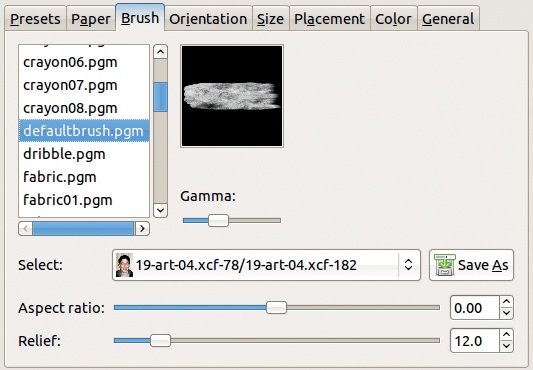
The Brush tab (Figure 17-156) works in a similar way. There is a long list of existing brushes, which are small grayscale images. If other images or layers were open in GIMP before the filter was selected, they will appear in the SELECT menu and can be saved as brushes. The GAMMA slider sets the luminosity of the brush. ASPECT RATIO [–1 to +1] changes the brush proportions: A negative value reduces the height, and a positive value reduces the width. The brush size can be changed in the Size tab. RELIEF [0 to 100] specifies the amount of virtual paint used for each stroke.
The Orientation tab (Figure 17-157) sets the orientation of the brush strokes. The DIRECTIONS slider specifies the number of pixels [1 to 30] in a stroke (i.e., the width of the stroke). The START ANGLE [0 to 360] sets the direction of the first stroke, and ANGLE SPAN [0 to 360] sets the possible range of strokes that follow the first one. There are eight aspects of the image that can direct the ORIENTATION of the strokes:
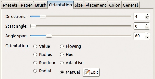
VALUE: Luminosity determines the direction of the stroke.
RADIUS: The stroke direction is based on the distance from the center of the image.
RANDOM: The stroke direction is random.
RADIAL: The stroke direction is a based on the direction to the center of the image.
FLOWING: A flowing pattern is generated, independent of image properties.
HUE: The hue determines the direction of the stroke.
ADAPTIVE: The direction follows the contours of the original image.
MANUAL: The EDIT button opens the Orientation Map editor.

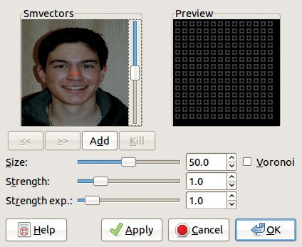
The Orientation Map editor window (Figure 17-158) can be used to define the orientation of successive strokes based on vectors, shown in the image preview on the left (called VECTORS). A vertical slider changes the preview brightness to make the vectors more visible. Middle-clicking the preview adds a new vector wherever you click. The current vector appears in red, the others in gray. Left-clicking moves the current vector, and right-clicking rotates it. Two arrow buttons below the preview change which vector is current, and the ADD button adds a new vector in the center of the preview. The KILL button deletes the current vector. The preview on the right, called PREVIEW, shows the effect of the vectors on brush stroke orientation.
The first and third sliders below the previews modify parameters of the current vector: ANGLE does the same thing as right-clicking, and STRENGTH [0.1 to 5] changes the vector length, which represents the breadth of the effect of each vector. The two other sliders affect all of the vectors: ANGLE OFFSET changes all of the vector angles, and STRENGTH EXP changes the length of all vectors. Exp stands for exponent and is likely related to the mathematical algorithm used to calculate the result.
On the left side, TYPE sets the arrangement of brush strokes, shown in the right-hand preview. The VORONOI box, if checked, causes only the closest vector to affect a given point.
There is no way to save the orientation map built with the editor, so you must re-create maps that you want to use again. However, the APPLY button allows you to see the effect of the orientation map in the GIMPressionist preview window. Note that you’ll have to update the preview after applying the effect.
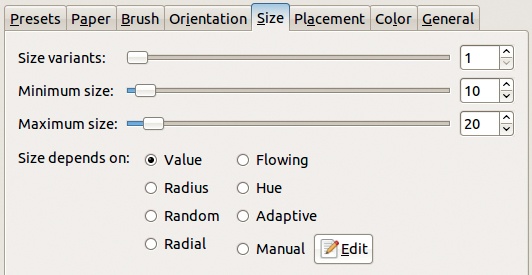
The Size tab (Figure 17-159) sets the size of the strokes and works a lot like the Orientation tab. You can set the amount of variation, the minimum and maximum size, and which of eight possible image characteristics influence the brush stroke size. When the manual method is selected, the EDIT button brings up the Size Map editor.
The Size Map editor window (Figure 17-160) is similar to that of the Orientation Map editor, except there are no choices for types and the angle settings are replaced with size settings.
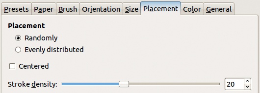
The Placement tab (Figure 17-161) is used to specify how the strokes are distributed in the image: randomly or evenly, focused around the center if CENTERED is checked, and with a STROKE DENSITY in the range [1 to 50].
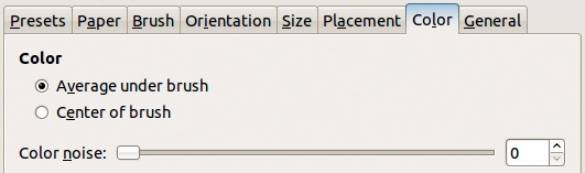
The Color tab (Figure 17-162) is used to specify what color will be used for each brush stroke. A stroke can be an average of the pixels it covers or the same color as the center pixel. COLOR NOISE [0 to 100] (random color variation) can also be added.
The General tab (Figure 17-163) sets the background color and the relief of the brush strokes. The background color (the color between brush strokes) can be taken from the initial image or from the chosen paper, or it can be a solid color, selected with the color chooser. If the image has an Alpha channel, the background can also be transparent.
The three checkboxes do the following:
PAINT EDGES creates a thin border around all brush strokes.
TILEABLE makes the image tilable.
DROP SHADOW adds a slight shadow beneath each brush stroke.


The five sliders on the right add relief to the brush strokes:
EDGE DARKEN [0 to 1] sets the depth of the relief.
SHADOW DARKEN [0 to 99] sets the darkness of the shadows.
SHADOW DEPTH [0 to 99] sets the distance between the brush stroke and the shadow.
SHADOW BLUR [0 to 99] blurs the shadow.
DEVIATION THRESHOLD [0 to 1] is rather mysterious and can be left at the default value.
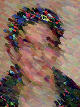

GIMPressionist has a wide variety of parameter settings, and as a result, there are a vast number of possible results. Be warned that some of the settings can lead to a prohibitively long computation time. The GIMPressionist filter is so diverse that it can actually replicate a number of other artistic filters, such as Apply Canvas or Cubism. Figure 17-164 to Figure 17-166 are varied examples of GIMPressionist on the image shown in Figure 17-147.
Glass Tile simulates a view of the image through a glass brick wall. The dialog only contains settings for the width and height of tiles. The result is shown in Figure 17-167.
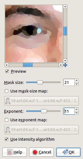
Oilify is designed to simulate an oil painting with large brush strokes. It’s possible to get the same effect with the GIMPressionist filter, but this filter makes the process fast and easy.
The dialog, shown in Figure 17-168, contains parameter settings similar to those of the Depth Merge filter. MASK SIZE [3 to 50] specifies the size of the brush strokes. The mask-size map option requires that another image the same size as the image being edited, preferably in grayscale, also be open in GIMP. The brightness of the image map determines the size of the strokes in the target image. EXPONENT [1 to 20] sets the variation between strokes, and this can also be specified using an image map. Finally, the USE INTENSITY ALGORITHM box, if checked, preserves the details and colors of the initial image. This filter often processes for a long time before producing a result. Figure 17-169 shows a possible result of Oilify.
Photocopy creates a simulation of a black and white photocopy. The result is similar to a grayscale edge-detect image.
The Photocopy filter darkens areas of the image that are darker than the average of the neighboring pixels, and it lightens the other areas. In addition to making simulated photocopies, you can use this filter to sharpen an image: Apply it to a layer copy that’s above the original in the layer stack and then put it in Multiply mode.
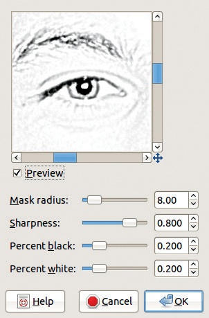
The dialog, shown in Figure 17-170, has the following parameters:
MASK RADIUS [3 to 50] sets the size of the neighboring area that will be averaged and thus alters the coarseness of the effect.
SHARPNESS [0 to 1] sets the sharpness of the result.
PERCENT BLACK [0 to 1] controls the amount of solid black added to the image. The effect is generally quite subtle.
PERCENT WHITE [0 to 1] sets the proportion of white pixels in the image. If PERCENT WHITE is set to zero, the filter effect is very similar to desaturation.
Figure 17-171 shows the result.

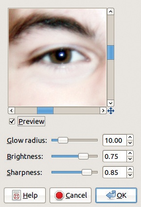
Softglow makes the image glow by further brightening the areas of the image that are already the brightest.
The settings in the dialog, shown in Figure 17-172, are simple. GLOW RADIUS [1 to 50] affects the sharpness of the resulting image. BRIGHTNESS [0 to 1] sets the intensity of the effect. SHARPNESS [0 to 1] determines how harsh the lighting is. See Figure 17-173.

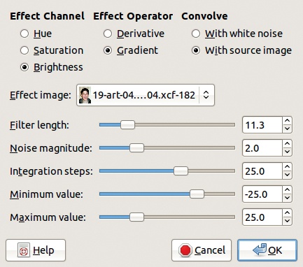
The Van Gogh filter is officially called Van Gogh (LIC), where LIC stands for Line Integral Convolution. This filter adds a blur to an image in one of two ways: based on the gradients in an image map or based on white noise. The dialog, shown in Figure 17-174, does not include a preview. There are three sets of radio buttons:
EFFECT CHANNEL specifies which HSV channel is used.
EFFECT OPERATOR allows you to select among the gradients in the image or the derivative (the reverse) of the gradient.
CONVOLVE changes what is convoluted (combined) with the target image: either white noise (noise with the same amplitude in all frequencies), an effect image, or the target image itself.

The effect image must be the same size as the image processed, and only its gradients will be used by the filter. It must be open in GIMP when the filter is called. We used the image shown in Figure 17-175, created with the Blend tool.
The sliders are difficult to explain, and you’ll probably learn best by just trying them. FILTER LENGTH [0.1 to 64] is the only one that’s really useful when dealing with the source image. It controls the amount of blur, or the coarseness of the texture.
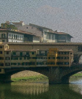

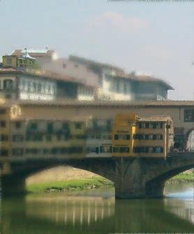
Figure 17-176 shows the effect when the target image is also the effect image and CONVOLVE is set to WITH SOURCE IMAGE. Figure 17-177 shows the result when white noise was chosen.
Weave simulates painting the image on a weave of ribbon or perhaps straw. The ribbons are striped so that they appear to be made out of some fibrous material. These stripes are referred to as threads.
The dialog, shown in Figure 17-178, does not include a preview. The filter builds an additional layer that contains the weave pattern and combines it in Multiply mode. This pattern is shown in Figure 17-179. The parameters specify the width and spacing of the ribbons; the darkness and depth of the shadow; and the length, density, and intensity of the threads.
