In this section, we introduce you to the general principles of preprocessing.
Image preprocessing enhances the visibility of the elements that we’re interested in within an image. In other words, the aim is to restore the original information as faithfully as possible. Generally speaking, preprocessing methods make pixels in the same regions more similar or increase the differences among pixels in different regions. But defining exactly what makes up a “region” is difficult.
As mentioned at the beginning of this chapter, preprocessing is more commonly used in scientific imaging applications than when creating decorative imagery or photos for fun. If a photographer wants to touch up portraits he’s taken of an actor, he’ll probably use the techniques from Chapter 2 and Chapter 5, not the techniques in this chapter. Erasing wrinkles or blemishes doesn’t require a lot of information, just a steady hand and a little time.
On the contrary, biologists often want to extract as much information as possible from a micrograph, a photo taken through a microscope. If they want to enhance the image quality, they can’t use techniques that degrade the information contained in the image. This also holds true for an intelligence agent using a photo taken via satellite or for an astronomer using a photo taken through a telescope.
The techniques used in this chapter modify the look of an image so you can extract information from it more easily. They remove useless and detrimental information (i.e., noise) to reinforce the meaningful information.
The idea of improving an image is a highly subjective one. But the human eye is especially sensitive to high contrasts, so the techniques we present here are generally intended to increase an image’s contrast, as it’s is the best way to improve visibility within a scene.
Although this chapter’s appeal is narrower than that of previous chapters, we think the techniques presented here can be useful to almost anyone who processes photographs with GIMP. In particular, the noise-reduction and edge-detection techniques have a variety of applications. Moreover, this information will help you to build a more thorough understanding of GIMP’s capabilities, which might come in handy when you least expect it.
The main purpose of image preprocessing is to get information that helps make the image more readable. When you use the image histogram to make adjustments, you change the individual pixel intensities. This transformation does not change the shape of the regions, but it can change their texture, color, luminosity, or contrast with the surroundings.
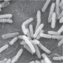
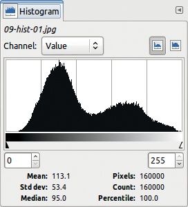
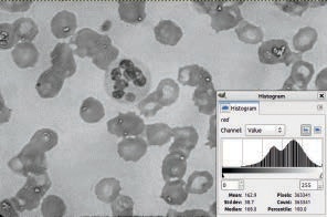
Figure 7-18 is a grayscale photo of bacteria that was taken with a microscope. Figure 7-19 shows its corresponding histogram. Among the 160,000 pixels in this image, 1684 of them have a value of 77, in the interval from 0 to 255.
Choose the Levels tool and adjust the image’s only level, as shown in Figure 7-20. The result appears in Figure 7-21 with its histogram. The histogram now spans the entire range, but not all values are represented because the total number of discrete colors is less than the length of the interval [0:255]. The contrast has been increased, and the resulting image is more readable.
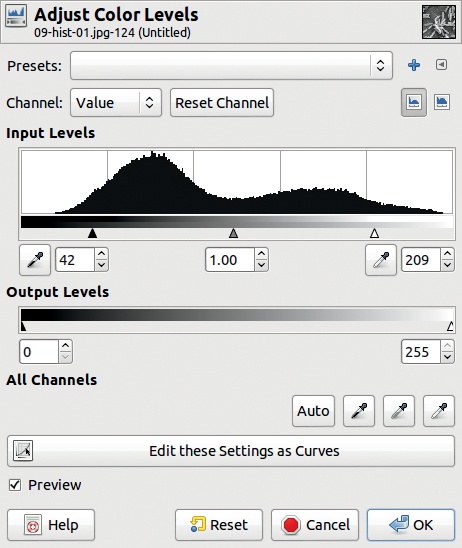
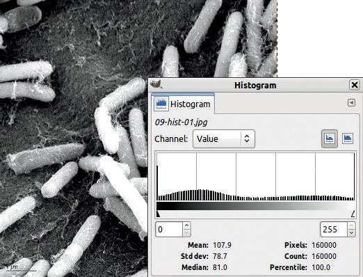
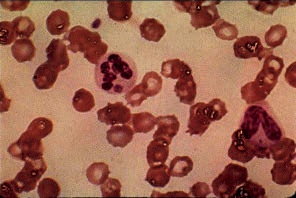
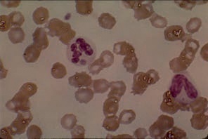
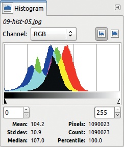
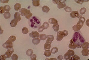
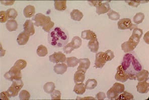
Figure 7-22 shows a micrograph of human blood, this time in color. Figure 7-23 shows the combined histograms for this image. You see that these histograms each have two separated peaks of different heights and in different positions depending on the channel chosen. The Red channel extends further into the high values than the other two, but none of the channels extends all the way to 255.
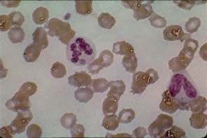
You can get more information by decomposing the image into its three channels using Image: Colors > Components > Decompose. From the dialog that appears (Figure 7-24), choose the first color model—RGB. Leave DECOMPOSE TO LAYERS checked, and click OK. A new image is created with a layer for each channel. Each layer is a grayscale representation of the corresponding channel. For example, Figure 7-25 shows the Red layer.

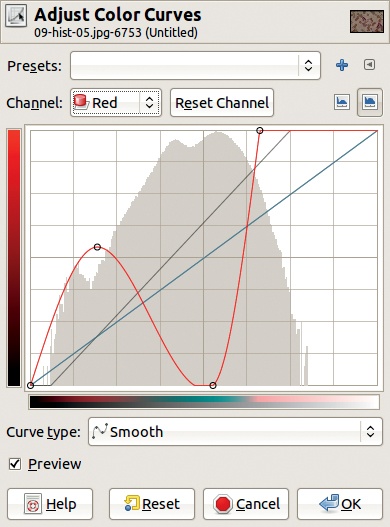
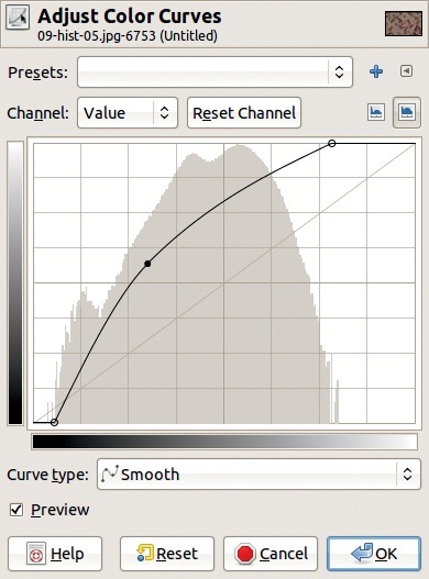
One useful tool for improving these channels separately is Image: Colors > Curves. When you apply it to the layer corresponding to the Red channel, you get Figure 7-26. Click the small button on the right, just above the curve, to get a logarithmic histogram. In this histogram, the height of the vertical bars is not proportional to the number of pixels: The ratio between the height and the number decreases as the height increases. In many cases, this type of histogram is more readable.

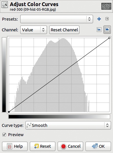
Adjust the curve as shown in Figure 7-27 to keep only the interesting parts of the histogram. Figure 7-28 shows the result with the corresponding altered histogram. Note the white vertical bars that correspond to the unrepresented values.
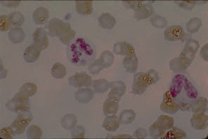
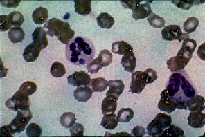
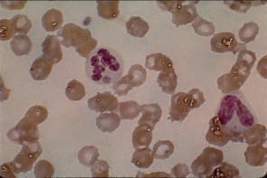
Do the same thing with the other two channels: Select the corresponding layer, select the Curves tool, and adjust the curve. When you’ve done this for the three layers, choose Image: Colors > Components > Recompose, which reconstitutes the original image using the values of the three channels in the decomposed layers. The result appears in Figure 7-29 with its combined RGB histograms. The image is much more readable, and the biologist can now see and interpret some details that weren’t really visible before.


In the previous tutorial, we used some automatic tools to extend an image’s dynamics, but the results weren’t very good. Although they can be useful in some cases, you clearly shouldn’t depend on automatic tools to adjust an image’s dynamics. In this section, we use several automatic tools on a micrograph of bacteria—with some interesting results.
Figure 7-30 to Figure 7-35 show the result of using the six entries from the Image: Colors > Auto menu. In this case, the best choice is not a matter of taste but rather of utility. The biologist who will interpret this picture will choose the transformation that provides her with the most significant information.
transformations are global and cannot be parameterized. They work on all the channels in the same way, although the Stretch HSV transformation operates on the HSV model rather than the RGB one. For comparison, Figure 7-36 shows the effect of using the AUTO button in the Levels tool. That transformation operates separately on each channel, removing the lowest values in the histograms, so it takes away some background noise but can also delete meaningful information.

Next, try some more complicated manipulations with the Curves tool. Work only on the Value channel (i.e., the grayscale values), although you could also work on the three color channels separately. In each case, first apply the curve modification shown in Figure 7-27 to remove the unrepresented extreme values.
In the sequence of figures from Figure 7-37 to Figure 7-44, you see the modification made to each curve, its effect (stated in each figure’s caption), and the resulting image. The results are fairly diverse, and some of them are probably not very useful. In these last examples, the correlation among channels, and thus the general hue, was maintained in the images. Note that if you use the AUTO button in the Levels tool, the correlation would not be maintained. For most users, this makes no difference.


A variety of manipulations are possible with the Curves tool. Changing the shape of the curves can lead to interesting results—but more often to weird and useless results. For example, Figure 7-45 shows a bizarre curve applied to the Red channel. A similar curve was applied to the two other channels to create Figure 7-46, which probably does not provide the biologist with any additional useful information.