
In this last section of the chapter, we build a few logos using some of the techniques described for textures. Note, however, that the File: Create > Logos menu provides a lot of predefined logos.
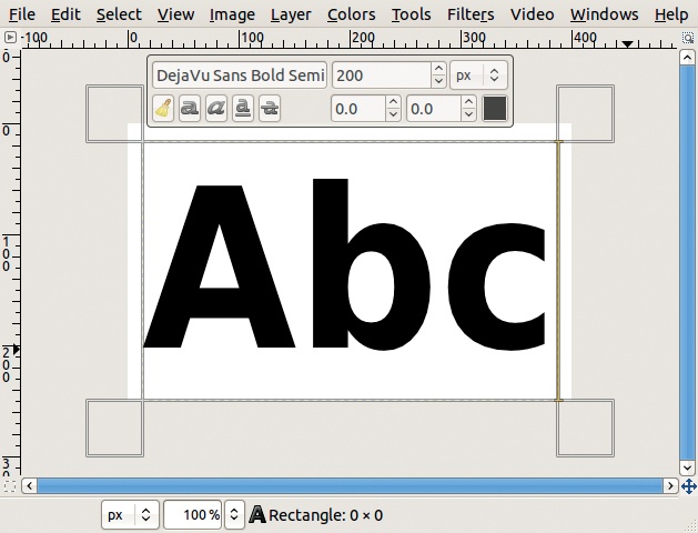
To build a logo, you need a way to add text to an image. Do this with the Text tool, which is accessible from the Toolbox or with ![]() . Its options dialog appears in Figure 4-70.
. Its options dialog appears in Figure 4-70.
The three most important parameters are the FONT, SIZE, and COLOR of the text. You can change the font by clicking the button that displays the letters “A” and “a” in the current font. You can also use the Fonts dialog, a dockable dialog generally found in the multi-dialog window.
GIMP doesn’t ship with any fonts. It accesses the fonts that are available on your system. If you wish to add additional fonts, many are available for free online, but keep in mind that intricate fonts can decrease readability. Moreover, when transforming a logo to add relief, a bold or even ultra-bold font works best.
The default size of the Text tool is 18 pixels, which is much too small for a logo. Generally, logo text should range from 50 to 200 (or more) pixels. You can change the text size, as well as the other parameters, as you work and so can use some trial and error to home in on the perfect settings for your logo.
The Color button brings up the standard Color chooser. Once you’ve built the text, you can also drag a color from the Toolbox to the image.
When text is added to an image, it becomes a text layer. As long as it keeps this property, you can change the parameters or even the text itself. This new layer is the size of the text plus a small border, so it’s generally smaller than the canvas. While the text layer property is active, you can change the dimensions of the layer using the corner handles customary for selections. The layer itself is transparent, and the text is printed on this transparency.
To add text to an image, click in the image wherever you want the upper-left corner of the text to appear. If you want to move the text, change to the Move tool, but you can still go back to the Text tool and edit the text itself.
One of the simplest ways to make the text in a logo more prominent is to add relief. The best tool for this is the Blend tool, using any one of the three Shapes: angular, spherical, or dimpled. The effect of these shapes depends on the font used, so experiment and find the one you like.
To create the relief, first check the LOCK ALPHA CHANNEL box in the Layers dialog (found just under the OPACITY slider). Now the Gradient tool will affect only the text, not the transparency behind it.
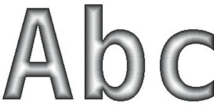
Next, choose the gradient. A simple gradient from the foreground color to the background color using RGB progression is generally the best choice. The gradient should progress from a light color to a dark one because the middle of the characters will be colored with the first color and the edges with the second one. If the foreground color is darker than the background color, which is usually the case, simply check the REVERSE box or the double arrow just to the right of the GRADIENT button.
To apply the gradient, just make a stroke in the image. The direction and length of the stroke don’t matter when using a shaped gradient shape.
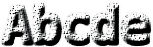
Figure 4-71 shows some meaningless text written using the Monospace Bold font at 200 pixels. Figure 4-72 shows the result after adding a shaped (spherical) gradient to this text. After the gradient is applied, the text layer no longer has the text property.
You can add relief to a logo using other methods. Here’s one:
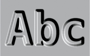
Begin with some simple text, as shown in Figure 4-71. Merge the text layer with the background.
Apply a Gaussian blur. The blur radius will determine the amount of relief: 8.0 in our case.
Apply the Image: Filters > Distort > Emboss filter. Check the EMBOSS button, leaving the three parameters in place.
The result appears in Figure 4-73. Our image is now grayscale, but you could colorize it after embossing. Or if you made a copy of the initial text layer, you could transform it to a selection and use it to colorize the background and the text in different colors.
The terms shade and shadow can have similar meanings, but here we use them to refer to discrete effects, so we add some modifiers to further differentiate the terms. The proper shade is the shading on an object that’s caused by the object itself; the cast shadow (also called the drop shadow) is the shadow cast by the object onto the object’s environment. For example, in Figure 4-73, the object is supposed to be lit from the lower left, so the upper-right sides of the text are in proper shade. But the object is not high enough above the background to cast a shadow.
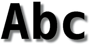
Generating a cast shadow is simple. Start with the text from Figure 4-71. Duplicate the text layer. The middle layer will be used for the cast shadow. Because the shadow shouldn’t be completely black, change the color of the middle layer to a dark gray. With the Lock Alpha channel box unchecked, apply a Gaussian blur with a radius of 10 to the dark gray text. This blur gives the cast shadow a soft, natural look. Move this layer away from the intended light source. The more you move this layer, the higher above the background the text will appear to be. See the result in Figure 4-74.
In this example, the cast shadow is the same size and same orientation as the text, both of which give the illusion of a background parallel to the text. Use the Perspective tool (![]() ) to change the perspective of the cast shadow, as shown in Figure 4-75. Now the background no longer appears to be parallel to the text.
) to change the perspective of the cast shadow, as shown in Figure 4-75. Now the background no longer appears to be parallel to the text.
If you add a gradient, as you did to create Figure 4-72, you get the image shown in Figure 4-76.


You can also add a reflection of the text. This is similar to a cast shadow, although it’s usually lighter, more tilted, placed in front of the text, and flipped vertically. To add a reflection, follow these steps:
Enlarge the canvas to 400 × 280 pixels (Image: Image > Canvas Size). Enlarge the background layer to the same size (Image: Layer > Layer to Image Size).
Duplicate the top layer, which will eventually become the reflected text, and apply the Image: Layer > Transform > Flip Vertically tool.
Change its color to a light gray, and apply a Gaussian blur (with the Lock Alpha channel box unchecked).
Deform it with the Perspective tool and, again with the Lock Alpha channel box unchecked, move the reflection until you’re satisfied with the result.
Our shadowed and reflected text appears in Figure 4-77.

Now we demonstrate a way to add relief and proper shade simultaneously. Create a new image and add some text using the same parameters as before. But this time the text should be blue because what you are about to do will not work if the text is black.
Duplicate the text layer twice, and then do the following:
Apply a Gaussian blur with a radius of 8 to the bottom layer of text. Offset it (
 ) by 3 in both
 XandY.Apply a Gaussian blur with a radius of 5 to the top layer of text. Offset it by –2 in both
XandY.Deform the Value curve of the top layer (Image: Colors > Curves) to add relief. Depending on the curve’s final form, several different effects are possible. We simply picked up the middle of the curve and dragged it toward the top-left corner.
Change the blending mode of the top layer. You might try Screen, Overlay, Lighten Only, or Addition. We used Difference mode to create Figure 4-78.
In this section, we show you how to change the material that the logo is made of. This is generally equivalent to changing its texture.
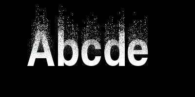
Begin by typing some text in white on a black background, and then merge the text layer with the background. Duplicate the layer, and apply the following effects to the new top layer:
Image: Filters > Noise > Spread: Break the chain, and set the horizontal parameter to 0 and the vertical parameter to 100.
Image: Filters > Distorts > Shift: Shift vertically by 25.
The result appears in Figure 4-79.
Then add a white layer mask (Layers: right-click > Add Layer Mask) to the top layer, and use the Blend tool (L) to apply the following gradient to this mask: black to white, linear, without repetition, using a vertical stroke spanning from the middle of the image toward, but not up to, the top border. Press the ![]() key to get a perfectly vertical stroke. The result is shown in Figure 4-80.
key to get a perfectly vertical stroke. The result is shown in Figure 4-80.
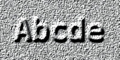
Merge the layers, and apply the following effects:

Add some color to this image with the Image: Colors > Curves tool. In the Red channel, drag the middle point of the curve toward the top-left corner. In the Blue channel, drag the middle point toward the bottom-right corner. The result appears in Figure 4-81. Of course, you can (and should) experiment with different values for all the filter parameters to gain a better sense of what the filters can do.
In this example, the initial logo is written in black on a white background. Duplicate the text layer, and merge the middle layer with the background. Activate the bottom layer and apply the following effects:
Apply Image: Colors > Invert.
Apply a Gaussian blur of 5.
Apply Image: Colors > Auto > Stretch Contrast.
Open the Image: Colors > Levels tool and choose the Green channel. Push the gray triangle under INPUT LEVELS to the left until you’re satisfied with the effect.
The result appears in Figure 4-82. By using a different channel, or even several channels at the same time, you can change the color of the glow. You could also colorize the top layer.


The next technique utilizes several powerful filters that we’ve used previously. The result will be interesting, but the process is rather complicated.
Begin with a new white 400 × 200 image. Apply the Image: Filters > Render > Clouds > Solid Noise filter with x and y sizes set to 2.8 and the other parameters set to the default values. Stretch the contrast (Image: Colors > Auto > Stretch Contrast) and apply a Gaussian blur of 5.
In the Blend tool options, choose the Golden gradient. Check that the shape is set to Linear and that there is no repetition set. Apply the Image: Colors > Map > Gradient Map tool, which bumps the gradient using the background as a map. The resulting texture is shown in Figure 4-83. If you had checked the TILABLE box in the Solid Noise filter dialog, this texture would be tilable.
Create a new image (![]() ) of the same size, and using the ADVANCED OPTIONS, choose GRAYSCALE color space and fill it with black. Add some white text in a large bold font. Merge the two layers and apply a Gaussian blur of 5.
) of the same size, and using the ADVANCED OPTIONS, choose GRAYSCALE color space and fill it with black. Add some white text in a large bold font. Merge the two layers and apply a Gaussian blur of 5.
Create a third image of the same size in the RGB color space and fill it with black. In this Image window, select the Image: Filters > Light and Shadow > Lighting Effects filter. You already saw its dialog in Figure 4-59.

On the OPTIONS tab, check CREATE NEW IMAGE and HIGH QUALITY PREVIEW.
On the BUMP MAP tab, check ENABLE BUMP MAPPING, choose the grayscale text image as the BUMPMAP IMAGE, set CURVE to LINEAR or SINUSOIDAL, and set MAXIMUM HEIGHT to 0.02.
On the ENVIRONMENT MAP tab, check ENABLE ENVIRONMENT MAPPING and choose the golden texture as the ENVIRONMENT IMAGE.
You can adjust the settings on the two remaining tabs or simply click OK. The result appears in Figure 4-84. You can personalize this logo in many ways, for example, by adjusting the remaining options in the Lighting Effects filter or by using the Curves or Levels tool to change the color.
Despite the title of this section, we haven’t yet built a truly textured logo. It’s time to correct that omission. First, create a new white 400 × 200 image and type our logo text in black. Duplicate the text layer, add a white layer under it, and merge the top layer with the white one. Finally, apply a Gaussian blur of 10 to this layer, which will be used as a bump map.
Now select a texture that you’ve made, for example, the one shown in Figure 4-50, and open it as a new layer in your image (![]() ). Alternatively, you may open it in a new image and then drag its thumbnail from the Layers dialog to the text image. If the new layer is too large, use Image: Layer > Layer to Image Size.
). Alternatively, you may open it in a new image and then drag its thumbnail from the Layers dialog to the text image. If the new layer is too large, use Image: Layer > Layer to Image Size.
With the new layer active, select Image: Filters > Map > Bump Map. Choose the top text layer as a bump map, and modify the other parameters to get the effect you want. A low ELEVATION or a high DEPTH will add a cast shadow in addition to the proper shade.
Click OK and see that the texture occupies the whole layer (Figure 4-85). You want the textured text on a white background, which you can do fairly easily since you kept a copy of the initial text layer. In the Layers dialog, convert the Alpha channel of this text layer to a selection. Its outline follows the characters, not their relief, so select Image: Select > Grow and enlarge the selection by 5 pixels. Then activate the top layer, invert the selection (![]() ), and cut it (
), and cut it (![]() ). The result appears in Figure 4-86.
). The result appears in Figure 4-86.