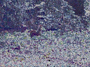
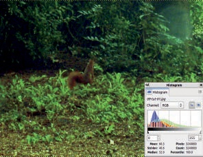
So, how do you separate noise from the meaningful elements in a picture? One way is to gather information about the image, via histograms, to see if there’s distortion in any of the channels. The image we’ll use in this tutorial isn’t particularly interesting, but it is representative of the problems you may encounter when dealing with badly taken photographs. As you can see in Figure 7-1, the picture’s quality is very poor. The photograph was taken through a closed window, in poor lighting, and with the camera’s automatic settings.
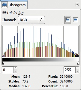
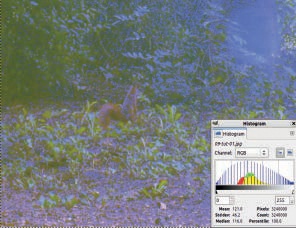
Begin by gathering information on the image dynamics, such as the ratio between the smallest and largest values in various channels. The combined histograms shown in Figure 7-2 are a way to visualize the image dynamics. Open them via Image: Colors > Info > Histogram, and change the CHANNEL to RGB. The three channels—Red, Green, and Blue—are shown in the same graph in their corresponding colors. The colors in the areas where the histograms superimpose are additive. A position on the horizontal axis represents a specific value between 0 and 255. The height of the histogram (the vertical axis) represents the number of pixels with that value.


Move the small triangles under the horizontal grayscale bar to frame the meaningful interval of values. Figure 7-3 shows that almost no pixels have a value less than 65 or greater than 173. In fact, 99.1 percent of the pixels are in the framed interval, which explains why the image is dull and hazy.

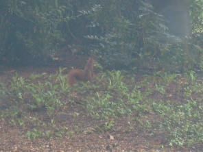
Extending the dynamic range is fairly easy with the tools available in GIMP. The simplest one is Image: Colors > Auto > Equalize, which automatically stretches the dynamic range in each channel to span the entire available range. Figure 7-4 shows the result, and Figure 7-5 shows the corresponding histogram. Because the image has only slightly more than a hundred different values, and the range has 255 values, extending the existing values over the full range leaves a lot of values unrepresented, which explains the strange “comb” shape.
In the resulting image (Figure 7-4), you see the squirrel is more visible, but the color distortions in the image have been exaggerated.
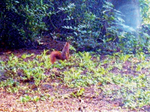
The same menu contains other automatic tools. For example, Figure 7-6 shows the image and its histograms after we used Image: Colors > Auto > Stretch Contrast. You could also try Image: Colors > Auto > Normalize, which gives a similar result.

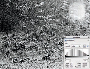
Pressing the AUTO button in the Levels tool yields the image shown in Figure 7-7. You can get a similar result by using Image: Colors > Curves to manipulate the curves in each color channel and suppress high and low values, which are not present in this photograph.
The histograms you saw in the preceding section are not very useful because they are crammed into one window, and their significance is not obvious in the image. A better way to visualize the three channels is to use Image: Colors > Components > Decompose. In the dialog shown in Figure 7-8, choose RGB to decompose the image into its three RGB channels. A new image with three grayscale layers, one for each channel, is created. In the Histogram window, choose the Value channel, which is done automatically because the image has no color or transparency.
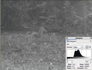
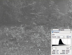

Figure 7-9 to Figure 7-11 show the three channels, along with their respective histogram. Clearly the Blue channel contributes much less to the image than the other two channels. Let’s see what happens if you stretch its histogram and leave the others unchanged.
Select the Blue layer in the Layers dialog and apply Image: Colors > Auto > Equalize. The result, if you hide the other two layers, appears in Figure 7-12. Next, apply Image: Colors > Components > Recompose. The result, shown in Figure 7-13, is worse than the original. This image demonstrates that proper preprocessing requires an understanding of image dynamics that goes beyond being able to use the automatic tools.
Noise is a set of small fluctuations around the average value intensity in some region of an image. As you’ll see later in this chapter, noise reduction is useful in many circumstances. But in the present case, the image is mostly noise, and no noise reduction process can really improve it. The only tool that’s even slightly useful is Image: Filters > Enhance > Unsharp Mask, which brings up the dialog shown in Figure 7-14.


If you increase the RADIUS to more than 40, you improve the image a bit, as shown in Figure 7-15. The squirrel is more visible and has more relief, but identifying most of the plants in the background would still be very difficult.
Generally, edge detection enhances the visibility of objects in a photograph. But when we applied the various filters in the Image: Filters > Edge Detect menu to our initial squirrel photograph, we didn’t see any improvement. You can achieve a better result by successively applying several different tools.
For example, first select the Levels tool, and click AUTO. Next, apply the Unsharp Mask filter. Finally, choose the Image: Filters > Edge-Detect > Edge filter. Using the settings shown in Figure 7-16, you get the result shown in Figure 7-17. Admittedly, this version is not really an improvement if your goal is to create a realistic image of the squirrel in its habitat. You could try applying the last filter on a copy of the layer and then adjusting the blending mode to get a more natural result.