
Figure 22-28 shows the full Image: View menu, which allows you to control image views. We cover here only the entries not covered in Chapter 10.
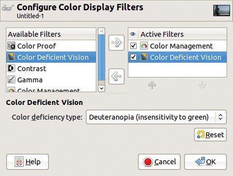
Image: View > Display Filters opens the dialog shown in Figure 22-29. Here, you can choose which filters to apply when an image is displayed. Available filters are shown on the left and the active ones on the right. If you select a filter in the left column, you can copy it to the right column with the corresponding arrow.


Uncheck the checkbox next to an active filter to deactivate it without removing it. Initially, only the COLOR MANAGEMENT filter is active, assuming you activated it in the Preferences dialog. Remember, these filters affect only the way an image is displayed; they don’t change the image itself.
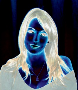
In Figure 22-30, we chose the COLOR DEFICIENT VISION filter in the left column, copied it to the right column, and selected it. A new field appears that allows us to select the type of deficient vision: protanopia, deuteranopia, or tritanopia (as described in Color Blindness). Figure 22-31 shows the result when we apply the Deuteranopia filter. The goal is to show us the image as it would look to a person with this type of color blindness. You may find this tool particularly useful when designing a website.

The CONTRAST filter shows the image as it would appear to those suffering from cataracts or retinal disease. It lets you transform the image so they are able to see it correctly. As Figure 22-32 shows, the default value of 1.0 for the number of contrast cycles is too high and creates useless artifacts. A value of 0.3 would yield a usable result.
The GAMMA filter allows you to apply a systematic gamma correction to all displayed images. This tool is handy when compensating for the distortions of a damaged screen. The filter shows the image aspect under those conditions.
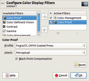
The COLOR PROOF filter, whose configuration dialog appears in Figure 22-33, controls the printer preview. The printer preview displays images to simulate their appearance when printed. You should only use color proofing when preparing to print an image, because the printer will apply a color filter to the image in the form of an ICC profile. Here, you choose the profile and intent to be used when printing an image. Figure 22-34 shows the result of using the parameter values shown in Figure 22-33. The BLACK POINT COMPENSATION button, if checked, improves the representation of dark colors, especially blacks. (For more information, see Color Management.)

The rest of the Image: View menu contains numerous checkboxes. We review them here and in the next section:
SHOW SELECTION (
 ) toggles the visibility of the “marching ants” that show the outline of the current selection. Remember, this outline is in the middle of the selection fuzziness; hiding it can lead to surprises when you find yourself trying to paint in an image without realizing that you are painting outside the current selection.
SHOW LAYER BOUNDARY is useful when the boundaries of the current layer differ from those of the canvas. The dashed line appears in yellow and black.
SHOW GUIDES (
 ) is handy for temporarily hiding guides that you want to keep. The dashed line is blue and black.
SHOW GRID shows or hides the grid.
SHOW SAMPLE POINTS controls the Sample Points dockable dialog, which is created from the Image: Windows > Dockable Dialogs submenu. To create a sample point,
 click in one of the rulers and drag the pointer to the pixel you want to sample. You can create as many sample points as you want, but only the first four are described in the dialog, shown with the points themselves in Figure 22-35. As you can see, you can choose to move a point by dragging it and delete it by dragging it back to a ruler. Note that you can only move these sample points if you have selected the Color Picker tool (
 ).
).This feature, when combined with the Levels tool or Curves tool, is especially useful. If you’re trying to fix the color balance in an image, place the sample points in areas where you know what the color should be—like a green tree leaf or the blue sky. Then, as you change all the colors with one of the previously mentioned tools, you can simultaneously compare the values in the sample points to make sure the colors of key objects are still accurate.
The last four checkboxes in the Image: View menu let you toggle the visibility of parts of the Image window, including the menu bar, rulers, scroll bars, and status bar. These options are great when you’re short on screen space. (Remember, you can access menus by right-clicking in an image or clicking the image menu button at the top-left corner of the rulers.) The Toggle Quick Mask button disappears if you hide the scroll bars, but you can always access it from the Image: Selection menu or by pressing
 .
.


We still have a few more options to review in the Image: View menu.
Image: View > Padding Color opens the menu shown in Figure 22-36, with options similar to those on the Image Window Appearance tab in the Preferences dialog (shown in Figure 22-10). One difference is that here we can select the padding color for the active Image window only.
Other customizations available in the Image: View menu all relate to snapping: Snapping describes the way the mouse pointer is attracted to a feature in the Image window. Snapping is active, by default, for the guides. Select SNAP TO GRID for drawing schema precisely. Select SNAP TO CANVAS EDGES when you want to begin a selection exactly on an edge. Select SNAP TO ACTIVE PATH when working with paths.