
New GIMP users are sometimes put off by the presence of several separate windows and have complained for many years about that. Our advice is to try it first. Multi-window mode lets you view two images at once. It also allows for more control over the sizes of various windows and the placement of dialogs. If you still don’t like working with multiple windows, then switch to single-window mode.
Many people are used to closing windows as soon as they don’t need them, even if they plan to reopen them again soon. Users often also simply close a dialog window if they change their mind rather than press CANCEL or NO. This action is necessary in applications with a blocking interface. The GIMP interface is nonblocking: You can begin several things at the same time, change your mind, leave a question temporarily unanswered without canceling the dialog, and so on. The capability to do several things at once is particularly handy if you need some information before finalizing settings, for example.
What happens if you close one of the GIMP windows? It depends on the window itself. Closing the Image window has two different effects, depending on its contents. If the Image window is empty, closing it quits GIMP and is equivalent to selecting Image: File > Quit or pressing .
.
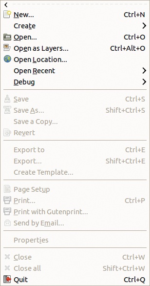
Figure 9-19 shows the Image: File menu when the Image window is empty. Many entries are grayed out, which means they are irrelevant when there is no current image. The keyboard shortcut to quit GIMP () is also shown in the menu.
If the Image window contains an image, closing the window is equivalent to selecting Image: File > Close or pressing  . If the image has been changed and not yet been saved, GIMP asks whether you want to save the image or discard the changes, as shown in Figure 9-20. Even if you’ve just exported the image, GIMP asks if you want to save it (as XCF). You can cancel if you decide not to close the image.
The Image window is the only window that closes GIMP when closed. The Toolbox window and the multi-dialog window are only auxiliary windows. You can open and close or hide and recall them ( ).
).
In previous versions of GIMP, the Toolbox was the main window. It contained a menu bar different from the Image window menu bar, and closing the Toolbox quit GIMP.
In current versions of GIMP, you can work without the Toolbox because having it available is only a convenience. You can access all the tools it contains via the Image: Tools menu, and this menu actually contains more tools than the default Toolbox window. Other dialogs are more useful because you can’t access the features they provide in other ways. These include the Tool Options dialog, the Layers dialog, and the Channels dialogs.

Up to now, we’ve referred to the Image window as if there was only one. But you can have several Image windows if you open multiple images at the same time. If you close one of them using , Image: File > Close, or the button at the top of the window, only that window is closed, and the others remain open. When you close the last open image, you’ll see the empty Image window, which you first saw when GIMP started. You can also close all the open images without quitting GIMP by pressing  or selecting Image: File > Close all.
When you have several images open, you need to know which image is active. If you use a menu in an Image window, it operates on the image in that same window. If you are using a tool in the Toolbox, however, the active image is less obvious. In fact, clicking a tool icon in the Toolbox selects the tool but does not activate it. To activate it, you need to click in an Image window.
Although clicking generally works well, if your window manager allows for it, set up GIMP so that simply hovering the mouse pointer over a window makes it active without your needing to click. In the GNOME 2 desktop environment, check the first button in the window that opens via System > Preferences > Windows. In GNOME 3, install and call gconf-editor, then change apps: metacity > general > focus-mode to mouse. In Ubuntu Unity, this is the default behavior. In Windows, go to the control panel and find “Change how your mouse works.” In Mac OS X, use TinkerTool.
This setup makes working in GIMP much easier. For example, suppose you choose the Rectangle Select tool, the first one in the Toolbox. Click the icon and move the mouse pointer to the Image window you want to work in, and you can immediately begin to draw the rectangular selection. If you need to click in the window to make it active first, you may accidentally make a tiny, virtually invisible selection if you’re not careful. To use a keyboard shortcut ( in this case), you must click the Image window before typing the shortcut—without accidentally editing the image with the current tool. Moving the mouse pointer above the image and typing the shortcut is much safer and easier.
The dialogs in the multi-dialog window also operate on only one of your Image windows. An image menu appears, by default, at the top of the multi-dialog window to show which image is currently active (Figure 9-14). When you press AUTO, the button is gray, and the current image changes automatically when you select an Image window (by clicking or by moving the mouse pointer, depending on your settings). If you don’t press it, the button is white, and you must explicitly change the current image in the menu.
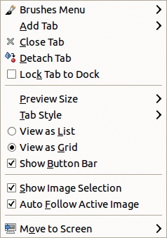
As Figure 9-21 shows, in the Tab button menu for an ordinary dockable dialog, you have two image selection options:
SHOW IMAGE SELECTION specifies whether the image menu appears at the top of the dock.
AUTO FOLLOW ACTIVE IMAGE specifies whether selecting another Image window changes the active image. This option is the same as AUTO at the top of the dockable dialog.
Although they appear in the Tab button menu of a specific dialog, these options apply to the whole dock.
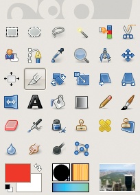
Another way to see which image is active in the dockable dialogs is to add a thumbnail of it in the Toolbox, as shown in Figure 9-22. To add it (or any information thumbnail), select Image: Edit > Preferences. In the dialog that opens (covered in detail in Chapter 22), select TOOLBOX and check the three buttons under the heading APPEARANCE, as shown in Figure 9-23.

We already considered several of the entries on the Tab menu, which pops up when you click the small triangle button at the top right of a dockable dialog (Figure 9-21). Next we look at some of the other entries that appear in the middle of this menu. For some dialogs, some entries are grayed out or omitted.
PREVIEW SIZE opens the menu shown in Figure 9-24. Many dockable dialogs display thumbnails of an image or brushes, patterns, gradients, or fonts. You can display this thumbnail in eight sizes. Figure 9-25 shows the Brushes dialog with small-sized thumbnails selected. The tiny size is useful if you have a very small screen, and the largest sizes are useful for users with impaired vision.


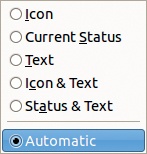
TAB STYLE opens the menu shown in Figure 9-26 and is used to change the appearance of the tabs. ICON uses only a descriptive icon. CURRENT STATUS displays a thumbnail of the currently selected brush, pattern, font, gradient, or so on. TEXT shows the dialog name. You can also choose to show both the name and the icon or the status. Figure 9-27 shows tabs with the icon and text. AUTOMATIC chooses the style depending on the available space in the dock: When only one tab is visible, the ICON & TEXT style is used; if several tabs are visible, the ICON or CURRENT STATUS styles are used.
VIEW AS LIST and VIEW AS GRID are radio buttons, so you can select only one at a time. VIEW AS LIST displays one item per line, while VIEW AS GRID displays as many items per line as possible.
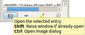
SHOW BUTTON BAR specifies whether the button bar at the bottom of the dialog is displayed. The buttons in the bar vary by dialog. Some have up to eight buttons (such as the Paths dialog), whereas others have only three (such as the Patterns dialog). The button’s function is shown in a tooltip message if you hover the mouse pointer over the button, as shown on Figure 9-28. Hide the button bar if the screen is crowded; the corresponding actions are still available in the right-click menu and in the first entry on the Tab menu.