
If you’re planning to build a website or are designing one for someone else, you need to decide how the graphics will be laid out. Sometimes knowing what will look good until you actually see it is hard. In this tutorial, we create a prototype of a website about healthy food. This site will offer information about different foods and services to help people plan their meals, track their progress, and so on.
Before creating graphics or choosing colors, make a plan for the website. Start by writing down what the website should bring to its visitors.
Visitors can be divided into two main types: first-time and repeat. First-time visitors should be able to navigate the website easily and find what they’re looking for quickly. Repeat visitors should find reasons to come back regularly. They should be able to check new content and use the website services effortlessly.
The next step is to lay out the blocks that will constitute the website. You should have a block for new content, displayed in a prominent place, which all visitors will see. New visitors, or returning visitors who are not yet registered members, will also see beginner blocks to help them decide what to read. Registered visitors will instead get member blocks that display their personal goals and progress.
Now arrange the blocks. You may want to draw a sketch on paper first to let your ideas take form, or you can fire up GIMP to sketch a draft digitally. In this tutorial, we use the 960 Grid System to help us calculate the dimensions of the blocks in a page that’s 960 pixels wide. The 960 Grid System (http://960.gs/) offers a set of prototyping resources: templates in 12, 16, and 24 columns, including templates for GIMP with preset guides; sketch sheets like the one in Figure 8-1; CSS files; and example HTML files. You can also create a custom GIMP template if you prefer another page layout (Image: File > Create Template).

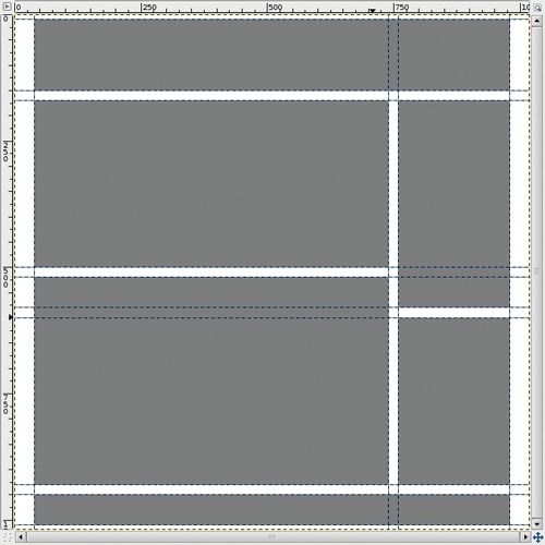
If you decided to use the 960 Grid System to build this design, you can translate your sketch sheet into the provided GIMP template, as shown in Figure 8-2. If not, use your custom template with the guides placed where you prefer. You will have to define your own CSS files, however, without the help of 960 Grid System files.
Drag guides from the image rulers to mark the boundaries of the blocks. Choose 960 pixels as the total width of the page and delineate a right column that’s 220 pixels wide; add 20-pixel margins around the design and 10-pixel margins between blocks. Verify that the Image: View > Snap to Guides option is checked so you can use the Rectangle Select tool to select a block and fill it. Use a middle-range gray (#808080) to fill the blocks. Figure 8-2 shows the result.
Being able to change the color of a block with one click makes color prototyping faster. To set this up, build a rectangular outline around each block:
Create a new transparent layer, and place it at the top of the layers stack. It will contain all the block outlines.
Select the Rectangle Select tool, and draw a rectangle using the guides.
Select Image: Edit > Stroke Selection. In the dialog that opens, choose to stroke a line in a solid color with a width of 2 pixels. Choose a color that contrasts with your design.
Repeat these steps for each of the six blocks.
To colorize a block, use the Bucket Fill tool in the transparent layer you created. From the Bucket Fill options, select FILL SIMILAR COLORS and uncheck SAMPLE MERGED. When you click inside a block, only that block is filled because the Bucket Fill tool fills only contiguous areas of the same color, and the outline surrounding the block is a different color. You can then build new layers with different colors and hide various layers to reveal the different options. If you click outside of any block, your color fills the margins of the layout, which is considered the background of the page you’re building.
Always be aware of the margins, header and footer height, and column width. Changing any of these can drastically alter the feel of the design.

Next, choose a color palette for the website. You can choose a palette in several ways: Pick colors using the Color chooser, use the eye dropper to pick colors from a photo or an illustration that will be included in the design, or browse through palette collections that other people have designed. With GNU/Linux, you can use the Agave color scheme generator.
For this website, we want a palette that includes red, orange, yellow, green, and brown. These colors seem bright and energetic, which is the feeling we want for our website. Choose at least one deep color and one soft color to add contrast to the design. Alternatively, start with a monochrome palette, and add different hues when the design looks good in black and white.
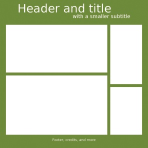
For our site, we first try a mid-dark background with bright blocks, as shown in Figure 8-3. The header and footer blend into the background, so we need bright text colors to make them readable. We add placeholder titles to see how text will look in this design. We start with a neutral font (Sans), with a size of 80 pixels for the main heading and 36 pixels for the subheading.
In the final website, header titles can either be text or an image. Text is nice because the reader (and search engines) can interact with it, but you need to choose a web-safe font, so your choices are limited. Note you’ll need to make the titles readable for vision-impaired viewers by adding the proper tags in the HTML file.
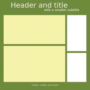
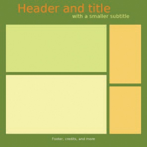
Now add colors: We add a deep green in the background to remind viewers of vegetables and nature (to convey the “healthy” feeling). See the result in Figure 8-4. Then, we fill the content blocks with a neutral pale yellow, which looks nice with the green but isn’t too distracting. The result is shown in Figure 8-5. To make the side menus more colorful, we use orange, to complement the green and yellow, as shown in Figure 8-6.
The design has enough contrast, but it lacks energy. We need more bright colors. We can add color to the header, to the illustrations that will decorate the page, or to action buttons like “Buy now” or “Register”. We decide to color the header a really bright orange, as you can see in Figure 8-7.


Next we add one more bright color. Bright yellow could fit, but bright lime green is even better as it looks nice with the dark green in the background. This website doesn’t have any big action buttons, but we want new users to be drawn to the block that describes the website’s strong points and its services. We color that block bright lime green so it stands out. Figure 8-8 shows the result, and our palette is shown in Figure 8-9.
This palette was built using the Color chooser: The first color (green) has an HSV value of (75, 100, 50); the second color (orange) is HSV (30, 100, 100); the third color (the darker yellow) is (44, 62, 100); the fourth color (the lighter yellow) is (60, 30, 100); the fifth color (a yellow-green) is (75, 50, 100). The H channel (the first number) determines the general hue; the S channel (the second number) determines whether the color is saturated or pastel; and the V channel (the last number) determines whether it’s light or dark.
Save this palette in the Palettes dockable dialog (Image: Windows > Dockable Dialogs). Create a new palette by clicking the second button from left in the bottom row. In the Palette Editor, add colors to your palette from the current foreground or background color, edit a color, or delete it.
To use the new palette, click the color you want in the Palette Editor to set the foreground color or  -click to set the background color.
We liven up the page by adding illustrations as new layers with transparent backgrounds. The result is shown in Figure 8-10.
Now we do some fine-tuning. We adjust the font to make the header more attractive and shrink the footer because it takes up too much space. Figure 8-11 shows the new layout.
The blocks look a little cramped, so we add white margins around them, as shown in Figure 8-12. To create the margins, add a layer below the blocks, create a rectangular selection around the blocks, increase it by 10 pixels (Image: Select > Grow), and fill it with white.


The margins around the blocks are barely visible, so we widen them from 10 pixels to 20 pixels, as shown in Figure 8-13. This time we want to shrink the blocks and move the guides 10 pixels toward the center of each block. We create a selection that’s 10 pixels in from the current edges of the block by following the guides, invert the selection to select only the outer 10 pixels of the block, and then cut the selection to reveal more white border.

