In this section, you get to look over the shoulder of a digital painter as she develops a complete landscape painting in GIMP. Although this isn’t a follow-along tutorial, it shows you how a digital painter plans and executes a moderately complex piece, and you get to see a variety of practical techniques and tricks in action.
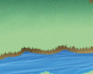
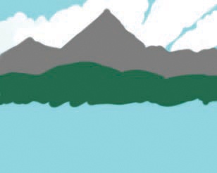
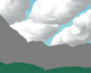
I’ll begin by creating layers for each major aspect of the landscape, going from the most distant (the sky in Figure 3-86) to the closest element (the river in Figure 3-92) in Figure 3-86 to Figure 3-92. I initialize each layer with a transparent background, so the layers behind show through. At this stage, I just use basic paintbrush strokes to get a general idea of the composition. I don’t spend much time on the colors—I pick whatever comes to mind because I can tweak them later. I also don’t spend much time getting the shapes exactly right: Mountains (Figure 3-88) are rough triangles, and trees (Figure 3-91) are scribbles.


Once all the layers are set up, I adjust colors by locking the Alpha channel and dropping new colors in (as we did in Coloring the Mushrooms). I try to capture a mood with the color combination. When you’re first starting out, finding the right combination might seem difficult, but with more practice, you’ll be able to envision what a piece will become even at this early stage.
Next I refine each layer. I use a graphics tablet with the Paint Dynamics set to Basic Dynamics so pressure controls opacity.
I’ll start with the sky. I make the sky richer using the techniques described in The Smudge Tool, dropping small paintbrush strokes (Figure 3-93) and smudging in a circular motion (Figure 3-94). This makes the flat, plain sky much more interesting.


Now I add volume to those flat white shapes to make them look more like clouds. I lock the Alpha channel, add gray paintbrush strokes to the bottom of the clouds (Figure 3-95), and smudge the shadows to create soft transitions (Figure 3-96). I then unlock the Alpha channel and smudge the cloud edges a bit to get that fluffy feeling (Figure 3-97).


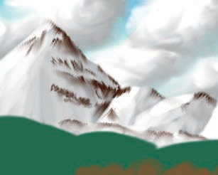

The mountains layer is challenging because I want snowy mountains but need to distinguish the mountains from the clouds. Now that the bottoms of the clouds are shadowed, I can add the snow without losing the mountains. I lock the Alpha channel again and add white paintbrush strokes, pressing harder where the sun makes the snow bright and lighter on the other side (Figure 3-98). This time, the brush strokes look nice, so I’m not going to smudge them. To make the mountains more interesting, I want to add some dark areas where the snow has melted or couldn’t reach. I paint in MULTIPLY mode to maintain the lighting I just defined (Figure 3-99). I smudge these areas chaotically to give them a natural, artistic look (Figure 3-100). Finally, I add a slight blueish tone to the snow, giving it a more realistic feel (Figure 3-101).


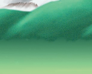
The hills just need a nice texture so they look like grassy hills. I start by lighting them with the Dodge/Burn tool set to RANGE HIGHLIGHTS (Figure 3-102). The hills’ color is rather dark, so I use several coats to get the result shown. I then smooth the result with the Smudge tool (Figure 3-103).
I’ll add some noise to the hills to make them look less smooth and bare. I experimented with the filters in the Image: Filters > Noise menu and found that one of them, Image: Filters > Noise > RGB Noise, results in something close to what I have in mind, so I apply it with the default parameters (Figure 3-104) and get the result shown in Figure 3-105.


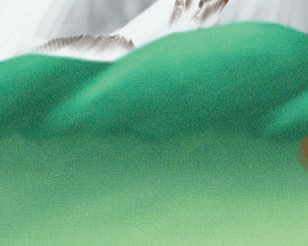
First I want to create a soft transition between the hills and the grassland. I start by choosing a vertical gradient ranging from the deep green of the hills to the middle green of the grass. With the Alpha channel locked, I apply the gradient from the top of the grassland to the middle of the grassland. Figure 3-106 shows the result. I then unlock the Alpha channel and improve the transition between the two layers with the Smudge tool. I also smooth any seams in the grassland that were created by the gradient. The smudged gradient is shown in Figure 3-107.
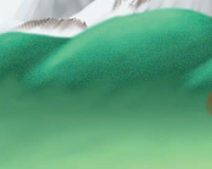

I decide to texture the grassland using the same filter that worked so well for the hills: Image: Filters > Noise > RGB Noise. The result, shown in Figure 3-108, is what I expected, but the transition between hills and grassland is now too subtle. This time I want to sharpen a transition. I use the Eraser tool to remove some of the smudging done earlier to reveal more of the dark base of the hills. I stop when I’m happy with the transition (Figure 3-109).
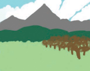
While painting the background, something about the trees started to bug me. It’s not just that they’re ugly scribbles; they don’t seem to fit in the composition. First I need to figure out what is making me uneasy, and then I can fix it. Is it the color (too dark for the mood of the painting)? Or the position? Maybe the size? Yes, that’s it: The trees look too small compared to the rest of the landscape.
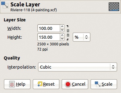
A quick layer transformation confirms my suspicion. I select Image: Layer > Scale Layer, unlock the chain, and choose 150% height and 100% width (see Figure 3-110) so the trees get taller but not wider. My intuition was good, and after erasing a bit of the bottommost trunk, I get Figure 3-111, which is a better composition.


Now, I want to make these trees look like something other than scribbles. I start with the trunks and leave the foliage for last because it lies on top of the trunks.
I add vertical strokes to the trunks to give the impression of tree bark. I use the Airbrush tool to get a natural effect, adding dark brown lines on the shady side and lighter lines on the sunny side. The trees in the front should have more contrast than those in the back, whose colors blend in the distance. Whenever I add shadows, I make sure the shady side is the same on the mountains, hills, and trees.
I use the Smudge tool to create roots, stroking vertically from the feet of the trees into the grass. The closest tree should have roots more detailed, whereas the distant trees only need a few strokes. The result is in Figure 3-112.
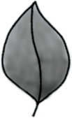

For the foliage, I create my own animated leaf brush. I start by drawing a leaf on a relatively large canvas (200 × 200 is fine) and fill it lightly. I draw the leaf in grayscale so the brush can pick the Foreground color. The result is shown in Figure 3-113.
I then create a new image for the animated brush (1600 × 200) and copy and rotate the leaf eight times, as shown in Figure 3-114. (Chapter 22 goes into more detail about animated brushes.) I remove white from the new brush and set it up so any color can replace black pixels (Image: Colors > Colors to Alpha), and then I export the brush in GIMP animated brush format with the options shown in Figure 3-115.

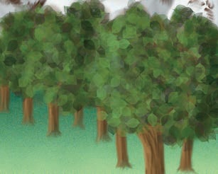
When I refresh the Brushes dialog, my new brush appears. I select it, pick the Paintbrush tool, and select the Random Color Paint Dynamics setting. I choose a greenish gradient (one called Greens is somewhere in the middle), change the brush spacing to get the full gradient potential, and start painting to experiment. Leaves that are 200 × 200 pixels are a bit too large for this drawing, so I adjust the SIZE to make the brush smaller. When I make it too small, I can’t really make out the leaves anymore. A size of 100 × 100 works best. I cover the trees with foliage, as shown in Figure 3-116, letting some of the brown sketch show through as branches.
Next, I want to give the trees some depth to distinguish the foliage of the close trees from the distant ones. I paint over the leaves with the same brush and the same gradient, but with the mode set to LIGHTEN ONLY for highlights and to DARKEN ONLY for shadows (Figure 3-117).
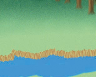

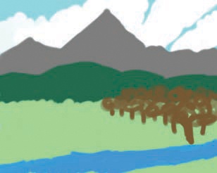
Now on to the final element: the river. Currently, it lies flat on the grass, but I’ll fix that by adding banks. I’ll draw them on a new layer, using a color gradient to give it some detail. I do that by defining a new paint dynamics that correlates Color with Fade. I choose a FADE LENGTH by trial and error. The foreground and background colors that the gradient will span should be close to each other so the gradient isn’t too hard on the eyes. I paint the banks in small vertical strokes, following the bends of the river, as shown in Figure 3-118.
The waterline should be flat, so I erase the bottom of the bank with a fuzzy brush, resulting in Figure 3-119.
I add volume by drawing a semitransparent gradient over the bank. I first lock the Alpha channel to keep the gradient on the bank. I pick a dark color, the Blend tool, and the FG to Transparent gradient. I begin each stroke above the bank, cross over it, and end at the water line. Now that the bank is darker, some imperfections become evident, so I unlock the Alpha channel and fix them, using the Smudge tool to fill the holes and the Eraser tool to clean up the waterline. The current result is shown in Figure 3-120.


The grass should curve over the edge of the bank, so I draw blades of grass with the Smudge tool. I do the same thing on the other side of the river, as shown in Figure 3-121.
The river still looks pretty flat, so I’ll add some details. I burn the far side of the river, to put it in shadow, and airbrush a current with long, soft strokes, as shown in Figure 3-122. The state of the Layers dialog once the painting is finished is shown in Figure 3-123. The final painting is shown at its full size in Figure 3-124.