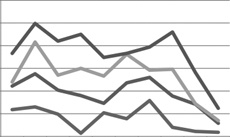
Excel is a wonderful program in which to store lots of data, but let’s face it—data is only useful if you can do something with it. The point of having a lot of data is being able to analyze that data. Presenting data visually, in chart format, can greatly simplify the analysis process.
Excel 2008 provides 11 types of charts, each with multiple implementations, for a whopping total of 73 two- and three-dimensional chart formats that you can create instantly from data stored in a worksheet. The basic chart types are Area, Bar, Bubble, Column, Doughnut, Line, Pie, Radar, Stock, Surface, and Scatter. Although you can create any type of chart from a data selection, certain data is best represented by certain chart types. For example:
Creating a chart in a workbook is as simple as selecting the data you want to chart, and then clicking the chart type in the Elements Gallery. If, after you create a chart, you find that the chart type isn’t appropriate to the data, you can change the chart type by activating the chart and then clicking another chart type on the Charts tab of the Elements Gallery.
After you create a chart, you can add data labels to help a person looking at the chart understand the data. You can also add a title, display axes and gridlines if appropriate to the chart type, and modify the chart or any of its elements, which include the following:
Chart area. This is the entire area within the frame displayed when you click a chart.
Plot area. This is the rectangular area bordered by the axes.
X-axis and y-axis. The data is plotted against a horizontal x-axis—also called the category axis—and a vertical y-axis—also called the value axis. (Three-dimensional charts also have a z-axis—called the series axis— expressing the depth of the chart.)
Tick-mark labels. These are labels along each axis that identify the data.
Data labels. These are graphical representations of each data point in a data series.
Legend. This key identifies the data series.


