In this exercise, you’ll create a pie chart from a data range and move the chart to its own sheet. You’ll change the chart type and extend the data range on which the chart is based. Then you’ll add labels to the chart to clearly present the data.
Note
SET UP Open the CookieSalesByTroop workbook from the ~/Documents/Microsoft Press/ 2008OfficeMacSBS/WorkSheets/ folder.
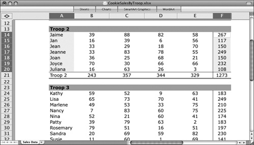
In the second table, select cells A14:A20. Press and hold the Command key, and then select cells F14:F20.
Click the Charts tab of the Elements Gallery.
The gallery expands and displays all the available charts, ordered by chart type.
Click the Area, Bar, Bubble, Column, Doughnut, Line, Pie, Radar, Stock, Surface, and Scatter buttons to view the available chart types in each group. When you finish, display the Pie gallery.
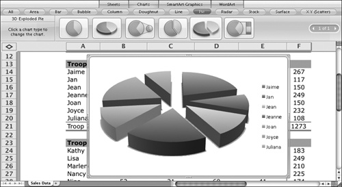
Click the 3D Exploded Pie chart type (the fifth thumbnail in the Pie group).
Tip
Point to any thumbnail to display the layout name and description in the style name area at the left end of the gallery.
Excel inserts a frame, containing a chart based on the selected data, into the worksheet. A legend appears to the right of the chart.
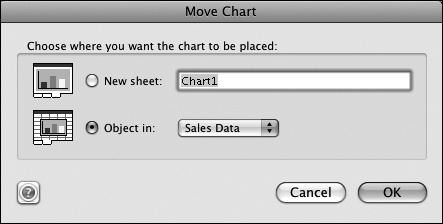
Right-click the chart frame, and then click Move Chart.
The Move Chart dialog box opens.
In the New sheet box, replace Chart1 with Troop 2 by Girl. Then click OK.
The chart, still in its frame, moves to its own chart sheet. The sheet tab reflects the name you entered in the Move Chart dialog box. The legend isn’t legible in this format.
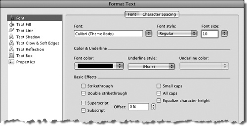
Right-click the legend, and then click Format Text.
The Format Text dialog box opens.
On the Font page, click 18 in the Font size list, and then click OK.
The chart size changes to accommodate the larger legend.
Right-click the chart, and then click Add Data Labels.
The total sales appear on each pie wedge but, again, the labels are too small to read.
Display the Formatting Palette in the Toolbox.
While the pie wedges are selected, only the chart-related panels are visible.
Click any one of the data labels on the pie.
The Font panel and the Alignment And Spacing panel appear in the Formatting Palette.
In the Font panel, change the Size to 20. Then click a blank area inside the chart frame.
The legend and data labels are now easier to read.
Note
You can also change the font size of the data labels from the Format Data Labels dialog box, which you display by right-clicking any data label and then clicking Format Data Labels. If you increase the font size beyond the size at which a label can fit on its pie wedge, the label moves away from the pie and a line connects the label to its wedge.
Display the Chart Options panel of the Formatting Palette. Under Titles, click the Click here to add title placeholder, and then type Troop 2 Sales by Girl.
The text that you enter in the Chart Options panel also appears at the top of the chart.
In the Chart Options panel, under Other options, click Percent in the Labels list, and then click Top in the Legend list.
The labels change to indicate the percent of total sales represented by each pie wedge, and the legend changes to a horizontal orientation across the top of the chart frame. Again, the chart size changes to fit the available space.
Click the Sales Data sheet tab. Select cells A11:E11, A21:E21, and A34:E34.
Display the Charts tab of the Elements Gallery. In the Bar group, click 3-D Clustered Bar.
Excel creates a chart in the worksheet, depicting the number of each of the four cookie flavors sold by each troop.
Because we didn’t select the names of the cookies, they are identified on the y-axis of the chart only as 1, 2, 3, and 4.
Move the chart to its own sheet, named Cookies by Troop, and close the Elements Gallery.
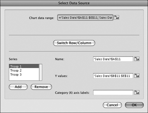
Right-click the chart, and then click Select Data.
The Select Data Source dialog box opens, with the worksheet displayed behind it. The data range you selected in step 15 is still active in the worksheet, and is also displayed notationally in the Chart Data Range box.
Three data series are listed in the Series box. Clicking a series displays the corresponding worksheet cells containing the series name and Y values.
In the Series list, click Troop 1. Then click the Collapse Dialog button to the right of the Category (X) axis labels box.
The Select Data Source dialog box minimizes to only a single input box, so that you can more easily access the data behind it.
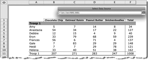
Scroll the Sales Data worksheet until row 1 is visible. Then select cells B1:E1 (the cookie names).
As you select the cells, they appear notationally in the Select Data Source input box.
In the Select Data Source dialog box, click the Expand Dialog button.
The dialog box expands to its normal format.
In the Select Data Source dialog box, click OK.
The appropriate cookie names appear on the y-axis of the chart. The labels and legend are, again, not very legible.
Right-click any one of the cookie names, and then click Format Axis.
The Format Axis dialog box opens.
Display the Text Box page of the dialog box. In the Text Layout area, click Rotate all text 270° in the Text direction list.
The change is visible on the chart behind the dialog box.
Display the Font page of the dialog box. In the Font size list, click 14, and in the Font style list, click Bold. Then click OK.
The cookie names appear vertical on the chart at a legible size.
Using the right-click method or the Formatting Palette panels, change the legend font size to 16, and the legend placement to Left.
Point to the right end of any of the horizontal data bars.
A ScreenTip displaying the data series (troop), data point (cookie type), and value (total sales) represented by the data bar appears.
With the chart frame (rather than any chart element or group of elements) active, display the Charts tab of the Elements Gallery.
Rather than displaying the chart type, the style name area says Change Chart.
Apply the following chart types to the chart to see various ways in which you can present this data:
In the Area group, apply the 3-D 100% Stacked Area type.
In the Bubble group, apply the 3-D Bubble type.
In the Radar group, apply the Marked Radar type.
In the XY (Scatter) group, apply the Smooth Marked Scatter type.
Notice as you view the various chart types that some chart types automatically pick up the correct axis data, and others don’t. If you change the chart type and Excel doesn’t automatically pick up the data it needs, you can easily edit the chart to specify the data sources.
Experiment on your own with chart types and practice applying formatting by using the right-click method and the commands on the Formatting Palette.
Save the CookieSalesByTroop workbook as My Charts.