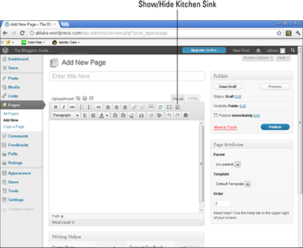
Figure 10-5: The WordPress visual editor.
Designing and Creating Your Sales Page
You can start to design your sales page before you’ve finished your e-book. Give yourself plenty of time for this task because the sales page is one of the main ways in which you convert potential readers into paying customers — especially during the initial launch of your e-book.
In addition to the critical elements covered in the preceding section, you may want to include other pieces of content on your sales page, such as these examples:
![]() Relevant biographical information about yourself: If you have a PhD in psychology and you’ve written an e-book about ways to help a friend or relative with depression, your academic qualification is obviously relevant — information that readers will want to know about.
Relevant biographical information about yourself: If you have a PhD in psychology and you’ve written an e-book about ways to help a friend or relative with depression, your academic qualification is obviously relevant — information that readers will want to know about.
![]() A short excerpt from the e-book: This is more commonly included with fiction than with nonfiction, but nothing is stopping you from using the technique for any sort of book. With nonfiction, you might consider having several short quotes from your e-book at different points on the sales page.
A short excerpt from the e-book: This is more commonly included with fiction than with nonfiction, but nothing is stopping you from using the technique for any sort of book. With nonfiction, you might consider having several short quotes from your e-book at different points on the sales page.
![]() Information about bonuses that you supply with the e-book: For example, if you’ve written a nonfiction e-book, it might come with useful worksheets, recorded interviews with experts in the field, or other extras.
Information about bonuses that you supply with the e-book: For example, if you’ve written a nonfiction e-book, it might come with useful worksheets, recorded interviews with experts in the field, or other extras.
![]() A downloadable sample of your e-book — perhaps the first few chapters: This sample is a useful way to build readers’ trust: They can get a real taste of what they’ll be buying. If you’ve written a novel, those first few chapters should draw readers in — they’ll want to know what happens next. With a nonfiction book, your sample might consist of the first chapters or one chapter from each part.
A downloadable sample of your e-book — perhaps the first few chapters: This sample is a useful way to build readers’ trust: They can get a real taste of what they’ll be buying. If you’ve written a novel, those first few chapters should draw readers in — they’ll want to know what happens next. With a nonfiction book, your sample might consist of the first chapters or one chapter from each part.
Drafting the copy for your sales page
Even if you’re used to writing chapter after chapter of your e-book, writing a sales page can be a tough proposition. Most authors aren’t natural marketers (in fact, the very thought of self-promotion might make you feel anxious) — I found it tough to write my first few sales pages.
At some point, though, you need to sit down and start writing. I suggest beginning with a clear description of your e-book. If you’re not sure what to write, imagine what you’d say to a friend who asks, “So what’s your book about?”
You might find that it’s useful to study the sales copy for similar books. For example, if you’ve written a romance novel, take a look at several different blurbs to see what elements they have in common and what seems to work. If you’ve written a book about starting a small business, look around online for e-books on similar topics to see how other authors have put together their sales pages.
One piece of text that you’ll want to pay close attention to is the headline — the title of your page. Though you can simply use the name of your e-book, the headline is, ideally, as compelling and attention-grabbing as possible. Focus on the key benefits to the reader — with nonfiction, that often means telling them what they’ll learn, and with fiction, it means emphasizing the entertainment factor, as in these examples:
![]() Grow better, bigger tomatoes — in three simple steps.
Grow better, bigger tomatoes — in three simple steps.
![]() Learn everything you need to know about web design, from setting up your first site to starting a whole new career.
Learn everything you need to know about web design, from setting up your first site to starting a whole new career.
![]() Get my latest book, [title] — described as “a gripping read” and “an action-packed thriller that keeps you on the edge of your seat.”
Get my latest book, [title] — described as “a gripping read” and “an action-packed thriller that keeps you on the edge of your seat.”
How much you need to write on your sales page is up to you. Generally, the more expensive the e-book, the more time you need to persuade potential customers that it’s for them.
Explaining the benefits of your e-book
The benefits of reading a fiction e-book are usually implied — though you might want to write a sentence or two that hooks into the usual desires of readers in your genre. For example, literary readers will likely be looking for a different sort of experience from romance or crime fans.
With nonfiction, it’s important to spell out what the reader will get from your e-book. A basic tenet of marketing says that it’s important to focus on benefits, not simply on features. A feature, by the way, might read, “This e-book is 100 pages long.” A benefit might read, “This fluff-free e-book for busy executives walks you through exactly what you need to know as quickly as possible.”
Present benefits as bullet points whenever possible. Bullets make text easy to read and comprehend (and they look good on the screen). Between five and seven bullets is about right: Fewer bullets aren’t enough to sway your potential customer toward buying; too many bullets make the customer start skipping to the next section.
When you’re struggling to figure out how your e-book benefits readers, think about the answers to these questions:
![]() How will your readers feel after they’ve finished the e-book? Will they be more confident? Reassured? Entertained?
How will your readers feel after they’ve finished the e-book? Will they be more confident? Reassured? Entertained?
![]() What will readers learn from your e-book? Perhaps they’ll gain a new skill, whether that’s being able to put together a useful presentation or being able to take apart and repair a computer.
What will readers learn from your e-book? Perhaps they’ll gain a new skill, whether that’s being able to put together a useful presentation or being able to take apart and repair a computer.
![]() Who would find this e-book particularly useful? Imagine who’s likely to buy your e-book, and imagine which aspects of the book will be particularly relevant to them. For example, a book on starting a small business might be bought by people who are motivated by escaping from a day job, establishing a secondary income, or finally pursuing a dream. You can hit on all these benefits in your bullet points.
Who would find this e-book particularly useful? Imagine who’s likely to buy your e-book, and imagine which aspects of the book will be particularly relevant to them. For example, a book on starting a small business might be bought by people who are motivated by escaping from a day job, establishing a secondary income, or finally pursuing a dream. You can hit on all these benefits in your bullet points.
![]() What might readers have tried and failed at in the past? Perhaps your book on dieting is a straightforward guide, based on healthy principles — not a fad diet that doesn’t even work. Be clear about how your book is different from (and better than) other books that readers may have come across.
What might readers have tried and failed at in the past? Perhaps your book on dieting is a straightforward guide, based on healthy principles — not a fad diet that doesn’t even work. Be clear about how your book is different from (and better than) other books that readers may have come across.
Finding images and graphics for your sales page
Your sales page doesn’t only need to be well-written — it also needs to look attractive. By including images and graphics, you add immediate visual interest for the reader.
Consider including these two important images:
![]() Your e-book’s cover: This one isn’t negotiable — there’s no reason to omit it. You can simply put the cover on the page as a flat image. Some authors like to use software to turn their cover into a 3D graphic that looks like a little book, because they feel this helps give the e-book a more tangible form in readers’ minds.
Your e-book’s cover: This one isn’t negotiable — there’s no reason to omit it. You can simply put the cover on the page as a flat image. Some authors like to use software to turn their cover into a 3D graphic that looks like a little book, because they feel this helps give the e-book a more tangible form in readers’ minds.
 If you’ve commissioned a cover from a designer, that person should be able to create a 3D graphic for you, so if you want this, let the designer know.
![]() A photo of yourself: A photo isn’t absolutely essential, but a smiling picture of yourself helps establish an instant connection with potential readers. The photo can be a simple head-and-shoulders shot or a photo that relates to the content of your e-book. (I often use photos of me with various writing paraphernalia because most of my e-books are aimed at writers.) You can use the same photo that you have on your About page.
A photo of yourself: A photo isn’t absolutely essential, but a smiling picture of yourself helps establish an instant connection with potential readers. The photo can be a simple head-and-shoulders shot or a photo that relates to the content of your e-book. (I often use photos of me with various writing paraphernalia because most of my e-books are aimed at writers.) You can use the same photo that you have on your About page.
Lots of graphics packages are available to buy, usually quite cheaply. You can also purchase stock photography to use on your sales page, in the same way that you might have done for your e-book’s cover. (See Chapter 5 for more on this topic.) Though you can find many freely available graphics on the web, make sure that they’re truly free for anyone to use — you don’t want to inadvertently infringe on someone’s copyright. A better investment may be to purchase a cheap graphics package instead.
Visually, it’s a good idea to try to use images from the same set to make an obvious stylistic connection between them. (It looks odd to have cutesy cartoon-style images mixed in with shiny, slick graphics.) If you have the budget, you can hire a professional designer to create your whole sales page, with unique graphics that all fit together well.
In addition to the Buy button, some graphics and images you might want to consider are described in this list:
![]() Bullet-point graphics, such as a green check mark instead of the standard round dot: Don’t get too clever with these, though; they can become distracting.
Bullet-point graphics, such as a green check mark instead of the standard round dot: Don’t get too clever with these, though; they can become distracting.
![]() Icons that help the reader to distinguish between different parts of what you’re offering, especially if your e-book comes with bonuses: For example, use a Microphone icon alongside a description of a recorded interview.
Icons that help the reader to distinguish between different parts of what you’re offering, especially if your e-book comes with bonuses: For example, use a Microphone icon alongside a description of a recorded interview.
![]() Screen shots of your e-book’s contents, if it’s nonfiction: Screen shots can help readers gain a good sense of the book’s purpose.
Screen shots of your e-book’s contents, if it’s nonfiction: Screen shots can help readers gain a good sense of the book’s purpose.
![]() Photographs of reviewers or people who’ve written testimonials: Be sure to get permission to use them. Try to format all photos in the same way — for example, have all of them as head shots measuring 150 x 150 pixels.
Photographs of reviewers or people who’ve written testimonials: Be sure to get permission to use them. Try to format all photos in the same way — for example, have all of them as head shots measuring 150 x 150 pixels.
Using formatting to make your sales page look good
You can add graphics to your sales page, and you can use text formatting to add visual interest and to make it easy for the reader to comprehend it all. Even if you’re not technically minded, these elements are easy to add using the visual editor in WordPress, shown in Figure 10-5. Note that to reveal the second row of buttons, you need to click the Show/Hide Kitchen Sink button, on the upper right. Hover your cursor over a button to see a brief explanation of that feature.
Bold text
Bold text is a helpful way to make a phrase or sentence stand out. It’s best used in a consistent manner (for the first sentence of each subsection or for the first phrase in each bullet point, for example). Avoid using bold text for individual words in the middle of sentences, because it can look choppy. If you need to emphasize a single word, try italics instead.
Subheadings
Readers often skim sales pages, looking for pieces of information that interest them. Subheadings not only help break the page into easily digestible parts, but also act as signposts to the reader. Phrases such as About the Author and Contents List are simple, functional ways to split your page into logical and useful sections.
White space
Reading text on a screen takes more physical effort than reading it on a printed page. Having plenty of white space helps make your page more attractive and easier to read — wide margins, space between individual lines of text, and short paragraphs. Bullet points are also an effective way to create white space.
Block quotes
If you’re quoting from a testimonial or review, or even sharing a short excerpt from your book, try setting it off from the main text using the Block Quotes feature in WordPress. Quoted text is normally indented, and it’s often presented in a different color or with a background. The exact styling depends on the blog theme you’re using.
Colors
You can use fonts of different colors on your sales page, to draw attention. You might use red text, for example, to emphasize a special offer that’s ending soon. Don’t go overboard on different colors, though — pick one consistent color for subheadings rather than have a rainbow of different ones. Make sure that the colors you choose are easy to read against your background — which should usually be plain white or a light shade of a color.
Yellow highlighter pen
Some Internet marketers are fond of adding the “yellow highlighter pen” — putting a yellow background behind sentences or even whole paragraphs of text. Although this technique definitely helps draw the reader’s eye, it has also become rather tacky and outdated, and it tends to carry an inevitable whiff of snake oil and used-car salesmen. Use at your own risk!
..................Content has been hidden....................
You can't read the all page of ebook, please click here login for view all page.