
Designing the Layout
Our prior WPF image viewer application relied on a relatively simple layout. Images from a selected folder were presented in a vertically scrolled list box to the left of the screen, and the right, main portion of the screen showed the selected image and allowed the user to alter the image in four basic ways: you could make the image grayscale, you could apply a blur effect to the image, you could rotate the image, and you could flip the image vertically.
Instead of using a single-page approach as we did with the original application, we now use two pages: a grid page that shows all the available images in the targeted folder (grouped by their rating value), and an edit/details page that shows the image selected from the grid and allows us to apply a new rating.
Figure 23.15 shows a sketch of the new application starting page, and Figure 23.16 shows the editing page.


Implementing the Grid Page UI
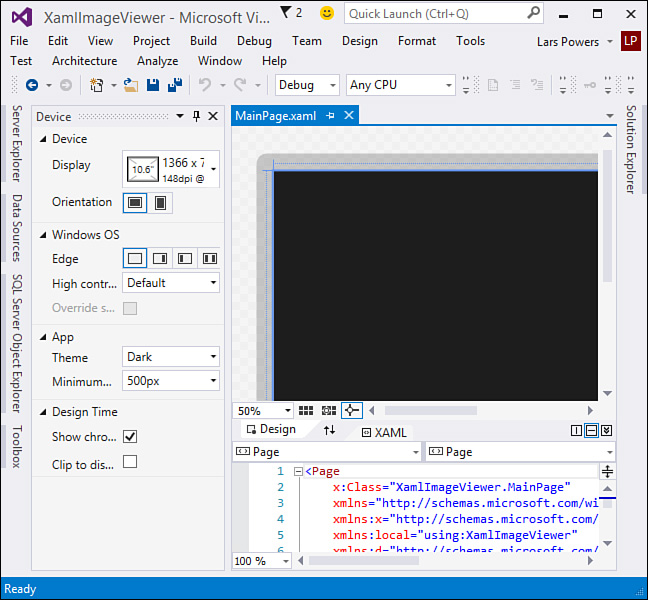
Because we chose the Blank App template, we have only a single page added to our project at this stage: MainPage.xaml. It’s currently empty, so we have some work to do to implement our initial grid display (see Figure 23.17). Note that in the page designer, we have a graphical representation of a landscape-oriented tablet. This is nonfunctional chrome added to the window to enable developers to clearly visualize their application on the intended device. To the left of the designer window is a new tool window (the Device window) that changes the way the designer displays its content. You can remove the device border chrome, change the screen size or resolution of the emulated device screen, and even put the display into different orientation modes.
With MainPage.xaml open, look at the XAML code. We need to modify the existing Grid element so that it has two rows. The top row will contain our app name, and the bottom will contain the GridView of images.
<Grid.RowDefinitions>
<RowDefinition Height="140" />
<RowDefinition Height="*" />
</Grid.RowDefinitions>
Next comes the implementation of the GridView. There will be three basic attributes of the GridView that will require XAML: we need to create an event handler for the GridView’s SelectionChanged event, we need an ItemTemplate that will display our images, and we need to set the GridView’s ItemsSource to our list of images. Let’s defer that last one for a bit and instead concentrate on the event handler and the item template.
Create a GridView element inside the existing Grid and name it ImagesGridView; now let Visual Studio do the work for you on the event handler side by adding the SelectionChanged event and selecting New Event Handler (see Figure 23.18). Visual Studio will stub out the code for us in the code-behind file.

Also within the GridView element, we need to establish the link to our data model. Set the ItemsSource property to bind to an object called Images. (This object doesn’t exist yet, but we will get around to creating it in a short while.)
ItemsSource="{Binding Images}"
Your GridView declaration should now look like this:
<GridView x:Name="ImagesGridView" Grid.Row="1"
HorizontalAlignment="Left" VerticalAlignment="Top"
SelectionMode="Single"
Padding="120,126,120,50"
SelectionChanged="ImagesGridView_SelectionChanged"
ItemsSource="{Binding Images}"
/>
An item template is now needed. Templates provide the structure around the way data is displayed within the GridView. In our case, we are simply showing an image, and XAML has an Image element designed to do just that. To embed an Image element within the GridView, the syntax looks like this:
<GridView.ItemTemplate>
<DataTemplate>
<Grid HorizontalAlignment="Stretch">
<Grid.RowDefinitions>
<RowDefinition Height="175"/>
</Grid.RowDefinitions>
<Image Grid.Row="0" Height="175" Width="275"
Source="{Binding Image}" Stretch="UniformToFill"/>
</Grid>
</DataTemplate>
</GridView.ItemTemplate>
One last minor piece of housekeeping: open the App.xaml file and add a static string to the resource dictionary with the key AppName for storing the name of our application. This will be used across pages within the header area.
<Application
x:Class="XamlImageViewer.App"
xmlns="http://schemas.microsoft.com/winfx/2006/xaml/presentation"
xmlns:x="http://schemas.microsoft.com/winfx/2006/xaml"
xmlns:local="using:XamlImageViewer">
<Application.Resources>
<ResourceDictionary>
<ResourceDictionary.MergedDictionaries>
<!--
Styles that define common aspects of the platform look
and feel.
Required by Visual Studio project and item templates
-->
<ResourceDictionary Source="Common/StandardStyles.xaml"/>
</ResourceDictionary.MergedDictionaries>
<x:String x:Key="AppName">Xaml Image Viewer</x:String>
</ResourceDictionary>
</Application.Resources>
</Application>
We will reference the application name within the header area of the page (in other words, the top row of our outermost Grid) by using a simple TextBlock bound to that static string.
<TextBlock x:Name="pageTitle" Grid.Row="0"
IsHitTestVisible="false"
Style="{StaticResource PageHeaderTextStyle}"
Text="{StaticResource AppName}"
Margin="50,0,0,50"
/>
And with that, the structure of our main page’s UI is in place.
Creating the Data Model
With our base UI in place, we turn our attention to the classes that will hold our image information. We need two of them: one to store the list of images (obtained from the Pictures library) and a second to wrap each image file.
Add a new class to the project and call it ImageFile. To this class, add three properties: a string property called FileName, an ImageSource property called Image, and an integer property called Rating. All of these should be backed by private fields (called _fileName, _image, and _rating, respectively) and should implement getters and setters.
string _fileName;
private ImageSource _image = null;
private int _rating = 0;
public string FileName
{
get { return _fileName; }
set {_fileName = value; }
}
public int Rating
{
get { return _rating; }
set {_rating = value; }
}
public ImageSource Image
{
get { return this._image; }
set { this._image = value; }
}
Because this object will be contained within a collection and we will want to know if properties change so that they can be signaled back to the parent collection, we will use the INotifyPropertyChanged pattern here.
First inherit the ImageFile class from INotifyPropertyChanged. Then declare an event handler called PropertyChanged.
public event PropertyChangedEventHandler PropertyChanged;
Next, implement an OnPropertyChanged routine.
private void OnPropertyChanged(string propertyName)
{
if (PropertyChanged != null)
PropertyChanged(this, new PropertyChangedEventArgs(propertyName));
}
In each of the property sets, include a call to OnPropertyChanged, passing in the name of the property.
public string FileName
{
get { return _fileName; }
set { _fileName = value; OnPropertyChanged("FileName"); }
}
public int Rating
{
get { return _rating; }
set {_rating = value; OnPropertyChanged("Rating"); }
}
public ImageSource Image
{
get { return this._image; }
set { this._image = value; OnPropertyChanged("Image"); }
}
The actual bitmap that is the image file is assigned via the Image property. Let’s write a SetImage routine that will take in the file, create a bitmap object from that file, and then assign it to our Image property.
public async void SetImage(StorageFile file)
{
IRandomAccessStream fileStream =
await file.OpenAsync(Windows.Storage.FileAccessMode.Read);
BitmapImage bitmap = new BitmapImage();
bitmap.SetSource(fileStream);
Image = bitmap;
}
Before moving on, there is one last piece of functionality to add: a method that will examine the file’s Rating property, transform it from its 0-100 value into a 0-5 value, and then assign that to our ImageFile’s Rating property. Image properties are held in the WinRT class ImageProperties, which we populate directly from the StorageFile instance via its GetImagePropertiesAsync method.
public async void SetRating(StorageFile file)
{
//Get the image properties for the file.
ImageProperties imageProps =
await file.Properties.GetImagePropertiesAsync();
//We are looking for the Rating property.
uint rating = imageProps.Rating;
//Rating is a number 0-100.
//We need to factor this down to a 0-5 rating.
//0 == 0
//1-24 = 1
//25-49 = 2
//50-74 = 3
//75-98 = 4
//99 = 5
if (rating == 0)
{
Rating = 0;
}
else if (rating > 98)
{
Rating = 5;
}
else if (rating >= 75)
{
Rating = 4;
}
else if (rating >= 50)
{
Rating = 3;
}
else if (rating >= 25)
{
Rating = 2;
}
else
{
Rating = 1;
}
}
Note
We are making liberal use of the new async and await C# keywords in our code to reinforce app responsiveness via async processing. We touch on these keywords a bit in Chapter 3, “The .NET Languages,” but it will be well worth your while to understand these patterns in detail to support your WinRT development efforts. Here is the best place to start: http://msdn.microsoft.com/en-us/library/hh191443(v=VS.140).aspx.
Creating the Collection Class
Now on to the class that will hold our collection of images. Add a new class to the project, called ImageList. This class is simple in structure. It will hold an internal ObservableCollection of type ImageFile and expose this collection via a property called Images. Just as with the ImageFile class, we want to implement the INotifyPropertyChanged pattern here.
private ObservableCollection<ImageFile> _imageList =
new ObservableCollection<ImageFile>();
public ObservableCollection<ImageFile> Images
{
get { return _imageList; }
set
{
_imageList = value;
OnPropertyChanged("ImageList");
}
}
We also need a method to actually load the collection with ImageFile instances. File and folder access in WinRT is accomplished via the StorageFile and StorageFolder classes. There is also a handy helper class, KnownFolders, that can be used to get a reference to specific libraries such as the Music library or the Pictures library. We will get a reference to the Pictures library and then iterate through its collection of StorageFile instances. For each, we create a new ImageFile instance and populate its properties accordingly.
public async void LoadImages()
{
//Folder and file objects
StorageFolder folder;
ImageFile imageFile;
IReadOnlyList<IStorageFile> files;
//Get reference to Pictures library.
folder = KnownFolders.PicturesLibrary;
//Get the files within the Pictures library.
files = (IReadOnlyList<IStorageFile>)await folder.GetFilesAsync();
//Iterate each file and create a new ImageFile to wrap it.
foreach (StorageFile file in files)
{
imageFile = new ImageFile();
var stream = await file.OpenAsync(FileAccessMode.Read);
imageFile.FileName = file.Name;
imageFile.SetImage(file);
imageFile.SetRating(file);
this.Images.Add(imageFile);
}
}
Binding the Data
We should have a fully functioning set of data objects at this stage. But we have to bind those images to our UI. First create an instance of our data model within the MainPage.xaml.cs file. Open the code-behind and add a private field to the page class for our ImageList object.
private ImageList _imageList;
In the page constructor, we need to set the data context for our page to the ImageList and make the call to load the image list.
public MainPage()
{
this._imageList = new ImageList();
this.DataContext = this._imageList;
this.InitializeComponent();
}
At this stage, our data model should be functionally complete. However, if you try to run the application now, you will get the error message shown in Figure 23.19.

If you recall from our earlier discussion around the concept of capabilities, Windows Store applications do not, by default, have permission to access file directories. We need to request that permission. And that is done via capabilities.
Requesting Capabilities
Capabilities, put simply, are access categories that an application must first be granted permission to. This includes file system access, network access, and access to hardware devices such as cameras and microphones. Capabilities are requested via the applications package manifest file. Find this file in Solution Explorer, and double-click it to open the manifest editor (see Figure 23.20). For our application to work, we need to place a check mark next to the Pictures Library entry on the Capabilities tab.

In a normal situation in which a user is downloading your application from the Windows Store, these special permission requests are clearly identified within the store and again when the application is installed. The user has the option, at that point, of disallowing the access or not installing the app at all. The user is in the driver’s seat here, not the application. When you are debugging applications under Visual Studio, the access is automatically granted at runtime provided you have checked the appropriate box and saved the manifest file.
With that done, run the application. Assuming you have images in the root of your Pictures library, the application should look like Figure 23.21.

Now we can focus on the second page, which will allow us to view and change the rating for the selected image.
Implementing the Image Editor Page
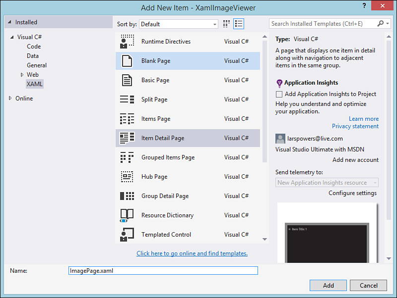
Right-click the project in the Solution Explorer window and select Add, New Item. From the Templates list, we want to add an Items Detail page, as shown in Figure 23.22. Name the page ImagePage.
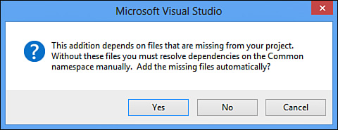
When you add this page to your project, you will see a warning dialog (see Figure 23.23). The template for this page is preplumbed to do a variety of things for you, the developer. To do those things, it relies on a bunch of standard helper classes and XAML constructs. These are normally placed within the Common folder of your project and in the project root. Because we haven’t added these yet (remember, we started with a basic blank project), Visual Studio has detected that they are missing and offers to add them for you. Click Yes.
The first thing we do in this page is fix up the app name header (find the TextBlock with the name pageTitle and bind its Text to "{StaticResource AppName}" just as we did on MainPage). Then we clear out everything sitting within the outermost Grid element except for the VisualStateManager markup you will see; we won’t be using any of those default UI elements, although we will keep some of the code structure that was created as part of the items detail template.
So, with an empty Grid consisting of two columns, we can get to work on our layout. We want a large Image element to the left of the screen in the left column (to hold the selected image from MainPage) and a form area to the right (in the right column) that will display the image’s rating value and its filename. For now, we are going to use a standard slider control to display and edit the image’s rating value.
Here is the XAML for the image area within the root Grid. This contains both the display of the image and its filename and rating values. Note that we are binding the controls to properties off of our ImageFile class.
<Grid x:Name="ImageGrid" Grid.Row="1">
<Grid.ColumnDefinitions>
<ColumnDefinition Width=".65*" />
<ColumnDefinition Width=".35*" />
</Grid.ColumnDefinitions>
<Image x:Name="SelectedImage" Grid.Column="0"
Margin="50,0,25,25"
Source="{Binding Image}"/>
<Grid Grid.Column="1">
<Grid.ColumnDefinitions>
<ColumnDefinition Width="100" />
<ColumnDefinition Width="*"/>
</Grid.ColumnDefinitions>
<Grid.RowDefinitions>
<RowDefinition Height="auto" />
<RowDefinition Height="auto" />
</Grid.RowDefinitions>
<!--Image rating and filename display -->
<Slider Grid.Row="0" Grid.Column="1" Grid.ColumnSpan="2"
x:Name= "RatingSlider"
Style="{StaticResource RatingSliderStyle}"
TickPlacement="Inline" TickFrequency="1" Minimum="0"
Maximum="5"
HorizontalAlignment="Left" Orientation="Horizontal"
Width="300"
Margin="15,0,0,0"
Value="{Binding Rating}"
SnapsTo="Ticks"/>
<TextBlock Grid.Column="0" Grid.Row="1" Margin="5,5,0,5"
Style="{StaticResource BasicTextStyle}"
HorizontalAlignment="Left" VerticalAlignment="Center"
Height="20">File name:</TextBlock>
<TextBlock Grid.Column="1" Grid.Row="1" x:Name="FileNameTextBlock"
Style="{StaticResource BasicTextStyle}" Margin="5,5,0,5"
HorizontalAlignment="Left" Text="{Binding FileName}"
Width="auto"/>
</Grid>
</Grid>
This page isn’t done yet. We have two major areas to work on: passing the selected image into the page, and then saving the rating information back to the image file. Let’s tackle these in that order.
Page Navigation and Passing State
If you examine the code in ImagePage.xaml.cs, you will notice a routine called LoadState. This was stubbed out for us as part of this page’s template. This routine is called when the page is navigated to and provides something crucial: a navigation parameter that enables us to pass objects around between pages. To make this work, we have to take a quick trip back to MainPage.xaml.cs and write some code in our SelectionChanged event handler to navigate to the details page and pass along the ImageFile object we need.
private void ImagesGridView_SelectionChanged(object sender,
SelectionChangedEventArgs e)
{
//Navigate to the next page, passing the selected image along.
//Cast selected item to ImageFile.
ImageFile image = (ImageFile)ImagesGridView.SelectedItem;
this.Frame.Navigate(typeof(ImagePage), image);
}
With that code in place, we are ready to fill out the LoadState routine in ImagePage.xaml.cs. Add a private field and property in the page to hold the passed-in ImageFile.
private ImageFile _imageFile;
public ImageFile ImageFileInstance
{
get { return _imageFile; }
set { _imageFile = value; }
}
Now assign ImageFileInstance within the LoadState routine. Because we have bound our UI controls to the ImageFile properties, we also need to update our page’s data context to point to the ImageFileInstance property.
protected override void LoadState(Object navigationParameter,
Dictionary<String, Object> pageState)
{
ImageFileInstance = navigationParameter as ImageFile;
this.DataContext = ImageFileInstance;
}
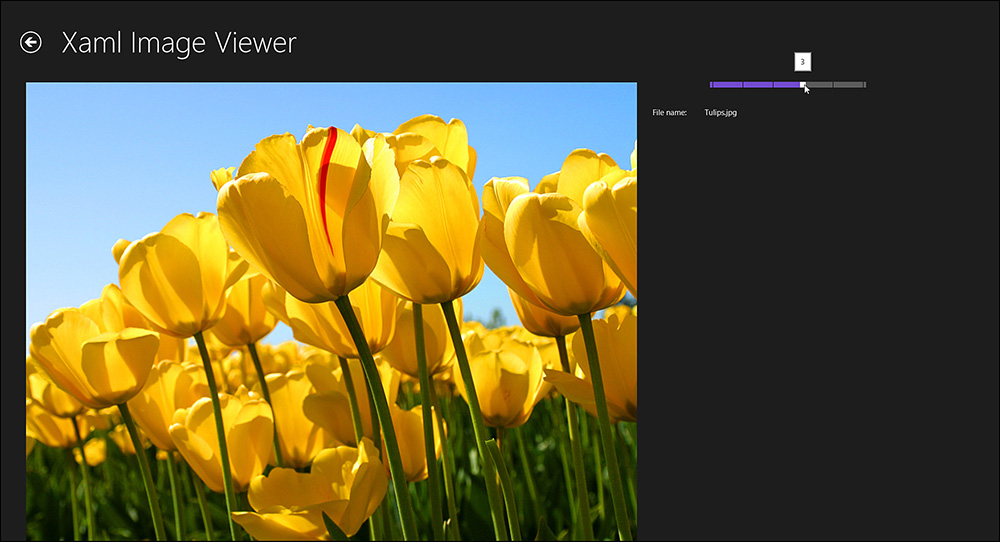
As a quick check, let’s run the app. With the navigation state passing and data binding working, we have a page that does everything but save rating information back to the file (see Figure 23.24).
Creating an App Bar
Even though we have discussed the fact that Windows Store applications will generally save data implicitly and not explicitly, in this case we want our users to actively tell the application that they want a changed rating value to be saved back to the file. So we start by implementing a simple app bar with a single Save button to execute that process.
App bars can appear at either the top of the page or the bottom. The convention is that navigation-related commands go on top and application commands go on the bottom. Our app bar with its solitary Save button will live at the bottom.
In the ImagePage.xaml, create a Page.BottomAppBar element outside the outermost layout grid but within the page itself. Within that element, we want to nest an actual AppBar element. AppBar objects are typically structured using a simple StackPanel containing your app bar buttons. Remember that our UI should work well with touch devices, including tablets. For that reason, we want to actually avoid centering our button in the middle of the bar. With a tablet device, a user will want to be able to press the button using only the thumbs of the hands gripping the tablet. And that means that buttons should be placed to the far right or far left of the app bar. We’ll go to the right with ours.
<Page.BottomAppBar>
<AppBar x:Name="BottomAppBar1" Padding="10,0,10,0"
AutomationProperties.Name="Bottom App Bar">
<Grid>
<StackPanel x:Name="AppBarStackPanel"
Orientation="Horizontal"
Grid.Column="0" HorizontalAlignment="Right">
<Button x:Name="SaveButton"
Style="{StaticResource SaveAppBarButtonStyle}"
Tag="Edit"
Click="SaveButton_Click"/>
</StackPanel>
</Grid>
</AppBar>
</Page.BottomAppBar>
If you carefully examine the Button that we have defined, you will notice a style reference to SaveAppBarButtonStyle. With WinRT XAML projects, a StandardStyles.xaml resource dictionary is included for you by default. And within that XAML file are many, many style resources for a wide spectrum of app bar buttons for commands ranging from save to search to rename to volume. They are all commented out to start; simply pick the ones you need, copy them into your page, or uncomment them.
That’s all the XAML we need. The app bar is now fully functioning. We are now just missing the save routine.
Tip
The app bar button styles use a unique approach to their embedded icons. These buttons are intrinsically aware of the Segoe UI Symbol character set. By setting their Content property to an offset value, WinRT will automatically grab the appropriate glyph/icon from that character set and use it. Because that font has hundreds of basic Metro-style icons, it is a perfect match and is simple to implement. The best way for you to find icons this way is to fire up the charmap.exe program on Windows 8. Select Segoe UI Symbol in the top drop-down, and then click the icon you want. Its offset will display in the status bar. For instance, a “star” icon is located at offset E113. Therefore, we would have a content tag set to .
We’ll call the save routine from the SaveButton_Click event; the routine itself will retrieve the file property information, change the Rating property to whatever the current value of the rating slider is, and then save the properties back out using the SavePropertiesAsync() method call.
private void SaveButton_Click(object sender, RoutedEventArgs e)
{
SaveRating();
}
private async void SaveRating()
{
var file =
await KnownFolders.PicturesLibrary.GetFileAsync(_imageFile.FileName);
var fileProperties = await file.Properties.GetImagePropertiesAsync();
fileProperties.Rating = (uint)this.RatingSlider.Value;
await fileProperties.SavePropertiesAsync();
}