
XAML and Design Panes
The WPF Designer offers two different views: the visual representation of the window and the XAML that implements the window. You can make changes to the window and its controls by either editing the XAML or changing elements on the design surface. Either way, the designer keeps both panes in sync.
You can configure the position and layout of the XAML and design panes in the following ways:
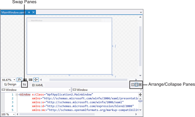
 The Swap button swaps the positions of the XAML and design panes with one another.
Vertical Split button tiles the panes vertically.
The Horizontal Split button tiles the panes horizontally.
The Collapse/Expand Pane button minimizes or restores the bottom or leftmost pane (depending on the view mode you are in).
Figure 21.5 shows the location of these pane management buttons on the designer.
Tip
If you are lucky enough to have a multimonitor setup, the vertical split view is particularly helpful because you can display your XAML code on one screen and your visual design surface on another.
We interact with the designer in the same way we interact with other design surfaces or code editors: Controls can be placed on the design pane from the Toolbox and then manipulated, and we can use the XAML pane to handcraft or alter XAML (with complete IntelliSense and formatting).
For the most part, control placement and positioning works the same as it does in the Windows Forms designer. There are a few minor exceptions: the WPF Designer has some unique visualizations for displaying snap lines and control sizing (see Figure 21.6).

The Property Window
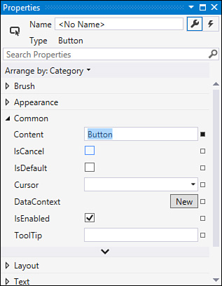
As expected, when you have a control selected in the designer, you can manipulate its attributes using the Properties window. The WPF Properties window has some significant differences over its Windows Forms sibling. It supports two unique ways for locating control properties. Besides the categorized and alphabetic display modes, you can group and sort properties by source. This is great for quickly looking at those properties, for instance, that have their value set explicitly in XAML or that have values that are currently being inherited down from a style. The WPF Properties window also enables you to search for properties of the control by typing in a search box. As you type, the window automatically filters the property list to just those that match your search criteria. Figure 21.7 shows an image of the Properties window.
The Zoom Control
One additional item is present with the WPF designer: a zoom control. Perched in the small toolbar at the bottom of the design page, this drop-down can be used to zoom in or out on the current window from 3% to 6400% of the window’s actual size. Figure 21.8 shows the magnification control, and Figure 21.9 shows our Push Me button (and container window) at 8 times magnification.


The zoom control is particularly useful when you have a complex form layout with a lot of snap lines and nested/layered controls amassed in a certain area. By zooming in on the area, you can get a crisp view of where things are positioned, and it becomes much easier to select or position the control you want instead of one of its neighbors. By zooming out, you can get a thumbnail look at your window to see how your overall look and feel are shaping up.
The XAML pane also has a zoom control; this can prove useful when you want to zoom out to quickly drill through lines or code or zoom in for readability or presentation purposes.