Responsive Web Layout with Bootstrap 3
The Bootstrap framework is made up of CSS and JavaScript (using jQuery) that work together to create a mobile-first, responsive design for a website by default. Mobile-first means that Bootstrap is built to check the screen size of the device requesting your page and then only render the portions of the CSS that can be displayed by the device. This keeps the CSS lean based on the device. Of course, a larger device (with more processing power) will load the richer CSS.
Responsive design is part of this mobile-first strategy. It refers to the ability of the design to respond to screen real estate. This typically means collapsing the layout, simplifying the navigation (even moving it off the page into a foldout menu), and more. The mobile-first, responsive design allows your website to automatically adapt to phone, tablets, and larger screens without writing different HTML or CSS.
Bootstrap is extremely popular because it solves a key issue with websites. Users now expect this type of behavior from the sites they visit. Thankfully, Bootstrap makes it easy to implement mobile-first, responsive designs. Let’s take a look.
The Bootstrap Files in the ASP.NET Templates
Bootstrap is included by default in many of the ASP.NET templates. This includes the ASP.NET 5 Web Site template. Recall from Chapter 17 that these files are installed in the wwwroot/lib folder under the folder named bootstrap. Figure 18.6 shows these files in Solution Explorer. Notice too the bower_component folder (accessed via the Solution Explorer, Show all Files option). This folder contains all of Bootstrap. Gulp then generates what is required for the given build and target environment.

The many files shown in Figure 18.6 make up the typical Bootstrap package for a given site. The following describes the files in each of the three folders:
css—The files inside the css folder include the Bootstrap CSS in both readable form (bootstrap.css) and optimized-for-production form (bootstrap-min.css). There are also readable and minified Bootstrap theme files. This is the standard Bootstrap theme; however, you can download and create additional themes (more on themes to come).
fonts—The fonts folder contains a number of common glyphs as common icons used for most sites and devices. For example, there is a down arrow for drop-down lists, a “hamburger” icon for displaying a menu on small devices, and dozens more. There are multiple sizes of each to be used based on screen size.
js—The js folder contains the readable and minified version of the Bootstrap JavaScript that works with the CSS for adaptive rendering.
Recall from Chapter 17 that Bootstrap is installed in your project using the Bower package manager. You can see the dependency by opening bower.json from Solution Explorer. Bootstrap uses either Less or Sass as a processor for CSS. You can write your own files to override default Bootstrap and then compile it for your project (using Less or Sass and Gulp). More on this later in the chapter.
Bootstrap is included in your project via the _Layout.cshtml page. Inside the <head> tag of this page, you will find the following two references (among others).
<link rel="stylesheet" href="~/lib/bootstrap/css/bootstrap.css" />
<link rel="stylesheet" href="~/css/site.css" />
The first <link> tag indicates the Bootstrap style sheet. The second <link> tag is for your site-specific CSS, which often includes overrides for Bootstrap styles (more on this to come).
Near the bottom of _Layout.cshtml is where the Bootstrap JavaScript is included for pages within the site. (Note that Bootstrap requires jQuery.) This is done via that following call.
<script src="~/lib/bootstrap/js/bootstrap.js"></script>
For the most part, Bootstrap does not style much of your site by default. Instead, you use the many, many class definitions inside Bootstrap for your HTML elements. These style classes work to handle layout, responsiveness, and visual design of your site. We will examine some of these classes in the coming sections.
How the Bootstrap Grid Layout Works
It is important to understand how Bootstrap works to lay out your pages to maximize responsiveness and readability. Page layout is a key decision you will make when starting a Bootstrap site. You need to determine your target device displays and the way you intend to divide your pages into vertical and horizontal sections using the Bootstrap grid system.
The Bootstrap layout is built on a grid made up of columns and rows. There are 12 logical columns in the grid. However, you typically choose the number of columns in the grid to apply to a specific vertical section of your page. For example, you might define the primary content area of your page as a single row with 3 sections of equal width across the page when shown on larger displays. In this case, you would assign each section 4 columns of the grid. As your page narrows, Bootstrap will wrap each column underneath the others until ultimately you are showing only a single column of the row. (The other columns will wrap under each other, right to left.) It will then compress this single column (including fonts and images) as the screen further narrows. This is the page being responsive to the screen size and keeping the page readable and easy to navigate. (A user can scroll up and down versus having to scroll left and right to view your page.)
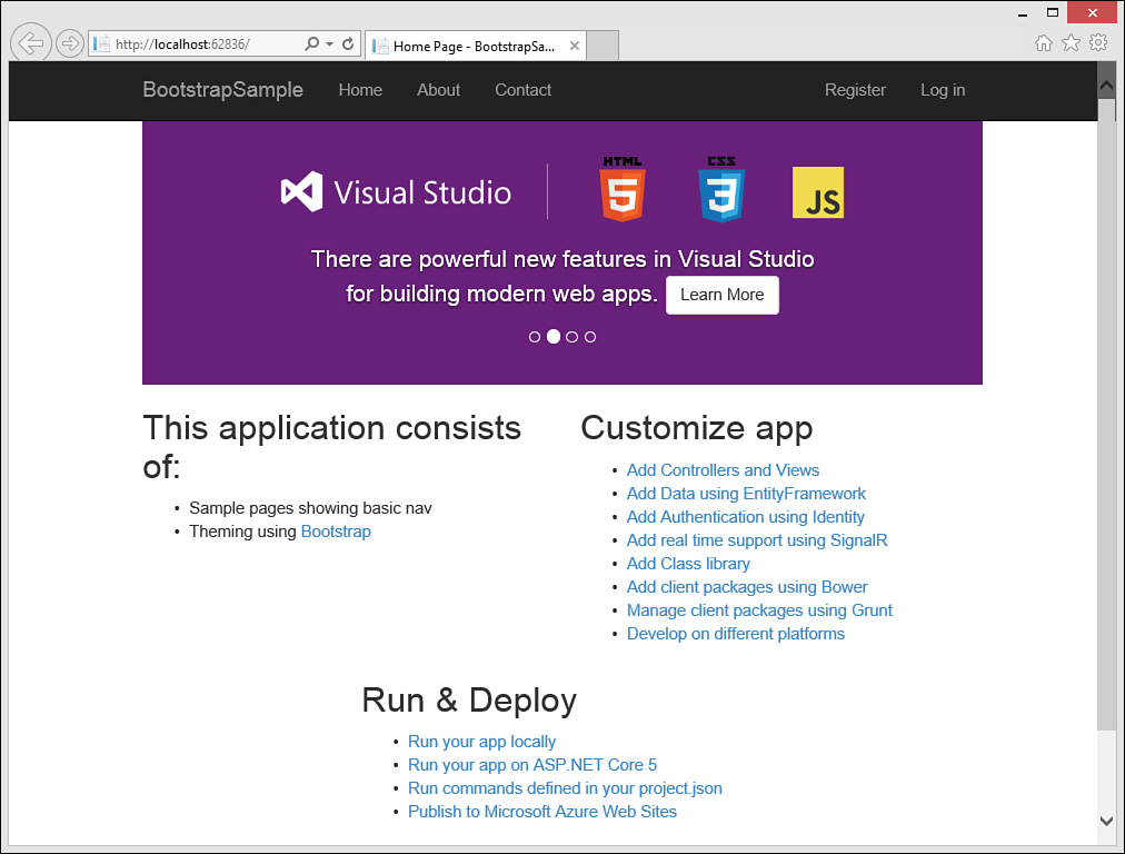
Figure 18.7 shows an example of the grid applied to the ASP.NET 5 Web Site template Index.cshtml page. The page is displayed on a desktop screen with the resolution of 1024 wide. The top and bottom of the page consist of sections that are meant to span the entire grid. The highlighted area is a Bootstrap row (defined as <div class="row">). Within the row, you can see the 12 columns across the page. Each section takes up four of these columns (defined as <div class="col-md-4">).

Bootstrap will wrap each column in the row under one another when the same page is displayed on a smaller screen (< 768 wide). However, it will maintain a single column section on the page and further shrink that section (through scaling) as the page narrows. The logical columns of each row are wrapped under one another. Each row is then stacked on the other. Figure 18.8 shows the same page with a width similar to a phone.
The Bootstrap 3 grid layout system always uses 12 columns; however, you specify a grid size and the way you intend your page to be displayed on that grid. You can target a single grid size and let Bootstrap do the work to render your site on the other sizes. You might develop and test against the one grid size you believe users will view your site with most often. Figure 18.7 targets the medium grid. In this case, the page shows all three sections of columns when viewed using this grid. Figure 18.8 shows the way the site renders using an extra-small grid; it wraps the columns. The Bootstrap grids are defined by screen resolution. The following lists the grids in Bootstrap by their style name. (xx refers to the number of columns you intend for the style definition.)
col-lg-xx—screens >= 1200px, typically large desktop displays
col-md-xx—screens >= 992px, typically standard desktops and tablets used in the landscape mode (held horizontally)
col-sm-xx—screens >= 768px, typically tablets used in portrait mode (held vertically)
col-xs-xx—screens < 768px, typically phones used in portrait mode
Page layout is a specific choice you will make for your site. It is not predetermined by Bootstrap. Instead, you use the grid system to define an overall layout for your page based on a given grid. The Bootstrap site does include a number of templates for various scenarios. However, these are easy enough to customize. Let’s take a look at the Bootstrap-specific markup for the ASP.NET Web Site template.
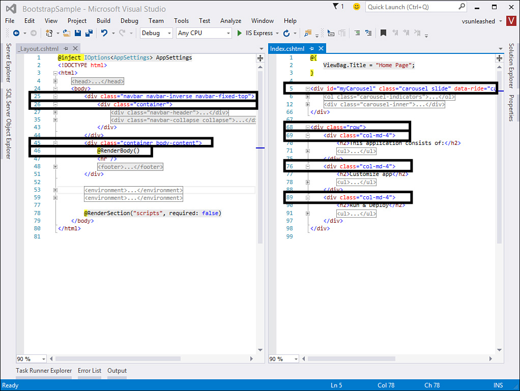
Figure 18.9 shows the two primary files that make up layout for the ASP.NET 5 Web Site template home page: _Layout.cshtml and Index.cshtml. The former defines the overall layout shared across the site. The latter is layout specific to the home page. Let’s walk through this layout using line numbers from the markup.
_Layout, line 25—Uses the navbar class to indicate that <div> defines navigation for the site (more on navbars to come).
_Layout, line 26—Marks the <div> as a container. A Bootstrap container is meant to represent the full width of the page (the entire grid with padding). You typically stack containers on one another and use rows within containers. The container then scales based on page size.
_Layout, line 45—Marks the <div> as another container—in this case, the body-container for styling the main body portion of your site.
_Layout, line 46—ASP.NET Razor syntax indicating where the body of the page that uses the given layout will be rendered (in this case, Index.cshtml).
Index, line 5—Uses the style class, carousel slide, to indicate the use of the Bootstrap carousel component (see “Component” section below).
Index, line 68—Marks this <div> as a Bootstrap row in the grid system.
Index, lines 69, 76, and 89—Each line indicates that the given <div> should be part of the grid system using the medium screen and targeting four columns when shown on that screen (col-md-4).
As you may have noticed in the earlier walk-through, each page can define its own layout in the grid system. It will then render inside the body container, which spans the full page width. In fact, for content that is meant to take the full page, you do not need to specify grid layout rendering. Grid layout is used when you need to show different sections of the page as vertical columns when rendered at the appropriate width.
You should test your site against each grid (or page size) you intend to target. As you have seen, Bootstrap will, by default, adjust your layout automatically for different screen sizes. However, you can also have fine control over how your page is laid out on the different screen sizes. You do so by specifying additional column styles for the given screen size.
As an example, the home page shown thus far shows three sections at the medium and large grid sizes. It wraps to a single section when rendered at the small and extra-small screen sizes. Figure 18.10 shows an example. However, you may want to change this to show two sections when at the small size (and leave the others as-is). You can do so by setting the style definition for the first two <div> tags as follows.
<div class="col-md-4 col-sm-6">

This definition tells Bootstrap that when the page is shown on the small grid, you want the first and second <div> sections to take up 6 columns each (and the third <div> can wrap). You might then indicate the third <div> to also render at the same width (6 columns) when shown on the small grid. Furthermore, you can use the offset style to indicate the third <div> should center by offsetting 3 columns to the left (3 left columns + 6 display columns + 3 remaining columns = 12). When you use offset, you will also need to indicate an offset for the medium grid (0 in this case). The following shows the markup for this third section.
<div class="col-md-4 col-md-offset-0 col-sm-6 col-sm-offset-3">
The page will now be displayed differently for small grids. Figure 18.11 shows the same page size as 18.9 with the new results.
How the Bootstrap Navigation Bars Work
A primary element of Bootstrap is the navbar class. This class indicates a form of navigation for your site. Typically, you have a single navbar for your page. However, you can use navbar anywhere a toolbar is needed on your site.
A navbar is made up of many elements, each with its own class definition. These elements and classes allow you to control the visual aspects and behavior of the navbar. This includes keeping the navbar at the top of the page regardless of how far down the user scrolls. You can also add a logo to your page and icons to the individual navigation elements. It also allows the navbar to collapse into a foldout menu if the screen is too small to reliably show the full navbar.
Let’s take a look at the markup for the navbar in the ASP.NET 5 Web Site template. This will help you understand the styles and resulting behavior when working with Bootstrap navbars. Figure 18.12 shows the markup.
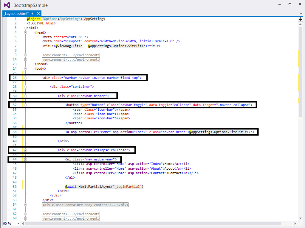
Figure 18.2 shows specific markup lines highlighted. The following walks you through each of these lines by line number:
Line 26—Indicates the <div> contains markup for a navigation bar using the style navbar. The style navbar-fixed-top indicates the given navbar should always be fixed to the top of the page.
Line 30—Defines the <div> that contains the header information for the given navbar—in this case, a button (line 32) that will show navigation elements (line 44) and a logo (line 38).
Line 32—Used to indicate a button for displaying navigation elements when the page width is small. The navigation elements themselves are referenced by line 44, class="nav navbar-nav".
The class definition, class="navbar-toggle", indicates that this button should be shown as a toggle button (click to open/close). Toggle buttons for navigation are only shown when the navigation does not fit the width of the screen.
The button itself is rendered as glyphs. These glyphs are defined inside the <span> tags under button. In this case, three icon bars are shown. This is often referred to as a “hamburger” menu. You could, of course, use a different icon of your choosing.
The data-toggle="collapse" and data-target=".navbar-collapse" indicates that the content for the menu when toggled is contained in the element marked with these styles (line 42).
Line 38—Represents the logo inside the navbar. This item uses the navbar-brand class to indicate that this item represents the brand for the site. It is also outside the collapsed region; it will therefore stay on the page as it shrinks.
Line 42—Marks the <div> that contains the collapsed navigation items. This includes the list of items (line 44) and the Login link (line 50).
Line 44—Marks the actual navbar list of navigation elements.
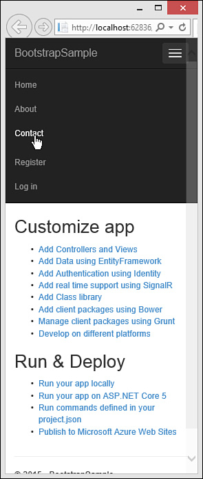
These styles allow you to show and hide navigation elements as the screen size changes. Refer to Figure 18.11 to see the navigation in full view. Figure 18.8 shows the navigation collapsed inside the hamburger menu with the application name still displayed. Clicking the menu icon shows the menu, as demonstrated by Figure 18.13.
More Info
There is more you can do with a Bootstrap navbar. This includes supplying icons for navigation elements, creating drop-down menus for various top-level items, changing colors and fonts, and more. You can find details at the Bootstrap site http://getbootstrap.com/components/#navbar.
Bootstrap Components
The navbar discussed in the prior section is just one of the many Bootstrap components available to developers. A Bootstrap component is simply standard HTML markup with CSS class definitions in Bootstrap to help make your page visually appealing and responsive. Other components include buttons, drop-downs, input groups, alerts, badges, breadcrumbs, thumbnails, panels, progress bars, and more. We cannot cover them all here, but the following provides a brief overview of a few more of these components to give you an understanding of how to use them and their power.
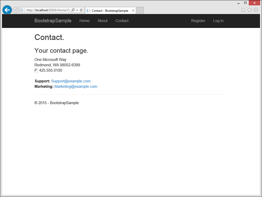
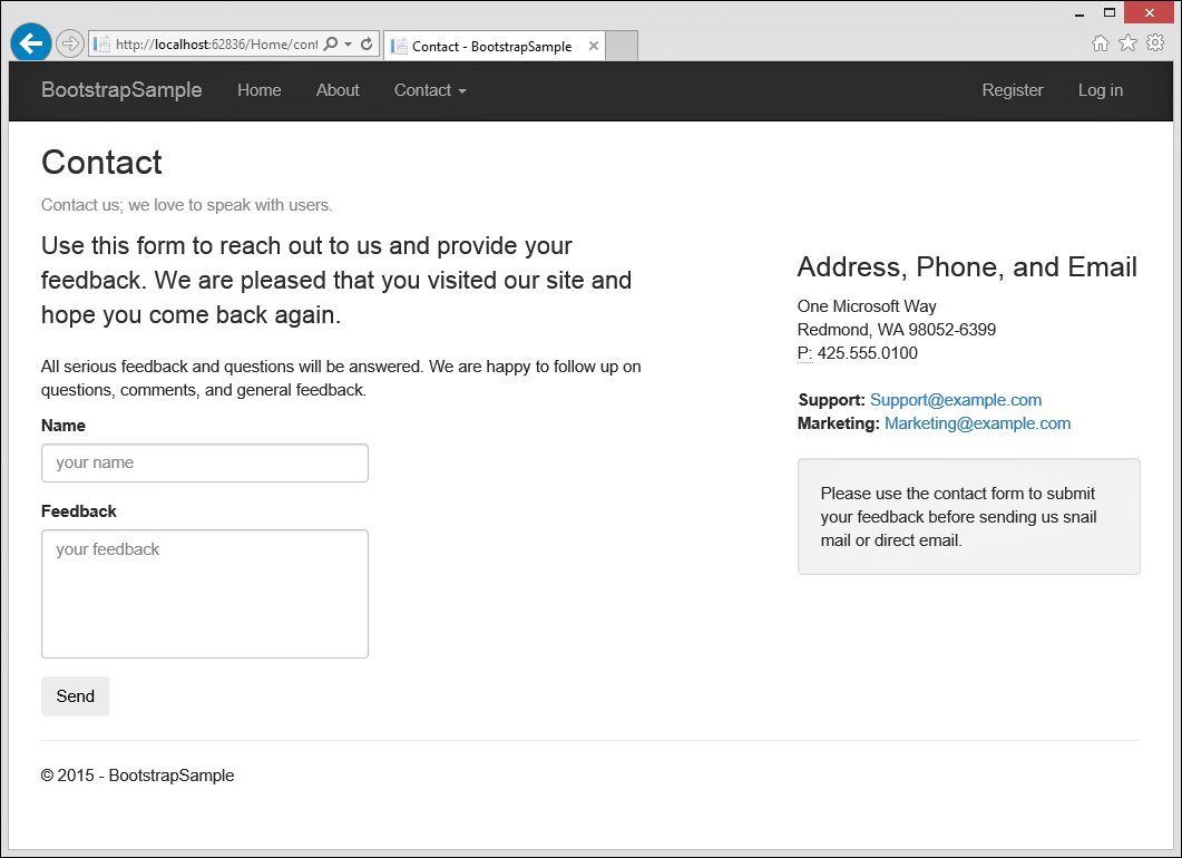
The examples that follow are used to style the contact page in the ASP.NET 5 Web Site template. Figure 18.14 shows an example of what this page looks like by default. As we proceed along, you can use this for comparison.
Working with Text
Bootstrap provides a number of styles you can use to change the font and font size and draw your attention to text elements on the page. This includes the standard heading tags of <h1>, <h2>, and so on for defining titles, subtitles, and subsections of pages. However, there are many additional classes that help make the text of your page visually appealing and easy to consume. The following walk-through identifies a number of these:
1. Using the ASP.NET 5 Web Site template, open the Contact.cshtml page from Solution Explorer.
2. Replace the <h3> tag with a <p> tag under the <h2> title tag. Mark this tag with the Bootstrap CSS class, text muted. This will serve as a muted subtitle under the actual page title. The following shows an example.
<p class="text-muted">Contact us; we ...</p>
3. Create a new <div> tag with the class of row, as in <div class="row">.
4. Create two <div> tags inside the row <div> tag. The first tag will represent the main content of the page. The second will be a sidebar containing the address information. Set the class for each of these new <div> tags to work with the Bootstrap grid system as follows.
<div class="row">
<div class="col-md-7">
</div>
<div class="col-md-4 col-md-offset-1">
</div>
</div>
5. Add two <p> tags inside the main content <div> for the page (col-md-7). Set the class to lead for the first <p> tag to indicate this is a lead paragraph. You do not need to set the class on the second <p> tag.
6. Copy and paste the address content inside sidebar <div>. At the top, add an <h3> to title the address information.
7. Add a <p> tag under the address information inside the sidebar <div>. You can offset this paragraph with class="well" to give it a highlighted, sunken look.
Listing 18.3 shows an example of what your final markup should look like. We have excluded some of the text content here for clarity. Figure 18.15 shows the new contact page running in a browser. The browser has been narrowed to a small grid size.
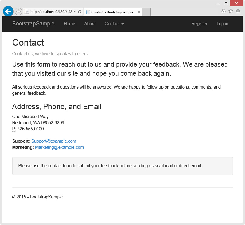
FIGURE 18.15 The Contact page using a few Bootstrap text styles to highlight specific areas of the page.
LISTING 18.3 The Contact Markup Demonstrating Bootstrap Text Styling
@{
ViewBag.Title = "Contact";
}
<h2>@ViewBag.Title</h2>
<p class="text-muted">Contact us; we love to speak with users.</p>
<div class="row">
<div class="col-md-7">
<p class="lead">Use this form to ...</p>
</div>
<div class="col-md-4 col-md-offset-1">
<h3>Address, Phone, and Email</h3>
<address>
One Microsoft Way<br />
Redmond, WA 98052-6399<br />
<abbr title="Phone">P:</abbr>
425.555.0100
</address>
<address>
<strong>Support:</strong>
<a href="mailto:[email protected]">[email protected]</a><br />
<strong>Marketing:</strong>
<a href="mailto:[email protected]">[email protected]</a>
</address>
<p class="well">Please use the contact form to ...</p>
</div>
</div>
Standard Form Elements
Bootstrap also helps you create good-looking user input forms. There are styles for labels, input controls, buttons, and more. The following walks you through adding and styling a few controls on the Contact form. You’ll notice that ASP.NET MVC pages use these styles inside the Razor syntax. Here, however, we simply use the styles in standard markup:
1. Open the Contact.cshtml page you created in the prior section.
2. Form elements are grouped by Bootstrap using the class form-group. This class typically styles a <div> to indicate a group of controls such as a label and a text box. Start by adding this <div> to the page inside the main content area as follows: <div class="form-group"></div>.
3. Add a <label> and an <input> tag to the <div>. The <label> uses the class control-label. The <input> uses the class form-control. You can also set the placeholder attribute of the <input> tag to create default text for the user. The following shows an example.
<div class="form-group">
<label for="name" class="control-label">Name</label>
<input type="text" name="name" class="form-control"
placeholder="your name" />
</div>
4. Repeat Steps 2 and 3 for a <textarea> control to allow the user to type her feedback. The following shows an example.
<div class="form-group">
<label for="feedback" class="control-label">Feedback</label>
<textarea name="feedback" class="form-control"
placeholder="your feedback" rows="6" cols="40"></textarea>
</div>
5. Finally, add an <input> button to the bottom, after the last form-group. Use the class btn to stylize it with Bootstrap, as in the following.
<input type="submit" class="btn" value="Send" />
You can now run the page and view the results. Figure 18.16 shows the page with our developing form. The browser is set a medium grid size.
Button Drop-Downs
You can use standard <select> tags to create drop-downs and have them stylized by Bootstrap. However, Bootstrap includes a more powerful drop-down component that allows a user to select from a menu of items based on a user clicking a button or an icon or taking some other action. The following walks you through using the Bootstrap drop-down component:
1. Open the Contact.cshtml page you created in the prior section.
2. Add a new <div> styled as a form-group class between the name and the feedback groups. Add a label and name it Reason. The following shows an example.
<div class="form-group">
<label class="control-label">Reason</label>
</div>
3. Add another <div> under the <label> control. Style this <div> as class="dropdown".
4. We will create a drop-down that consists of two buttons. The first button will tell the user to select an item. Once selected, this button will display the item selected. This button will be styled as btn. We give this button an ID because we will use it in some JavaScript we need to write. The following shows an example.
<button class="btn" id="selectedBtn">Select</button>
The second button uses a down arrow (or caret) to give the user a visual indication to click for selection. This caret is set using a <span> tag. We use the data-toggle attribute to reference the container for the actual menu when the user toggles the button. The following shows an example.
<button class="btn" data-toggle="dropdown">
<span class="caret"></span>
</button>
5. We now add a list of items for the menu as a <ul>. We style that list as class="dropdown-menu". We give this an ID as well to make it easy to select using jQuery. Each of the <li> items in the <ul> we make as <a> tags. This gives Bootstrap a way to style the items as a user hovers over them. The following shows the full group of controls for the drop-down component.
<div class="form-group">
<label class="control-label">Reason</label>
<div class="dropdown">
<button class="btn" id="selectedBtn">Select</button>
<button class="btn" data-toggle="dropdown">
<span class="caret"></span>
</button>
<ul class="dropdown-menu" id="reasonsList">
<li><a href="#">Question</a></li>
<li><a href="#">Comment</a></li>
<li><a href="#">Error</a></li>
</ul>
</div>
</div>
6. We now need to write a small JavaScript function that uses jQuery to update the Select button text based on the selected menu item. You can do so in a separate file or within the same page in a scripts section at the bottom of the page. The following shows the code added to the same page.
@section Scripts {
<script type="text/javascript">
$('document').ready(function () {
var resultBtn = $("#selectedBtn");
$("#reasonsList li a").on("click", function () {
var selected = $(this).text();
resultBtn.text(selected);
});
});
</script>
}
You can now run the page and view the results. Figure 18.17 shows the page executing in a browser with the drop-down being selected.

Note that the sample for the book uses the same technique to add a drop-down menu to the navbar (one for each of the contact pages listed in the examples).
More Info
The preceding examples will get you started building stylized components in Bootstrap. However, there are many additional items with which you will likely need to work. For more information, see http://getbootstrap.com/components/.
Changing the Bootstrap Visual Design
At the time of writing this chapter, it is estimated that Bootstrap is used on nearly one-third of all websites. This number is significantly higher for new sites; nearly all of them use Bootstrap. You do not have to go far on the Internet to find a site built with Bootstrap. One drawback is that if not done right, many sites start to look the same. You can fix this. Bootstrap is meant to provide mobile-first, responsive design. However, the visual design (fonts, colors, look and feel) is still very much in your control. Here we take a look at ways to implement new designs for sites that use Bootstrap.
There are four primary ways you can change your default Bootstrap design. Each comes with its own trade-offs and support overhead. You may also decide to mix these approaches for various reasons. We explore each option here. But first, a warning: you do not want to simply overwrite your Bootstrap files. This will make it painfully difficult to upgrade to the latest version of Bootstrap in the future. Instead, follow any of the approaches listed next.
Override Styles Using site.css
You can still write custom styles using a site-specific style sheet. The style sheet, site.css, is loaded after Bootstrap inside the _Layout.cshtml page. Therefore, any styles placed in site.css will override the themed styles of Bootstrap. This is the easiest (and most widely used) form of creating a custom look for Bootstrap.
There is a lot of guidance available on both the Bootstrap site and related blogs for writing custom CSS for Bootstrap. This includes making changes to fonts and colors, buttons, the navbar, and form elements. All you need is a good understanding of CSS, and you can write customizations.
As an example, suppose you wanted to modify the background of the navbar. You might start by switching from the navbar-inverse Bootstrap theme to the default. You would do so by editing the first navbar <div> in _Layout.cshtml as follows.
<div class="navbar navbar-default navbar-fixed-top">
Next, you can open site.css and add an override for the background color for the navbar. The following shows this style override along with an override for the logo text (.navbar-brand) to be black.
.navbar-default {
background-color: azure;
}
.navbar-default .navbar-brand {
color: black;
}
This simple change is shown in Figure 18.18. Of course, you can apply this process for more dramatic changes to the look of your site. The benefit of this approach is that you are not impacting your Bootstrap files and thus can upgrade at a later date. However, you now are maintaining multiple style definitions for the elements in your site.

Download a Custom Theme
There are many free and paid Bootstrap themes available for use. A good place to start is bootswatch.com. Here you will find more than a dozen Bootstrap themes. You can use these as is, or you can further customize them using the techniques listed in this section.
To use a theme from bootswatch.com, you simply download it and copy over your existing Bootstrap files (after backing them up, of course). This includes bootstrap.min.css and bootstrap.css.
There are also source files available for these themes. If you use Less, there are variables.less and bootswatch.less files used to compile a new version of Bootstrap. (See “Create Bootstrap Customizations and Compile with Less/Sass” later in this chapter). If you use Sass, the _variables.scss and _bootswatch.scss files can be used.
Create a Custom Build of Bootstrap
The Bootstrap site provides a customization page (http://getbootstrap.com/customize/) that allows you to edit the many features of Bootstrap and then compile to a customized version. One of the features is setting the many variables used to define colors in your site. For example, Figure 18.19 shows the Less variables that define the gray and brand colors. You make changes here and then have them compiled and propagated throughout the CSS.

FIGURE 18.19 The Bootstrap customizer allows you to make changes and then generate a new Bootstrap file for your site.
Once you make customizations using this site, you will have to make them again the next time you upgrade. This is one of the drawbacks of this approach. The site does help you keep track of your changes. It generates a config.json file on your behalf. You can use this file in future compilations as a starting point.
In addition to custom variables (for colors), the site allows you to select which part of Bootstrap you want to include. You have options for portions of the CSS, the components you intend to use, and jQuery plug-ins you want to add to the site. This is great if you only intend to use a subset of Bootstrap. It then works to lower the overall download footprint of Bootstrap on your site.
Once you have completed making customizations, there is a button at the bottom of the page to compile and download. This provides a set of Bootstrap files you can use as a replacement for your current files.
Create Bootstrap Customizations and Compile with Less/Sass
The last method for customizing Bootstrap is using the source files. This is similar to the customizer page from the Bootstrap site but puts you in control of the files and the compilation. This requires some setup and configuration using Less (or Sass) and Gulp tasks for compilation (see Chapter 17 for examples).
The primary folder in the source is the less folder. It contains files for all the many Bootstrap components, including alerts, buttons, forms, drop-downs, navbar, and more. It also includes the variables.less file, which defines the colors used throughout your site.
You do not want to make changes directly to these files. Again, this will make it difficult to upgrade. Instead, you create a custom file that works like the bootstrap.less file. The bootstrap.less file simply imports the many less files during Less compilation and then outputs the resulting CSS. For example, the following are just some of the import statements inside bootstrap.less.
//Core CSS
@import "scaffolding.less";
@import "type.less";
@import "code.less";
@import "grid.less";
@import "tables.less";
@import "forms.less";
@import "buttons.less";
You want to create your own, custom bootstrap.less but with a new name such as my-theme.less. This file should sit outside the bootstrap.less folder so it doesn’t cause confusion. However, it will include the same imports as bootstrap.less (at least for those items you intend to import). You will have to edit the import statements to point Less to the bootstrap directory from your custom my-theme.less file.
Next, you create a copy of variables.less and move this outside the Bootstrap directory. This file defines the colors for the site. You will edit this custom version of this file for your needs. You need to then make sure your theme file my-theme.less points to this version of variables.less.
Finally, you can add your style overrides directly to the my-theme.less file. Or you can create another file for overrides and import that one, too. You can then set Gulp tasks in Visual Studio to compile your Less into a new style sheet. This gives you controlled customizations to Bootstrap without breaking upgrades.