Working with ToolStrip Controls
Many of the standard, core visual elements of a form are realized with ToolStrip controls. A ToolStrip control functions as a container for other controls that derive from ToolStripItem. It can host various types of controls: buttons, combo boxes, labels, separators, text boxes, and even progress bars. The ToolStrip class itself is used to directly implement toolbars on a form and functions as a base class for the StatusStrip control and the MenuStrip control.
ToolStrip controls come with an impressive list of built-in capabilities. They intrinsically support, for example, dragging an item from one tool strip to another, dynamically reordering and truncating items in the tool strip as users resize the strip or its parent form, and fully supporting different operating system (OS) themes and rendering schemes.
All the different flavors of the ToolStrip control have some common traits:
 A design-time smart tag provides quick and easy access to common commands.
In-place editing of child controls is supported. (For example, a point-and-click interface is offered for adding, removing, and altering items within the ToolStrip, StatusStrip, or MenuStrip.)
An Items Collection Editor dialog box enables you to gain more fine control over child control properties and enables add/reorder/remove actions against the child controls.
Tool strips support a pluggable rendering model; you can change the visual renderer of a tool strip to a canned rendering object or to a custom object to obtain absolute control over the appearance of the tool strip.
From the initial form design, you know that you need menus, toolbars, and status bars, so the ToolStrip control and its descendants play a crucial role.
Creating a Menu
MenuStrip controls enable you to visually construct a form’s main menu system. Dragging and dropping this control from the Toolbox onto the blank form automatically docks the menu strip to the top of the form (see Figure 20.18).
After you place this control on the form, selecting the MenuStrip control activates the smart tag glyph. (Smart tags are covered in Chapter 7, “Working with Visual Studio’s Productivity Aids.”) Clicking the smart tag enables you to quickly do three things:
Automatically insert standard items onto the menu
Change the menu’s RenderMode, Dock, and GripStyle properties
Edit the menu items
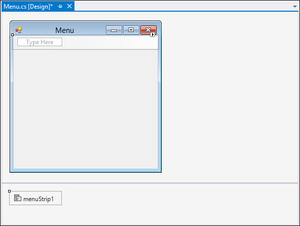
Leveraging the capability to automatically equip a menu strip with a standard set of menus shaves a few minutes of design time off the manual approach. Figure 20.19 shows the result.
Not only has the designer inserted the standard File, Edit, Tools, and Help top-level menu items, but it also has inserted subitems below each menu. Table 20.3 indicates the exact menu structure that results from using the menu’s Insert Standard Items feature.

If you want to manually add menu items into the menu strip, you can use the placeholder block within the menu strip labeled with the text “Type Here.” Every time you type in the placeholder block, additional placeholders become visible, and a menu item is added to the menu strip (see Figure 20.20).

Creating a Toolbar
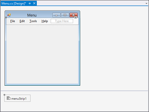
The next item up for inclusion on the form is a toolbar. Toolbars in .NET 2.0 and later are implemented directly with ToolStrip controls. As mentioned before, ToolStrip controls can host various child controls; each inherits from the ToolStripItem base class. Figure 20.21 shows the controls that can be implemented inside a tool strip.
In fact, the interactive layout features of the tool strip work the same way as the menu strip: dragging the control onto the form will result in a blank ToolStrip control docked to the top of the form just under the existing menu control, and you can quickly add a roster of standard items to the tool strip by using its smart tag and selecting Insert Standard Items.
Controls use the concept of z-order to determine their “depth” on the form. If two controls occupy the same space on a form, the control’s individual z-order determines which of the two controls is on top and which is on the bottom. You control this layering in the IDE by right-clicking a control and using the Send to Back and Bring to Front menu commands.
Z-order plays an important role in the placement of docked controls. Docked controls are arrayed in increasing order of their z index on the form. For instance, if you select the ToolStrip and issue the Send to Back command, the order of the MenuStrip and ToolStrip containers is altered to place the ToolStrip first (at the top of the form) and the MenuStrip second (just below the ToolStrip instance).
Figure 20.22 shows the in-progress form with the added ToolStrip control.

If you want to enable users to drag and drop the toolbar or menu onto one of the form’s four sides, you use the ToolStripContainer. In fact, there is a shortcut option here: you can take any of the ToolStrip controls currently on the form and add them to a ToolStripContainer with just a couple clicks of the mouse. One of the items available via a tool strip’s smart tag is the command Embed in a ToolStripContainer. If you issue this command against the toolbar that you just added to the sample form, Visual Studio does two things for you: it adds a ToolStripContainer to the form, and it places the selected ToolStrip into the container—specifically, in the top panel of the ToolStripContainer.
Creating a Status Bar
Status bars provide the user feedback on an application’s current status, progress within an action, details in context with an object selected on a form, and so on. The StatusStrip control provides this functionality in starting with .NET 2.0/Visual Studio 2005, and it supplants the StatusBar control found in earlier versions.
As with the other ToolStrip descendants, the StatusStrip control functions as a container; its capability to host labels in addition to progress bars, drop-downs, and split buttons makes it a much more powerful control than the StatusBar.
Figure 20.23 shows the fictional Contoso CSR form with a StatusStrip docked at the bottom of the form. In design mode, you see a drop-down button that holds a selection for each of the four supported child controls. For the purposes of this demonstration prototype, add a label control to report general application status and an additional label and progress bar in case you run into any long-running retrieval or edit operations.
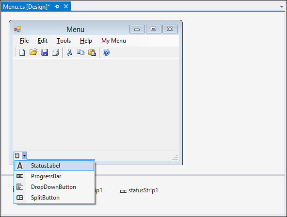
By default, child controls are added in a left-to-right flow layout pattern within the StatusStrip pattern. With just six clicks (two per item), you can add these controls to the strip. The in-place editing capabilities are great for quickly building out the look and feel of the strip; for greater control of the strip’s child controls, you can use the Items Collection Editor dialog box.
Tip
By right-clicking any of the StatusStrip child controls and selecting Convert To, you can quickly change the type of the control. For instance, if you have a label control currently on the strip but you really want a drop-down button, you right-click the label and select Convert To, DropDownButton. This saves you the hassle of deleting the control and adding a new one.
Editing the StatusStrip Items
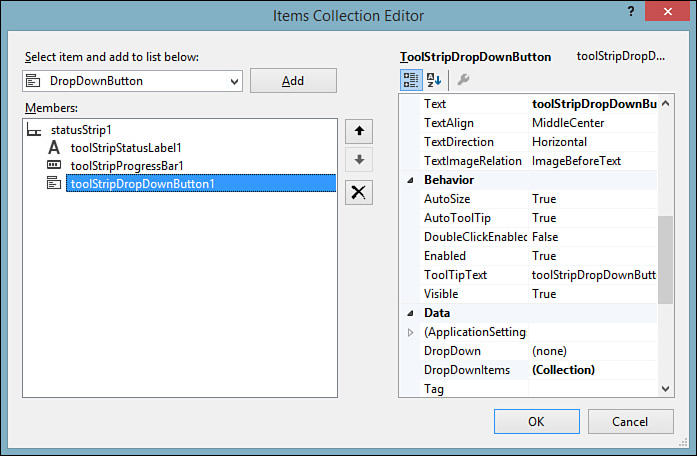
You use the StatusStrip’s smart tag and select Edit Items to launch the Items Collection Editor dialog box. The editor provides direct access to all the hosted control’s properties and enables you to edit, delete, and reorder items within the status strip (see Figure 20.24).
By tweaking some properties here, you can improve the layout and appearance of your items. Figure 20.25 shows the default layout of the controls you added; ideally, you want the progress bar and its label control to sit at the far right of the status strip and the status label to sit at the far left to consume any remaining space.

To make this happen, you need to set the Spring property to True for the leftmost label. This will cause the label to expand and contract to fill the available space on the status strip. Next, set its TextAlignment property to situate the text to the left of the label region and change the Text property to something more appropriate.
Figure 20.26 shows the fruits of our labor.
