
Starting the Layout
After creating a new WPF project, we double-click the MainWindow.xaml file and start designing our user interface. To start, a Grid panel and some nested StackPanel or WrapPanel containers provide the initial layout. Referring to the sketch design (see Figure 21.23), one can envision a Grid with two rows and two columns to start. The top row holds the Menu control (which should span both columns). The bottom row holds the list box of images in the left column, and another parent control in the right column displays the image and the editing buttons.
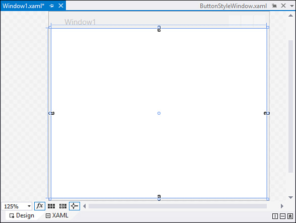
To get started on this layout, we can use the grid control that has been automatically placed on our window during project creation. We could use the XAML pane for our window to quickly enter some XAML tags for the right elements, but let’s see how quickly the WPF Designer enables us to create a layout without typing anything. Select the grid within the designer; you can do this by either clicking within the designer or clicking within the <Grid> element in the XAML pane. With the grid control selected, notice two shaded border areas to the top and to the left side of the grid control. These are known as grid rails. The grid rails enable you to quickly create columns and rows within the grid. If you move the mouse cursor over one of the grid rails, the cursor changes to cross-hairs. A grid splitter also appears; this visually indicates where the exact column or row divider is positioned within the grid. By clicking within the top grid rail, you can add a column; clicking in the left grid rail adds a row. Figure 21.24 shows an example of a grid selected in the designer, with the grid rails visible to the top and to the left of the grid.
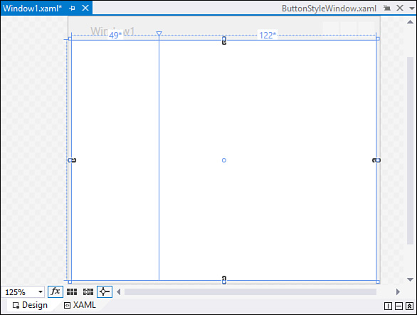
For this project, move your cursor over the top grid rail and move the resulting column splitter so that it is approximately one-third of the way through the Grid’s width. Now click within the rail to create the two columns. Note that the designer shows us the exact width, in pixels, for each column (see Figure 21.25).
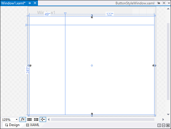
Now do the same within the left grid rail. Position the row splitter so that the top row has a height of about 30 pixels. Don’t worry about getting this exact; we tweak the sizing a little later.
Add the List of Images
Drag a list box into the first column, second row. Initially, this list box has a height, width, and margin value set for it. Because we want this control to resize itself based on the size of the column and row that it sits within, we need to change these properties. Make sure the list box is selected within the designer, and then delete any values within the Height and Width properties. You should also set the VerticalAlignment and HorizontalAlignment properties to Stretch. Finally, set the Margin property to 5.
You should now have a design surface that looks something like the window in Figure 21.26.
Add the Top Menu
The top Menu control in our application will be used to open a folder selection dialog box. Drag a Menu control into the first column and first row. This control needs to span both of the columns in our grid, so resize it within the designer so that it crosses the border between column one and column two. We can now make adjustments similar to those we made for our list box. Using the property window, remove any Height value, and set the Width to Auto. Set the HorizontalAlignment and VerticalAlignment properties to Stretch, and set the Margin to 5.
We know we need to provide folder selection capabilities, so we title a main menu item as Folder and include a subitem under that titled Open. To implement this design, use the property window and edit the Items property; a collection editor dialog box opens that enables us to add the Folder menu items. Via the Header property, we need to specify the text that is displayed for the menu (see Figure 21.27) and the name: FolderOpenMenuItem.
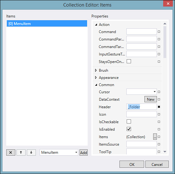
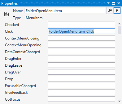
After the Folder menu item has been created, select it and use the property window to edit its Items collection to add the final Open menu item. For this menu item, we also want to specify an event handler for its Click event. Make sure you have the Events tab selected in the property window, and then enter FolderOpenMenuItem_Click in the Click event (see Figure 21.28). Visual Studio automatically creates a stub for the event handler and opens it within the code editor for you. Because we aren’t ready to implement this event yet, you can simply click back to the WPF Designer within the IDE.
Add the Image Viewer
The main screen area for this application is the image viewer and its associated command buttons. This consists of a grid with two rows: the top row holds an Image control and grows as we resize. The bottom row is a static height and holds a StackPanel of buttons oriented horizontally.
Drag a Grid control from the Toolbox into the second row and second column of our original parent grid. You configure the rows as indicated the same way you did for the root grid. For the image view box, we use an Image control. Drag one into the top row of the new grid and, as before, remove any Margin settings or Width/Height values.
Finally, drag a StackPanel into the bottom row of the new grid, remove any Margin settings, and set its Orientation property to Horizontal and the HorizontalAlignment property to Center. This panel is where we place our image manipulation buttons, which you can add now as well. Drag four buttons into the StackPanel, and adjust their margins and height/width until you get the workable look and feel you are after.
Note
While building this app, we have mostly relied on the WPF Designer’s property window to tweak our control properties. But because the XAML code editor supports IntelliSense, and because XAML is fairly readable, you might find it faster and more productive to make the changes directly within the XAML. The bottom line here is that the IDE enables you to choose how you are most productive.
Grid Sizing Details
With all our grids, columns, and rows now in place, we can think about how we want to handle sizing. In other words, how do we want our columns and rows to resize themselves if a user happens to resize the parent window? To configure the grid correctly, we need to understand the concepts of fixed, auto, and proportional sizing.
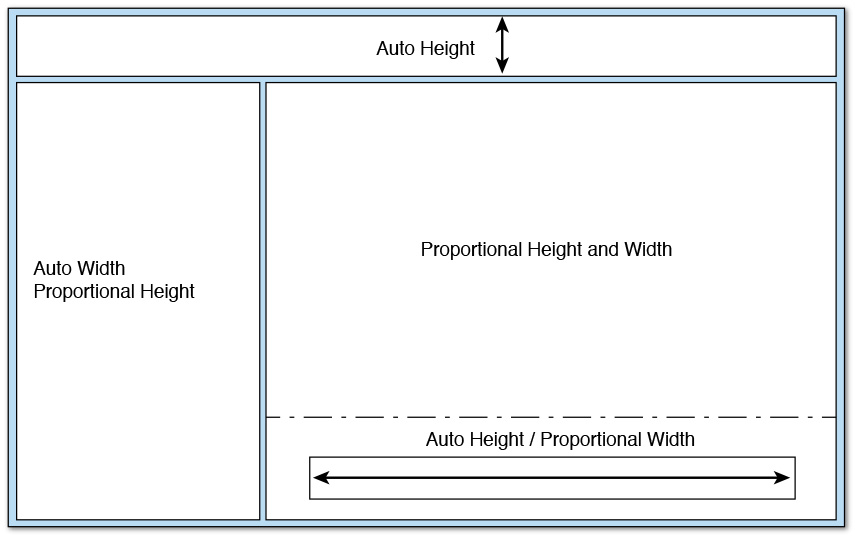
Proportional sizing, also sometimes referred to as star sizing, is used to apportion row height or column width as a proportion of all available space. XAML-wise, proportional sizing is expressed with an asterisk inside of the Row.Height or Column.Width properties. With star sizing, you indicate the proportional “weight” that you want the column to occupy. For instance, for a grid with two columns, if we specified a width on both columns of ".5*", we would end up with both columns taking up half of the available space (width-wise) of the grid. Figure 21.13 shows some example column sizes using proportional sizing. If we just specify an asterisk with no weight (for example, Width="*"), we are instructing that column to take all the remaining space.
Auto sizing causes the row height or width to grow or shrink as necessary to exactly fit whatever is currently placed within the row or column. So a row that is auto sized would be as tall as the tallest control it hosts. Note that in addition to the control height, other things can affect the space reserved for a control, such as margins and padding.
Finally, fixed sizing works exactly like you think it would. You specify a width or height in pixels, and the column or row snaps to that dimension regardless of how the grid’s parent control or window is sized.
With these details exposed, we can formulate a strategy for our layout. Figure 21.29 shows a revised sketch indicating our sizing scheme.
The WPF Designer provides a way to directly indicate the sizing type for each row and column. Using the grid rails again, hover the mouse over the rail space for a column. A small toolbar pops up directly above the rail with three buttons. These three buttons correspond to the three sizing modes. Go ahead and cycle through all the rows and columns in the designer, setting the height and width properties using the designer toolbar.
Here is a look at the current XAML with all the basic elements in place.
<Grid>
<Grid.RowDefinitions>
<RowDefinition Height="Auto" />
<RowDefinition Height="*" />
</Grid.RowDefinitions>
<Grid.ColumnDefinitions>
<ColumnDefinition Width="Auto" />
<ColumnDefinition Width="*" />
</Grid.ColumnDefinitions>
<ListBox Grid.Row="1" HorizontalAlignment="Stretch"
Margin="5" Name="listBox1" VerticalAlignment="Stretch"
ItemsSource="{Binding}"
Width="175" />
<Menu Grid.ColumnSpan="2" HorizontalAlignment="Stretch"
Margin="0" Name="menu1" VerticalAlignment="Stretch">
<MenuItem Header="_Folder" VerticalAlignment="Center">
<MenuItem x:Name="OpenMenuItem" Header="_Open"
Click="FolderOpenMenuItem_Click"
VerticalAlignment="Center">
</MenuItem>
</MenuItem>
</Menu>
<Grid Grid.Row="1" Grid.Column="1">
<Grid.RowDefinitions>
<RowDefinition Height="*" />
<RowDefinition Height="Auto" />
</Grid.RowDefinitions>
<Image Grid.Row="0" Name="image1" Stretch="UniformToFill"
Margin="5" VerticalAlignment="Center"
HorizontalAlignment="Center" />
<StackPanel Grid.Row="1" Orientation="Horizontal"
HorizontalAlignment="Center" >
<Button Width="50" Height="50" Margin="10">
Button</Button>
<Button Width="50" Height="50" Margin="10">
Button</Button>
<Button Width="50" Height="50" Margin="10">
Button</Button>
<Button Width="50" Height="50" Margin="10">
Button</Button>
</StackPanel>
</Grid>
</Grid>