
Creating a Windows Presentation Foundation Project
Windows Presentation Foundation (WPF) projects behave much like WinForms projects do. In fact, one of the design goals for the WPF Designer and editor was to act in ways that would be familiar to developers who are used to Windows Forms development. Just as we previously did with our WinForms project, we start the development and design process by selecting a template (WPF Application) from the File, New Project dialog.
Two XAML files are automatically created within the project: MainWindow.xaml, which represents the main window for the app; and App.xaml (Application.xaml in Visual Basic), which represents the application itself. These are analogous to the Form1.cs/Form1.vb and Program.cs/Module1.vb files created in a new Windows Forms project.
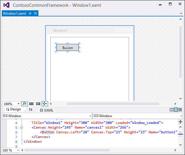
The first difference you notice with WPF projects is that, by default, you are presented with two different panes. In one pane, you see the design surface for the window, and in another you see an editor that contains the XAML declarations for the form. This design view is actually the same that is used for web applications (which we investigate as part of the next topic). See Figure 6.41 for a look at the Window1.xaml file loaded in the IDE.
Each of these panes is simply a different view of the same window: a visual view and a text/XML view. I can add a button to the window, for example, by dragging it from the Toolbox onto the design surface or by typing the XAML declaration directly into the XAML pane like this:
<Button Height="25" Name="button1" Width="75">Button</Button>
Both the design and the XAML view are kept in sync with one another automatically.
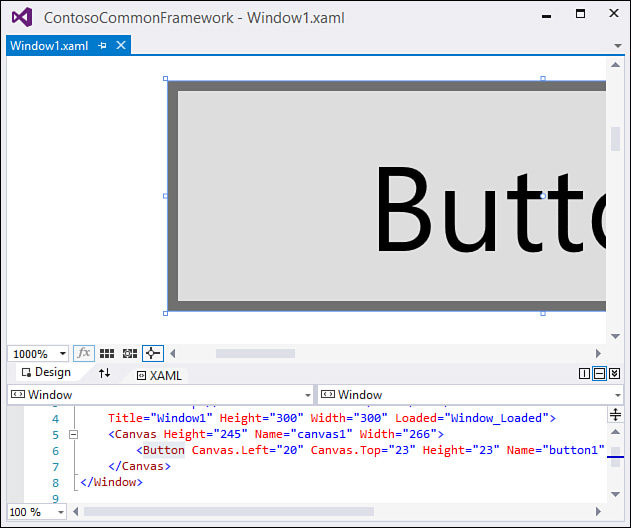
Because WPF is based on vector graphics, you can zoom in and out in the designer using the combo-box control in the lower left of the designer. Note that you can hold down the Ctrl key and use the mouse scroll wheel to control the zoom level directly. Figure 6.42 shows the Window1 content, with a button, zoomed in at 10x.
Using the Split Panes
You have control over how the design and XAML panes are displayed and positioned within the IDE. There is a small button flagged with two-way arrows that, when pressed, swaps the position of the two panes. You can also change the panes from a horizontal to a vertical orientation (or vice versa) by clicking the Horizontal Split or Vertical Split button. Finally, you can collapse either pane by clicking the Collapse/Expand Pane button.
A cluster of controls situated on the border between the design and XAML editor panes control zooming, pane management/arrangement, and other functions (see Figure 6.43).

Adding Controls
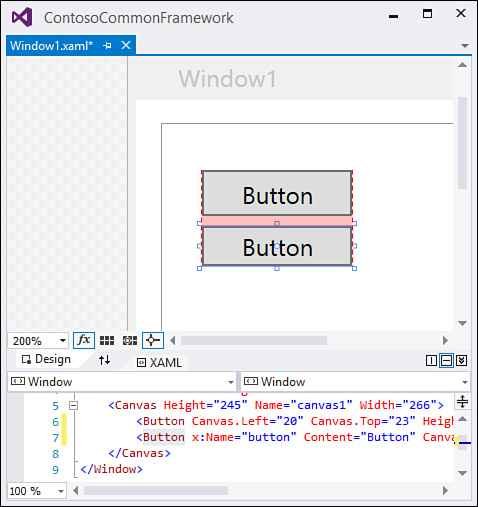
WPF windows are populated with controls by using the same drag-and-drop action from the Toolbox that is used with Windows Forms and web forms development. Control positioning and sizing are aided through snap lines, grid lines, and sizing boxes that look a bit different than their WinForms counterparts but perform the same tasks (see Figure 6.44).
We cover WPF development in more detail in Chapter 21, “Building WPF Applications.”