Customizing the Ribbon
Ribbon support within an Office project is enabled by adding a ribbon project item to the project. Right-click the project within Solution Explorer and select Add New Item. In the Add New Item dialog box (see Figure 22.5), you see two different ribbon templates available for selection: Ribbon (Visual Designer) and Ribbon (XML). As their names suggest, the Visual Designer template provides you with a what-you-see-is-what-you-get (WYSIWYG) design surface for creating your ribbon customizations. Because this design surface can’t be used to build certain types of more advanced ribbon features, the Ribbon (XML) item template is provided to enable you to handcraft ribbon features in XML. You need to use the Ribbon (XML) item if you want to do any of the following:
 Add a built-in (as opposed to custom) group to a custom tab
Add a built-in control to a custom group
Customize the event handlers for any of the built-in controls
Add or remove items from the Quick Access toolbar

For our purposes, let’s select the Ribbon (Visual Designer) item and add it to our project. This adds the Ribbon1.cs file to our project. In a fashion similar to the other Visual Studio project types, this file has a designer and a code-behind file attached to it.
The design surface you are presented with is an exact replica of an empty ribbon (see Figure 22.6).
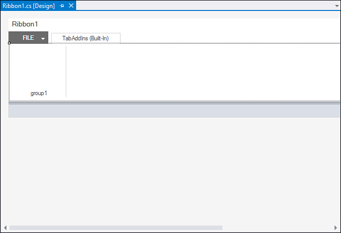
Ribbons are composed of several elements. Tabs are used to provide the high-level task grouping of features, groups are used within each tab to provide more granular sectioning of the features, and controls reside within the groups are used to build out the custom user interface for the add-in.
With the Ribbon Designer loaded, you now have access to ribbon-specific controls in the Toolbox (see Figure 22.7). Adding controls to the ribbon or adding new groups is as simple as dragging the desired control to the ribbon or Group tab.

Adding Items to the Ribbon
To demonstrate, you can create our own custom group within the Add-Ins tab. Because you are presented with one group already by default, you can rename it to something more appropriate for your add-in. All the items in the ribbon are modified via the Properties window, just as with all other Visual Studio project types. We just click the group and then set its label property.
Groups act as containers on the design surface, enabling us to drag and drop a button into the group. Figure 22.8 shows the beginnings of a custom ribbon for a purchasing system integration add-in. To duplicate this, drag three buttons into the existing group on the ribbon, change their ControlSize property to RibbonControlSizeLarge, set their label properties to the appropriate text you want displayed on the button, and add some images of your choosing to the buttons by setting the Image property.

Tip
The images used in this example were taken from the Visual Studio 2015 Image Library, but there is actually a cool way to reuse any of the icons that you see within Office. First, download the Icons Gallery add-in from the Microsoft Download Center. (Search for “Office 2010: Icons Gallery.”) This download places a Word document file on your drive. Open the file, and then click the File tab at the top of the ribbon. Down the column on the left, you should see two entries labeled ImageMso 0 and ImageMso 1. Click either of these to see the gallery of icons.
Each icon has an accompanying label—a string that you can plug directly into a ribbon button’s OfficeImageId property. As long as an image isn’t already set for the button, the identified Office icon is used. This is a real boon for UI design, given the hundreds and hundreds of high-quality icons already available within Office. The image doesn’t show in design time but does display correctly at runtime.
Adding more groups to your ribbon involves more of the same drag-and-drop action from the Toolbox. You can change the order of the groups in the ribbon by selecting and then dragging a group to the left or right of any other existing groups.
Note
Notice that there is already a default tab implemented in the ribbon called TabAddIns (Built-In). When you’re creating a ribbon for your add-in, its groups are automatically displayed under the Add-Ins tab within the target Office application. If you want to add items to one of the other default tabs in the Office application or create your own tab, you have to use the Ribbon (XML) project item, and not the Ribbon Designer, to achieve that level of customization.
Handling Ribbon Control Events
Handling the events for our buttons is easy. Again, the idea behind the Office Developer Tools for Visual Studio is to provide Office customization capabilities using the same development paradigms already present in Visual Studio. This means that you can double-click a button to have the IDE automatically create and wire up an event-handler routine, ready to accept whatever code we need to write to implement the button’s behavior.
To test this out, let’s add the following to the Replace PO button.
private void buttonReplacePO_Click(object sender,
RibbonControlEventArgs e)
{
MessageBox.Show("buttonReplacePO_Click fired!");
}
If you run the project now by pressing F5, Word automatically launches; you can see your ribbon customizations by clicking the Add-Ins tab. Clicking the Replace PO button yields the results shown in Figure 22.9.
