Using Containers
Containers are .NET controls designed to hold other controls. You can use containers in conjunction with the Anchor and Dock control properties to create intricate design scenarios. Although there are various container controls, the ones most applicable to control layout are FlowLayoutPanel, TableLayoutPanel, and SplitContainer.
Both the TableLayoutPanel and the FlowLayoutPanel containers derive from the more generic Panel class. The Panel class provides high-level capabilities for grouping controls. This is beneficial from a placement perspective because you can aggregate a bunch of controls into one group by positioning them within a panel. This way, you can act on them as a group; for instance, disabling a panel control disables all its child controls. The TableLayoutPanel and FlowLayoutPanel build on that functionality by also providing the capability to dynamically affect the positioning of their child controls.
The TableLayoutPanel
Consider a series of labels and text boxes for entering address information. They are typically arrayed in a column-and-row fashion. The TableLayoutPanel is ideal for implementing this behavior because it automatically forces the column and row assignment that you make for each of the controls. Figure 20.11 shows a series of Label and TextBox controls embedded within a TableLayoutPanel. Notice that resizing the form (and thus the panel, which is docked to fill the form interior) causes the panel’s controls to auto-adjust their alignment.

If an item within one of the cells extends beyond the cell’s boundaries, it automatically overflows within the cell. This provides you with the same layout capabilities that HTML offers for web browser-based interfaces.
Note
When a control is added to a TableLayoutPanel, it is decorated with five additional properties: Cell, Column, Row, ColumnSpan, and RowSpan. These properties can be used to change the control’s row/column position within the layout panel at runtime. The ColumnSpan and RowSpan properties are used the same way as their namesakes in the HTML world. In .NET, controls that imbue other controls with additional properties are called extender providers.
The FlowLayoutPanel
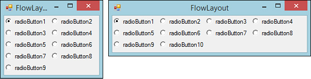
The FlowLayoutPanel has a simpler layout algorithm. Items are ordered either vertically or horizontally by wrapping control sets across rows or columns as needed. The two screens shown in Figure 20.12 illustrate the effect of resizing a flow layout panel containing a series of radio buttons.
The SplitContainer
The SplitContainer control is a much enhanced alternative to the original Splitter control that was included with .NET 1.0/1.1/Visual Studio 2003. This control represents the marriage of two panels and a splitter; the splitter separates the two panels either horizontally or vertically and enables a user to manually adjust the space (in the horizontal or vertical) that each panel consumes within the overall container.
Figure 20.13 shows the versatility of this control; two split containers, one embedded within a panel hosted by the other, are used to provide both vertical and horizontal resizing capabilities for the panels on a form. (Panel 2 isn’t visible because it is the panel functioning as the container for the split container with panels 3 and 4.) By dragging the split line to the right of panel 1, you can increase or decrease the horizontal real estate it occupies on the form. The same is true for the split line between panel 3 and panel 4; dragging this adjusts the ratio of space that both panels vertically occupy in relation to one another.

FIGURE 20.13 Resizing with the SplitContainer: a horizontal SplitContainer embedded in a vertical SplitContainer.
The ToolStripContainer
Many applications support the capability to drag and dock a toolbar, menu, and the like to any side of a form: top, bottom, left, or right. Visual Studio itself is an example of just such an application. By grabbing and dragging a Visual Studio toolbar, you can reposition it, for example, to the left side of the IDE. The ToolStripContainer control enables this functionality in your applications as well; it is a combination of four panels, each positioned on the four different edges of the containing form. These panels are used to host ToolStrip controls (more on these in a bit) and (at runtime) enable users to move tool strips within and between the four panels.
Note
Although the ToolStripContainer provides a convenient vehicle for snapping tool strips to the sides of a form, there is unfortunately no built-in support for “floating” tool strips.
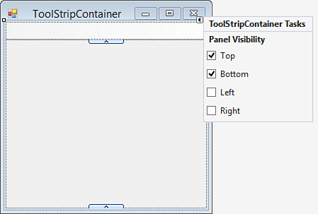
The design experience is simple: you can shuffle controls around to the four different panels depending on where you want them positioned within the parent form. Figure 20.14 shows a ToolStripContainer in design mode. The smart tag offers up control over the visibility of the top, left, right, and bottom panels. Each panel is hidden by default. You can click any of the arrows on the sides of the container to expand the corresponding panel and give you room to place tool strips within the panel.
Although it is convenient to be able to place items in a ToolStripContainer within the designer, the real benefit that you get from the control is the automatic support for dragging and dropping between panels at runtime. This means that, without writing a single line of layout or positioning code, you have enabled functionality that lets users place their menus or toolbars wherever they want within the form. Figure 20.15 shows a toolbar, hosted in a ToolStripContainer, which has been redocked from the top panel to the left panel at runtime.

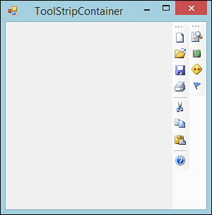
Multiple ToolStrip controls can also be stacked within any of the given panels in the ToolStripContainer. Figure 20.16 shows multiple command bars stacked within the rightmost panel. As noted later in the chapter, a control’s z-order dictates its place within the stack.
Note
The sharing of space (vertically or horizontally) within a ToolStripContainer is sometimes referred to as rafting. The ToolStrip controls are free to float anywhere within the panel.
A few other intricacies are involved with form/control layout and positioning, but we have now covered the basics. With these concepts in hand and a general design for your form, you can start using the Windows Forms Designer.