
Creating the User Control
We start by creating a User Control class that encapsulates the user interface for our tool window and the processing logic for the extension. Add a Custom Tool Window project item to the project; call it MyToolWindow.
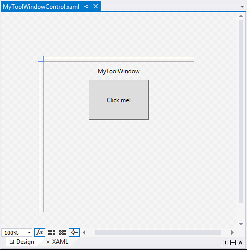
The first thing to note is that the project item has already created the shell of our user control for us. After we added this project item, the design surface of the user control is loaded and ready to go (see Figure 15.8). As we noted before, the user control is a XAML-based user interface. If you need to familiarize yourself with Windows Presentation Foundation (WPF)/XAML development concepts, you may want to skip ahead and read Chapter 21 or Chapter 23.
Within the user control, there is already a StackPanel container created for us inside a grid. It currently contains a TextBlock and a Button control. We won’t need the Button control, so delete it. We want to add an Image control (within the StackPanel, after the TextBlock) to display the palette of colors, stored as a simple .jpg file. In this case, we’re using a color palette from a popular Paint program as our source for the bitmap; grab your own palette “picture” from wherever you like, copy it over into your project folder, and add it to your project. Set the Source property of the Image control to the relative path of your image file. Our path looks like this: color-spectrum.jpg.
With the palette in place, you now need a TextBlock control to display the RGB values. (Set its name property to TextBlockRGB). This can be added directly into the existing StackPanel container immediately after the Image control. Finally, in the finest tradition of gold-plating, you also add a Border control (named BorderSelectedColor) that will have its background color set to the current color selection and another TextBlock control (TextBlockCode) that shows the code you would generate to implement that color in a color structure. Both of these can be added, one after another, to the StackPanel.
Figure 15.9 provides a glimpse of the user control after these controls have been situated on the design surface.

Handling Movement over the Palette
With the UI in place, you can now concentrate on the code. First, you can add an event handler to deal with mouse movements over the top of the palette picture box. Within the MouseMove event handler, we will update the TextBlock control and the Border control background as the pointer roves over the palette bitmap. This is easily accomplished by first establishing the event within the XAML markup, like this:
<Image Name="ImagePalette" Source="color-spectrum.jpg" Margin="10"
MouseMove="ImagePalette_MouseMove" />
If you let Visual Studio do the work for you and select <New Event Handler> as you are typing the MouseMove property into the XAML, you will get the C# event handler created for you for free. Within the handler, the code will need to look something like this:
private void ImagePalette_MouseMove(object sender, MouseEventArgs e)
{
//Get the color under the current pointer position
UIElement SelectedObject = e.Source as UIElement;
Color color = GetPointColor();
DisplayColor(color);
DisplayCode(color, false);
}
We also need a way to react when the user clicks on the palette (triggering a copy of the code to the Clipboard). So in the same fashion, add a new event handler in the XAML for the MouseDown event so that the Image element now looks like this:
<Image Name="ImagePalette" Source="color-spectrum.jpg" Margin="10"
MouseMove="ImagePalette_MouseMove" MouseDown="ImagePalette_MouseDown" />
And within the event handler C# code, write the clipboard action:
private void ImagePalette_MouseDown(object sender, MouseButtonEventArgs e)
{
//On mouse click within the palette, copy
//the Color code to the Clipboard
Clipboard.Clear();
Clipboard.SetText(TextBlockCode.Text);
}
We haven’t implemented the GetPointColor, DisplayColor, or DisplayCode routines yet; let’s do that now.
Implementing the Helper Routines
Whenever the mouse pointer moves over the picture box region, you need to capture the color components of the point directly below the cursor (GetPointColor), update the label controls and the border control to reflect that color (DisplayColor), and then generate the code to implement a matching color structure (DisplayCode). Here are the implementations of these routines.
/// <summary>
/// Returns a Color structure representing the color of
/// the pixel at the current mouse x and y coordinates.
/// </summary>
/// <returns>A Color structure</returns>
private Color GetPointColor()
{
//Retrieve the relative coordinate of the mouse position
//in relation to the current window.
Point point = Mouse.GetPosition(this);
//Grab a bitmap of the current window
var renderTargetBitmap =
new RenderTargetBitmap((int)this.ActualWidth,
(int)this.ActualHeight,
96, 96, PixelFormats.Default);
renderTargetBitmap.Render(this);
//Determine if we are in bounds
if ((point.X <= renderTargetBitmap.PixelWidth) &&
(point.Y <= renderTargetBitmap.PixelHeight))
{
//Crop a pixel out of the larger bitmap.
var croppedBitmap =
new CroppedBitmap(renderTargetBitmap,
new Int32Rect(
(int)point.X,
(int)point.Y, 1, 1));
//Copy the pixel to a byte array.
var pixels = new byte[4];
croppedBitmap.CopyPixels(pixels, 4, 0);
//Convert the RGB byte array to a Color structure.
Color SelectedColor = Color.FromRgb(pixels[2],
pixels[1],
pixels[0]);
//Return the Color struct
return SelectedColor;
}
else
{
//Return black if we are out of bounds
return Colors.Black;
}
}
/// <summary>
/// Given a Color struct, update the UI controls
/// to show the RGB values, and repeat the selected
/// color within the BorderSelectedColor control.
/// </summary>
/// <param name="color">The current color under
/// the mouse cursor.</param>
private void DisplayColor(Color color)
{
//Set the border color to match
//the selected color
SolidColorBrush brush =
new SolidColorBrush(color);
BorderSelectedColor.Background = brush;
//Display the RGB values
string rgb = color.R.ToString() + ", "
+ color.G.ToString() + ", "
+ color.B.ToString();
TextBlockRGB.Text = rgb;
}
/// <summary>
/// Display the VB or C# code to implement the
/// provided Color
/// </summary>
/// <param name="color">The color to implement</param>
/// <param name="isVB">True to generate VB; false
/// for C#</param>
private void DisplayCode(Color color, bool isVB)
{
string code = "";
if (isVB)
{
code = "Dim color As Color = ";
}
else
{
code = "Color color = ";
}
code = code + @"Color.FromArgb(" + color.R.ToString() + ", " +
color.G.ToString() + ", " +
color.B.ToString() + ");";
TextBlockCode.Text = code;
}
Tip
To isolate and test the user control, you might want to add a WPF project to the solution and host the control within a XAML window for testing. Just drop the control onto the design window and run the project.
With the user control in place, you are ready to proceed to the second stage of the add-in’s development: wiring the user control into the IDE.