
Microsoft expended considerable effort on the commands that are placed on the server ribbon; that is, the ribbon you see when you open a SharePoint site in the browser. However, this is its first attempt at creating a ribbon for SharePoint and it might not meet the needs of all users, all of the time, for all solutions. When you consider the business needs of your users, the commands and the grouping of those commands plus the tabs displayed on the ribbon, it might be different than what you require. However, before you can create one of your own or modify the existing server ribbon to meet your business needs, you first need to understand the ribbon terminology.
The SharePoint 2010 server ribbon is an extension of the Office ribbon that was first introduced with some of the Office 2007 client applications and later added to all Office 2010 client applications, including Microsoft Access 2010, Microsoft InfoPath 2010, Microsoft SharePoint Designer 2010, and Microsoft Visio 2010. The commands themselves have changed very little, and if you’re familiar with Windows SharePoint Services 3.0, you will recognize the same functionality—it’s just presented in a very different way.
Note
Ribbon references for SharePoint and Office 2010 applications are available on the Microsoft Office site at http://office.microsoft.com, and you can find them by typing the keywords 2010 ribbon. On the results page, under All Results, click Templates to view the interactive ribbon references. If you have upgraded sites from Windows SharePoint Services 3.0, then you might like to point your users toward the How-To Training course, “Make the switch to the SharePoint 2010 user interface,” which is available at http://office.microsoft.com/en-us/sharepoint-server-help/make-the-switch-to-the-sharepoint-2010-user-interface-RZ101806469.aspx.
The SharePoint Server ribbon mimics the behavior and functionality that you would expect from the ribbon in an Office client application; however, it is implemented in SharePoint as a number of server controls, grouped into tabs across the top. You navigate through the tabs to complete SharePoint-related tasks. Some tabs are contextual, which means that they appear or hide depending on where you are and the SharePoint object that is selected in the main portion of the webpage.
These contextual tabs can be grouped together into contextual tab sets that are color coded for quick identification (see Figure 15-5). For example, the Editing Tools tab set and its associated contextual tabs (Format Text and Insert) are orange; the Library Tools tab set is blue; Web Part Tools tab set, purple; and the Picture Tools tab set is violet.
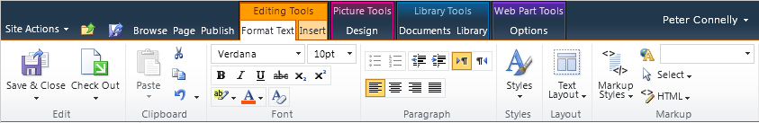
Figure 15-5. New ribbon tabs require fewer clicks to carry out a task, and you can take advantage of color coding to assist in the quick identification of commands.
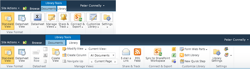
Within each tab, there are groups. Groups contain controls with similar functionality. For example, in the Edit group, you can complete tasks associated with editing a file, such as the Save & Close and the Check Out buttons. The controls in a group are arranged based on a ribbon template that also describes how the controls are to be scaled when the width of the browser window is changed. Therefore, when the width of the browser window is reduced, some controls will continue to show as a large icon (32x32 pixels) with text, others as small icons (16x16 pixels) with text, or just a small icon with no text. Yet others might be displayed as text on a menu item on a drop-down menu, as shown in Figure 15-6.
The Server ribbon contains many types of controls. These can include simple controls, such as buttons, toggle buttons, and combo boxes, or they can be more advanced, such as a split button or color picker control (see Figure 15-7). The split button is used as both a button and a menu. Each control is associated with a command that executes when you click the control.

Figure 15-7. The architecture of the Server ribbon: components, tab sets, tabs, groups and controls.
Note
For a list of control types that you can use on the ribbon, go to http://msdn.microsoft.com/en-us/library/ee537017(office.14).aspx.
Tip
INSIDE OUT Ribbon controls that can be modified by using CSS
Some of the ribbon controls can be extended by making modifications to the CSS classes. For example, you can modify the styles that are presented in the split button drop-down menu for the following controls:
Styles on the Format Text tab in the Editing Tools tab set. This control uses the CSS classes that match the naming standard .ms-rteStyle-
SSSS, whereSSSSis the style name in the drop-down list.Markup Styles on the Format Text tab in the Editing Tools tab set. This control uses the CSS classes that match the naming standard .ms-rteElement-
SS, whereSSis the style name in the drop-down list.Styles on the Design tab in the Table Tools tab set. This control uses the CSS classes that match the naming standard .ms-rteTable
XXX-NNN, whereXXXis the table section, andNNNis the name to identify the table styling.Image Styles on the Design tab in the Picture Tools tab set. This control uses the CSS classes that match the naming standard .ms-rteImage-
x, wherexis a number.Position on the Design tab in the Picture Tools tab set. This control uses the CSS classes that match the naming standard .ms-rtePosition-
x, wherexis a number.
For more information about each of these controls, read Chapter 6.
Unlike tabs, which can appear or hide, controls on a tab are never hidden; they are either enabled (active) or disabled (inactive). Therefore, all commands on a tab might not be enabled. Commands might be disabled for the following reasons:
The user might not have permissions to a complete task; for example, on the Page tab, if the user does not have contribute rights, then all the controls that require that level of permissions will be inactive (grayed-out), as shown in Figure 15-8.
An object is not selected in the main portion of the page; for example, when working in a list, you must first select a list item before the commands become active.
The computer on which a user is working does not have the appropriate Office 2010 client application installed; for example, the Connect To Outlook command will be active if Microsoft Outlook 2007 or 2010 is installed, and the Sync To SharePoint Workspace will be active if SharePoint Workspace is installed.
A page or list setting might not be configured or enabled; for example, on the Documents tab, the Version History control in the Manage group will only be active if the list or library has enabled versioning.
An ActiveX control might need to be installed; for example, when the view displays the content of a library, code in the file OWS.js determines whether Office applications are installed and, if they are, instantiates an ActiveX control—SharePoint.OpenDocuments.3. This control allows users to create documents based on the libraries or content types document template. This control also allows users to edit documents by using their associated application.
Note
Groups that contain no controls are not displayed. For example, by default, the Quick Steps group on the Documents or Items tab contains no controls. This is so you can use SharePoint Designer to add controls to this group, which will then become visible.
Each of the ribbon components are related to each other in a hierarchical structure, as illustrated in Figure 15-9. This hierarchical structure is also true for other elements such as the Site Actions menu, which is another type of ribbon, except it is a drop-down menu.

The location of each control is represented by dot-separated notation, as demonstrated here:
Ribbon.[tab].[Group].Controls
For example, ribbon.Documents.New.AddDocument is the split button control in the New group on the Documents tab with which you can upload documents into a document library; Ribbon.List.Actions.ExportToSpreadsheet is the button control in the Actions group on the List tab that you use to export list items to a Microsoft Excel spreadsheet.
Tip
INSIDE OUT Where are the core ribbon components defined?
Most of the core SharePoint Foundation ribbon components are defined as XML in the file CMDUI.XML, which you can find in the TEMPLATEGLOBALXML subfolder in the SharePoint root %Program Files%Common FilesMicrosoft SharedWeb Server Extensions14. The ribbon XML is then translated into the ribbon by two JavaScript files: GUI.js and SP.Ribbon.js. SharePoint features might also implement changes and additions to the ribbon. You should not modify the CMDUI.XML file directly.