
SharePoint 2010 User Experience Improvements
Using the Browser to Add Custom Actions
Working with the Ribbon and LIM in SharePoint Designer
Extending the Ribbon by Using Visual Studio
So far, this book has detailed how to install and manage Microsoft SharePoint 2010 sites as well as how to add unique content to pages. Using previous chapters, specifically Chapter 6, Chapter 10 and Chapter 14, you should now be able to see how you can create and customize SharePoint 2010 solutions to meet your business needs.
However, when you build a SharePoint 2010 solution, it should be more than a collection of lists, libraries, pages, and workflows. Each of these components should be combined to provide users with a holistic solution, in which the components work together and not as discrete entities. Using Web Part connections and customizing the Data Form Web Part (DFWP) Form Action button to initiate workflows are just two examples of how you can achieve this. But SharePoint 2010 provides other components that you can use to improve user experience (UX).
Microsoft did considerable refactoring of the user interface (UI), introducing the Office 2007 client application ribbon to SharePoint Foundation, targeting standard tasks that users need to complete and reduce the use of tables. In addition to Microsoft Internet Explorer, SharePoint Foundation now supports Mozilla Firefox and Apple Safari. Browser support extends even further with SharePoint 2010 Service Pack 1. In addition, when migrating from Windows SharePoint Services 3.0, the UI can be upgraded separately from content database upgrade; thus, you can keep the Windows SharePoint 3.0 UI, yet take advantage of much of the SharePoint Foundation 2010 functionality. Microsoft split Cascading Style Sheet (CSS) files into multiple files that are only downloaded when necessary, thereby reducing the time needed to render pages. Similarly, Microsoft introduced script on demand, which allows delaying JavaScript downloads until they’re needed.
These improvements all help to improve UX, and your solutions can extend many of these improvements, specifically by displaying links, relevant text, and commands on the following interface elements:
Server ribbon SharePoint 2010 contains its own version of the Microsoft Office Fluent UI, as shown in Figure 15-1, which was designed to make it easier for users to find and manipulate features within a product. The new ribbon interface is fully extensible by using SharePoint Designer and Microsoft Visual Studio 2010.
Status bar Figure 15-1 Demonstrates that this element is similar to the status bar that you see in the client Office application. It is used to display persistent information. It uses four predefined background colors to identify the importance of the text displayed in the status bar. You can post the status of multiple items in the status bar such that, the most important ones are displayed at the top. The format of the status bar message is HTML. The predefined background colors and meaning are described by Microsoft as:
Red—Very Important
Yellow—Important
Green—Success
Blue—Information
The status bar can contain multiple messages, but it will only reflect the color that equates to the highest level of importance or priority.
Notification area This displays on the right side of the page and shows transitory messages (see Figure 15-2). By default it is only visible for five seconds; however, you can make it a sticky parameter.
List item menu (LIM) Also known as the Edit Control Block (ECB), this is a contextual menu that is associated with all list items or files and is displayed in list views and list view Web Parts, as shown in Figure 15-3. The LIM is available in a list view on the Title column of an item, when Title (linked to an item via the edit menu) is displayed, and in a library view (on the name of the document), and when the Name (linked to the document via the edit menu) is displayed.
On an announcements list, the LIM contains controls with which you can complete the following tasks: View Item, Edit Item, Manage Permissions and Delete Items. On a document library, the LIM contains the commands View Properties, Edit Properties, Check Out, Send To, Manage Permissions and Delete. Depending on the document type, the LIM might also contain a command so that you can edit the file. Other commands might appear depending on the configuration of the list or library; for example, if a workflow is attached to the list or library and versioning is enabled, you will see the Workflows and Version History commands.
Modal dialogs To help users stay within the context of a page, yet display new information, SharePoint Foundation introduces a new Ajax-based dialog framework. The new information is displayed in modal dialogs, without the need to navigate away from the page, thereby reducing the need for the page to refresh. The content of the original page is grayed-out, as shown in Figure 15-4.

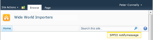

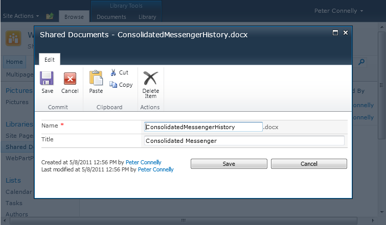
Figure 15-4. You can use modal dialogs to complete tasks such as adding or editing list items, without leaving the page.
It is the modification of these components that is detailed in this chapter.