CG animation draws from many disciplines. While learning Maya, you’ll work with concepts derived not only from computer graphics, but also from design, film and cinematography, and traditional animation. Here’s a summary of the most important of those concepts as they apply to Maya.
Computer Graphics Concepts
Knowing a bit about the general terminology and methodology of computer graphics will help you understand how Maya works. Let’s begin with the crucial distinction between raster (bitmapped) and vector graphics and how this distinction affects you as a Maya user.
Raster Images
Raster images (synonymous with bitmapped images) make up the world of computer images today. These images are displayed through the arrangements of colored pixels onscreen or dots on a print to display an image. Everything you create in Maya will eventually be seen as a raster image, even though you first create it using vectors.
Raster image programs, such as Photoshop, let you adjust existing settings such as color, size, and position for all or part of an image. They let you paint onto a scanned picture or a virtual canvas to adjust or create the pixels yourself. These programs affect pixels directly, giving you the tools to change pixels to form images. For instance, you can use a scanned photo of your house in Photoshop to paint the side of the house red to see what it might look like before you run down to the local paint store.
A raster or bitmap image is a mosaic of pixels, so the resolution of an image is defined by the number of pixels in the horizontal and vertical directions. Because they’re based on a grid of a fixed size, raster images don’t scale up well. The closer you get to a raster image, the bigger the pixels become, making the image look blocky, or pixelated. To make large raster images, you need to begin with a higher resolution. The higher the resolution, the larger the file size will be. Figure 1-1 shows what happens when you blow up a raster image.
Figure 1-1: A raster image at its original size (left) and blown up several times (right)

Most common raster displays are television or computer screens. In fact, the term raster originally referred to the display area of a television or computer monitor. To form an image, the electronics in these devices essentially paint it as a grid of red, green, and blue pixels on a glowing screen. Every image generated by a computer, therefore, must either begin as a raster image or be rasterized as part of rendering for display.
Vector Images
Vector images are created in a completely different way. They’re formed using mathematical algorithms and geometric functions. Instead of defining the color of each and every pixel in a grid of a raster image, a vector image uses coordinates and geometric formulas to plot points that define areas, volumes, and shapes.
Popular vector-based image applications include Adobe Illustrator and Flash, as well as practically all computer-aided design (CAD) programs, such as AutoCAD and SolidWorks. These programs let you define shapes and volumes and add color and texture to them through their toolsets. They store the results in scene files containing coordinates and equations of points in space and the color values that have been assigned to them. This vector information is then converted into raster images (called rasterization) through rendering so you can view the final image or animation.
When scaled, vector graphics don’t suffer from the same limitations as raster images. As you can see in Figure 1-2, vectors can be scaled with no loss of quality; they will never pixelate.
Figure 1-2: A vector image at its original size (left) and blown up quite a bit (right)

Motion in vector programs is stored not by a long sequence of image files, but through changes in positions of the geometry and in the math that defines the shapes and volumes. When a Flash cartoon is played on a website, for example, the information downloaded and fed to your computer is in vector form. Your computer then renders this information on the fly in real time into a raster display of the content that you can (you hope) enjoy on your screen.
When you work in Maya, vectors are displayed as wireframes. When you finish your scene, Maya renders the image, converting the vector information into a sequence of raster images you can play back.
Image Output
When you’re done with your animation, you’ll probably want as many people as possible to see it (and like it!). To make that happen, you have to render it into a file sequence or a movie file. The file can be saved in any number of ways, depending on how you intend it to be viewed.
Color Depth
An image file stores the color of each pixel as three values representing red, green, and blue. Image type depends on how much storage is allotted to each pixel (the color depth). These are the color depths common to image files in CG production:
Grayscale The image is black and white with varying degrees of gray in between, typically 256 shades of gray. Grayscale images are good for rendering out black-and-white subjects as well as being used for some types of texture maps like displacement maps.
8-Bit Image File (a.k.a. 24-Bit Color Display) Referred to as 24-bit color display or True Color in desktop settings for Windows, each color channel is given 8 bits for a range of 256 shades of each red, green, and blue channel, for a total of 16 million colors in the image. This color depth gives good color quality for an image and is widely used in most animation applications. Most of your renders from Maya will probably be as 8-bit image files, because most monitors are only capable of 8-bit color reproduction in playback.
16-Bit Image File Used in television and film work using such file types as TIFF16, a 16-bit image file holds 16 bits of information for each color channel, resulting in an impressive number of color levels and ranges. Each file can exceed several megabytes even at low resolutions. These files are primarily used in professional productions, although they’re being supplanted by the use of 32-bit images.
32-Bit Image File This is where the big kids play. Used primarily for film work but increasingly in general use, 32-bit image files, such as the OpenEXR format, give you an incredible amount of range in each color channel. This lets you adjust a wide range of tones and hues in your rendered output for the fullest detail. They’re pretty much standard for film work because outputting CG to film can require high levels of color and brightness range in the image.
High Dynamic Range Imagery (HDRI) HDRI images are 32-bit float images that are created by combining several digital photos into one image file. For example, photos are taken of a subject with different levels of light using various exposures during photography. With a “32 bit float” file format, a lot of information can be stored about the colors in the image; i.e. a very high bit depth is achieved. This way, you have a series of images that range from dark (with very fast exposure) to normal (with proper exposure time) to blown out brightness (with overexposure). These different exposures are then compiled into a single HDR file format (.hdr) that represents a wider range of light and dark than a typical photo. These files are traditionally used as lighting setups, especially for scenes in which CG is integrated with a live-action background using image-based lighting (IBL), a concept we’ll touch on in Chapter 11.
Color Channels
As mentioned, each image file holds the color information in channels. All color images have red, green, and blue color channels that, when viewed together, give a color image. Each channel is a measurement of how much red, green, or blue is in areas of the image. A fourth channel, called the alpha channel, is used as a transparency channel. This channel, also known as the matte channel, defines which portions of the image are transparent or opaque. Not all image files have alpha channels. You can read more about alpha channels in Chapter 7.
File Formats
In addition to image types, several image file formats are available today. The most common is probably JPEG (Joint Photographic Experts Group), which is widely used on the Internet.
The main difference between file formats is how the image is stored. Some formats compress the file to reduce its size. However, as the degree of compression increases, the color quality of the image decreases.
The popular formats to render into from Maya are TIFF (Tagged Image File Format), Maya IFF (Maya Image File Format), and Targa. These file formats maintain a good 8-bit image file, are either uncompressed or barely compressed (lossless compression), and are frequently used for broadcast or film work. These formats also have an alpha channel, giving you better control when you later composite images together. To see an animation rendered in a file sequence of TIFFs, for example, you must play them back using a frame player such as FCheck (which is included with Maya) or IRIDAS FrameCycler, or compile them into a movie file using a program such as Adobe After Effects.
Ultimately, your final image format depends on the next step in your project. For example, if you plan to composite your CG, you’ll need to output a format that can be imported by your compositing or editing program. TIFF files are perhaps the best format to use, because they’re widely compatible, store uncompressed color, and have an alpha channel. You might also consider outputting to 16-bit or even 32-bit float images to give you the greatest range of color when you fine tune the image sequences. For the vast majority of your work as a beginner, you’ll be working in 8 bit.
Movie Files
Animations can also be output to movie files such as AVI or QuickTime. These usually large files are self-contained and hold all the images necessary for the animation that they play back as frames. Movie files can also be compressed, but they suffer from quality loss the more they’re compressed.
Maya can render directly to an uncompressed AVI movie format, saving you the seeming hassle of having to render out a large sequence of files. Although rendering directly to an AVI movie may seem like a good idea, it usually isn’t. It’s best to render a sequence of files that can easily be compiled into a movie file later using a program such as Adobe After Effects, Premiere, or QuickTime Pro. The primary reason is simple: your render may crash, or your machine may freeze. In such an event, you need to start your AVI render from the beginning, whereas with images (like TIFFs) you can pick up right after the last rendered frame. Rendering frames is just the better way to go.
Color
Color is how we perceive the differences in the wavelengths of light. The wide range of colors that we see (the visible spectrum) results when any of three primary colors of light—red, green, and blue—are “mixed” together. You can mix color in two ways: subtractive and additive. These color definitions are most often displayed in color wheels, which equally space the primary colors around a ring and place the resultant colors when primaries are mixed in between the appropriate primaries.
Knowing more about color will help you understand how your CG’s color scheme will work and help you design your shots with greater authority. (See the reading list at the end of this chapter for some books that expound on color theory and composition.)
Subtractive and Additive Color
Subtractive color mixing is used when the image will be seen with an external light source. It’s based on the way reflected light creates color. Light rays bounce off colored surfaces and are tinted by the different pigments on the surface. These pigments absorb and reflect only certain frequencies of the light hitting them, in essence subtracting certain colors from the light before it gets to your eyes. Pile up enough different colors of paint, and you get black; all the colors are absorbed by the pigment, and only black is reflected.
When subtractive color mixing is used in painting, the traditional color wheel’s primary colors are red, yellow, and blue. These three pigments can be mixed together to form any other color pigment, and they form the basis for the color wheel most people are exposed to in art education in primary school. In the world of print production, however, a CMYK (Cyan, Magenta, Yellow, and blacK) color wheel is used. Cyan, yellow, and magenta ink colors are the primary colors used to mix all the other ink colors for print work.
Projected light is mixed as additive color. Each light’s frequency adds on to another’s to form color. The additive primary colors are red, green, and blue. These three colors, when mixed in certain ratios, form the entire range of color. When all are equally mixed together, they form a white light.
A computer monitor uses only additive color, mixing each color with amounts of red, green, and blue (RGB).
Warm colors are those in the magenta to red to yellow range, and cool colors are those in the green to cyan to blue range of the additive color wheel. Warm colors seem to advance from the frame, and cool colors seem to recede into the frame.
How a Computer Defines Color
Computers represent all information, including color, as sets of numeric values made up of binary numbers—0s and 1s (bits). In an 8-bit color file, each pixel is represented by three 8-bit values corresponding to the red, green, and blue channels of the image. An 8-bit binary number ranges from 0 to 255, so for each primary color you have 256 possible levels. With three channels, you have 256 × 256 × 256 (16.7 million) possible combinations of each primary color mixed to form the final color.
Color value can also be set on the hue, saturation, and value (HSV) channels. Again, each channel holds a value from 0 to 255 (in an 8-bit image file); these values combine to define the final color. The hue value defines the actual tint (from red to green to violet) of the color. The saturation defines how much of that tint is present in the color. The higher the saturation value, the deeper the color will be. Finally, value defines the brightness of the color, from black to white. The higher the value, the brighter the color will be.
HSV and RGB give you different methods to control color, allowing you to use the method you prefer. All the colors available in Maya, from textures to lights, are defined as either RGB or HSV values for the best flexibility. You can switch from HSV to RGB definition in Maya at any time.
CMYK Color
A CMYK color wheel is used for print work, and this is referred to as the four-color process. Color inkjet printers produce color printouts by mixing the appropriate levels of these inks onto the paper.
All output from a computer, which is RGB based, to a printer goes through a CMYK conversion as it’s printed. For professional print work, specially calibrated monitors are used to enhance previewing the CMYK color of an RGB image before it’s printed. Fortunately, only print professionals need to worry about this conversion process, because most of it is handled by graphics software to a fairly accurate degree.
Viewing Color
The broadcast standard for North America is NTSC (National Television System Committee). One joke in the industry is that the acronym means Never The Same Color, referring to the fact that the color you see on one TV screen will be different from what you see on another screen. The same holds true for computer monitors, especially flat-panel displays. All displays are calibrated differently, and what you see on one screen may not be exactly what you see on another screen.
If it’s important to have consistent color on different screens, say on your home and school computers, you can use traditional color bars downloaded from the Internet or your own custom-made color chart to adjust the settings of the monitors you work with so they match more closely. If color is absolutely critical when you’re working in a group, it’s important for everyone to view color output on a single screen.
Resolution, Aspect Ratio, and Frame Rate
Resolution denotes the size of an image by the number of horizontal and vertical pixels, usually expressed as # × # (for example, 640 × 480). The higher the resolution, the finer the image detail will be.
You’ll adjust your final render size to suit the final medium for which you’re creating the animation. Table 1-1 lists some standard resolutions.
Typical Video Resolutions
| Name | Size | Notes |
| VGA (Video Graphics Array) | 640 × 480 | Formerly the standard computing resolution and still a popular television resolution for tape output. |
| NTSC D1 (National Television System Committee) | 720 × 486 | The standard resolution for broadcast television in North America. |
| NTSC DV | 720 × 480 | Close to the NTSC D1 resolution, this is the typical resolution of digital video cameras. |
| PAL (Phase Alternation Line) | 720 × 586 | The standard broadcast resolution for most European countries. |
| HDTV (High Definition TV) | 1920 × 1080 | The emerging television standard, sometimes also referred to as 1080i (interlaced frames) or 1080p (progressive frames). |
| 1K Academy (1K refers to 1000 pixels across the frame) | 1024 × 768 | Typically the lowest allowable resolution for film production at Academy ratio (see Table 1-2). Because film is an optical format (whereas TV is a raster format), there is no set defined resolution for film. Suffice it to say, the higher the better. |
| 2K Academy (2K refers to 2000 pixels across) | 2048 × 1556 | Most studios output CG for film at this resolution, which gives the best size-to-performance ratio. |
| 4K Academy (4K is 4000 pixels across) | 4094 × 3072 | A high resolution for film, used for highly detailed shots. |
Any discussion of resolution must include the matter of aspect ratio. Aspect ratio is the ratio of the screen’s width to its height. Aspect ratio standards are shown in Table 1-2.
Aspect Ratio Standards
| Name | Size | Notes |
| Academy Standard | 1.33:1 or 4:3 | The most common aspect ratio. The width is 1.33 times the length of the height. This is the NTSC television aspect ratio as well as the aspect ratio of 16mm films and some 35mm films, including classics such as Gone with the Wind. |
| Widescreen TV | 1.78:1 or 16:9 | With HD and widescreen TVs gaining popularity, the 16:9 standard is commonplace now. This aspect is used in HD programming and is also the aspect ratio of many widescreen computer monitors and laptops. This aspect is very close to the way most films are displayed (1.85:1, as shown next). |
| Widescreen Film (a.k.a. Academy Flat) | 1.85:1 | The most-often-used 35mm film aspect today. When it’s displayed on a television, horizontal black bars appear above and below the picture so the edges aren’t cropped off (an effect called letterboxing). |
| Anamorphic Ratio | 2.35:1 | Using an anamorphic lens, the image captured to 35mm film is squeezed. When played back with a projector with an anamorphic lens, the image is projected with a width at 2.35 times its height. On a standard TV, the letterboxing is more severe to avoid cropping the sides. |
The number of frames played back per second determines the frame rate of the animation. This is denoted as fps, or frames per second. The following are the three standard frame rates for media:
- NTSC: 30fps
- PAL: 25fps
- Film: 24fps
Knowing your output medium is important when beginning an animation project. Although it isn’t crucial, it can affect how you design your framing, create your movements, render your project, and so on. You can change the frame rate and render resolution at any time in Maya, but it’s always better to know as best you can what the final resolution and fps will be before you begin.
Playing back a 24fps animation at 30fps will yield a slower-moving animation and will necessitate either repeating some frames to fill in the gaps or ending the animation early. Conversely, playing a 30fps animation at 24fps will create a faster-moving animation that will either skip some frames or end later than it should.
3D Coordinate Space and Axes
Three-dimensional space is the virtual area in which you create your models and execute your animation. It’s based on the Cartesian coordinate system, a geometric map of sorts developed by the brainy René Descartes. Knowing where you are at all times is essential with a 3D program. You can do so if you understand the toolset you’re working with and the 3D space in which you’re working.
Space is defined in three axes—X, Y, and Z—representing width, height, and depth. The three axes form a numeric grid in which a particular point is defined by coordinates set forth as (#,#,#), corresponding to (X,Y,Z), respectively.
At the zero point of these axes is the origin. This is at (0,0,0) and is the intersection of all three axes. The 3D space defined by these three axes is called the World axis, in which the XYZ axes are fixed references. The axis in World Space is always fixed and is represented in Maya by the XYZ Axis icon in the lower-left corner of the Perspective windows.
Because objects can be oriented in all sorts of directions within the World axis, it’s necessary for each object to have its own width, height, and depth axis independent of the World axis. This is called the Local axis. The Local axis is the XYZ-coordinate space that is attached to every object in Maya. When that object rotates or moves, its Local axis rotates and moves with it. This is necessary to make animating an object easier as it moves and orients about in the World axis.
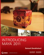
You’ll get a hands-on introduction to Maya’s Cartesian coordinate space in the tutorial in Chapter 2, “Jumping in Headfirst, with Both Feet,” where you’ll re-create the solar system with the Sun placed at the origin, the planets orbiting the World axis and rotating on their own Local axes, and moons orbiting the planets and also rotating (see Figure 1-3).
Figure 1-3: The Sun at the origin, Earth and other planets orbiting the World axis while rotating on their own axes, and the Moon orbiting Earth
Basic Design Concepts
Composition is all about how you lay out your scene and design your colors. Creating a dynamic frame that not only catches the eye but also informs and intrigues is itself an art form.
Some background in basic design is definitely helpful, and you’ll want to look at design books as you further your education in 3D. Understanding the fundamentals of layout and design makes for better-looking scenes and easier setup. The concepts presented here will get you started. Design theory may not seem specifically pertinent to CG right now, but recognizing that there is a logical system behind every pretty picture will help you progress, both as an artist and as an animator.
Form, Space, and Composition
Space is your canvas. Because your canvas ultimately will be a rendered image, your composition needs to fit within your rendered image frame. Whether that frame falls into a tiny web window or a huge IMAX screen, the basics of design always apply: how you arrange your forms and divide your space says a lot.
In the design lexicon, form means anything you can see; it has some sort of shape, color, or texture that distinguishes it from its frame. How your scene’s objects lie in the frame defines your composition. The space behind and between what is rendered out is the ground, or background plane. Objects become positive space, and the background becomes negative space.
To viewers, positive space tends to proceed forward from the frame, whereas negative space recedes. Playing with the position of positive and negative space greatly affects the dynamics of your frame.
Design a static frame in which the objects are all centered and evenly spaced, and your viewers will wonder why they’re looking at your composition. Arrange the composition so that your subjects occupy more interesting areas of the frame in which they play with negative space, and the eye is drawn all over the frame, creating a dynamic composition. This principle applies to still images as well as to animation.
In the tutorial in Chapter 10, you’ll use light and shadow to turn a still life of fruit into a dynamic and interestingly composed frame.
Balance and Symmetry
Balance in a frame suggests an even amount of positive space from one side of the frame to the other. A frame that is heavier on one side can create a more dynamic composition.
Symmetrical objects in a frame are mirrored from one side to another and create a certain static balance in the frame. An asymmetrical composition, therefore, denotes movement in the composition.
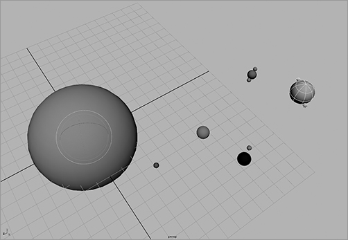
A popular technique used by painters, photographers, and cinematographers is called framing in thirds. With this technique, the frame is divided into a grid of thirds vertically and horizontally. Interesting parts of the frame, or focal points of the subjects, are placed at strategic locations in the grid. Placing your subject in the lower third makes it seem small or insignificant, static, or even boring. Placing it in the upper third makes the image more dynamic, magnifying its perceived scale or importance, and even tells a better story. Figure 1-4 illustrates the difference between a static, symmetric frame and a frame based on thirds.
Figure 1-4: A purely symmetrical frame looks static; the boy seems still with nowhere to go. Framing in thirds helps create or heighten a sense of motion, giving space for the boy to run.
Contrast
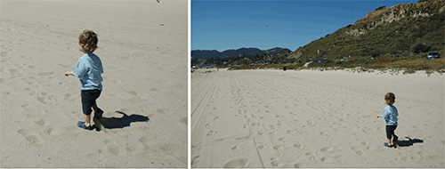
Contrast in design describes how much your foreground subject “pops” from the background. As you can see in Figure 1-5, when you create an area in your frame that contains little variation in color and light, the image seems flat and uneventful. Using dark shadows and light highlights increases the perceived depth in the image and helps pop out the subject from the background. Animating contrast can help increase or decrease the depth of your frame.
As you’ll see in Chapter 10, light plays an important role in creating dynamic contrasts within your frame.
Figure 1-5: With low contrast, the subject seems to disappear into the background. If you add shadows and highlights, the subject pops out.
Color
Your use of color also plays a big part in creating impact in your frame. As stated earlier, warm colors tend to advance toward you, and cooler colors seem to recede into the frame. Placing a warm color on a subject on a cool background creates a nice color contrast to help the dynamics of your frame.
Colors opposite each other on the color wheel are complementary colors and usually clash when put together. Using complementary colors can create a wide variation of contrast in your scene.
Narrative
A narrative film is a film that tells a story of a hero, called a protagonist, and that hero’s struggle against an antagonist. Even in the most abstract concept, there can be a perceived journey: a change that somehow occurs, even if it’s a change in the viewer as they view the imagery.
Convincing art creates a sense of change or arc for the audience. This adds an important dimension to your work. When the viewer feels you have something to say, your work becomes that much more touching.