Formatting Your Chart
You can quickly create an organization chart by using the default formatting options, or you can make modifications to a chart's text, colors, boxes, and lines.
Caution
Remember to consider readability and visual clarity when you modify an organization chart's defaults. Some formatting can enhance a chart's appearance, but too much formatting can make it confusing or worse—unreadable.
Tip
To copy formatting and apply it to another box or text area, select the area you want to copy and choose Edit, Copy Setup. Then select the new area to which you want to apply the formatting and choose Edit, Paste Setup (or Ctrl+V).
Formatting Text
The default text font is Arial, but you can modify this. Microsoft Organization Chart enables you to change the font, color, and alignment of organization chart text.
Caution
Because Microsoft Organization Chart is an external application, not all the PowerPoint formatting options apply. For example, Ctrl+B bolds text in PowerPoint, but doesn't have this same function in Organization Chart.
Changing Fonts
Choose Text, Font. The Font dialog box opens, shown in Figure 10.9.
Figure 10.9. Apply a variety of font formatting changes in this dialog box.
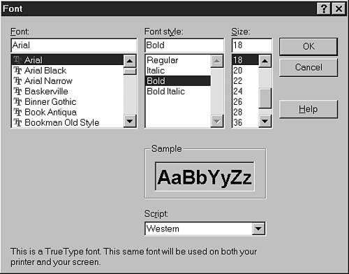
Select the new font from the Font drop-down list.
Select the new font style from the Font style drop-down list. Options include regular, bold, italic, and bold italic.
Select the new font size, ranging from 8 to 72 points.
Verify that Western is selected in the Script drop-down list. Other options such as Greek, Turkish, or Baltic won't display your text properly unless, of course, you are creating an organization chart in another language.
→ To learn how to deal with foreign language fonts, see "Using PowerPoint's Foreign Language Capabilities,"
Tip
The Sample box previews what your font changes look like in the chart.
Click OK to apply the font changes.
Changing Text Color
Select the text you want to change and choose Text, Color. The Color dialog box appears, shown in Figure 10.10.
Figure 10.10. The Color dialog box includes a wide variety of colors from which to choose.

Note
This Color dialog box isn't the same as the PowerPoint Colors dialog box, which provides many additional color choices.
Choose the new color from the available options and click OK. PowerPoint applies the new color.
→ For additional details on the use of color in your presentations, see "Using Color,"
Changing Text Alignment
By default, organization chart text is centered in each box. You can also left- or right-align this text if you want.
To left-align selected text, choose Text, Left. To right-align selected text, choose Text, Right. And to center selected text, choose Text, Center.
Note
You can only align text to the left, right, or center in Microsoft Organization Chart and not to the top, middle, or bottom.
Formatting Boxes
You can change the colors, shadowing, and borders on organization chart boxes.
Changing Box Fill Color
To change the fill color of selected boxes, choose Boxes, Color to display the Color dialog box (identical to the Color dialog box for text). Select the new color and click OK.
Tip
To change the fill color of the entire organization chart background, choose Chart, Background Color and select the appropriate color from the Color dialog box.
Applying a Box Shadow
If you want to add a shadow to selected boxes, choose Boxes, Shadow. Figure 10.11 shows the palette that displays. You can choose from seven different shadow options.
Figure 10.11. Choose a shadow option that fits your chart.

Tip
You can use a shadow and colors to differentiate between managers and staff, highlight teams or departments, and so forth.
Changing Box Borders
You can change the style, color, and line style of organization chart box borders.
To change the border style, select the boxes you wish to change and choose Boxes, Border Style. Figure 10.12 illustrates the border style palette that displays.
Figure 10.12. This palette enables you to choose the exact width and style of a border.

You can choose from a number of border styles—both single and double—ranging from hairline to thick widths.
To change the border color of selected boxes, choose Boxes, Border Color to open the Color dialog box. Select the new color and click OK to apply.
To change the border line style of selected boxes, choose Boxes, Border Line Style and select from the three options that display—a solid line, a broken line with wide spaces, and a broken line with narrow spaces.
Figure 10.13 illustrates an organization chart with border modifications.
Formatting Lines
Finally, you can format the lines that connect organization chart boxes.
Caution
These lines are not the same as the lines that frame box borders.
In Microsoft Organization Chart, select the chart you want to format by dragging the mouse to cover the entire chart area. Alternately, select the area of the chart you want to format.
Tip
Choose Edit, Select, All or press Ctrl+A to select the entire organization chart (except the chart title). You can also select specific areas of the chart from the Edit, Select menu as well.
To change the thickness of the connecting lines, choose Lines, Thickness and select from the options that display—from a thick line to no line at all.
To change the style of connecting lines, choose Lines, Style and select from the three options that display—a solid line, a broken line with wide spaces, and a broken line with narrow spaces.
To change the color of these lines, choose Lines, Color and select the appropriate color from the Color dialog box.
Figure 10.14 illustrates an organization chart with modifications to these connecting lines.
