Selecting a Chart Type
PowerPoint offers numerous chart types and chart subtypes for almost every kind of graphic representation you could want to create. Subtypes offer variations on the basic chart type, such as 3D options. PowerPoint includes the following basic chart types:
Column Creates vertical columns to compare the values of categories of data. Column, bar, and line charts work well if you want to compare values over a time period such as months or quarters. Figure 9.7 illustrates a sample column chart.
Figure 9.7. A column chart makes it easy to compare series of information.

Bar Creates horizontal bars to compare the values of categories of data.
Pie Creates a pie that analyzes percentages of a total number. Use a pie chart if you want to see the contribution of each item to a total. For example, you might want to see how much each line of items you sell contributed to total revenues for the year. Figure 9.8 displays an example of a pie chart.
Area Creates a chart displaying the trend of values in a single solid area.
Doughnut Creates a pie chart that can contain more than one series.
Radar Creates a radar image with markers for each data point.
Surface Creates a single 3D surface that analyzes trends in value.
Bubble Creates a comparison of three sets of values displayed as bubbles.
Figure 9.8. Use pie charts to show percentages of a total amount.

Stock Creates a chart displaying a stock's high, low, and close figures.
Cone Creates columns shaped like cones. Figure 9.9 shows a sample cone chart.
Note
To get a visual example of what each of these chart types looks like, you can select the type you want to learn more about in the Chart Type dialog box (Chart, Chart Type) and then click the Example of the selected chart type option from the Office Assistant that displays. This takes you to a Microsoft Graph Help window that provides details and examples of each chart type.
If you already know that you want to create a 3D clustered column chart, the PowerPoint default, you don't need to do anything to select a chart type. But if you want to use a different chart type, you should select it before you enter any data or make any other modifications.
To apply a new chart type, follow these steps:
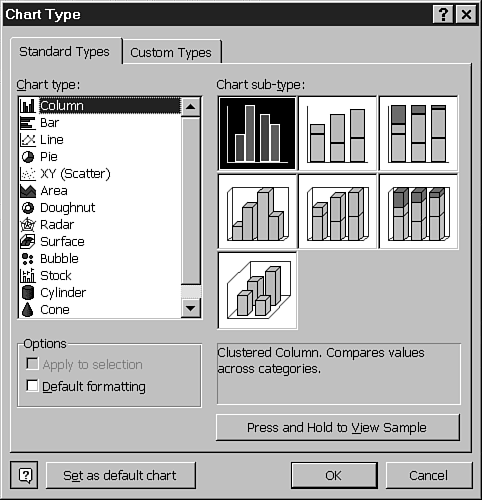
In Microsoft Graph, choose Chart, Chart Type from the menu. The Chart Type dialog box displays, as shown in Figure 9.10.
Tip
To quickly apply a new chart type, click the down arrow to the right of the Chart Type button on the Standard toolbar in Microsoft Graph. Choose from one of the chart type buttons on the palette that displays.
Figure 9.9. Use a cone chart as an alternative to a basic column or bar chart.

On the Standard Types tab, select the type of chart you want from the Chart Type list. A variety of subtypes appear in the Chart Sub-Type box.
Click the image of the subtype you want. The text box below provides detailed information about this subtype.
To preview what an actual chart of this type looks like, click the Press and Hold to View Sample button. A sample chart temporarily replaces the Chart Sub-Type box, as shown in Figure 9.11.
Figure 9.11. You can preview changes before making them.

If you want to change this to your default, select the Set as Default Chart button.
If none of the chart types in the Standard Types tab suits your needs, click the Custom Types tab to view more options. Figure 9.12 illustrates this tab.
Note
Custom charts include detailed formatting and some are customized specifically for a certain kind of output, such as onscreen presentations. The text box beneath the sample indicates these details.
Click the Built-In option button to display PowerPoint's ready-made custom charts.
Note
You can also add an active chart in your current presentation to the list of chart types. Simply select the User-Defined option button on the Custom Types tab, click the Add button, and enter details about this active chart to the Add Custom Chart Type dialog box that displays. Microsoft Graph adds this chart to its list of custom chart types.
Select the chart type you want to use from the Chart Type list. A sample displays in the Sample box.
Click OK to apply the chart type and return to your presentation.