
Luis Peso
Automotive Illustration
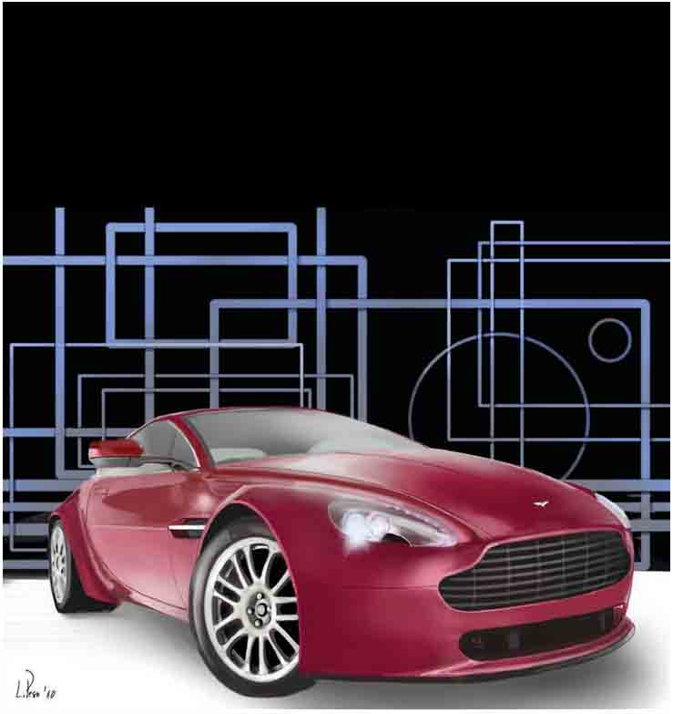
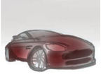
Aston Martin
LUIS PESO
Artist, Teacher
Granada, Spain
Master mobile artist Luis Peso trains his eye on a beautiful car and shows us why the iPad is his current tool of choice. Using the app “SketchBook Pro”, this tutorial takes us into the details of his creation.
Fingerpainting an Aston Martin with "Sketchbook Pro For IPAD"

Step 1
The main difference, of course, is the bigger screen. I made this rough sketch without the need of a zoom, while on the iPhone you must constantly zoom in and out to set every element in place.
Step 2
Here’s another great “SketchBook” feature you can enjoy while using the iPad: the layers’ blending modes. As I made the rough sketch, I wanted to start adding color, to help visualize the composition. On the iPhone, I had to add a layer and apply color over the sketch guide; with the iPad, I can set the new layer to Multiply and another one to Screen so I can add a dark (and light) base without affecting the sketch.
Color Layer #1 Set to Multiply

Color Layer #2 Set to Screen
Step 3
Working with the right mirror, where the tones are so evident, allows me to create the tonal palette I’ll sample from for the rest of the painting, making it more compact.

Below, we see the same palette as it looks expanded, after painting the whole car.

Step 4
“Sketchbook Pro” includes another great feature that we missed on “SketchBook Mobile”, the shape tool. I use it for the background and for the radiator of this Aston Martin:
- Add an oval, move it until it fits in the right position.
- Duplicate it, move the duplicate to the right position and merge these two layers.
- Duplicate this resulting layer and again move it into position.
- Merge again, duplicate, and keep doing this until you’re done.
- Then delete the rest of the circles (green marks) and you’ll have a great radiator.

Step 5
The bigger screen of the iPad, combined with the 2,500 percent zoom in “SketchBook Pro”, allows us to work the details in a very comfortable way. “SketchBook Pro for iPad” was designed to function on this device with a screen eight times larger than the iPhone, so obviously it’s easier to work this big. You spend a lot less time zooming in and out while working, but when you do need to zoom in on details, your abilities to create are extended to a new realm.

Step 6
This version of “SketchBook Pro for iPad” also allows you to block transparent pixels, which means that you will paint only over previously painted pixels, not outside them. Use this to add lights and shadows to the radiator, and the beautiful highlights this distinctive automobile should have, to finish the piece.
BY LUIS PESO
Artist, Teacher
Granada, Spain
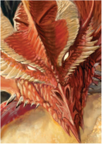
Luis Peso’s mobile art reaches a destination hard to grasp, with a level of detail and expertise usually reserved for a large canvas. Here, working on his iPhone, he explains his technique using the app “Brushes” and fashions a wonderful story that drives the process.


Step 1: Sketching
I always sketch with a normal brush at 1px, with the color almost black and almost opaque for a closer feeling of the traditional pencil look.
Step 2: Adding Color
I add color very roughly with a medium–big brush, just to see the overall look of the painting´s color, elements, and composition. Don´t worry about the details at this stage! Usually I start with a dark base and gradually add brightness. It´s essential to move up and down through the opacity and value sliders in the color menu.

Step 3: Detailing
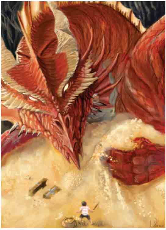
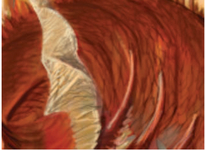
I have to be very sure where the light comes from to start shaping the dragon´s scales. The light affects the colors, so I add different red and orange tones. For the bright zones, I use a red almost white color with very low opacity, so I can control the amount of brightness stroke by stroke.
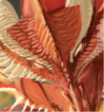
Working the Scales
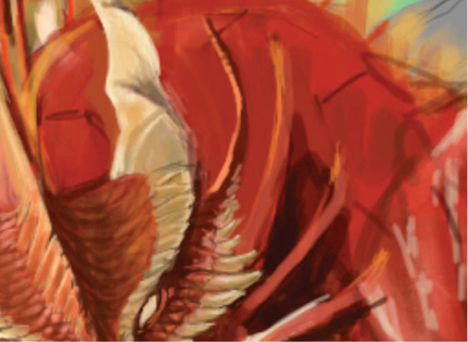
Giving Structure to the Body
Adding Scales to the Body
Finishing the Jaw
The detailed work is accomplished by zooming into each area of the image and working with small opaque brushes.

Step 4: The Kid, Smaller
I wanted to draw a dragon, but I thought, “What if, instead of the typical warrior fighting against the dragon, we present a thief child stealing the treasure . . . with a wooden sword?” What we know about dragons, reds in particular, is that they are very possessive about their treasure and they are sooo big. So I changed the size of the child to emphasize the dragon´s majesty . . . and the kid´s courage.
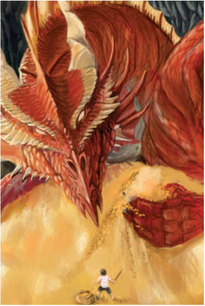
Step 5: Caring about the Treasure
To emphasize that the kid is really doing his job, I show the dragon protecting his treasure, as if in a defensive way.

Added more treasure!
Step 6: Final
Finally, I am happy with the result, not only with the way it looks but with what it conveys. I have created a giant and dangerous dragon that is really fearful of being robbed by a little kid armed with just a wooden sword. Funny, but epic at the same time. We have to keep dreaming . . .