 Viewing a matrix of scatterplots
by Luiz Felipe Martins, Magnus Vilhelm Persson, Ivan Idris, Martin Czygan, Phuong V
Python: End-to-end Data Analysis
Viewing a matrix of scatterplots
by Luiz Felipe Martins, Magnus Vilhelm Persson, Ivan Idris, Martin Czygan, Phuong V
Python: End-to-end Data Analysis
- Python: End-to-end Data Analysis
- Table of Contents
- Python: End-to-end Data Analysis
- Python: End-to-end Data Analysis
- Credits
- Preface
- 1. Module 1
- 1. Introducing Data Analysis and Libraries
- 2. NumPy Arrays and Vectorized Computation
- 3. Data Analysis with Pandas
- 4. Data Visualization
- 5. Time Series
- 6. Interacting with Databases
- 7. Data Analysis Application Examples
- 8. Machine Learning Models with scikit-learn
- 2. Module 2
- 1. Laying the Foundation for Reproducible Data Analysis
- Introduction
- Setting up Anaconda
- Installing the Data Science Toolbox
- Creating a virtual environment with virtualenv and virtualenvwrapper
- Sandboxing Python applications with Docker images
- Keeping track of package versions and history in IPython Notebook
- Configuring IPython
- Learning to log for robust error checking
- Unit testing your code
- Configuring pandas
- Configuring matplotlib
- Seeding random number generators and NumPy print options
- Standardizing reports, code style, and data access
- 2. Creating Attractive Data Visualizations
- Introduction
- Graphing Anscombe's quartet
- Choosing seaborn color palettes
- Choosing matplotlib color maps
- Interacting with IPython Notebook widgets
- Viewing a matrix of scatterplots
- Visualizing with d3.js via mpld3
- Creating heatmaps
- Combining box plots and kernel density plots with violin plots
- Visualizing network graphs with hive plots
- Displaying geographical maps
- Using ggplot2-like plots
- Highlighting data points with influence plots
- 3. Statistical Data Analysis and Probability
- Introduction
- Fitting data to the exponential distribution
- Fitting aggregated data to the gamma distribution
- Fitting aggregated counts to the Poisson distribution
- Determining bias
- Estimating kernel density
- Determining confidence intervals for mean, variance, and standard deviation
- Sampling with probability weights
- Exploring extreme values
- Correlating variables with Pearson's correlation
- Correlating variables with the Spearman rank correlation
- Correlating a binary and a continuous variable with the point biserial correlation
- Evaluating relations between variables with ANOVA
- 4. Dealing with Data and Numerical Issues
- Introduction
- Clipping and filtering outliers
- Winsorizing data
- Measuring central tendency of noisy data
- Normalizing with the Box-Cox transformation
- Transforming data with the power ladder
- Transforming data with logarithms
- Rebinning data
- Applying logit() to transform proportions
- Fitting a robust linear model
- Taking variance into account with weighted least squares
- Using arbitrary precision for optimization
- Using arbitrary precision for linear algebra
- 5. Web Mining, Databases, and Big Data
- Introduction
- Simulating web browsing
- Scraping the Web
- Dealing with non-ASCII text and HTML entities
- Implementing association tables
- Setting up database migration scripts
- Adding a table column to an existing table
- Adding indices after table creation
- Setting up a test web server
- Implementing a star schema with fact and dimension tables
- Using HDFS
- Setting up Spark
- Clustering data with Spark
- 6. Signal Processing and Timeseries
- Introduction
- Spectral analysis with periodograms
- Estimating power spectral density with the Welch method
- Analyzing peaks
- Measuring phase synchronization
- Exponential smoothing
- Evaluating smoothing
- Using the Lomb-Scargle periodogram
- Analyzing the frequency spectrum of audio
- Analyzing signals with the discrete cosine transform
- Block bootstrapping time series data
- Moving block bootstrapping time series data
- Applying the discrete wavelet transform
- 7. Selecting Stocks with Financial Data Analysis
- Introduction
- Computing simple and log returns
- Ranking stocks with the Sharpe ratio and liquidity
- Ranking stocks with the Calmar and Sortino ratios
- Analyzing returns statistics
- Correlating individual stocks with the broader market
- Exploring risk and return
- Examining the market with the non-parametric runs test
- Testing for random walks
- Determining market efficiency with autoregressive models
- Creating tables for a stock prices database
- Populating the stock prices database
- Optimizing an equal weights two-asset portfolio
- 8. Text Mining and Social Network Analysis
- Introduction
- Creating a categorized corpus
- Tokenizing news articles in sentences and words
- Stemming, lemmatizing, filtering, and TF-IDF scores
- Recognizing named entities
- Extracting topics with non-negative matrix factorization
- Implementing a basic terms database
- Computing social network density
- Calculating social network closeness centrality
- Determining the betweenness centrality
- Estimating the average clustering coefficient
- Calculating the assortativity coefficient of a graph
- Getting the clique number of a graph
- Creating a document graph with cosine similarity
- 9. Ensemble Learning and Dimensionality Reduction
- Introduction
- Recursively eliminating features
- Applying principal component analysis for dimension reduction
- Applying linear discriminant analysis for dimension reduction
- Stacking and majority voting for multiple models
- Learning with random forests
- Fitting noisy data with the RANSAC algorithm
- Bagging to improve results
- Boosting for better learning
- Nesting cross-validation
- Reusing models with joblib
- Hierarchically clustering data
- Taking a Theano tour
- 10. Evaluating Classifiers, Regressors, and Clusters
- Introduction
- Getting classification straight with the confusion matrix
- Computing precision, recall, and F1-score
- Examining a receiver operating characteristic and the area under a curve
- Visualizing the goodness of fit
- Computing MSE and median absolute error
- Evaluating clusters with the mean silhouette coefficient
- Comparing results with a dummy classifier
- Determining MAPE and MPE
- Comparing with a dummy regressor
- Calculating the mean absolute error and the residual sum of squares
- Examining the kappa of classification
- Taking a look at the Matthews correlation coefficient
- 11. Analyzing Images
- Introduction
- Setting up OpenCV
- Applying Scale-Invariant Feature Transform (SIFT)
- Detecting features with SURF
- Quantizing colors
- Denoising images
- Extracting patches from an image
- Detecting faces with Haar cascades
- Searching for bright stars
- Extracting metadata from images
- Extracting texture features from images
- Applying hierarchical clustering on images
- Segmenting images with spectral clustering
- 12. Parallelism and Performance
- Introduction
- Just-in-time compiling with Numba
- Speeding up numerical expressions with Numexpr
- Running multiple threads with the threading module
- Launching multiple tasks with the concurrent.futures module
- Accessing resources asynchronously with the asyncio module
- Distributed processing with execnet
- Profiling memory usage
- Calculating the mean, variance, skewness, and kurtosis on the fly
- Caching with a least recently used cache
- Caching HTTP requests
- Streaming counting with the Count-min sketch
- Harnessing the power of the GPU with OpenCL
- A. Glossary
- B. Function Reference
- C. Online Resources
- D. Tips and Tricks for Command-Line and Miscellaneous Tools
- 1. Laying the Foundation for Reproducible Data Analysis
- 3. Module 3
- 1. Tools of the Trade
- 2. Exploring Data
- 3. Learning About Models
- 4. Regression
- 5. Clustering
- 6. Bayesian Methods
- 7. Supervised and Unsupervised Learning
- 8. Time Series Analysis
- E. More on Jupyter Notebook and matplotlib Styles
- A. Bibliography
- Index
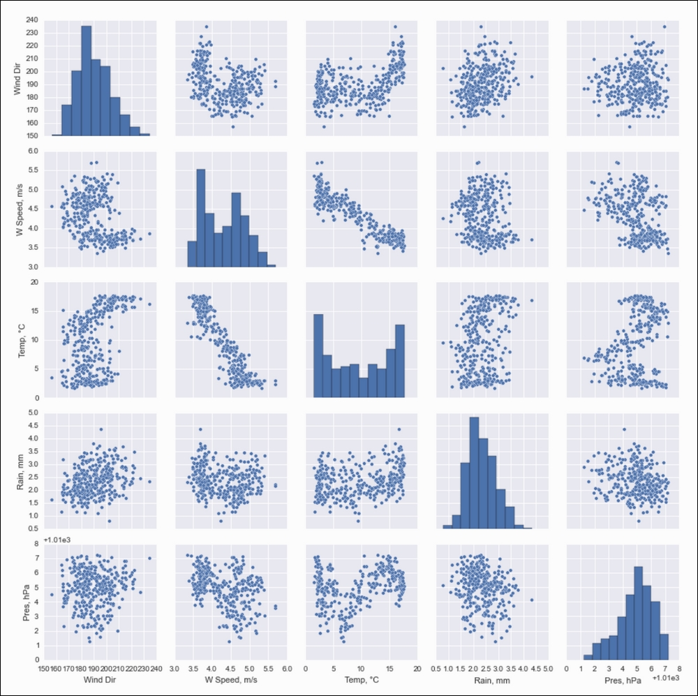
If you don't have many variables in your dataset, it is a good idea to view all the possible scatterplots for your data. You can do this with one function call from either seaborn or pandas. These functions display a matrix of plots with kernel density estimation plots or histograms on the diagonal.
- Imports the following:
import pandas as pd
from dautil import data
from dautil import ts
import matplotlib.pyplot as plt
import seaborn as sns
import matplotlib as mpl
- Load the weather data with the following lines:
df = data.Weather.load()
df = ts.groupby_yday(df).mean()
df.columns = [data.Weather.get_header(c) for c in df.columns]
- Plot with the Seaborn
pairplot()function, which plots histograms on the diagonal by default:%matplotlib inline # Seaborn plotting, issues due to NaNs sns.pairplot(df.fillna(0))
The following plots are the result:
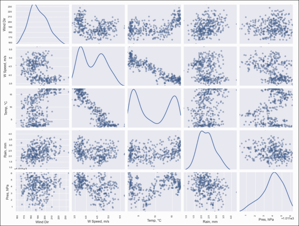
- Plot similarly with the pandas
scatter_matrix()function and request kernel density estimation plots on the diagonal:sns.set({'figure.figsize': '16, 12'}) mpl.rcParams['axes.linewidth'] = 9 mpl.rcParams['lines.linewidth'] = 2 plots = pd.scatter_matrix(df, marker='o', diagonal='kde') plt.show()
Refer to the following plots for the end result:
The complete code is available in the scatter_matrix.ipynb file in this book's code bundle.
-
No Comment
..................Content has been hidden....................
You can't read the all page of ebook, please click here login for view all page.