
In time series, there are mainly four different patterns or components:
- Trend: A slow but significant change of the values over time
- Season: A change that is cyclical and has a period of less than one year
- Cycle: A change that is cyclical and has a period of longer than one year
- Random: A component that is random; the best model for purely random data is the mean, given that it has a distribution corresponding to the normal distribution
Thus, before we can analyze our data, it needs to be stationary, and for it to be stationary, we need to take care of the patterns: trend, season, and cycle. The analysis that you will perform will be on part of the time series that does not fit into any of these patterns, with the random component being part of the uncertainty of the model.
One method of taking care of the various components and making the time series stationary is decomposing. There are different ways of identifying the components; in statsmodels, there is a function to decompose all of them in one go. So let's import it and run our time series through it:
from statsmodels.tsa.seasonal import seasonal_decompose
carsales_decomp = seasonal_decompose(carsales, freq=12)
The function takes a frequency as input; this relates to the season so input the seasonal period that you think your data has. In this case, I took 12 as, by looking at the data, it seems like a yearly period. The returned object contains several attributes that are Pandas Series, so let's extract them from the returned object:
carsales_trend = carsales_decomp.trend
carsales_seasonal = carsales_decomp.seasonal
carsales_residual = carsales_decomp.resid
To visualize what these different components are now, we plot them in a figure:
def change_plot(ax):
    despine(ax)
    ax.locator_params(axis='y', nbins=5)
    plt.setp(ax.get_xticklabels(), rotation=90, ha='center')

plt.figure(figsize=(9,4.5))

plt.subplot(221)
plt.plot(carsales, color='Green')
change_plot(plt.gca())
plt.title('Sales', color='Green')
xl = plt.xlim()
yl = plt.ylim()

plt.subplot(222)
plt.plot(carsales.index,carsales_trend,
         color='Coral')
change_plot(plt.gca())
plt.title('Trend', color='Coral')
plt.gca().yaxis.tick_right()
plt.gca().yaxis.set_label_position("right")
plt.xlim(xl)
plt.ylim(yl)

plt.subplot(223)
plt.plot(carsales.index,carsales_seasonal,
         color='SteelBlue')
change_plot(plt.gca())
plt.gca().xaxis.tick_top()
plt.gca().xaxis.set_major_formatter(plt.NullFormatter())
plt.xlabel('Seasonality', color='SteelBlue', labelpad=-20)
plt.xlim(xl)
plt.ylim((-8000,8000))

plt.subplot(224)
plt.plot(carsales.index,carsales_residual,
         color='IndianRed')
change_plot(plt.gca())
plt.xlim(xl)
plt.gca().yaxis.tick_right()
plt.gca().yaxis.set_label_position("right")
plt.gca().xaxis.tick_top()
plt.gca().xaxis.set_major_formatter(plt.NullFormatter())
plt.ylim((-8000,8000))
plt.xlabel('Residuals', color='IndianRed', labelpad=-20)

plt.tight_layout()
plt.subplots_adjust(hspace=0.55)
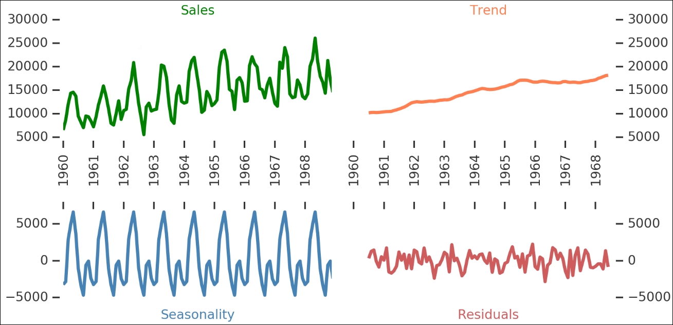
Here, we can see all the different components—the raw sales are shown on the upper left, while the general trend of the data is shown on the upper right. The identified seasonality is on the lower left and the residuals after breaking these two out is on the lower right. The seasonal component has multiple periodic peaks. This seasonal component is really interesting as it accounts for a majority of the annual variation in sales. Let's take a closer look at it by plotting the detrended data (that is, the trend subtracted off the raw sales figures) and seasonality changes (during one year):
fig = plt.figure(figsize=(7,1.5) )

ax1 = fig.add_axes([0.1,0.1,0.6,0.9])
ax1.plot(carsales-carsales_trend,
         color='Green', label='Detrended data')
ax1.plot(carsales_seasonal,
         color='Coral', label='Seasonal component')
kwrds=dict(lw=1.5, color='0.6', alpha=0.8)
d1 = pd.datetime(1960,9,1)
dd = pd.Timedelta('365 Days')
[ax1.axvline(d1+dd*i, dashes=(3,5),**kwrds) for i in range(9)]
d2 = pd.datetime(1960,5,1)
[ax1.axvline(d2+dd*i, dashes=(2,2),**kwrds) for i in range(9)]
ax1.set_ylim((-12000,10000))

ax1.locator_params(axis='y', nbins=4)
ax1.set_xlabel('Year')
ax1.set_title('Sales Seasonality')
ax1.set_ylabel('Sales')
ax1.legend(loc=0, ncol=2, frameon=True);

ax2 = fig.add_axes([0.8,0.1,0.4,0.9])
ax2.plot(carsales_seasonal['1960':'1960'],
         color='Coral', label='Seasonal component')
ax2.set_ylim((-12000,10000))
[ax2.axvline(d1+dd*i, dashes=(3,5),**kwrds) for i in range(1)]
d2 = pd.datetime(1960,5,1)
[ax2.axvline(d2+dd*i, dashes=(2,2),**kwrds) for i in range(1)]
despine([ax1, ax2])

import matplotlib.dates as mpldates
yrsfmt = mpldates.DateFormatter('%b')
ax2.xaxis.set_major_formatter(yrsfmt)
labels = ax2.get_xticklabels()
plt.setp(labels, rotation=90);
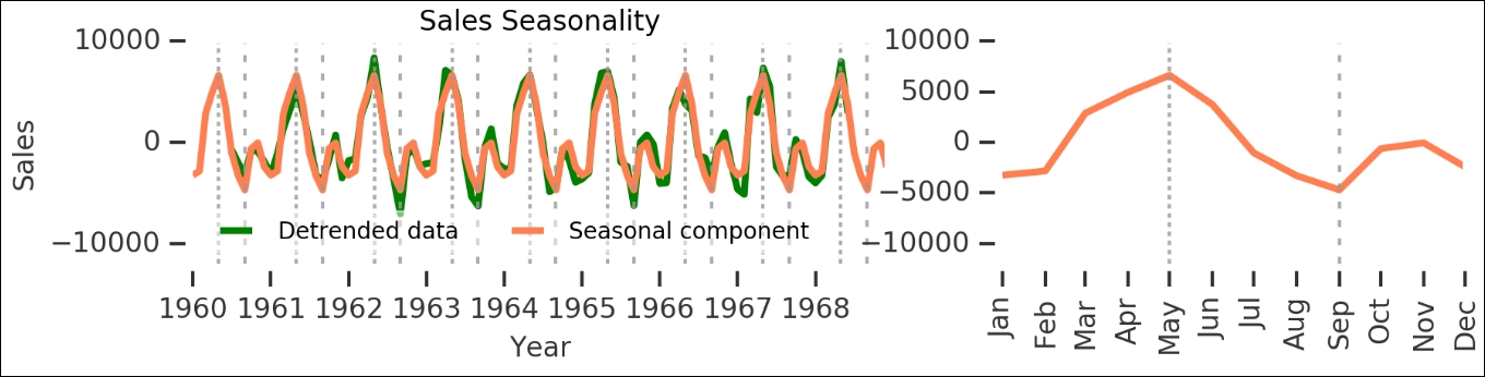
As you can see here, the seasonal component is really significant. While this is rather obvious for this dataset, it is a good start in time series analysis when you can break the data up into pieces like this, and it gives a wealth of insight into what is happening. Let's save this seasonal component for one year:
carsales_seasonal_component = carsales_seasonal['1960'].values
The residuals, which are left after subtracting the trend and seasonality, should now be stationary, right? They look like they are stationary. Let's check with our wrapper function. To do this, we first need to get rid of NaN values:
carsales_residual.dropna(inplace=True)
is_stationary(carsales_residual.dropna());
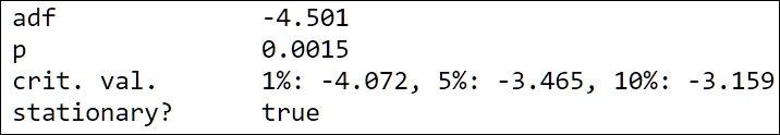
It is now stationary; this would mean that we can continue to analyze the time series and start modeling it. There are some possible bugs in the current version of statsmodels when trying to re-include the seasonal and trend components in the models of the residuals. Due to this, we have tried to do it in a different way.
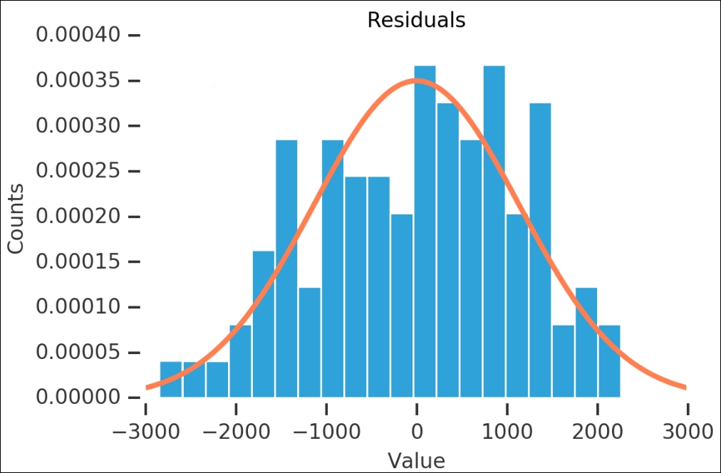
Before we start making the time series models, I want to look a bit more at the residuals. We can use what we have learned in the first few chapters and check whether the residuals are normally distributed. First, we plot the histogram for the values and overplot a fitted Gaussian probability density distribution:
loc, shape = st.norm.fit(carsales_residual)
x=range(-3000,3000)
y = st.norm.pdf(x, loc, shape)
n, bins, patches = plt.hist(carsales_residual, bins=20, normed=True)
plt.plot(x,y, color='Coral')
despine(plt.gca())
plt.title('Residuals')
plt.xlabel('Value'), plt.ylabel('Counts'),
Another check that we used was the probability plot, so let's run it on this as well. However, instead of letting it plot the figure, as we did previously, we will do it ourselves. To do this, we catch the output of probplot() and do not give it any axes or plotting functions as input. After we get the variables, we just plot them and a line with the given coefficients:
(osm,osr), (slope, intercept, r) = st.probplot(carsales_residual,
                                               dist='norm', fit=True)
line_func = lambda x: slope*x + intercept
plt.plot(osm,osr,
         '.', label='Data', color='Coral')
plt.plot(osm, line_func(osm),
         color='SteelBlue',
         dashes=(20,5), label='Fit')
plt.xlabel('Quantiles'), plt.ylabel('Ordered Values')
despine(plt.gca())
plt.text(1, -14, 'R$^2$={0:.3f}'.format(r))
plt.title('Probability Plot')
plt.legend(loc='best', numpoints=4, handlelength=4);
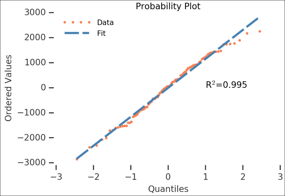
The residuals look like they are normally distributed—the high R2 value also shows that it is statistically significant. Now that we have checked the residuals of the automatic decomposition, we can go over to the next method of making the data stationary.
With differencing, we simply take the difference between two adjacent values. To do this, there is a convenient diff() method in Pandas. The following plot shows you the difference with the data shifted by one period:
carsales.diff(1).plot(label='1 period', title='Carsales')
plt.legend(loc='best')
despine(plt.gca())
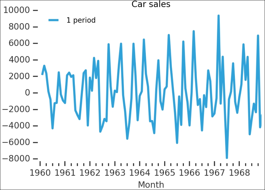
Remember that this is on the raw data—the data with the strong trend and seasonality. While the trend has disappeared, it seems that some of the seasonality is still there; however, let's check whether this is a stationary time series:
is_stationary(carsales.diff(1).dropna())
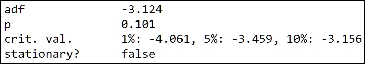
No, the p-value is higher than 0.05 and the ADF value is higher than at least 5%, so we cannot reject the null hypothesis. Let's run diff() again, but with both 1 and 12 periods (that is, 12 months, one year):
carsales.diff(1).plot(label='1 period', title='Carsales',
                      dashes=(15,5))
carsales.diff(1).diff(12).plot(label='1 and 12 period(s)',
                               color='Coral')
plt.legend(loc='best')
despine(plt.gca())
plt.xlabel('Date')
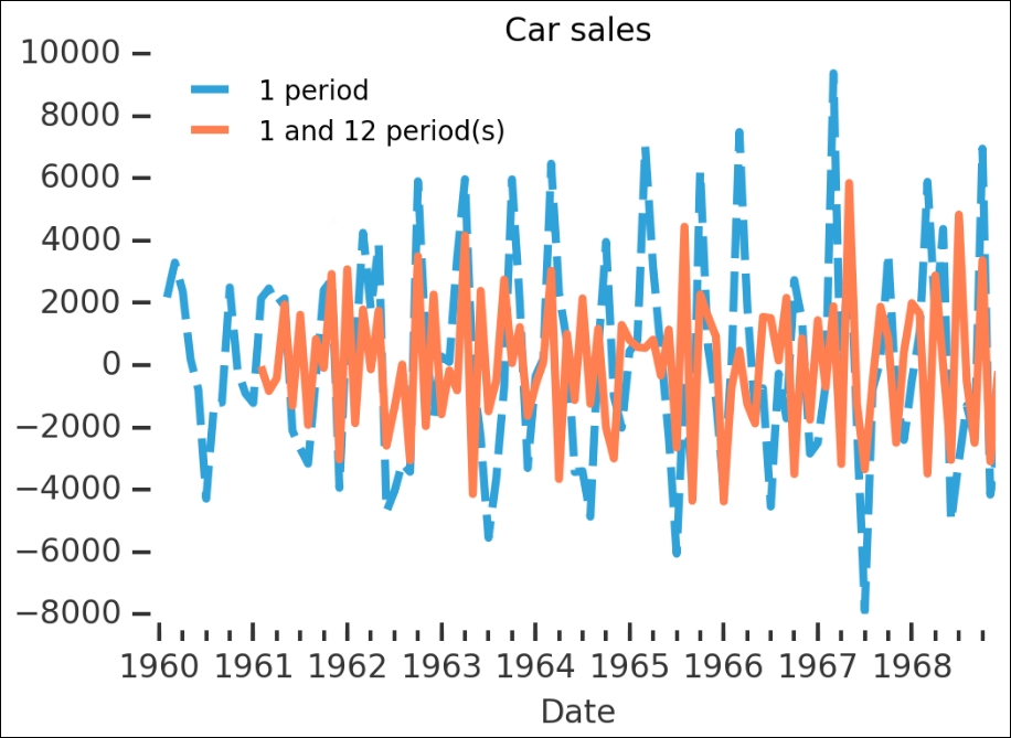
It is very hard to judge from this whether it is more or less stationary. We have to run the wrapper on the output to check:
is_stationary(carsales.diff(1).diff(12).dropna());

This is much better; we seem to have gotten rid of the seasonal and trend components.
I encourage you to use the first example dataset and check some of the things that we covered in this section. How do the various cyclic/seasonal components decompose? What values do you have to use for it to work? In the next section, we will go through some of the general models for time series and how they are used in statsmodels.