
In the previous chapter, when discussing visual representations of numerical data, we introduced histograms, which represent the way the data is distributed across a number of intervals. One of the drawbacks of histograms is that the number of bins is always chosen somewhat arbitrarily, and incorrect choices may give useless or misleading information about the distribution of the data.
We say that histograms abstract some of the characteristics of the data. That is, a histogram allows us to ignore some of the fine-grained variability in the data so that general patterns are more apparent.
Abstraction is, in general, a good thing when analyzing a dataset but we would like to have an accurate representation of all data points that is visually compelling and computationally useful. This is provided by the cumulative distribution function. This function has always been important for statistical computations, and cumulative distribution tables were in fact an essential tool before the advent of the computer. However, as a graphical tool, the cumulative distribution function is not usually emphasized in introductory statistics texts. In my opinion, this is partly due to a historical bias as it is unwieldy to draw a cumulative distribution function without the aid of a computer.
To give a concrete example, let's first generate a set of random values following a Normal distribution with the following code segment:
mean = 0
sdev = 1
nvalues = 10
norm_variate = mean + sdev * rnd.randn(nvalues)
print(norm_variate)
In this code, we use the NumPy numpy.random module (abbreviated as rnd) to generate the randomized values. The documentation for the random module can be found at
http://docs.scipy.org
. Specifically, we use the randn() function, which generates normally distributed pseudorandom numbers with mean 0 and variance 1, then we move the distribution to the mean through addition and widen the distribution by sdev through multiplication. This function takes the number of values that we want as an argument, which we stored in the nvalues variable.
Note
Notice that we use the term pseudorandom. When generating the random numbers, the computer actually uses a formula that produces values that are distributed, approximately, according to a given distribution. These values cannot be truly random as they are generated by a deterministic formula. It is possible to use sources of true randomness, as provided, for instance, by the site https://www.random.org/ . However, pseudorandom numbers are usually sufficient for computer simulations and most data analysis problems.
The result is stored in the norm_variates variable, which is a NumPy array. We can pretend that the numbers represent the offset in grams from the target weight for a 10 gram package of saffron, perhaps to make more sense of the numbers. This would mean that -0.1 means that the package contains 0.1 gram less saffron than it should and +0.2 means that it contains more saffron than it should.
Running this cell will produce an array containing 10 numbers. Running the code with more values, say 100 (that is, nvalues=100), would produce a distribution that follows a normal distribution more closely. This array should follow, approximately, a Normal distribution with a mean 0 and standard deviation of 1. Values that result from the sampling from a random variable, for example, the values in the norm_variate array, are called random variates. The cumulative distribution function of a dataset is, by definition, a function that, given a value of x, returns the number of data points that do not exceed x, normalized to the range from 0 to 1. To give a concrete example, let's sort the values we generated previously and print them using the following code:
for i, v in enumerate(sorted(norm_variates), start=1):
    print('{0:2d} {1:+.4f}'.format(i, v))
This code uses a for loop structure to iterate over the sorted list of random variates. We use enumerate(), which provides a Python iterator that returns both the index i and corresponding value v from the list in each iteration. The start=1 parameter causes the iteration number to start at 1. Then, for each pair, i and v are printed. In the print statement, we use format specifiers, which are the expressions enclosed by curly brackets,{...}. In this example, {0:2d} specifies that i is printed as a 2-digit decimal value and {1:+.4f} specifies that v is printed as assigned float value with four digits of precision. As a result, we obtain a sorted list of the data, numbered from 1.
The values obtained by me are as follows:
 1 -0.1412
 2 +0.6152
 3 +0.6852
 4 +2.2946
 5 +3.2791
 6 +3.4699
 7 +3.6961
 8 +4.2375
 9 +4.4977
10 +5.3756
From this list, it is easy to compute values of the cumulative distribution function. Consider the value 2.2946, for example. There are four data points that are less than or equal to the given value: -0.1412, 0.6152, 0.6852, and 2.2946 itself. We now divide the number of values, 4, by the number of points so that the result is between 0 and 1. So, the value of the cumulative distribution function is 4/10=0.4 for these 10 values. In terms of a mathematical expression, we write the following:
It is common practice to abbreviate cumulative distribution function by cdf, and we will do so from now on.
An important point to notice is that the cdf is not defined only at values in the dataset. In fact, it is defined for any numeric value whatsoever! Let's suppose, for example, that we want to find the value of the cdf at x=2.5. Notice that the number 2.5 is between the fourth and fifth values in the dataset, so there are still four data values less than or equal to 2.5. As a consequence, the value of the function at 2.5 is also 4/10=0.4. In fact, it can be seen that, for all numbers between 2.2946 and 3.2791, the cdf will have the value 0.4.
Thinking a little bit about this process, we can infer the following behavior for a cdf: it remains constant (that is, flat) between values in the dataset. At each data value, the function will jump, the size of the jump being the reciprocal of the number of data points. This is illustrated in the following figure:
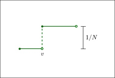
In the preceding figure, v is a point in the dataset and the graph displays the cdf in the neighborhood of v. Notice the flat intervals between the data points and the jump exactly at the data point v. The filled circle at the discontinuity indicates the value of the function at that point. These are characteristics of any cumulative distribution function for a discrete dataset.
Let's now define a Python function that can be used to plot the graph of a cdf. This is done with the following code:
def plot_cdf(data, plot_range=None, scale_to=None, **kwargs):
num_bins = len(data)
sorted_data = np.array(sorted(data), dtype=np.float64)
   data_range = sorted_data[-1] - sorted_data[0]
   coutns, bin_edges = np.histogram(sorted_data, bins=num_bins)
xvalues = bin_edges[:1]
yvalues = np.cumsum(counts)
if plot_range is None:
        xmin = sorted_data[0]
        xmax = sorted_data[-1]
    else:
        xmin, xmax = plot_range
   #pad the arrays
  xvalues = np.concatenate([[xmin, xvalues[0]], xvalues, [xmax]])
  yvalues = np.concatenate([[0.0, 0.0], yvalues, [yvalues.max()]])
    if scale_to is not None:
        yvalues = yvalues / len(data) * scale_to
  plt.axis([xmin, xmax, 0, yvalues.max()])
   return plt.plot(xvalues, yvalues, **kwargs)
Notice that running this code will not produce any output as we are simply defining the plot_cdf() function. The code is somewhat complex, but all we are doing is defining lists of points stored in the xvalues and yvalues arrays. These values are the leading edge of the staircase and the height of the specific step. The plt.step() function plots these in a step plot. We use NumPy's concatenate() function to pad the array, in the start with zeroes, and in the end with the maximum (or last) value of the array. To plot the cdf for a dataset, we can run the following code:
nvalues = 20
norm_variates = rnd.randn(nvalues)
plot_cdf(norm_variates, plot_range=[-3,3], scale_to=1.0,
         lw=2.5, color='Brown')
for v in [0.25, 0.5, 0.75]:
    plt.axhline(v, lw=1, ls='--', color='black')
In this code, we first generate a new set of data values. Then, we call the plot_cdf() function to generate the graph. The arguments of the function call are plot_range, specifying the range in the x axis, and scale_to, which specifies that we want the values (y axis) to be normalized from 0 to 1. The remaining arguments to the plot_cdf() function are passed to the Pyplot function, plot(). In this example, we set the line width with the lw=2.5 option and line color with the color="Brown" option.
Running this code will produce an image similar to the following one:
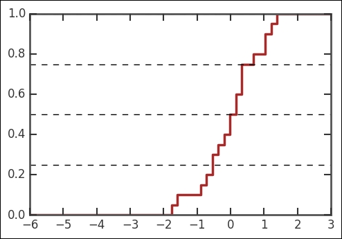
The graph obtained by you will be somewhat different as the data is randomly generated. In the preceding figure, we also draw horizontal lines at yvalues 0.25,0.5, and 0.75. These correspond, respectively, to the first quartile, median, and third quartile in the data. Looking at the corresponding values in the x axis, we see that these values correspond approximately to -0.5, 0, and 0.5. This makes sense as the actual values for a theoretical Normal distribution are -0.68, 0.0, and 0.68. Notice that we do not expect to recover these values exactly due to randomness and the small size of the sample.
Now, I invite you to perform the following experiment. Increase the number of values in the dataset by changing the value of the nvalues variable in the preceding code, and run the cell again. It will be noticed that, as the number of data values increases, the curve becomes smoother and converges toward an S-shaped curve, symmetric about its center. Also notice that the quartiles and median will tend to approach the theoretical values for the Normal distribution, -0.68, 0.0, and 0.68. As we will see in the next section, these are some of the characteristics of the standard Normal distribution.
Let's investigate the cdf for a realistic dataset. The housefly-wing-lengths.txt file contains wing lengths in tenths of a millimeter for a small sample of houseflies. The data is from a 1968 paper by Sokal, R. R., and Rohlf, J. R. in the journal Biometry (page 109) and a 1955 paper by Sokal, R. R. and P.E. Hunter in the journal Annual Entomol. Soc. America (Volume 48, page 499). The data is also available online at http://www.seattlecentral.edu/qelp/sets/057/057.html.
To read the data, make sure that the housefly-wing-lengths.txt file is in the same directory as the Jupyter Notebook, and then run the following code segment:
wing_lengths = np.fromfile('data/housefly-wing-lengths.txt',
                           sep='
', dtype=np.int64)
print(wing_lengths)
This dataset is in a plain text file with one value per line, so we simply use NumPy's fromfile() function to load the data into an array, which we name wing_lengths. The sep='
' option tells NumPy that this is a text file, with values separated by the new line character,
. Finally, the dtype=np.int64 option specifies that we want to treat the values as integers. The dataset is so small that we can print all the points, which we do by repeating the wing_lengths array name at the end of the cell.
Let's now generate a plot of the cdf for this data by running the following code in a cell:
plot_cdf(wing_lengths, plot_range=[30, 60],
         scale_to=100, lw=2)
plt.grid(lw=1)
plt.xlabel('Housefly wing length (x.1mm)', fontsize=18)
plt.ylabel('Percent', fontsize=18);
We, again, use the plot_cdf() function that was previously defined. Notice that now we use scale_to=100 so that, instead of proportions, we can read a percentage in the vertical axis. We also add a grid and axis labels to the plot. We obtain the following plot:

Notice that the cdf has, roughly, the same symmetric S-shaped pattern that we observed before. This indicates that a Normal distribution might be an adequate model for this data. It is, indeed, the case that this data fits a Normal distribution quite closely.
Just as an example of the kind of information that can be extracted from this plot, let's suppose that we want to design a net that will catch 80% of the flies. That is, the mesh should allow only flies with a wing length in the bottom 20% to pass. From the preceding graph, we can see that the 20th percentile corresponds to a wing length of about 42 tenths of a millimeter. This is not intended to be a realistic application and if we were really building this net, we would probably want to do a more careful analysis, but it shows how we can get information about the data quickly from a cumulative distribution plot.