
With Bayesian analysis, we can fit any model; anything that we can do with frequentist or classical statistics, we can do with Bayesian statistics. In this next example, we will perform linear regression with both Bayesian inference and frequentist approaches. As we have covered the model creation and date parsing, we will go through things a little bit more quickly in this example. The data that we are going to use is the atmospheric CO2 over a span of about 1,000 years and the growth rate over the past 40 years, and then fit a linear function to the growth rate over the past 50-60 years.
The data for the last 50-60 years is from National Oceanic and Atmospheric Administration (NOAA) marine stations, surface sites. It can be found at http://www.esrl.noaa.gov/gmd/ccgg/trends/global.html , where you can download two datasets, growth rates, and annual means. The direct links to the data tables are ftp://aftp.cmdl.noaa.gov/products/trends/co2/co2_gr_gl.txt for the growth rates (that is, gr) and ftp://aftp.cmdl.noaa.gov/products/trends/co2/co2_annmean_gl.txt for the global means (annual in this case). The data reference is Ed Dlugokencky and Pieter Tans, NOAA/ESRL ( hhtp://www.esrl.noaa.gov/gmd/ccgg/trends/ ).
To go further back, we need ice core samples from the South Pole, the SIPLE station ice core that goes about 200 years into the past. At http://cdiac.ornl.gov/trends/co2/siple.html , there is more information and a direct link to the data, http://cdiac.ornl.gov/ftp/trends/co2/siple2.013 . The data reference is Neftel,A., H. Friedli, E. Moor, H. Lötscher, H. Oeschger, U. Siegenthaler, and B. Stauffer, 1994. Historical CO2 record from the Siple Station ice core. In Trends: A Compendium of Data on Global Change. Carbon Dioxide Information Analysis Center, Oak Ridge National Laboratory, U.S. Department of Energy, Oak Ridge, Tenn., U.S.A. For data even further back, a 1,000 years, we use ice cores from the Law Dome; more information can be found at http://cdiac.ornl.gov/trends/co2/lawdome.html with a direct link to the data, http://cdiac.ornl.gov/ftp/trends/co2/lawdome.smoothed.yr75 , and the reference is D.M. Etheridge, L.P. Steele, R.L. Langenfelds, R.J. Francey, J.-M. Barnola, and V.I. Morgan, 1998. Historical CO2 records from the Law Dome DE08, DE08-2, and DSS ice cores. In Trends: A Compendium of Data on Global Change. Carbon Dioxide Information Analysis Center, Oak Ridge National Laboratory, U.S. Department of Energy, Oak Ridge, Tenn., U.S.A.
As we have done a few times now, we read in the data with the Pandas csv reader:
co2_gr = pd.read_csv('data/co2_gr_gl.txt',
                  delim_whitespace=True,
                 skiprows=62,
                 names=['year', 'rate', 'err'])
co2_now = pd.read_csv('data/co2_annmean_gl.txt',
                  delim_whitespace=True,
                 skiprows=57,
                 names=['year', 'co2', 'err'])
co2_200 = pd.read_csv('data/siple2.013.dat',
                  delim_whitespace=True,
                 skiprows=36,
                 names=['depth', 'year', 'co2'])
co2_1000 = pd.read_csv('data/lawdome.smoothed.yr75.dat',
                  delim_whitespace=True,
                 skiprows=22,
                 names=['year', 'co2'])
There are some additional comments in the last rows of the SIPLE ice core file:
co2_200.tail()

We remove them by slicing the data frame excluding the last three rows:
co2_200 = co2_200[:-3]
As the Pandas csv reader could not parse the last three rows into floats/integers, the dtype is not right; as it also reads in text, it will use the most generic and accepting data type. First, check the data type of all the datasets to see that we do not have to fix any of the others:
print( co2_200['year'].dtype, co2_1000['co2'].dtype,
  co2_now['co2'].dtype, co2_gr['rate'].dtype)
The co2_200 DataFrame has the wrong dtype, as expected. We change it with Pandas' to_numeric function and check whether it works:
co2_200['year'] = pd.to_numeric(co2_200['year'])
co2_200['co2'] = pd.to_numeric(co2_200['co2'])
co2_200['co2'].dtype,co2_200['year'].dtype
64-bit integer and float is now the new data type of the year and co2 columns respectively, which is exactly what we need.
Now let's visualize all of this. The dataset can be separated in two, as explained previously—one for the absolute CO2 concentration and one for the growth rate. The unit of the CO2 concentration is expressed as a mole fraction in dry air (the South Pole is one of the driest places on Earth); in this case, the fraction is expressed in parts per million:
fig, axs = plt.subplots(1,2,figsize=(10,4))

ax2 = axs[0]
ax2.errorbar(co2_now['year'], co2_now['co2'],
           #yerr=co2_now['err'],
           color='SteelBlue',
           ls='None',
           elinewidth=1.5,
           capthick=1.5,
           marker='.',
           ms=6)
ax2.plot(co2_1000['year'], co2_1000['co2'],
            color='Green',
           ls='None',
           marker='.',
           ms=6)
ax2.plot(co2_200['year'], co2_200['co2'],
            color='IndianRed',
           ls='None',
           marker='.',
           ms=6)
ax2.axvline(1800, lw=2, color='Gray', dashes=(6,5))
ax2.axvline(co2_gr['year'][0], lw=2,
color='SteelBlue', dashes=(6,5))
print(co2_gr['year'][0])
ax2.legend(['Recent',
            'LAW ice core',
            'SIPLE ice core'],fontsize=15, loc=2)
labels = ax2.get_xticklabels()
plt.setp(labels, rotation=33, ha='right')
ax2.set_ylabel('CO$_2$ (ppm)')
ax2.set_xlabel('Year')
ax2.set_title('Past CO$_2$')

ax1 = axs[1]
ax1.errorbar(co2_gr['year'], co2_gr['rate'],
           yerr=co2_gr['err'],
           color='SteelBlue',
           ls='None',
           elinewidth=1.5,
           capthick=1.5,
           marker='.',
           ms=8)
labels = ax1.get_xticklabels()
plt.setp(labels, rotation=33, ha='right')
ax1.set_ylabel('CO$_2$ growth (ppm/yr)')
ax1.set_xlabel('Year')
ax1.set_xlim((1957,2016))
ax1.set_title('Growth rate since 1960'),
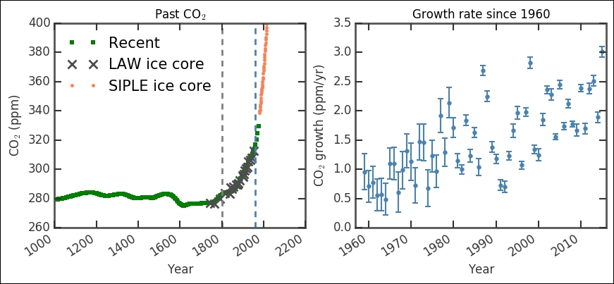
The left-hand plot showing the absolute CO2 level shows that the ice cores connect to the present day measurements very well. The first vertical dashed line marks the rough start of the industrial revolution (the year 1800). Even though it took some 50 years to really get the steam going (pun intended), this shows where the curve starts an exponential increase that has continued to this day. This correlation between the sharp changes from rather stable measurements to an exponential increase precisely after introducing coal burning steam engines is a strong evidence for manmade climate change. The second vertical line shows where the modern, direct measurements start, that is, 1959. They fit very well with the historical record extracted from ice cores. In the right-hand plot, we basically have a zoom in of that modern time period, from 1959 until today; however, it shows the growth of CO2 in the atmosphere in ppm (as covered earlier). The data seems to have some distribution in the uncertainties (signifying an upgrade in the measuring technique/instrument). Out of curiosity, let's check this first:
_ = plt.hist(co2_gr['err'], bins=20)
plt.xlabel('Uncertainty')
plt.ylabel('Count'),
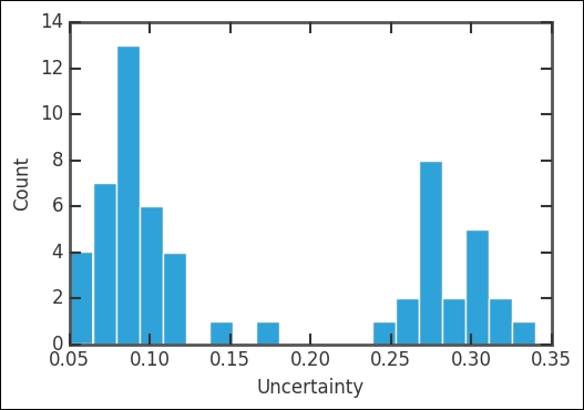
Indeed, it has two peaks where the oldest values are the most uncertain. Just like our previous example, let's first convert the values that we want to NumPy arrays:
x = co2_gr['year'].as_matrix()
y = co2_gr['rate'].as_matrix()
y_error = co2_gr['err'].as_matrix()
Now that we have done this, we define our model of a linear slope with the same method as for the airplane accidents. It is simply a function that returns the stochastic and deterministic variables. In our case, it is a linear function, taking slope and intercept; this time, we assume that they are normally distributed, which is not an unreasonable assumption. The normal distribution takes a minimum of two parameters, mu and tau (from PyMC documentation), which is just the position and width of the Gaussian normal distribution:
def model(x, y):
    slope = pymc.Normal('slope', 0.1, 1.)
    intercept = pymc.Normal('intercept', -50., 10.)
    @pymc.deterministic(plot=False)
    def linear(x=x, slope=slope, intercept=intercept):
        return x * slope + intercept
    f = pymc.Normal('f', mu=linear,
         tau=1.0/y_error, value=y, observed=True)
    return locals()
As before, we initiate the model with a call to MCMC and then sample from it half a million times, a burn-in of 50,000 and thin by 100 this time. I encourage you to first run with something low, such as four, or even omit it (that is, MDL.sample(5e5, 5e4)), plot the diagnostics (as follows), and compare the results:
MDL = pymc.MCMC(model(x,y))
MDL.sample(5e5, 5e4, 100)
You just ran half a million iterations in less than a minute! Due to the thinning, the post-sampling analysis is a bit quicker:
y_min = MDL.stats()['linear']['quantiles'][2.5]
y_max = MDL.stats()['linear']['quantiles'][97.5]
y_fit = MDL.stats()['linear']['mean']

slope = MDL.stats()['slope']['mean']
slope_err = MDL.stats()['slope']['standard deviation']
intercept = MDL.stats()['intercept']['mean']
intercept_err = MDL.stats()['intercept']['standard deviation']
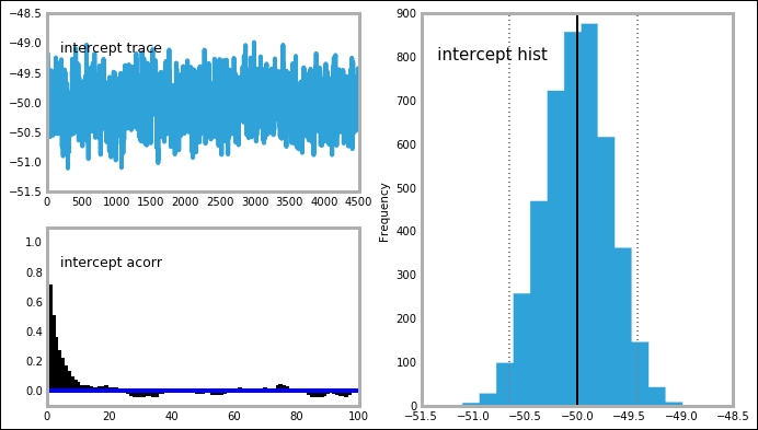
We should also create the plots for the time series, posterior distribution, and autocorrelation:
mcplt.plot(MDL)

The trace, posterior distribution, and autocorrelation plots all look very good—sharp, well-defined peaks and stable time series. This is also true for the intercept variable:
Before we plot the results, I also want us to use one of the other packages, the statsmodels ordinary least square fitting. Just as before, we import the formula package so that we can simply give Pandas the column names that we want to find the relationship between:
import statsmodels.formula.api as smf
from statsmodels.sandbox.regression.predstd import wls_prediction_std
ols_results = smf.ols("rate ~ year", co2_gr).fit()
We then grab the best fitting parameters and their uncertainty. Here, I flip the parameter tuples for convenience:
prstd, iv_l, iv_u = wls_prediction_std(ols_results)
ols_params = np.flipud(ols_results.params)
ols_err = np.flipud(np.diag(ols_results.cov_params())**.5)
We can now compare the two methods, least square (frequentist) and Bayesian model fitting:
print('OLS: slope:{0:.3f}, intercept:{1:.2f}'.format(*ols_params))
print('Bay: slope:{0:.3f}, intercept:{1:.2f}'.format(slope, intercept))
The Bayesian method seems to find the best estimates of the parameters just below the ordinary least square method. The parameters are close enough for us to call it even, but consistently closer to zero—an interesting observation. We will get back to this same dataset when we look at machine learning algorithms in the next chapter. I also want to look at the confidence versus credible intervals. We do this for the OLS and Bayesian model fit with the following method:
ols_results.conf_int(alpha=0.05)

The alpha=0.05 gives the confidence interval level, where it means the 95% confidence interval (that is, 1-0.05=0.95):
MDL.stats(['intercept','slope'])
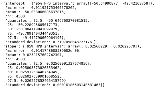
So the confidence level for the intercept is [-66.5, -37.1] for the OLS fit, and the credible interval from the Bayesian fit is [-50.6,-49.4]. This highlights the difference between the two methods. Let's now finally plot the results, and I want to draw both the fits in the same plot:
plt.figure(figsize=(10,6))
plt.title('Growth rate since 1960'),
plt.errorbar(x,y,yerr=y_error,
        color='SteelBlue', ls='None',
        elinewidth=1.5, capthick=1.5,
        marker='.', ms=8,
        label='Observed')
plt.xlabel('Year')
plt.ylabel('CO$_2$ growth rate (ppm/yr)')
plt.plot(x, y_fit,
        'k', lw=2, label='pymc')
plt.fill_between(x, y_min, y_max,
        color='0.5', alpha=0.5,
        label='Uncertainty')
plt.plot([x.min(), x.max()],
        [ols_results.fittedvalues.min(), ols_results.fittedvalues.max()],
        'r', dashes=(13,2), lw=1.5, label='OLS', zorder=32)
plt.legend(loc=2, numpoints=1);

Here, I use the matplotlib function, fill_between, to show the credible interval of the function. The fit of the data looks good, and after looking at it a few times, you might realize that it looks as if it is divided into two—two linear segments with some offset divided around 1985. One exercise for you is to test this hypothesis: create a function with two linear segments with a break in a certain year, and then try to constrain the model and compare the results. Why could this be? Perhaps they changed the instrument; if you remember, the two parts of the data also have different uncertainties, so a difference in systematic error is not completely unlikely.