
In this example, we will look at a dataset from the U.S. National Transportation Safety Board (NTSB). The NTSB has an open database that can be downloaded from their web page, http://www.ntsb.gov . One important thing about the data is that it contains civil aviation accidents and selected incidents within the United States, its territories and possessions, and in international waters, that is, it is not for the whole world. Basically, it is for U.S.-related accidents only, which makes sense for a U.S. national organization. There are databases that contain the whole world, but with less fields in them. For example, the NTSB dataset contains information about minor injuries for the accident in question. For comparison, and as an opening for exercises, after the Bayesian analysis of the NTSB data, we shall load and have a quick look at a dataset from OpenData by Socrata ( https://opendata.socrata.com ) that covers the whole world. The question that we want to investigate in this section is whether there are any jumps in the statistics for plane accidents with time. An alternative source is the Aviation Safety Network ( https://aviation-safety.net ). One important point before starting the analysis is that we shall once again read in the real raw data and clean it from unwanted parts so that we can focus on the analysis. This takes a few lines of coding, but it is very important to cover this as this shows you what is really happening and you will understand the results and data much better than if I would give you the finished cleaned and reduced data (or even created data with random noise).
To download the data from NTSB, go to their web page (
http://www.ntsb.gov
), click on Aviation Accident Database, and select Download All (Text). The data file, AviationData.txt, should now be downloaded and saved for you to read in.
The dataset contains date stamps for when a specific accident took place. To be able to read in the dates into a format that Python understands, we need to parse the date strings with the datetime package. The datetime package is a standard package that comes with Python (and the Anaconda distribution):
from datetime import datetime
Now let's read in the data. To spare you some time, I have redefined the column names so that they are more easily accessible. By now, you should be familiar with the very useful Pandas read_csv function:
aadata = pd.read_csv('data/AviationData.txt',
delimiter='|',
skiprows=1,
names=['id', 'type', 'number', 'date',
'location', 'country', 'lat', 'long', 'airport_code',
'airport_name', 'injury_severity', 'aircraft_damage',
'aircraft_cat', 'reg_no', 'make', 'model',
'amateur_built', 'no_engines', 'engine_type', 'FAR_desc',
'schedule', 'purpose', 'air_carrier', 'fatal',
'serious', 'minor', 'uninjured',
'weather', 'broad_phase', 'report_status',
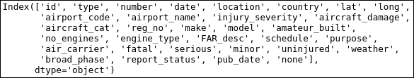
'pub_date', 'none'])Listing the column names shows that there is a wealth of data here, such as location, latitude, and longitude of the accident, the airport code and name, and so on:
aadata.columns
After looking at the data and trying some of the following things, you will discover that some date entries are empty, that is, just containing whitespace ( ). We could, as before, find the entries with whitespace using the apply (-map) function(s) and replace the values. In this case, I will just quickly filter them out with a Boolean array produced by the matching expression, !=, that is, not equal to (we only want the rows with dates). This is because, as mentioned in the beginning, we want to see how the accidents vary with time:
selection = aadata['date'] != '  '
aadata = aadata[selection]
Now the actual date strings are a bit tricky. They have the MONTH/DAY/YEAR format (for me as a European, this is illogical). The standard datetime module can do the job as long as we tell it what format the dates are in. In practice, Pandas can parse this when reading the data with the parse_dates=X flag, where X is either a column index integer or column name string.
However, sometimes it does not work well without putting in a lot of work, as in our case, so we shall parse it on our own. Here, we parse it into the new column, datetime, where each date is converted to a datetime object with the strptime function. One of the reasons for this is that the date is given with whitespace around it. So it is given as 02/18/2016 instead of 02/18/2016, which is also why we give the date format specification as %m/%d/%Y, that is, with whitespace around it. This way, the strptime function knows what it looks like:
aadata['datetime'] = [datetime.strptime(x, ' %m/%d/%Y ') for x in
  aadata['date']]
Now that we have datetime objects, Python knows what the dates mean. Only checking just the year or month could be interesting later on. To have it handy, we save those in separate columns. With a moderate dataset like this, we can create many columns without slowing down things noticeably:
aadata['month'] = [int(x.month) for x in aadata['datetime']]
aadata['year'] = [int(x.year) for x in aadata['datetime']]
Now we also want the dates as decimal year, so we can bin them year by year and calculate yearly statistics. To do this, we want to see what fraction of a year has passed for a certain date. Here, we write a small function, the solution inspired in part by various answers online. We call the datetime function to create objects representing the start and end of the year. We need to put year+1 here, if we do not do this, month=12 and day=31 would yield in nonsensical values around the new year (for example, 2017 when it is still 2016). If you search on Google for this problem, there are a lot of different, good answers and ways of doing this (some requiring additional packages installed):
def decyear(date):
    start = datetime(year=date.year, month=1, day=1)
    end = datetime(year=date.year+1, month=1, day=1)
    decimal = (date-start)/(end-start)
    return date.year+decimal
With this function, we can apply it to each element in the datetime column of our table. As all the column rows contain a datetime object already, the function that we just created happily accepts the input:
aadata['decyear'] = aadata['datetime'].apply(decyear)
Now, the columns Latitude, Longitude, uninjured, fatalities, and serious and minor injuries should all be floats and not strings for easy calculations and other operations. So we convert them to floats with the applymap method. The following code will convert the empty strings to Nan values and numbers to floats:
cols = ['lat', 'long',
        'fatal',
        'serious',
        'minor',
        'uninjured']
aadata[cols] = aadata[cols].applymap(
        lambda x: np.nan if isinstance(x, str)
                    and x.isspace() else float(x))
We are just applying a lambda function, which converts the values to floats and empty strings to NaN, to all the entries in the given columns. Now let's plot the data to see if we need to trim or process it further:
plt.figure(figsize=(9,4.5))
plt.step(aadata['decyear'], aadata['fatal'],
         lw=1.75, where='mid', alpha=0.5, label='Fatal')
plt.step(aadata['decyear'], aadata['minor']+200,
         lw=1.75,where='mid', label='Minor')
plt.step(aadata['decyear'], aadata['serious']+200*2,
         lw=1.75, where='mid', label='Serious')
plt.xticks(rotation=45)
plt.legend(loc=(0.01,.4),fontsize=15)
plt.ylim((-10,600))
plt.grid(axis='y')
plt.title('Accident injuries {0}-{1}'.format(
            aadata['year'].min(), aadata['year'].max()))
plt.text(0.15,0.92,'source: NTSB', size=12,
         transform=plt.gca().transAxes, ha='right')
plt.yticks(np.arange(0,600,100), [0,100,0,100,0,100])
plt.xlabel('Year')
plt.ylabel('No injuries recorded')
plt.xlim((aadata['decyear'].min()-0.5,
          aadata['decyear'].max()+0.5));
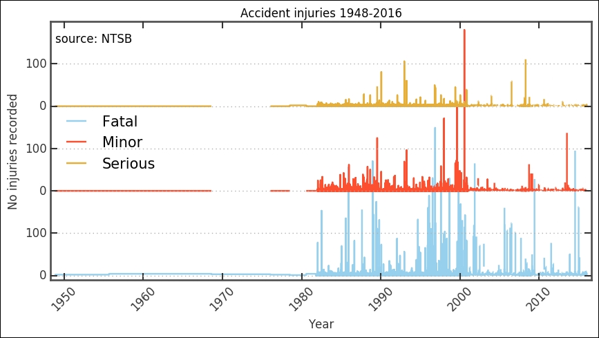
The available data before around 1980 is very sparse and not ideal for statistical interpretation. Before deciding what to do, let's check the data for these entries. To see how many accidents were recorded, we plot the histogram around that time. Here, we employ a filter by combining two Boolean arrays. We also change the bins parameter by giving it the years, 1975 to 1990; in this way, we know that the bins will be per year:
plt.figure(figsize=(9,3))
plt.subplot(121)
year_selection = (aadata['year']>=1975) & (aadata['year']<=2016)
plt.hist(aadata[year_selection]['year'].as_matrix(),
         bins=np.arange(1975,2016+2,1), align='mid')
plt.xlabel('Year'), plt.grid(axis='x')
plt.xticks(rotation=45);
plt.ylabel('Accidents recorded')
plt.subplot(122)
year_selection = (aadata['year']>=1976) & (aadata['year']<=1986)
plt.hist(aadata[year_selection]['year'].as_matrix(),
         bins=np.arange(1976,1986+2,1), align='mid')
plt.xlabel('Year')
plt.xticks(rotation=45);
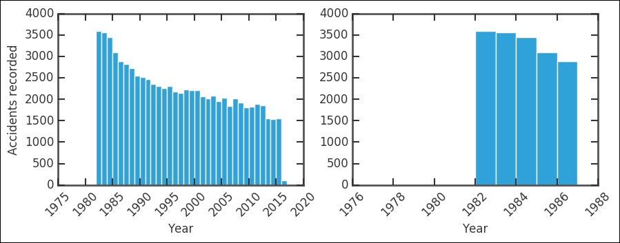
The absolute number of accidents have roughly halved in 35 years; given that the number of passengers has definitely increased, this is very good. The right-hand plot shows that before 1983, there are very few recorded accidents by the NTSB. Listing the table with this criteria shows six recorded accidents:
aadata[aadata['year']<=1981]
After this thorough inspection, I think it is safe to remove the entries before and including 1981. I do not know the reason for the lack of data; perhaps the NTSB was founded at this point? Their mandate was reformulated to include storing a database of the incidents? In any case, let's exclude these entries:
aadata = aadata[ aadata['year']>1981 ]
Creating the same figure as before, this is what we can see:
plt.figure(figsize=(10,5))
plt.step(aadata['decyear'], aadata['fatal'],
         lw=1.75, where='mid', alpha=0.5, label='Fatal')
plt.step(aadata['decyear'], aadata['minor']+200,
         lw=1.75,where='mid', label='Minor')
plt.step(aadata['decyear'], aadata['serious']+200*2,
         lw=1.75, where='mid', label='Serious')
plt.xticks(rotation=45)
plt.legend(loc=(0.8,0.74),fontsize=15)
plt.ylim((-10,600))
plt.grid(axis='x')
plt.title('Accidents {0}-{1}'.format(
          aadata['year'].min(), aadata['year'].max()))

plt.text(0.135,0.95,'source: NTSB', size=12,
         transform=plt.gca().transAxes, ha='right')
plt.yticks(np.arange(0,600,100), [0,100,0,100,0,100])
plt.xlabel('Year')
plt.ylabel('No injuries recorded')
plt.xlim((aadata['decyear'].min()-0.5,
          aadata['decyear'].max()+0.5));
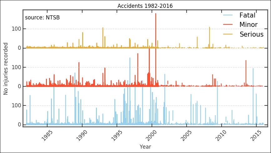
We now have a cleaned dataset that we can work with. It is still hard to distinguish any trends, but around the millennium shift, there is a change in the trend. However, to further see what might be happening, we want to bin the data and look at various key numbers.
In this section, we will bin the data by year. This is so that we can get a better overview of overall trends in the data, which takes us to the next step in the characterization and analysis.
As mentioned before, we want to bin the data per year to look at the trends per year. We did binning before in
Chapter 4
, Regression; we use the groupby method of our Pandas DataFrame. There are two ways to define the bins here, we can use NumPy's digitize function or we can use Pandas cut function. I have used the digitize function here as it is more generally useful; you might not always use Pandas for your data (for some reason):
bins = np.arange(aadata.year.min(), aadata.year.max()+1, 1 )
yearly_dig = aadata.groupby(np.digitize(aadata.year, bins))
We can now calculate statistics for each bin. We can get the sum, maximum, mean, and so on:
yearly_dig.mean().head()

Additionally, ensure that you get the years out:
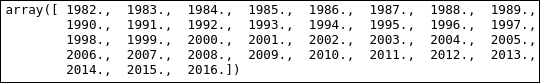
np.floor(yearly_dig['year'].mean()).as_matrix()
More importantly, we can visualize it. The following function will plot a bar plot and stack the various fields on top of each other. As input, it takes the Pandas groups object, a list of field names (< 3), and which field name to use as x axis. Then, there are some customizations and tweaks to make it look better. Noteworthy among them is the fig.autofmt_xdate(rotation=90, ha='center') function, which will format the dates for you automatically. You can send it various parameters; in this case, we use it to rotate and horizontally align the x tick labels (as dates):
def plot_trend(groups, fields=['Fatal'], which='year', what='max'):
    fig, ax = plt.subplots(1,1,figsize=(9,3.5))
    x = np.floor(groups.mean()[which.lower()]).as_matrix()
    width = 0.9
    colors = ['LightSalmon', 'SteelBlue', 'Green']
    bottom = np.zeros( len(groups.max()[fields[0].lower()]) )
    for i in range(len(fields)):
        if what=='max':
            ax.bar(x, groups.max()[fields[int(i)].lower()],
                   width, color=colors[int(i)],
                   label=fields[int(i)], align='center',
                   bottom=bottom, zorder=4)
bottom += groups.max()[
fields[int(i)].lower()
].as_matrix()
        elif what=='mean':
            ax.bar(x, groups.mean()[fields[int(i)].lower()],
                   width, color=colors[int(i)],
                   label=fields[int(i)],
                   align='center', bottom=bottom, zorder=4)
            bottom += groups.mean()[
                                    fields[int(i)].lower()
                                    ].as_matrix()
    ax.legend(loc=2, ncol=2, frameon=False)
    ax.grid(b=True, which='major',
            axis='y', color='0.65',linestyle='-', zorder=-1)
    ax.yaxis.set_ticks_position('left')
    ax.xaxis.set_ticks_position('bottom')
    for tic1, tic2 in zip(
                          ax.xaxis.get_major_ticks(),
                          ax.yaxis.get_major_ticks()
                          ):
        tic1.tick1On = tic1.tick2On = False
        tic2.tick1On = tic2.tick2On = False
    for spine in ['left','right','top','bottom']:
        ax.spines[spine].set_color('w')
    xticks = np.arange(x.min(), x.max()+1, 1)
    ax.set_xticks(xticks)
    ax.set_xticklabels([str(int(x)) for x in xticks])
    fig.autofmt_xdate(rotation=90, ha='center')
    ax.set_xlim((xticks.min()-1.5, xticks.max()+0.5))
    ax.set_ylim((0,bottom.max()*1.15))
    if what=='max':
        ax.set_title('Plane accidents maximum injuries')
        ax.set_ylabel('Max value')
    elif what=='mean':
        ax.set_title('Plane accidents mean injuries')
        ax.set_ylabel('Mean value')
    ax.set_xlabel(str(which))
    return ax
Now, let's use it to plot the maximum fatal, serious, and minor injuries for each year in the timespan, 1982 to 2016:
ax = plot_trend(yearly_dig, fields=['Fatal','Serious','Minor'],
  which='Year')
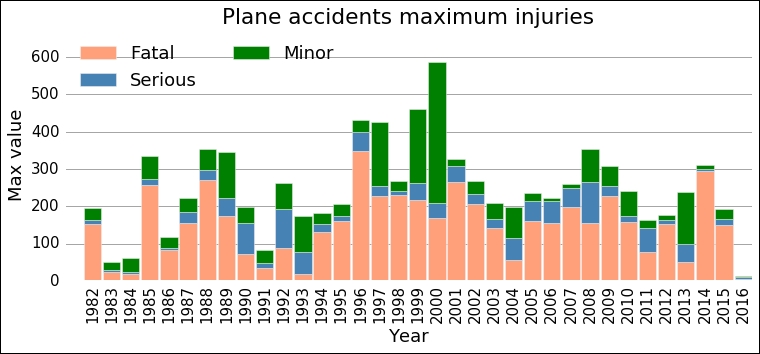
The dominant bars are the ones for fatal—at least from this visual inspection—so when things go really bad in an airplane accident, most people contract fatal injuries. What is curious here is that there seems to be a change in the maximum value, a jump somewhere between 1991 and 1996. After that, it looks like the mean of the maximum number of fatalities is higher. This is what we will try to model with Bayesian inference in the next section.
Now we can dive into the Bayesian part of this analysis. You should always inspect the data in the manner that we have done in the previous exercises. These steps are commonly skipped in text and even fabricated data is used; this paints a simplified picture of data analysis. We have to work with the data to get somewhere and understand what analysis is feasible. First, we need to import the PyMC package and plot function from the Matplot submodule. This function plots a summary of the parameters' posterior distribution, trace (that is, each iteration), and autocorrelation:
import pymc
from pymc import Matplot as mcplt
To start the analysis, we store the x and y values, year, and maximum fatalities in arrays:
x = np.floor(yearly_dig.mean()['year']).as_matrix()
y = yearly_dig.max()['fatal'].as_matrix()
Now we develop our model by defining a function with all the parameters and data. It is a discrete process, so we use a Poisson distribution. Furthermore, we use the exponential distribution for the early and late mean rate; this is appropriate for this stochastic process. Try plotting a histogram of the fatalities to see what distribution it has. For the year where the jump/switch takes place, we use a discrete uniform distribution, that is, it is flat for all the values between the lower and upper bounds and zero elsewhere. The variable that is determined by the various stochastic variables, late, early mean, and the switch point is the mean value before and after the jump. As it depends on (stochastic) variables, it is called a deterministic variable. In the code, this is marked by the @pymc.deterministic() decorator. This is the process that we are trying to model. There are several distributions built into PyMC, but you can also define your own. However, for most problems, the built-in ones should do the trick. The various available distributions are in the pymc.distributions submodule:
def model_fatalities(y=y):
    s = pymc.DiscreteUniform('s', lower=5, upper=18, value=14)
    e = pymc.Exponential('e', beta=1.)
    l = pymc.Exponential('l', beta=1.)
    @pymc.deterministic(plot=False)
    def m(s=s, e=e, l=l):
        meanval = np.empty(len(y))
        meanval[:s] = e
        meanval[s:] = l
        return meanval
    D = pymc.Poisson('D', mu=m, value=y, observed=True)
    return locals()
The return locals() is a somewhat simply way to send all the local variables back. As we have a good overview of what those are, this is not a problem to use. We have now defined the model; to use it in the MCMC sampler, we give the mode as input to the MCMC class:
np.random.seed(1234)
MDL = pymc.MCMC(model_fatalities(y=y))
To use the standard sampler, we can simply call the MDL.sample(N) method, where N is the number of iterations to run. There are additional parameters as well; you can give it a burn-in period, a period where no results are considered. This is part of the MCMC algorithm, where it can sometimes be good to let it run for a few iterations that are discarded so that it can start converging. Second, we can give a thin argument; this is how often it should save the outcome of the iteration. In our case, I run it 50,000 times, with 5,000 iterations as burn-in and thin by two. Try running with various numbers to see if the outcome changes, how it changes, and how well the parameters are estimated:
MDL.sample(5e4, 5e3, 2)
The step method, that is, how to move around in the parameter space, can also be changed. To check what step method we have, we run the following command:
MDL.step_method_dict

To change the step method, perhaps to the Adaptive Metropolis algorithm, which uses an adaptive step size (length), we would import it and run the following:
from pymc import AdaptiveMetropolis
MDL = pymc.MCMC(model_fatalities(y=y))
MDL.use_step_method(AdaptiveMetropolis, MDL.e)
MDL.use_step_method(AdaptiveMetropolis, MDL.l)
MDL.sample(5e4, 5e3, 2)
We are not going to do this here though; this is for problems where the variables are highly correlated. I leave this as an exercise for you to test, together with different prior parameter distributions.
Now we have the whole run in the MDL object. From this object, we can estimate the parameters and plot their posterior distribution. There are convenient functions to do all of this. The following code shows you how to pull out the mean of the posterior distribution and standard deviation. This is where credible interval comes in; we have credible intervals for the parameters, not confidence intervals:
early = MDL.stats()['e']['mean']
earlyerr = MDL.stats()['e']['standard deviation']
late = MDL.stats()['l']['mean']
lateerr = MDL.stats()['l']['standard deviation']
spt = MDL.stats()['s']['mean']
spterr = MDL.stats()['s']['standard deviation']
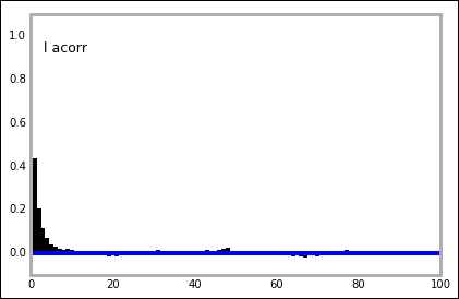
Before plotting the results and all the numbers, we must check the results of the MCMC run, to do this we plot the trace, posterior distribution, and autocorrelation for all the stochastic parameters. We do this with the plot function from the pymc.Matplot module that we imported in the beginning:
mcplt.plot(MDL)
The function plots all three things in one figure. This is very convenient for a quick assessment of the results. It is important to look at all the plots; they give clues to how well the run went:
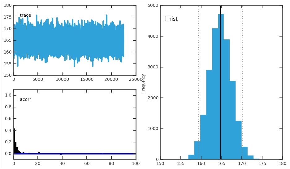
For each stochastic variable, the trace, autocorrelation, and posterior distribution is plotted:

In our case, this gives one figure each for e, l, and s. In each figure, the top left-hand plot shows the trace or time series. The trace is the value for each iteration. It can be accessed with MDL.trace('l')[:] for the late parameter. Try getting the trace and plotting the trace versus iteration and histogram for it; they should look the same as these. For a good model setup, the trace should fluctuate randomly around the best estimate, just like the trace for the early and later parameter. The autocorrelation plot should have a peak at 0; if the plot shows a significant amount of values at higher x values, it is a sign that you need to increase the thin variable. The trace and posterior distribution for the jump/switch point looks different. However, because it is a discrete variable and is constrained within one year, it just shows one peak and the trace follows this. Thus, the switch point is well-constrained with a very small credible interval. Each of the plots in the figures can be drawn individually with related functions in the pymc.Matplot module (mcplt here). The autocorrelation plot for the l variable can be produced with the following command:
mcplt.autocorrelation(MDL.l)
Now that we have constructed a model, run the sampler, and extracted the best estimate parameters, we can plot the results. The jump/switch point identified by the model is simply an index in the array of years, so we need to find which year the index/position corresponds to. To do this, we use NumPy's floor function to round down, and then we can convert it to an integer and slice the x array, which is our year array created in the beginning:
s = int(np.floor(spt))
print(spt, spterr, x[s])
The preceding code gives 12.524, 0.499423667841, and 1994.0 as an output.
To construct the plot with the results, we can once again use the function defined previously, but this time we are only looking at the fatal injuries, so we give a different field parameter. To plot the credible intervals, I use the fill_between function here; it is a very handy function and does exactly what it says. Furthermore, instead of the text function, which just places text in the figure, I use the more powerful annotate function, where we can customize it with a nice box around it:
ax = plot_trend(yearly_dig, fields=['Fatal'], which='Year')
ax.plot([x[0]-1.5,x[s]],[early,early], 'k', lw=2)
ax.fill_between([x[0]-1.5,x[s]],
                [early-3*earlyerr,early-3*earlyerr],
                [early+3*earlyerr,early+3*earlyerr],
               color='0.3', alpha=0.5, zorder=2)
ax.plot([x[s],x[-1]+0.5],[late,late], 'k', lw=2)
ax.fill_between([x[s],x[-1]+0.5],
                [late-3*lateerr,late-3*lateerr],
                [late+3*lateerr,late+3*lateerr],
                color='0.3', alpha=0.5, zorder=2)
ax.axvline(int(x[s]), color='0.4', dashes=(3,3), lw=2)
bbox_args = dict(boxstyle="round", fc="w", alpha=0.85)
ax.annotate('{0:.1f}$pm${1:.1f}'.format(early, earlyerr),
            xy=(x[s]-1,early),
            bbox=bbox_args, ha='right', va='center')
ax.annotate('{0:.1f}$pm${1:.1f}'.format(late, lateerr),
            xy=(x[s]+1,late),
            bbox=bbox_args, ha='left',va='center')
ax.annotate('{0}'.format(int(x[s])),xy=(int(x[s]),300),
            bbox=bbox_args, ha='center',va='center'),

Given the data, the parameters are in the ranges, 104.5+/-3.0 and 164.7+/- 2.7, with a 95% credibility (that is, +/-1 sigma). The mean maximum number of fatalities in a year have increased and made a jump around 1994 from 104.5 to 164.7 people. Although from the plot it looks around the year 2004 and 2012-2013, the maximum values do not follow the same trend. Even if this is a simple model, it is hard to argue for a more complex model and the results are significant. The goal should, of course, be to have zero fatalities for every year.
We analyzed what the statistics look like on a per year basis; what if we look at the statistics over the year? To do this, we need to bin per month. So in the next section, this is what we will do.
Repeat the binning procedure that we have, but by month:
bins = np.arange(1, 12+1, 1 )
monthly_dig = aadata.groupby(np.digitize(aadata.month, bins))
monthly_dig.mean().head()

Now we can do the same but per month; just send the right parameters to the plot_trend function that we have created:
ax = plot_trend(monthly_dig, fields=['Fatal', 'Serious', 'Minor'],
  which='Month')
ax.set_xlim(0.5,12.5);

While there is no strong trend, we can note that months 7 and 8, July and August, together with months 11 and 12, November and December, have higher values. Summer and Christmas are popular times of the year to travel, so it is probably a reflection of the yearly variation in the amount of travelers. More travelers means an increase in the number of accidents (with constant risk), thus a greater chance for high fatality accidents. Another question is what the mean variation looks like; what we have worked with so far is the maximum. I have added a parameter in the plotting function, what, and set it to mean, which will cause the mean to be plotted. I leave this as an exercise; you will see something peculiar with the mean. Try to create different plots to investigate! Also, do not forget to check the mean per month and year.
This last plot highlights something else as well—the total number of passengers might affect the outcome. To get the total number of passengers in the U.S., you can run the following:
from pandas.io import wb
airpasstot = wb.download(indicator='IS.AIR.PSGR',
       country=['USA'], start=1982, end=2014)
However, looking at this data and comparing it with the data that we have worked with here is left as an exercise for you.
To give you a taste of some of the powerful visualizations that are possible with Python, I want to quickly plot the coordinates of each accident on a map. This is of course not necessary in this case, but it is good to visualize results sometimes, and in Python, it is not obvious how to do it. So this part is not necessary for this chapter, but it is good to know the basics of how to plot things on a map in Python, as many things that we study depend on location on the Earth.
To plot the coordinates, we (unfortunately) have to install packages. Even more unfortunate is that it depends on what operating system and Python distribution you are running. The two packages that we will quickly cover here are the basemap module of the mpl_toolkits package and the cartopy package.
The first one, mpl_toolkits, does not work on Windows (as of April 2016). To install basemap from mpl_toolkits in Anaconda on Mac and Linux, run conda install -c https://conda.anaconda.org/anaconda basemap. This should install basemap and all its dependencies.
The second package, cartopy, depends on the GEOS and proj.4 libraries, so they need to be installed first. This can be a bit tedious, but once the GEOS (version greater than 3.3.3) and proj.4 libraries (version greater than 4.8.0) are installed, cartopy can be installed with the pip command-line tool, pip install cartopy. Once again, in Windows, the prebuilt binaries of proj.4 is version 4.4.6, making it very difficult to install cartopy as well.
For this quick exercise, we grab the latitudes and longitudes of each accident in separate arrays as the plotting commands might be sensitive with the input format and might not support the Pandas Series:
lats, lons = aadata['lat'].as_matrix(), aadata['long'].as_matrix()
First out is cartopy, where we first create a figure, then add axes to it, where we have to specify the lower left and top right edges of the axes inside the figure and additionally, give it a projection, which is taken from the CRS module of cartopy. When importing the CRS module, we also import the formatters for longitude and latitude, which will just add N, S, E, and W to the x and y tick labels. Importing the matplotlib ticker module, we can specify the exact locations of the tick labels. We could probably do this in the same manner with the ticks function.
As we are plotting the coordinates of the accidents, it is nice to have a background showing the Earth. Therefore, we load an image of the Earth with the ax.stock_img() command. It is possible to load coastlines, countries, and other things. To view examples and other possibilities including different projections, see the cartopy website (
http://scitools.org.uk/cartopy
). We then create a scatter plot with latitude and longitude as coordinates and scale the size of the markers proportional to the total fatalities. Then, we plot the gridlines, meridians, and latitude great circles. After this, we just customize the tick locations and labels with the imported formatters and tick location setters:
import cartopy.crs as ccrs
from cartopy.mpl.gridliner import LONGITUDE_FORMATTER, LATITUDE_FORMATTER
import matplotlib.ticker as mticker
fig = plt.figure(figsize=(12,10))
ax = fig.add_axes([0,0,1,1], projection=ccrs.PlateCarree())
ax.stock_img()
ax.scatter(aadata['long'],aadata['lat'] ,
           color='IndianRed', s=aadata['fatal']*2,
           transform=ccrs.Geodetic())
gl = ax.gridlines(crs=ccrs.PlateCarree(), draw_labels=True,
                  linewidth=2, color='gray',
                  alpha=0.5, linestyle='--')
gl.xlabels_top = False
gl.ylabels_right = False
gl.xlocator = mticker.FixedLocator(np.arange(-180,180+1,60))
gl.xformatter = LONGITUDE_FORMATTER
gl.yformatter = LATITUDE_FORMATTER
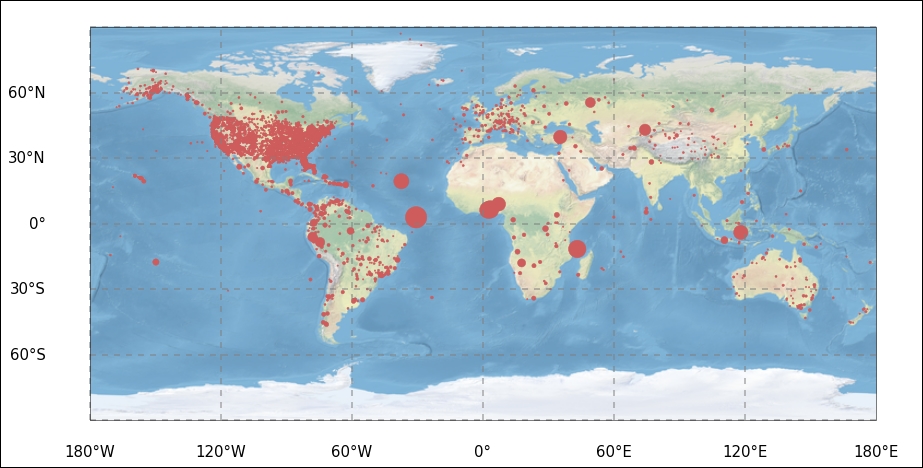
It seems that most of the registered accidents occurred over land. I leave the further tinkering of the figure to you. Looking at statistics over the world, it is useful to be able to plot the spatial distribution of the parameters.
As promised, we now produce the exact same plot in the basemap module of mpl_toolkits. Here, we only need to import the basemap module and no other tick-modifying functions. The projection is not set in creating the axes, instead it is created by calling the basemap function with the wanted projection. Previously, we called the Carree projection; this is simply the Equidistant Cylindrical projection, and in basemap, this is obtained by giving it the projection string, cyl, for cylindrical. The resolution parameter is given as c, for coarse. To get the same background image, call the shadedrelief command. There are other backgrounds, such as Earth by night, for example. It is possible to draw only coastlines or country borders. In basemap, there are built-in functions for a lot of things; thus, instead of calling matplotlib functions, we now call methods of the map object to create meridians and latitudes. I have also included the functions to draw coastlines and country borders, but commented them out. Try uncommenting them and perhaps comment out the drawing of the background image:
from mpl_toolkits.basemap import Basemap
fig = plt.figure(figsize=(11,10))
ax = fig.add_axes([0,0,1,1])
map = Basemap(projection='cyl', resolution='c')
map.shadedrelief()
#map.drawcoastlines()
#map.drawcountries()
map.drawparallels(np.arange(-90,90,30),labels=[1,0,0,0],
                  color='grey')
map.drawmeridians(np.arange(map.lonmin,map.lonmax+30,60),
                  labels=[0,0,0,1], color='grey')
x, y = map(lons, lats)
map.scatter(x, y, color='IndianRed', s=aadata['fatal']*2);
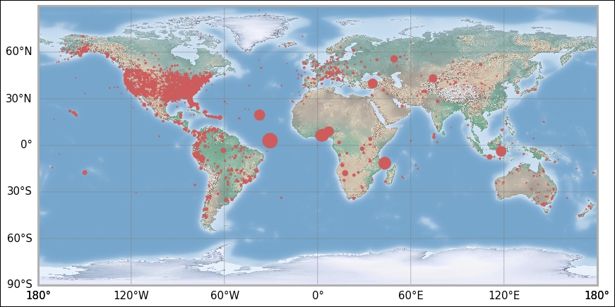
I leave any further tinkering of the coordinate plotting to you. However, you have the first steps here. As the main goal of this chapter is Bayesian analysis, we shall now continue with the data analysis examples.