
Linear regression is part of the general introduction to experimental techniques; it forms the base for many of the scientific breakthroughs for the last few centuries. We made some short dives into linear regression before, looking at Hubble's law among other things. The previous chapter consisted of looking at distributions, which is an integral part of exploratory data analysis and indeed one of the first steps in gaining insights into the data. All of the things that we have gone through so far are, as you will see, useful in this chapter as well. You are strongly encouraged to experiment and try out these new things in combination with what was learned in the previous chapters. In this chapter, we will cover the following forms of regression:
- Linear regression
- Multiple regression
- Logistic regression
In the simplest formulation, linear regression deals with estimating a variable from another variable. In multiple regression, a variable is estimated from two or more others. This, of course, only works when the variables have some kind of correlation between them. It's important to point out at this point is that correlation does not imply causation; just because two or more variables show a dependence on one another, it does not mean that they actually affect/depend each other in real life. Logistic regression fits models to one or more discrete variables, which are sometimes binary (that is, can only take the values 0 or 1).
In this chapter, we will start with a quick introduction to linear regression, then we dive directly into getting the data and testing a hypothesis of a simple relationship between two variables. After this, the extension to multiple variables is covered, where we simply add data to what we have from the previous section. Logistic regression is covered in the last part of the chapter.
Curiosity is strongly encouraged, and use what we have learned in the previous chapters to explore the data. Before running the examples in this chapter, start the Jupyter Notebook and run the default imports.
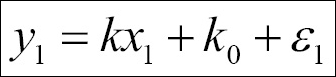
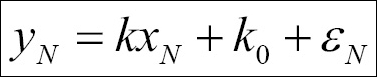
The simplest form of linear regression is given by the relation y = kx + k0 , where k0 is called intercept, that is, the value of y when x=0 and k is the slope. A general expression for this could be found by thinking of each point as the preceding relation plus an error ε. This would then look, for N points, as follows:


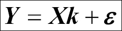
We can express this in matrix form:
Here, the various matrices/vectors are represented as follows:
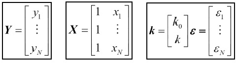
Performing the multiplication and addition of the matrix and vectors should yield the same set of equations that are defined here. The goal of the regression is to estimate the parameters, k, in this case. There are many types of parameter estimation methods—ordinary least squares being one of the most common—but there are also maximum likelihood, Bayesian, mixed model, and several others. In ordinary least-squares minimization, the square of the residuals are minimized, that is, rTr is minimized (T denotes the transpose and r denotes the residuals, that is Ydata-Yfit). It is nontrivial to solve the matrix equation; however, it is instructive to at least do this once if time permits. In the following example, we will use the least-squares minimization method. Most of the time, underlying computations use matrices to calculate the estimates of the parameters and uncertainty in the determination. What also comes out of the analysis is how correlated the variables are, that is, how likely it is that a linear relation exists between them.
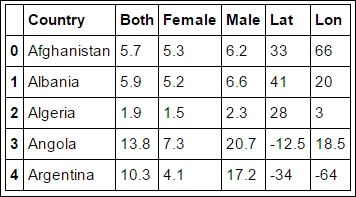
Before we start estimating parameters of linear relationships, we need a dataset. In this first example, we will look at the suicide rate data from the World Health Organization (WHO) at http://www.who.int. One very important and complex part of data analysis is getting the data into manageable data structures appropriate for our analysis. Therefore, we will see how to get the data and map it to our desired data structures. The first part of the dataset is age-standardized suicide rates (per 100,000 inhabitants) per country and gender.
The following code downloads the data and stores it in a file:
importurllib.request
payload='target=GHO/MH_12&profile=crosstable&filter=COUNTRY:*;REGION:*&x-sideaxis=COUNTRY&x-topaxis=GHO;YEAR;SEX'
suicide_rate_url='http://apps.who.int/gho/athena/data/xmart.csv?'

local_filename, headers = urllib.request.urlretrieve(suicide_rate_url+payload, filename='data/who_suicide_rates.csv')
The urllib module is part of the Python standard library (
https://docs.python.org/3/library
). If the filename input is not given, the file is stored in a temporary location on the disk. If problems arise, it is possible to also go directly to the URL and download the file. Alternatively, the OECD database contains suicide rates that also go back in time to 1960 (
http://stats.oecd.org
).
As before, we use Pandas' read_csv function from the Pandas data reader. Here, we give names to the columns; it is possible to send only the header=2 parameter. This would tell you that the column names are given in the header; however, this might not always be what we want:
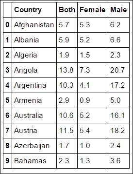
LOCAL_FILENAME = 'data/who_suicide_rates.csv_backup'
rates = pandas.read_csv(LOCAL_FILENAME, names=['Country','Both', 'Female', 'Male'], skiprows=3)
rates.head(10)
To make it easier for you, we tell it to skip the first three rows, where the metadata of the file is stored. As covered before, the CSV file format lacks a proper standard, hence it can be difficult to interpret everything correctly, so skipping the header makes it more robust in this case. However, experimenting with different input parameters is encouraged and can be very instructive. As shown in previous chapters, we start out by exploring this dataset:
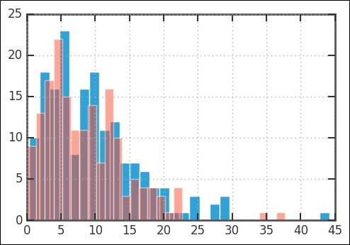
rates.plot.hist(stacked=True, y=['Male', 'Female'],
                bins=30, color=['Coral', 'Green'])
plt.xlabel('Rate'),
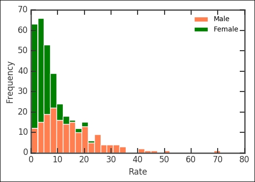
The histogram now plots the columns with names matching Male and Female, stacked on top of each other. It shows that the suicide rates are a bit different for males and females. Printing out the mean suicide rates for the genders shows that males have a significantly higher rate of suicide:
print(rates['Male'].mean(), rates['Female'].mean())
14.69590643274854 5.070602339181275
To look closer at some of the basic statistics of the rates, we use the boxplot command:
rates.boxplot();
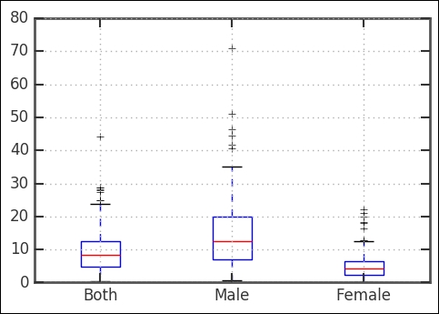
As it's clear, the suicide rate is higher for men in comparison with women. Looking at the boxplot and also the combined distribution (that is, the Both key), we can see that there is one outlier (that is, crosses) with a really high rate. It has over 40 suicides per 100,000; which country/countries is/are this? Let's have a look:
print(rates[rates['Both']>40])
   Country Both Female Male
66  Guyana 44.2   22.1 70.8
Here, we filter by saying that we want only the indices where the rates in the Both column are higher than 40. Apparently, the suicide rate in Guyana is very high. There are some interesting and, obviously, troublesome facts surrounding this. A quick web search reveals that while theories to explain the high rate have been put forth, studies are yet to reveal the underlying reason(s) for the significantly higher than average rate.
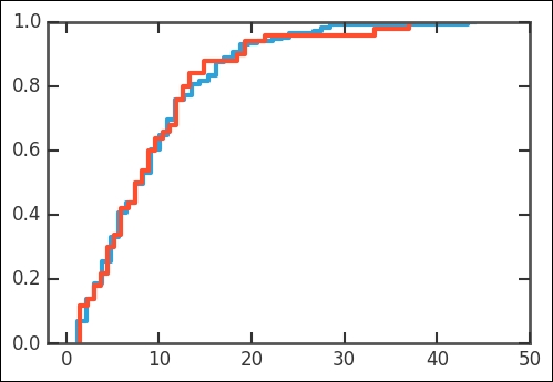
As seen in the preceding histograms, the suicide rates all have a similar distribution (shape). Let's first use the CDF plotting function defined in the examples in previous chapters:
def plot_cdf(data, plot_range=None, scale_to=None, nbins=False, **kwargs):
  if not nbins:
    nbins = len(data)
    sorted_data = np.array(sorted(data), dtype=np.float64)
    data_range = sorted_data[-1] - sorted_data[0]
    counts, bin_edges = np.histogram(sorted_data, bins=nbins)
    xvalues = bin_edges[1:]
    yvalues = np.cumsum(counts)
    if plot_range is None:
      xmin = xvalues[0]
      xmax = xvalues[-1]
    else:
      xmin, xmax = plot_range
   # pad the arrays
    xvalues = np.concatenate([[xmin, xvalues[0]], xvalues, [xmax]])
    yvalues = np.concatenate([[0.0, 0.0], yvalues, [yvalues.max()]])
    if scale_to:
      yvalues = yvalues / len(data) * scale_to
    plt.axis([xmin, xmax, 0, yvalues.max()])
    return plt.step(xvalues, yvalues, **kwargs)
With this, we can again study the distribution of suicide rates. Run the function on the combined rates, that is, the Both column:
plot_cdf(rates['Both'], nbins=50, plot_range=[-5, 70])

We can first test the normal distribution as it is the most common distribution:
st.probplot(rates['Both'], dist='norm', plot=plt);
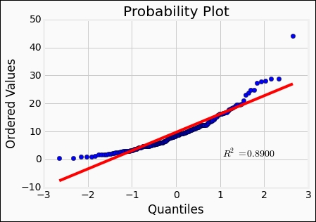
Comparing what we saw previously when creating plots like this, the fit is not good at all. Recall the Weibull distribution from the previous chapter; it might fit better with its skew toward lower values. So let's try it:
beta = 1.5
eta = 1.
rvweib = st.weibull_min(beta, scale=eta)
st.probplot(rates['Both'], dist=rvweib, plot=plt);
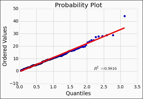
The Weibull distribution seems to reproduce the data quite well. The r-value, or the Pearson correlation coefficient, is a measure of how well a linear model represents the relationship between two variables. Furthermore, the r-square value given by st.probplot is the square of the r-value, in this case. It is possible to fit the distributions to the data. Here, we fix the location parameter to 0 with floc=0:
beta, loc, eta = st.weibull_min.fit(rates['Both'],
                      floc=0, scale = 12)
This gives beta of 1.49, loc of 0, and scale of 10.76. With the fitted parameters, we can plot the histogram of the data and overplot the distribution. I have included a fixed random seed value so that it should reproduce the results in the same way for you:
rates['Both'].hist(bins=30)
np.random.seed(1100)
rvweib = st.weibull_min(beta, scale=eta) plt.hist(rvweib.rvs(size=len(rates.Both)),bins=30, alpha=0.5);
Then, comparing the CDFs of the Weibull and our data, it is obvious that they are similar. Being able to fit the parameters of a distribution is very useful:
plot_cdf(rates['Both'], nbins=50,scale_to=1)
np.random.seed(1100)
plot_cdf(rvweib.rvs(size=50),scale_to=1)
plt.xlim((-2,50));
Now that we have the first part of the dataset, we can start to try to understand this. What are some possible parameters that go into suicide rates? Perhaps economic indicators or depression-related variables, such as the amount of sunlight in a year? In the coming section, we will test if the smaller amount of sunlight that one gets, the further away from the equator you go, will show any correlation with the suicide rate. However, as shown in the case of Guyana, some outliers might not fall into any general interpretation of any discovered trend.
With linear regression, it is possible to test a proposed correlation between two variables. In the previous section, we ended up with a dataset of the suicide rates per country. We have a Pandas DataFrame with three columns: the country name, suicide rates for males and females, and mean of both genders. To test the hypothesis that suicide rate depends on how much sunlight the country gets, we are going to use the country coordinate centroid, that is, latitude (and longitude) for each country. We assume that the amount of sunlight in each country is directly proportional to the latitude. Getting centroids of each country in the world is more difficult than what one might imagine. Some of the resources for this are as follows:
- A simple countries centroid can be found on the Gothos web page: http://gothos.info/2009/02/centroids-for-countries/
- A more complex table, which would demand more processing before the analysis, is at OpenGeocode: http://www.opengeocode.org/download.php#cow
- OpenGeocode has geolocation databases that are free public domain
We are using the Gothos version, so you should make sure that you have the data file (CSV format):
    coords=pandas.read_csv('data/country_centroids/
                           country_centroids_primary.csv', sep='	')
    coords.keys()

A lot of column names to work with! First, we take a peek at the table:
coords.head()
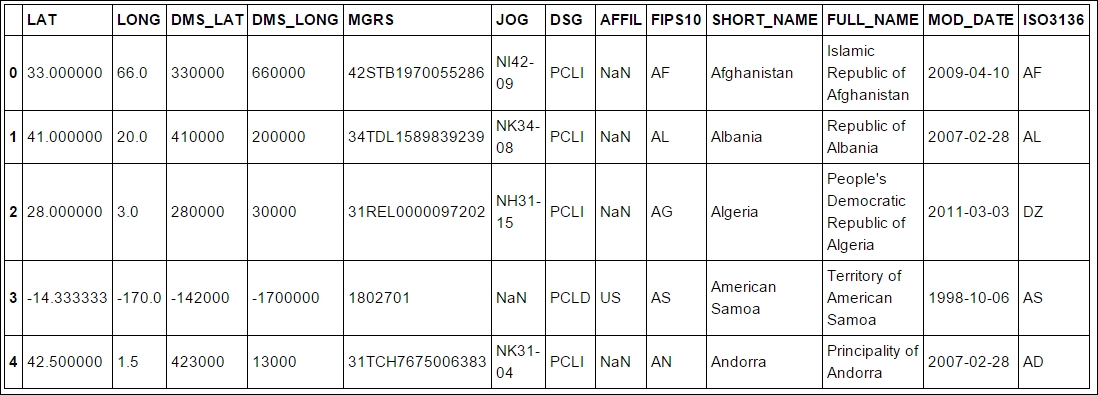
The interesting columns are SHORT_NAME and LAT. We shall now match the SHORT_NAME in the coords DataFrame with Country in the rates DataFrame and store the Lat and Lon value when the country name matches. In theory, it would be best if the WHO tables also had the ISO country code, which is a standard created by the International Organization for Standardization (ISO):
rates['Lat'] = ''
rates['Lon'] = ''
for i in coords.index:
  ind = rates.Country.isin([coords.SHORT_NAME[i]])
val = coords.loc[i, ['LAT', 'LONG']].values.astype('float')
rates.loc[ind,['Lat','Lon']] = list(val)
Here, we loop over the index in the coords DataFrame, and rates.Country.isin([coords.SHORT_NAME[i]]) finds the country that we have taken from the coords object in the rates object. Thus, we are at the row of the country that we have found. We then take the LAT and LONG values found in the coords object and put it into the rates object in the Lat and Lon column. To check whether everything worked, we print out the first few rows:
rates.head()
Some of the values are still empty, and Pandas, matplotlib, and many other modules do not handle empty values in a great way. So we find them and set the empty values to NaN (Not A Number). These are empty because we did not have the Country centroid or the names did not match:
rates.loc[rates.Lat.isin(['']), ['Lat']] = np.nan
rates.loc[rates.Lon.isin(['']), ['Lon']] = np.nan
rates[['Lat', 'Lon']] = rates[['Lat', 'Lon']].astype('float')
At the same time, we converted the values to floats (the last line of code) instead of strings; this makes it easier to plot and perform other routines. Otherwise, the routine has to convert to float and might run into problems that we have to fix. Converting it manually makes certain that we know what we have. In our simple approximation, the amount of sunlight is directly proportional to the distance from the equator, but we have Latitude. Therefore, we create a new column and calculate the distance from equator (DFE), which is just the absolute value of the Latitude:
rates['DFE'] = ''
rates['DFE'] = abs(rates.Lat)
rates['DFE'] = rates['DFE'].astype('float')
Furthermore, countries within +/-23.5 degrees away from the equator get an equal amount of sunlight throughout the year, so they should be considered to have the same suicide rate according to our hypothesis. To first illustrate our new dataset, we plot the rates versus DFE:
import matplotlib.patches as patches
import matplotlib.transforms as transforms
fig = plt.figure()
ax = fig.add_subplot(111)
ax.plot(rates.DFE, rates.Both, '.')
trans = transforms.blended_transform_factory(
         ax.transData, ax.transAxes)
rect = patches.Rectangle((0,0), width=23.5, height=1,
         transform=trans, color='yellow', alpha=0.5)
ax.add_patch(rect)
ax.set_xlabel('DFE')
ax.set_ylabel('Both'),

First, we plot the rates versus DFE, then we add a rectangle, for which we do a blended transform on the coordinates. With the blended transform, we can define the x coordinates to follow the data coordinates and the y coordinates to follow the axes (0 being the lower edge and 1 the upper edge). The region with DFE equal to or smaller than 23.5 degrees are marked with the yellow rectangle. It seems that there is some trend toward higher DFE and higher suicide rates. Although tragic and a sad outlook for people living further away from the equator, it lends support to our hypothesis.
To check whether we are sampling roughly even over the DFE, we draw a histogram over the DFE. A uniform coverage ensures that we run a lower risk of sample bias:
rates.DFE.hist(bins=13)
plt.xlabel('DFE')
plt.ylabel('Counts'),
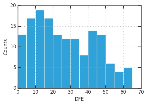
There are fewer countries with DFE > 50 degrees; however, there still seem to be enough for a comparison and regression. Eyeballing the values, it seems that we have about as many countries with DFE > 50 as one of the bins with DFE < 50. One possibility at this stage is to bin the data. Basically, this is taking the histogram bins and the mean of all the rates inside that bin, and letting the center of the bin represent the position and the mean, the value. To bin the data, we use the groupby method in Pandas together with the digitize function of NumPy:
bins = np.arange(23.5, 65+1,10, dtype='float')
groups_rates = rates.groupby(np.digitize(rates.DFE, bins))
Digitize finds the indices for the input array of each bin. The groupby method then takes the list of indices, takes those positions from the input array, and puts them in a separate data group. Now we are ready to plot both the unbinned and binned data:
import matplotlib.patches as patches
import matplotlib.transforms as transforms
fig = plt.figure()
ax = fig.add_subplot(111)
ax.errorbar(groups_rates.mean().DFE,
      groups_rates.mean().Both,
      yerr=np.array(groups_rates.std().Both),
      marker='.',
      ls='None',
      lw=1.5,
      color='g',
      ms=1)
ax.plot(rates.DFE, rates.Both, '.', color='SteelBlue', ms=6)
trans = transforms.blended_transform_factory(
      ax.transData, ax.transAxes)
rect = patches.Rectangle((0,0), width=23.5, height=1,
      transform=trans, color='yellow', alpha=0.5)
ax.add_patch(rect)
ax.set_xlabel('DFE')
ax.set_ylabel('Both'),

We now perform linear regression and test our hypothesis that less sunlight means a higher suicide rate. As before, we are using linregress from SciPy:
From scipy.stats import linregress
mindfe = 30
selection = ~rates.DFE.isnull() * rates.DFE>mindfe
rv = rates[selection].as_matrix(columns=['DFE','Both'])
a, b, r, p, stderr = linregress(rv.T)
print('slope:{0:.4f}
intercept:{1:.4f}
rvalue:{2:.4f}
pvalue:{3:.4f}
stderr:{4:.4f}'.format(a, b, r, p, stderr))

Here, the mindfe parameter was introduced only to fit a line where DFE is higher than this; you can experiment with the value. Logically, we will start this where DFE is 23.5; you will get slightly different results for different values. In our example, we use 30 degrees. If you want, you can plot the results just as in the previous chapter with the output of linregress.
As an alternative fitting method to linregress, we can use the powerful statsmodels package. It is installed by default in the Anaconda 3 Python distribution. The statsmodels package has a simple way of putting in the assumed relationship between the variables; it is the same as the R-style formulas and was included in statsmodels as of version 0.5.0. We want to test a linear relationship between rates.DFE and rates.Both, so we just tell this to statsmodels with DFE ~ Both. We are simply giving it the relationship between the keys/column names of the DataFrame.
The function is fitted with the Ordinary Least Squares (OLS) method, which basically minimizes the square of the difference between the fit and data (also known as the loss function):
import statsmodels.formula.api as smf
mod = smf.ols("DFE ~ Both", rates[selection]).fit()
print(mod.summary())
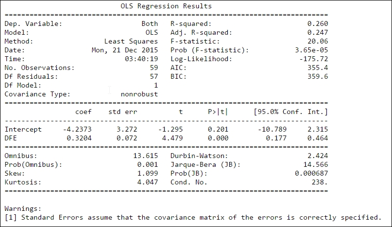
The first part, that is, the left side of the top table gives general information. The dependent variable (Dep. Variable) states the name of the variable that is fitted. Model states what model we used in the fit; except OLS, there are several other models such as weighted least squares (WLS). The number of observations (No. Observations) are listed and the degrees of freedom of the residuals (Df Residuals), that is, the number of observations (59) minus the parameters determined through the fitting 2 (k
and k). Df Model shows how many parameters were determined (except the constant, that is, intercept). The table to the right of the top table shows you information on how well the model fits the data. R-squared was covered before; here, the adjusted R-square value (Adj. R-squared) is also listed and this is the R-square value corrected for the number of data points and degrees of freedom. The F-statistic number gives you an estimate of how significant the fit is. Practically, it is the mean squared error of the model divided by the mean squared error of the residuals. The next value, Prob (F-statistic), gives you the probability to get the F-statistic value if the null hypothesis is true, that is, the variables are not related. After this, three sets of log-likelihood function values follow: the value of the log-likelihood value of the fit, the Akaike Information Criterion (AIC), and Bayes Information Criterion (BIC). The AIC and BIC are various ways of adjusting the log-likelihood function for the number of observations and model type.
After this, there is a table of the determined parameters, where, for each parameter, the estimated value (coeff), standard error of the estimate (std err), t-statistic value (t), P-value (P>|t|), and 95% confidence interval is shown. A P-value lower than a fixed confidence level, here 0.05 (that is, 5%), shows that there is a statistically significant relationship between the data and model parameter.
The last section shows the outcome of several statistical tests, which relates to the distribution of the fit residuals. Information about these can be found in the literature and the statsmodels documentation ( http://statsmodels.sourceforge.net/ ). In general, the first few test for the shape (skewness) of the errors (residuals): Skewness, Kurtosis, Omnibus, and Jarque-Bera. The rest test if the errors are independent (that is, autocorrelation)—Durbin-Watson—or how the fitted parameters might be correlated with each other (for multiple regression)—Conditional Number (Cond. No).
From this, we can now say that the suicide rate increases roughly by 0.32+/-0.07 per increasing degree of absolute latitude above 30 degrees per 100,000 inhabitants. There is a weak correlation with absolute Latitude (DFE). The very low Prob (F-statistic) value shows that we can reject the null hypothesis that the two variables are unrelated with quite a high certainty, and the low P>|t| value shows that there is a relationship between DFE and suicide rate.
We can now plot the fit together with the data. To get the uncertainty of the fit drawn in the figure as well, we use the built-in wls_prediction_std function that calculates the lower and upper bounds with 1 standard deviation uncertainty. The WLS here stands for Weighted Least Squares, a method like OLS, but where the uncertainty in the input variables is known and taken into account. It is a more general case of OLS; for the purpose of calculating the bounds of the uncertainty, it is the same:
from statsmodels.sandbox.regression.predstd import wls_prediction_std
prstd, iv_l, iv_u = wls_prediction_std(mod)
fig = plt.figure()
ax = fig.add_subplot(111)
rates.plot(kind='scatter', x='DFE', y='Both', ax=ax)
xmin, xmax = min(rates['DFE']), max(rates['DFE'])
ax.plot([mindfe, xmax],
        [mod.fittedvalues.min(), mod.fittedvalues.max()],
        'IndianRed', lw=1.5)
ax.plot([mindfe, xmax], [iv_u.min(), iv_u.max()], 'r--', lw=1.5)
ax.plot([mindfe, xmax], [iv_l.min(), iv_l.max()], 'r--', lw=1.5)
ax.errorbar(groups_rates.mean().DFE,
            groups_rates.mean().Both,
            yerr=np.array(groups_rates.std().Both),
            ls='None',
            lw=1.5,
            color='Green')
trans = transforms.blended_transform_factory(
    ax.transData, ax.transAxes)

rect = patches.Rectangle((0,0), width=mindfe, height=1,
                         transform=trans, color='Yellow',
                         alpha=0.5)
ax.add_patch(rect)
ax.grid(lw=1, ls='dashed')
ax.set_xlim((xmin,xmax+3));

There are a quite a few studies showing the dependency of suicide rates and Latitude (for example, Davis GE and Lowell WE, Can J Psychiatry. 2002 Aug; 47(6):572-4. Evidence that latitude is directly related to variation in suicide rates.). However, some studies used fewer countries (20), so they could suffer from selection bias, that is, accidentally choosing those countries that favor a strong correlation. What's interesting from this data though is that there seems to be a minimum suicide rate at a higher latitude, which speaks in favor of some relationship.
A few things to remember here are as follows:
- There is a significant spread around the trend. This indicates that this is not one of the major causes for the spread in suicide rates over the world. However, it does show that it is one of the things that might affect it.
- In the beginning, we took the coordinate centroids; some countries span long ranges of latitude. Thus, the rates might vary within that country.
- Although we assume that a direct correlation with the amount of sunlight per year one receives is directly proportional to the latitude, weather of course also plays a role in how much sunlight we see and get.
- It is difficult interpreting the gender data; perhaps women try suicide just as much as men but fail more often, then getting proper help. This would bias the data so that we believe men are more suicidal.
In the long run, the amount of exposure to sunlight affects the production of vitamin D in the body. Many studies are trying to figure out how all of these factors affect the human body. One indication of the complex nature of this comes from studies that show seasonal variations in the suicide rates closer to the equator (Cantor, Hickey, and De Leo, Psychopathology 2000; 33:303-306), indicating that increased and sudden changes in sun exposure increase the suicide risk. The body's reaction to changes in sun exposure is to release or inhibit the release various hormones (melatonin, serotonin, L-tryptophan, among others); a sudden change in the levels of the hormones seems to increase the risk of suicide.
Another potential influence on suicide rates is economic indicators. Thus, we will now try to see if there is a correlation between these three variables through multivariate regression.