
Interactive IPython notebook widgets are, at the time of writing (July 2015), an experimental feature. I, and as far as I know, many other people, hope that this feature will remain. In a nutshell, the widgets let you select values as you would with HTML forms. This includes sliders, drop-down boxes, and check boxes. As you can read, these widgets are very convenient for visualizing the weather data I introduced in Chapter 1, Laying the Foundation for Reproducible Data Analysis.
- Import the following:
import seaborn as sns
import numpy as np
import pandas as pd
import matplotlib.pyplot as plt
from IPython.html.widgets import interact
from dautil import data
from dautil import ts
- Load the data and request inline plots:
%matplotlib inline
df = data.Weather.load()
- Define the following function, which displays bubble plots:
def plot_data(x='TEMP', y='RAIN', z='WIND_SPEED', f='A', size=10, cmap='Blues'): dfx = df[x].resample(f) dfy = df[y].resample(f) dfz = df[z].resample(f) bubbles = (dfz - dfz.min())/(dfz.max() - dfz.min()) years = dfz.index.year sc = plt.scatter(dfx, dfy, s= size * bubbles + 9, c = years, cmap=cmap, label=data.Weather.get_header(z), alpha=0.5) plt.colorbar(sc, label='Year') freqs = {'A': 'Annual', 'M': 'Monthly', 'D': 'Daily'} plt.title(freqs[f] + ' Averages') plt.xlabel(data.Weather.get_header(x)) plt.ylabel(data.Weather.get_header(y)) plt.legend(loc='best') - Call the function we just defined with the following code:
vars = df.columns.tolist() freqs = ('A', 'M', 'D') cmaps = [cmap for cmap in plt.cm.datad if not cmap.endswith("_r")] cmaps.sort() interact(plot_data, x=vars, y=vars, z=vars, f=freqs, size=(100,700), cmap=cmaps) - This is one of the recipes where you really should play with the code to understand how it works. The following is an example bubble plot:

- Define another function (actually, it has the same name), but this time the function groups the data by day of year or month:
def plot_data(x='TEMP', y='RAIN', z='WIND_SPEED', groupby='ts.groupby_yday', size=10, cmap='Blues'): if groupby == 'ts.groupby_yday': groupby = ts.groupby_yday elif groupby == 'ts.groupby_month': groupby = ts.groupby_month else: raise AssertionError('Unknown groupby ' + groupby) dfx = groupby(df[x]).mean() dfy = groupby(df[y]).mean() dfz = groupby(df[z]).mean() bubbles = (dfz - dfz.min())/(dfz.max() - dfz.min()) colors = dfx.index.values sc = plt.scatter(dfx, dfy, s= size * bubbles + 9, c = colors, cmap=cmap, label=data.Weather.get_header(z), alpha=0.5) plt.colorbar(sc, label='Day of Year') by_dict = {ts.groupby_yday: 'Day of Year', ts.groupby_month: 'Month'} plt.title('Grouped by ' + by_dict[groupby]) plt.xlabel(data.Weather.get_header(x)) plt.ylabel(data.Weather.get_header(y)) plt.legend(loc='best') - Call this function with the following snippet:
groupbys = ('ts.groupby_yday', 'ts.groupby_month')
interact(plot_data, x=vars, y=vars, z=vars, groupby=groupbys, size=(100,700), cmap=cmaps)
Refer to the following plot for the end result:
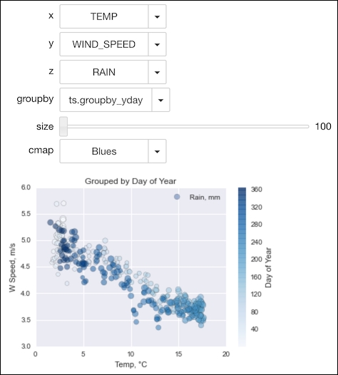
My first impression of this plot is that the temperature and wind speed seem to be correlated. The source code is in the Interactive.ipynb file in this book's code bundle.
- The documentation on interactive IPython widgets at https://ipython.org/ipython-doc/dev/api/generated/IPython.html.widgets.interaction.html (retrieved July 2015)
..................Content has been hidden....................
You can't read the all page of ebook, please click here login for view all page.