We will now look at three main groups of classification (learning) models: Support Vector Machine (SVM), Nearest Neighbor, and Random Forest. SVM simply divides the space in N regions, separated by a boundary. The boundary can be allowed to have different shapes, for example, there is a linear boundary or quadratic boundary. The Nearest Neighbor classification identifies the k-nearest neighbors and classifies the current data point depending on what class the k-nearest neighbors belong to. The Random Forest classifier is a decision tree learning method, which, in simple terms, creates rules from the given training data to be able to classify new data. A set of if-statements in a row is what gives it the name decision tree.
The data that we are going to use comes from the the UCI Machine Learning repository (Lichman, M. (2013)- http://archive.ics.uci.edu/ml . (Irvine, CA: University of California, School of Information and Computer Science). The dataset contains several measured attributes of three different types of wheat grains (M. Charytanowicz, J. Niewczas, P. Kulczycki, P.A. Kowalski, S. Lukasik, S. Zak,A Complete Gradient Clustering Algorithm for Features Analysis of X-ray Images, in: Information Technologies in Biomedicine, Ewa Pietka, Jacek Kawa (eds.), Springer-Verlag, Berlin-Heidelberg, 2010, pp. 15-24.).
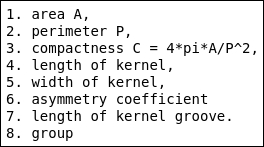
We want to create a classifier, something that, if we measure specific parameters of a seed, can tell what type of seed it is. With the dataset, a description of the columns are supplied, which can also be found on the UCI web page for the dataset. There are eight columns, seven for the parameters and one for the known type of the seed (that is, the label). I have created a text file for this; in case you are running a Linux-based system, you can list the contents with Jupyter magic:
%%bash
less data/seeds.desc
Now that we know what columns are there, we can read it into a Pandas DataFrame:
seeds = pd.read_csv('data/seeds_dataset.txt',
       delim_whitespace=True,
       names=['A', 'P', 'C', 'lkern', 'wkern',
       'asym', 'lgro', 'gr'])
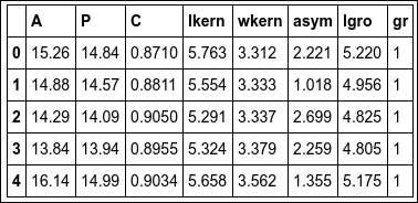
As always, list the contents of what was read:
seeds.head()
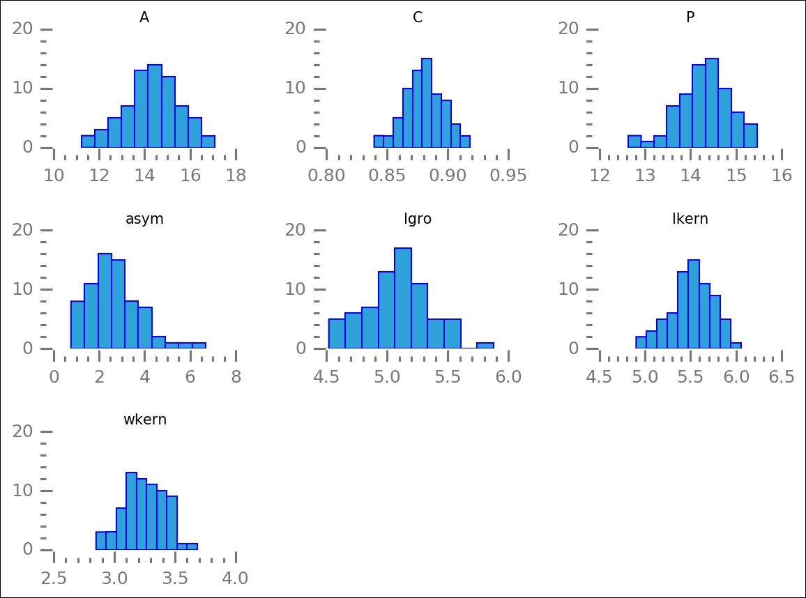
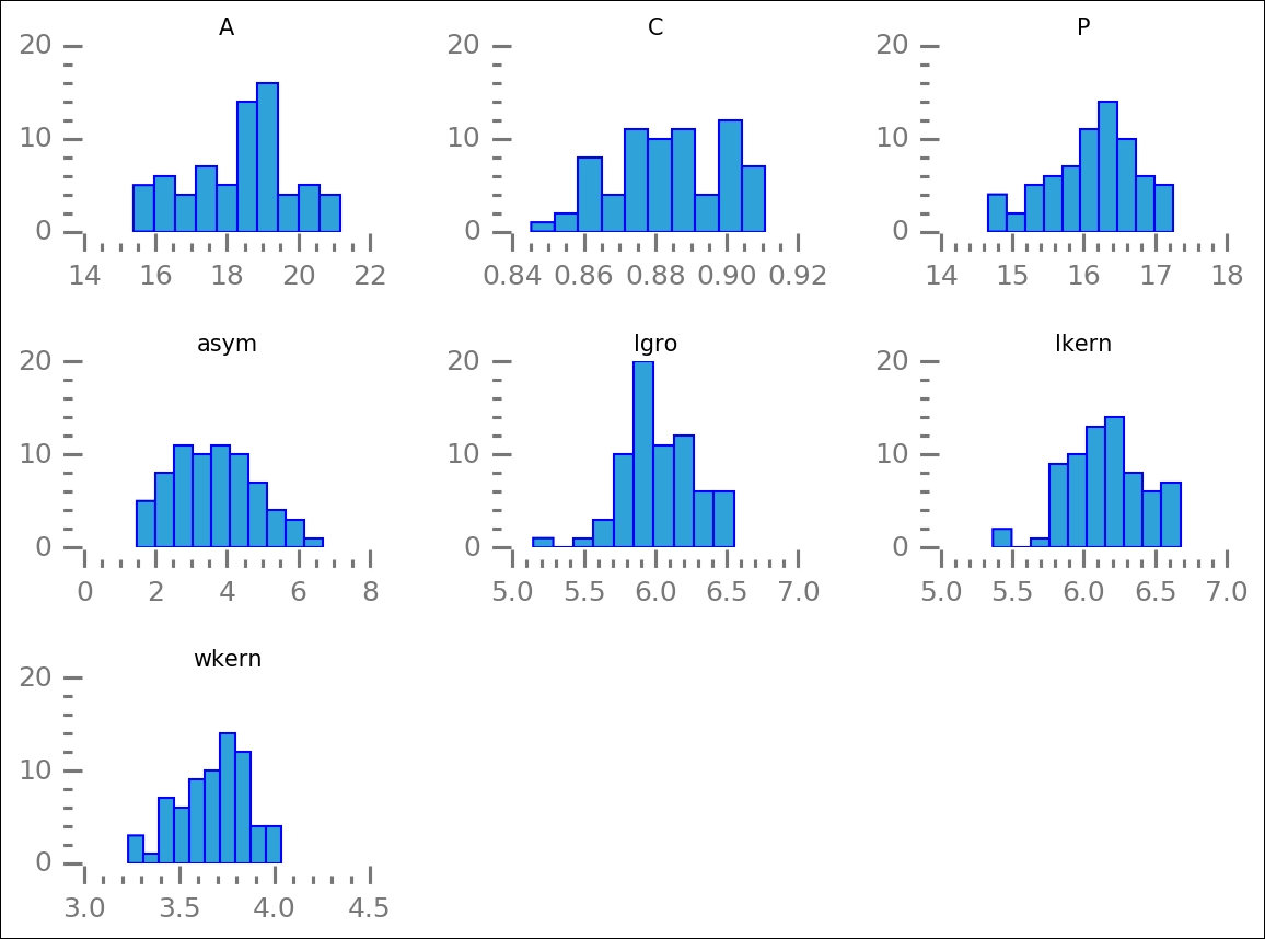
We could just run the whole classification process on all seven parameters in the dataset. This is computationally expensive, and the costs increase very quickly when increasing the amount of data. To make a first attempt at selecting only the attributes that matter for classification, I want to visually inspect the distribution of the values for the attributes for the different types of grains. To do this, we first create a selection filter for the different groups:
gr1 = seeds.gr == 1
gr2 = seeds.gr == 2
gr3 = seeds.gr == 3
To only plot the relevant parameters, we also create a list of the ones that we want to see (that is, not the type of grain):
pars = ['A','C','P','asym','lgro','lkern','wkern']
With Pandas' built-in histogram function, we can plot the attributes for each group. I have added some extra commands to make the figures look a bit better and more clutter-free:
axes = seeds[pars][gr1].hist(figsize=(8,6))
despine(list(axes.flatten()))
_ = [ax.grid() for ax in list(axes.flatten())]
_ = [ax.locator_params(axis='x', nbins=4) for ax in
    list(axes.flatten())]
_ = [ax.locator_params(axis='y', nbins=2) for ax in
    list(axes.flatten())]
plt.subplots_adjust(wspace=0.5, hspace=0.7)
Once again, we use the despine function to make the plots clearer. The preceding code will plot all of the attributes for the first group, gr1. The histogram will show you how the values are distributed:
With the selection filters, it is easy to plot the other groups:
axes = seeds[pars][gr2].hist(figsize=(8,6))
despine(list(axes.flatten()))
_ = [ax.grid() for ax in list(axes.flatten())]
_ = [ax.locator_params(axis='x', nbins=4) for ax in
    list(axes.flatten())]
_ = [ax.locator_params(axis='y', nbins=2) for ax in
    list(axes.flatten())]
plt.subplots_adjust(wspace=0.5, hspace=0.7)
By plotting all the groups, we can look at how the distribution of values for the attributes differ. We are trying to identify the ones that differ the most between groups:
axes = seeds[pars][gr3].hist(figsize=(8,6))
despine(list(axes.flatten()))
_ = [ax.grid() for ax in list(axes.flatten())]
_ = [ax.locator_params(axis='x', nbins=5) for ax in
    list(axes.flatten())]
_ = [ax.locator_params(axis='y', nbins=2) for ax in
    list(axes.flatten())]
plt.subplots_adjust(wspace=0.5, hspace=0.7)
After plotting this last group, we can look at each attribute and find the attribute where the distribution is separate for each group. This way, we can use it to distinguish the various groups (types of seeds), that is, classify them:

From this, I would argue that porosity and groove length are good parameters due to their fairly well-defined and, for the three groups, separated peaks. To check this, we plot them against each other. We also want to mark the various groups of grains:
fig = plt.figure()
ax = fig.add_subplot(111)
ax.scatter(seeds.P[gr1], seeds.lgro[gr1],
           color='LightCoral')
ax.scatter(seeds.P[gr2], seeds.lgro[gr2],
           color='SteelBlue', marker='s')
ax.scatter(seeds.P[gr3], seeds.lgro[gr3],
           color='Green', marker='<'),
ax.text(seeds.P[gr1].mean(), seeds.lgro[gr1].mean(),
        '1', bbox=dict(color='w', alpha=0.7,
                 boxstyle="Round"))
ax.text(seeds.P[gr2].mean(), seeds.lgro[gr2].mean(),
        '2', bbox=dict(color='w', alpha=0.7,
                  boxstyle="Round"))
ax.text(seeds.P[gr3].mean(), seeds.lgro[gr3].mean(),
        '3', bbox=dict(color='w', alpha=0.7,
                 boxstyle="Round"))
ax.set_xlabel('Porosity')
ax.set_ylabel('Groove length')
ax.set_title('Seed parameters')
despine(ax)
plt.minorticks_on()
ax.locator_params(axis='x', nbins=5)
ax.locator_params(axis='y', nbins=4)
ax.set_xlim(11.8,18)
ax.set_ylim(3.8,7.1);

Now, this is only two of the parameters; we have several more. However, from this, it seems that it is the hardest to separate groups 1 and 3, that is, the circles and triangles.
Built-in into Scikit-learn are several ways of determining the best parameters to look at. This is sometimes called feature selection, which is trying to determine which parameters have the biggest differences between each other and are best suited to describe the various groups as exactly that-distinct groups. Here, we use one where we can give a number, K (not to be confused with K in K-means), which determines up to what number of features it should select the best ones.
First, we store the seeds table as a matrix, a NumPy array, and then we separate the data and labels:
X_raw = seeds.as_matrix()
X_pre, labels = X_raw[:,:-1], X_raw[:,-1]
Now we can import the selection algorithm and run it on the data. Note that we also import the chi2 estimator and supply it to the selection object. This means that chi-squared minimization will be used to determine the best parameters:
from sklearn.feature_selection import SelectKBest
from sklearn.feature_selection import chi2
X_best = SelectKBest(chi2, k=2).fit_transform(X_pre, labels)
It has now selected two columns; to check which columns, we print out the first few rows of the selection and the raw data:
X_best[:5]
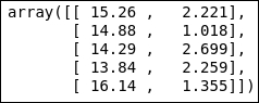
seeds.head()

The area (A) and asymmetry (asym) coefficients are the two best parameters to work with according to this selection algorithm. Before we run it through one of the machine learning algorithms for classification, we plot all of the data again, but this time the features are selected by the algorithm:
fig = plt.figure()
ax = fig.add_subplot(111)
ax.scatter(seeds.A[gr1], seeds.asym[gr1],
           color='LightCoral')
ax.text(seeds.A[gr1].mean(), seeds.asym[gr1].mean(),
        '1', bbox=dict(color='w', alpha=0.7,
        boxstyle="Round"))
ax.scatter(seeds.A[gr2], seeds.asym[gr2],
           color='SteelBlue',
           marker='s')
ax.text(seeds.A[gr2].mean(), seeds.asym[gr2].mean(),
        '2', bbox=dict(color='w', alpha=0.7,
        boxstyle="Round"))
ax.scatter(seeds.A[gr3], seeds.asym[gr3],
           color='Green',
           marker='<')
ax.text(seeds.A[gr3].mean(), seeds.asym[gr3].mean(),
        '3', bbox=dict(color='w', alpha=0.7,
        boxstyle="Round"))
ax.set_xlabel('Area')
ax.set_ylabel('Asymmetry')
ax.set_title('Seed parameters')
despine(ax)
plt.minorticks_on()
ax.locator_params(axis='x', nbins=5)
ax.locator_params(axis='y', nbins=3)
ax.set_xlim(9.6,22)
ax.set_ylim(-0.6,10);
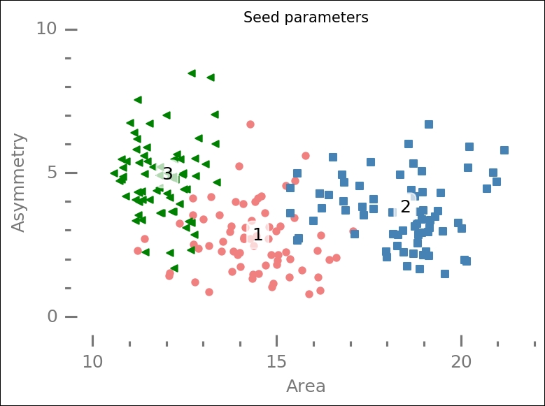
Compared with the previous similar plot, the points are more spread out, and perhaps the circles and triangles are more separated with less overlap—it is hard to assess.
To start classifying the data, we prepare a few things first. We import the SVM module and K-nearest neighbor along with the random forest estimators. Within the SVM module is the Support Vector Classification (SVC) estimator, the main estimator for SVM. SVC can be run with different kernels; we will cover the linear, radial basis function, and polynomial kernels. I will give a short explanation of them before we run them.
To visualize the classification, I want to plot the boundaries, and we will use contour lines to do this. For this, we need to create a grid of points and evaluate them with our trained classifier:
from sklearn import svm
from sklearn.neighbors import KNeighborsClassifier

res = 0.01
#X, y  = X_best[::2], labels[::2]
X, y  = X_best, labels
x_min, x_max = X[:, 0].min() - 1, X[:, 0].max() + 1
y_min, y_max = X[:, 1].min() - 1, X[:, 1].max() + 1
xx, yy = np.meshgrid(np.arange(x_min, x_max, res),
                     np.arange(y_min, y_max, res))
Here, we write a function to draw the results. To draw the boundaries, the x and y grid that we created previously is used. It is passed to the estimator's predict(xxyy) method. Here, input is the estimator, output from the machine learning classification model (that is, different SVMs, K-Nearest Neighbor, and Random Forest), and title of the plot. The contour plot draws the boundaries, and you can change ax.contour to ax.contourf to get filled contours. Now that we have a function to take care of the visualization, we can focus on testing the different models (called kernels):
def plot_results(clf, title):
    fig = plt.figure()
    ax = fig.add_subplot(111)
    plt.subplots_adjust(wspace=0.2, hspace=0.4)
    xxyy = np.vstack((xx.flatten(), yy.flatten())).T
    Z = clf.predict(xxyy)
    Z = Z.reshape(xx.shape)
    ax.contour(xx, yy, Z,
               colors=['Green','LightCoral', 'SteelBlue'],
               alpha=0.7, zorder=-1)
    ax.scatter(seeds.A[gr1], seeds.asym[gr1],
               color='LightCoral')
    ax.scatter(seeds.A[gr2], seeds.asym[gr2],
               color='SteelBlue', marker='s')
    ax.scatter(seeds.A[gr3], seeds.asym[gr3],
               color='Green', marker='<')
    ax.text(seeds.A[gr1].mean(), seeds.asym[gr1].mean(),
            '1', bbox=dict(color='w', alpha=0.7,
            boxstyle="Round"))
    ax.text(seeds.A[gr2].mean(), seeds.asym[gr2].mean(),
            '2', bbox=dict(color='w', alpha=0.7,
            boxstyle="Round"))
    ax.text(seeds.A[gr3].mean(), seeds.asym[gr3].mean(),
            '3', bbox=dict(color='w', alpha=0.7,
            boxstyle="Round"))
    despine(ax)
    plt.minorticks_on()
    ax.locator_params(axis='x', nbins=5)
    ax.locator_params(axis='y', nbins=3)
    ax.set_xlabel('Area')
    ax.set_ylabel('Asymmetry')
    ax.set_title(title, size=10)
    ax.set_xlim(9.6,22)
    ax.set_ylim(-0.6,10);
One simple kernel in SVC is the linear kernel, which assumes linear boundaries. As input, it takes C, the parameter determining the sensitivity to noisy data; with very noisy data, you can decrease this parameter. To get the linear kernel, run the classification on our data, and plot the results with our function, we run the following:
svc = svm.SVC(kernel='linear', C=1.).fit(X, y)
plot_results(svc, 'SVC-Linear')

As you can see, the boundaries are linear, and it does a reasonable job in dividing the various points into groups that correspond to the ones created by the researchers.
The next kernel, the Radial Basis Function (RBF), is the kernel used if no input kernel is given to the SVC call; it is basically a Gaussian kernel. The result is a kernel (region) that is built up by a linear combination of Gaussians. In addition to the C parameter, the gamma parameter can be given here; it is the inverse width of the Gaussian(s), so it gives the steepness of the boundary:
rbf_svc = svm.SVC(kernel='rbf', gamma=0.4, C=1.).fit(X, y)
plot_results(rbf_svc, 'SVC-Radial Basis Function')

Here, the boundaries are smoother. The borders in the center are roughly the same as with the linear kernel, but they differ going away from the dense regions.
The last SVC kernel that we will cover is the polynomial, and it is exactly what it sounds like, a polynomial. As input, it takes the degree:
poly_svc = svm.SVC(kernel='poly', degree=3, C=1.).fit(X, y)
plot_results(poly_svc, 'SVC-Polynomial')

The borders are thus represented by polynomials. I suggest that you try to change the degree to something else and see what happens with the borders.
Now we use the K-Nearest Neighbor. As input, this takes the weight and number of neighbors to compare with. The default weight is one that assumes uniform weights of all n_neighbors nearby points; changing the weights keyword to distance assumes that weights decrease with distance:
knn = KNeighborsClassifier(weights = 'uniform', n_neighbors=5).fit(X, y)
plot_results(knn, 'k-Nearest Neighbours')

This resembles some of the SVC kernels, but adapted to even smaller changes. Try changing weights to 'distance' and also changing the n_neighbors parameter and see how the results change. What happens when you change n_neighbors to something larger than 30; which of the other classifiers does it almost exactly replicate?
As a last example classifier, we use the Random Forest method. You can think of it as the dendrogram for hierarchical clustering in
Chapter 5
, Clustering; however, each branch is a rule to classify the data here. We give the object three inputs: max_depth, n_estimators, and max_features. The first, max_depth, determines how far each decision tree should go, and n_estimators gives how many decision trees there are in the forest. This is not really intuitive, so to show you what it is, first put n_estimators=1, run the code, and look at the output. Then, change to another, higher number and look at the new output:
rfc = RandomForestClassifier(
                             max_depth=3,
                             n_estimators=10,
                             max_features='auto').fit(X, y)
plot_results(rfc, 'Random Forest Classifier')
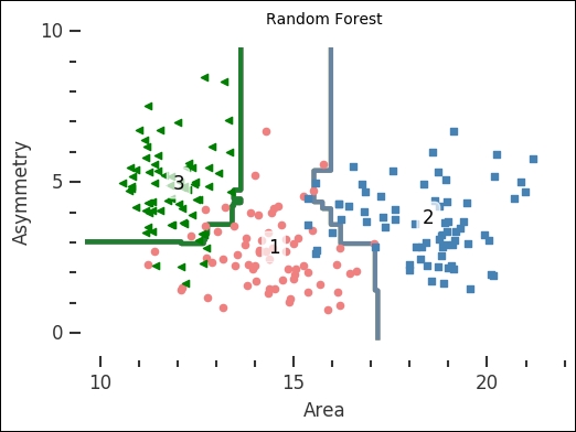
The number of trees in the forest is how many decision trees to build up the classifier with. The resulting plot shows that the random forest classifier is simple yet able to classify fairly complex problems. SVC together with the linear kernel is also simple, but you could imagine how the random forest classifier would be able to classify a more complex problem with fairly low depth and few estimators. I suggest that you take some time and play around with the input parameters for all the classifiers and see how the results change.
The preceding examples show you different results for the SVC (with various kernels), kNN, and Random Forest classifiers. However, when should you use one over the other? In general, try all of the methods on the given problem. The main advantages of SVC are highlighted in these examples—it is very versatile with many different kernels. Decision trees, like the random forest, run the risk of becoming too complex and thus overfitting the data. Also highlighted in the preceding examples, kNN is very good for classifications where the boundary is clearly not linear, as you can see in the results of the preceding image for kNN. There are also other kernels and classifiers. For example, a comparison of 179 classifiers was done for the article, Do we Need Hundreds of Classifiers to Solve Real World Classification Problems? (M. Fernandez-Delgado, 2014, JMLR, 15, 3133-3181). All of the common classifiers are covered in the study. However, as stated before, the important thing is to try various classifiers on your data to see what works.