
With data comprising of several separated distributions, how do we find and characterize them? In this chapter, we will look at some ways to identify clusters in data. Groups of points with similar characteristics form clusters. There are many different algorithms and methods to achieve this with good and bad points. We want to detect multiple separate distributions in the data and determine the degree of association (or similarity) with another point or cluster for each point. The degree of association needs to be high if they belong in a cluster together or low if they do not. This can of course, just as previously, be a one-dimensional problem or multi-dimensional problem. One of the inherent difficulties of cluster finding is determining how many clusters there are in the data. Various approaches to define this exist; some where the user needs to input the number of clusters and then the algorithm finds which points belong to which cluster, and some where the starting assumption is that every point is a cluster and then two nearby clusters are combined iteratively on a trial basis to see if they belong together.
In this chapter, we will cover the following topics:
- A short introduction to cluster finding—reminding you of the general problem—and an algorithm to solve it
- Analysis of a dataset in the context of cluster finding-the Cholera outbreak in central London 1854
- By simple zeroth order analysis, calculating the centroid of the whole dataset
- By finding the closest water pump for each recorded Cholera-related death
- Using the K-means nearest neighbor algorithm for cluster finding, applying it to data from Chapter 4 , Regression, and identifying two separate distributions
- Using hierarchical clustering by analyzing the distribution of galaxies in a confined slice of the Universe
The algorithms and methods covered here are focused on those available in SciPy.
As before, start a new Notebook and put in the default imports. Perhaps you want to change to interactive Notebook plotting to try it out a bit more. For this chapter, we are adding the following specific imports. The ones related to clustering are from SciPy, while later on, we will need some packages to transform astronomical coordinates. These packages are all preinstalled in the Anaconda Python 3 distribution and have been tested there:
import scipy.cluster.hierarchy as hac
import scipy.cluster.vq as vq
There are many different algorithms for cluster identification. Many of them try to solve a specific problem in the best way. Therefore, the specific algorithm that you want to use might depend on the problem you are trying to solve and also on what algorithms are available in the specific package that you are using.
Some of the first clustering algorithms consisted of simply finding the centroid positions that minimize the distances to all the points in each cluster. The points in each cluster are closer to that centroid than other cluster centroids. As might be obvious at this point, the hardest part with this is figuring out how many clusters there are. If we can determine that, it is fairly straightforward to try various ways of moving the cluster centroid around, calculate the distance to each point, and then figure out where the cluster centroids are. There are also obvious situations where this might not be the best solution, for example, if you have two very elongated clusters next to each other.
Commonly, the distance is the Euclidean distance:
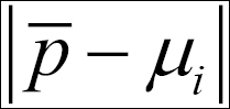
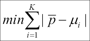
Here, p is a vector with all the points' positions, that is,{p1,p2,...,pN-1,pN} in cluster Ck, and the distances are calculated from the cluster centroid, µi. We have to find the cluster centroids that minimize the sum of the absolute distances to the points:
In this first example, we shall first work with fixed cluster centroids.
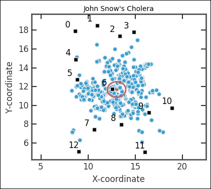
In 1854, there was an outbreak of cholera in North-western London, in the neighborhood around Broad Street. The leading theories at the time claimed that cholera spread, just like it was believed the plague spread, through foul, bad air. John Snow, a physician at the time, hypothesized that cholera spread through drinking water. During the outbreak, John tracked the deaths and drew them on a map of the area. Through his analysis, he concluded that most of the cases were centered on the Broad Street water pump. Rumors say that he then removed the handle of the water pump, thus stopping an epidemic. Today, we know that cholera is usually transmitted through contaminated food or water, thus confirming John's hypothesis. We will do a short but instructive reanalysis of John Snow's data.
The data comes from the public data archives of The National Center for Geographic Information and Analysis ( http://www.ncgia.ucsb.edu/ and http://www.ncgia.ucsb.edu/pubs/data.php ). A cleaned-up map and copy of the data files along with an example of a geospatial information analysis of the data can also be found at https://www.udel.edu/johnmack/frec682/cholera/cholera2.html . A wealth of information about physician and scientist John Snow's life and works can be found at http://johnsnow.matrix.msu.edu .
To start the analysis, we read in the data to a Pandas DataFrame; the data is already formatted into CSV files, readable by Pandas:
deaths = pd.read_csv('data/cholera_deaths.txt')
pumps = pd.read_csv('data/cholera_pumps.txt')
Each file contains two columns, one for X coordinates and one for Y coordinates. Let's check what it looks like:
deaths.head()

pumps.head()

With this information, we can now plot all the pumps and deaths in order to visualize the data:
plt.figure(figsize=(4,3.5))
plt.plot(deaths['X'], deaths['Y'],
         marker='o', lw=0, mew=1, mec='0.9', ms=6)
plt.plot(pumps['X'],pumps['Y'],
         marker='s', lw=0, mew=1, mec='0.9', color='k', ms=6)
plt.axis('equal')
plt.xlim((4.0,22.0));
plt.xlabel('X-coordinate')
plt.ylabel('Y-coordinate')
plt.title('John Snow's Cholera')

It is fairly easy to see that the pump in the middle is important. As a first data exploration, we will simply calculate the mean centroid of the distribution and plot this in the figure as an ellipse. We calculate the mean and standard deviation along the x and y axes as the centroid position:
fig = plt.figure(figsize=(4,3.5))
ax = fig.add_subplot(111)
plt.plot(deaths['X'], deaths['Y'],
         marker='o', lw=0, mew=1, mec='0.9', ms=6)
plt.plot(pumps['X'],pumps['Y'],
         marker='s', lw=0, mew=1, mec='0.9', color='k', ms=6)

from matplotlib.patches import Ellipse
ellipse = Ellipse(xy=(deaths['X'].mean(), deaths['Y'].mean()),
                  width=deaths['X'].std(), height=deaths['Y'].std(),
                  zorder=32, fc='None', ec='IndianRed', lw=2)
ax.add_artist(ellipse)
plt.plot(deaths['X'].mean(), deaths['Y'].mean(),
         '.', ms=10, mec='IndianRed', zorder=32)
for i in pumps.index:
    plt.annotate(s='{0}'.format(i), xy=(pumps[['X','Y']].loc[i]),
                 xytext=(-15,6), textcoords='offset points')
plt.axis('equal')
plt.xlim((4.0,22.5))
plt.xlabel('X-coordinate')
plt.ylabel('Y-coordinate')
plt.title('John Snow's Cholera')
Here, we also plotted the pump index, which we can get from DataFrame with the pumps.index method. The next step in the analysis is to see which pump is the closest to each point. We do this by calculating the distance from all pumps to all points. Then, we want to figure out for each point, which pump is the closest.
We save the closest pump to each point in a separate column of the deaths' DataFrame. With this dataset, the for-loop runs fairly quickly. However, the DataFrame subtract method chained with sum() and idxmin() methods takes a few seconds. I strongly encourage you to play around with various ways to speed this up. We also use the .apply() method of DataFrame to square and square root the values. The simple brute force first attempt of this took over a minute to run. The built-in functions and methods helped a lot:
deaths_tmp = deaths[['X','Y']].as_matrix()
idx_arr = np.array([], dtype='int')
for i in range(len(deaths)):
    idx_arr = np.append(idx_arr,
              (pumps.subtract(deaths_tmp[i])).apply(lambda
              x:x**2).sum(axis=1).apply(lambda x:x**0.5).idxmin())
deaths['C'] = idx_arr
Just quickly check whether everything seems fine by printing out the top rows of the table:
deaths.head()

Now we want to visualize what we have. With colors, we can show which water pump we associate each death with. To do this, we use a colormap; in this case, the jet colormap. By calling the colormap with a value between 0 and 1, it returns a color; thus, we give it the pump indexes and then divide it with the total number of pumps - 12 in our case:
fig = plt.figure(figsize=(4,3.5))
ax = fig.add_subplot(111)
np.unique(deaths['C'].values)
plt.scatter(deaths['X'].as_matrix(), deaths['Y'].as_matrix(),
               color=plt.cm.jet(deaths['C']/12.),
               marker='o', lw=0.5, edgecolors='0.5', s=20)
plt.plot(pumps['X'],pumps['Y'],
marker='s', lw=0, mew=1, mec='0.9', color='0.3', ms=6)
for i in pumps.index:
plt.annotate(s='{0}'.format(i), xy=(pumps[['X','Y']].loc[i]),
             xytext=(-15,6), textcoords='offset points',
             ha='right')
ellipse = Ellipse(xy=(deaths['X'].mean(), deaths['Y'].mean()),
                  width=deaths['X'].std(),
                  height=deaths['Y'].std(),
                  zorder=32, fc='None', ec='IndianRed', lw=2)
ax.add_artist(ellipse)
plt.axis('equal')
plt.xlim((4.0,22.5))
plt.xlabel('X-coordinate')
plt.ylabel('Y-coordinate')
plt.title('John Snow's Cholera')
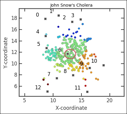
The majority of deaths are dominated by the proximity of the pump in the center. This pump is located on Broad Street.
Now, remember that we have used fixed positions for the cluster centroids. In this case, we are basically working on the assumption that the water pumps are related to the cholera cases. Furthermore, the Euclidean distance is not really the real-life distance. People go along roads to get water and the road there is not necessarily straight. Thus, one would have to map out the streets and calculate the distance to each pump from that. Even so, already at this level, it is clear that there is something with the center pump related to the cholera cases. How would you account for the different distance? To calculate the distance, you would do what is called cost-analysis (c.f. when you hit directions on your sat-nav to go to a place). There are many different ways of doing cost analysis, and it also relates to the problem of finding the correct way through a maze.
In addition to these things, we do not have any data in the time domain, that is, the cholera would possibly spread to other pumps with time and the outbreak might have started at the Broad Street pump and spread to other, nearby pumps. Without time data, it is extra difficult to figure out what happened.
This is the general approach to cluster finding. The coordinates might be attributes instead, length and weight of dogs for example, and the location of the cluster centroid something that we would iteratively move around until we find the best position.