
(RAY)
Job:10-91261 Title:Rockport : Little Book Of Packaging Ideas
175#_P Dtp:44 Page:296
before
W. M. Barr
DESIGN
Proteus Design, Boston, Massachusetts
MARKET
United States
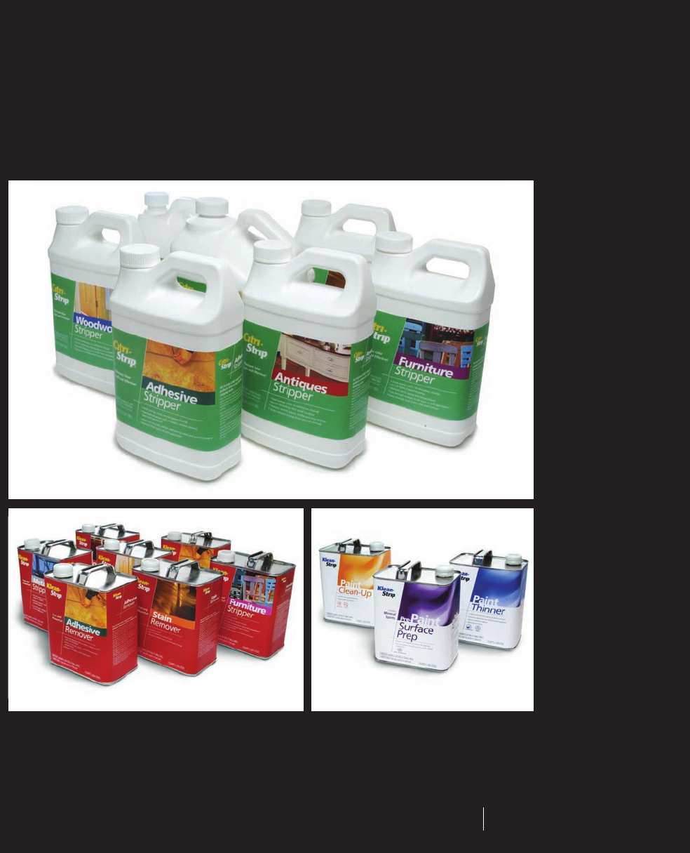
The original packaging for Barr’s
solvents emphasized the chemical
makeup of the product rather than the
job for which it was meant to be used.
As more DIYers began shopping the
category, however, the manufacturer
realized the packaging needed to be
more user friendly.
236-352_91261.qxp 10/18/06 8:33 AM Page 296
after
Although at first glance the redesigned
packages for the three products lines look
different from one another, the use of a
standard template, a second-level color-
coding system, and common images tie the
Klean-Strip and Citri-Strip lines together.
The packaging for the Klean-Strip thinners
line also subtly picks up the same layout
as that of the strippers, but it maintains a
different look to differentiate between the
products’ purposes. The careful combination
of individuality and continuity make shop-
ping the different lines of products much
easier for both the DIYer and professional.
296 297
THE LITTLE BOOK OF BIG PACKAGING IDEAS
(RAY)
Job:10-91261 Title:Rockport : Little Book Of Packaging Ideas
175#_P Dtp:44 Page:297
236-352_91261.qxp 10/18/06 8:33 AM Page 297

(RAY)
Job:10-91261 Title:Rockport : Little Book Of Packaging Ideas
175#_P Dtp:44 Page:298
Reason for Redesign
The previous packaging prominently featured the chemical
makeup of each product as the distinguishing factor.
However, as the home-improvement consumer changed
from the professional contractor to the DIYer and wood-
working hobbyist, the product was becoming increasingly
harder to shop. The packaging didn’t clearly state what
each product was for or how to use it, and no visual
differentiation existed between the various solvents.
Redesign Objectives
• Create easy-to-understand packaging that emphasizes
the solvent’s intended job instead of its chemical formula
• Capture the attention of DIY consumers, who in market
research exhibited barely any brand loyalty or awareness
• Design packaging lines that are different from one
another, making them task oriented
The Results
The new packaging reached consumers and made the
total product line easy to understand, raising the bar for
the home-improvement solvents category. The company
also used the insight it gained during the thinners and
strippers projects to reposition a number of other products,
including solvents, which they ultimately redesigned the
packaging for as well.
W. M. Barr Design Process
2 3
1
W. M. Barr is a Memphis-based
manufacturer that specializes in
home-improvement and automotive
products—paint thinners, strippers,
solvents, and specialty cleaners. The
home products in particular comprise
a comprehensive line that gives DIYers
and professionals all the solutions
needed to refinish furniture as well
as interior and exterior surfaces.
Barr’s products accomplish many
different tasks and span two sub-
brands, Klean-Strip and Citri-Strip.
Because each product has a specific
use with its own chemical formula,
organizing the product lines was
becoming especially complex.
236-352_91261.qxp 10/18/06 8:33 AM Page 298
298 299
THE LITTLE BOOK OF BIG PACKAGING IDEAS
(RAY)
Job:10-91261 Title:Rockport : Little Book Of Packaging Ideas
175#_P Dtp:44 Page:299
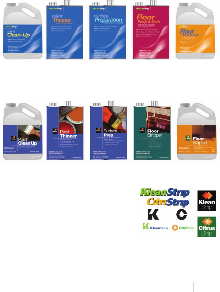
1–3
Proteus Design explored concepts for paint
thinner packages with prominently
displayed, descriptive product names
and a color classification system.
4, 5
The stripper packages required a
slightly different approach—they had
to be grouped into family units,
so that a color code encompassed
several products instead of one.
6
The new logos needed to tie the
brands together into a single family
of Barr products.
5
4
6
236-352_91261.qxp 10/18/06 8:33 AM Page 299
..................Content has been hidden....................
You can't read the all page of ebook, please click here login for view all page.