With healthy pockets of business in Australia and the United
States, there was plenty of room for expansion, but all of the
company’s packaging would have to be brought onto the same
platform first.
Don Chisholm, creative and strategy director for Dossier Creative of
Vancouver, British Columbia, describes Advanced Group Hair Care,
the client’s name when his group began working with it in 1998:
“AG is like a cosmetics company, but instead of making over your
face, they want to help you make over your hair. Their products
are designed to give you the best-quality hair care. The company
spends an enormous amount of money on high-quality ingredi-
ents: Each product is organically driven or contains very few
chemicals,” he says.
The client’s goal was to relaunch itself into the U.S. market with a
new identity, while maintaining existing clientele. The company’s
color-coding system had worked well when its product line was
smaller, but now it had become a confusing mix of shades on the
shelf, far too many colors for the customer to remember: This
would have to be remedied, Dossier Creative advised. Also, the
logo needed to be redone, ideally to accommodate the new name
the design firm was suggesting: AG.
“The client was understandably nervous about changing its iden-
tity: They had an $18 million business they didn’t want to upset,”
Chisholm recalls.
Once the client was convinced that the “AG” moniker would have
much better customer recall than “Advanced Group,” the Dossier
team could begin working on a shelf presence for the brand,
which is only available through salons. AG shampoos cost from
$12 to 14, whereas styling products range from $15 to $26, which
was in line with other salon products, but still pricier than retail
store brands. So the new packages needed to look upscale.
Dossier suggested that the client organize its products by the ex-
isting 34 subbrands—such as Fast Food, Tech One, or Plastic—
rather than by category—shampoo, conditioner, and so on. This
idea was also accepted.
In one early design, the AG symbol was anchored by a circle or
umlaut, to give the product a European feel. A system of dots
formed matrixes and, in turn, letters, such as “V” for “volumizing.”
A similar trial was more typographically based, and a completely
different experiment used photography. With this design, the pho-
tos would literally show thick or thin hair, or different styles that
can be achieved to explain what the product was for. This design
would also have a stainless steel band around its top.
AG Hair Products had become a victim of its own success. It
started as a small company in 1991, and after more than
10 years in business and
expanding its line from 4 to 28
products,
the brand needed coordination.
After 10 years in business, AG Hair Products had grown
from 4 to 28 products, and from an orderly branding
system to a hodgepodge of colors and package
shapes. Dossier Creative reorganized the brand by
means of its packaging.
(RAY)
Job:10-91261 Title:Rockport : Little Book Of Packaging Ideas
175#_P Dtp:44 Page:96
001-157_91261.qxp 10/16/06 1:30 PM Page 96

The design, Dossier and the client decided, would move the con-
sumer too far from the existing system, causing confusion and
potential loss of brand recognition. The change, they agreed, had
to be evolutionary, rather than revolutionary.
A second round of designs was based on color coding, as AG had
done in the past, but with far fewer categories—five to represent
each product grouping versus one for each of the 34 subbrands.
The designers experimented with such interesting effects as de-
pressed areas in the bottle where an imprinted rubber band
would sit, providing color coding and traction, and a depressed
area in the bottle to hold a debossed sticker.
In a third series of experiments, the final type treatment started
to be worked out. Here uniquely shaped containers with arched
sides were studied. The client loved the logo and type treat-
ments, but from ergonomic and production-cost standpoints, the
more uniquely shaped bottles were impractical. But Chisholm
says that these studies were fruitful in stretching the notion of
what the container could actually be.
Squared-off bottles were also tried, but eventually the team decided
on an elegantly round-shouldered bottle, a standard tube, and a
squat jar for the final designs. “These were clean and contemporary,
with an upscale, elegant shape which fits with the simple European
design,” says Chisholm. “The tapered shape elevates the brand,
providing it with a refined sensibility and a simple Zen elegance that
targets a fashionable and sophisticated consumer.”
The subbrands are color coded in a subtle way, using just enough
color to guide the buyer yet still maintain a cool, clean polished
presence on the salon store shelf. This classic approach is a de-
parture from the pool of competitors’ packaging designs, many of
which relied on novelty shapes and colors.
The white bottles were also a nod to AG’s former design, but in
this redesign, a pearlized white was chosen. “White is used to
symbolize a lab coat or the professional formulation of the prod-
uct. We stayed with white, but added the pearlized finish to give
the packages a more premium feel,” Chisholm says.
The tallest bottles in the line were adorned with a mysterious little
extra: a plastic cap that fits onto its bottom. Right now, Chisholm
explains, the cap is purely cosmetic, but in future products it may
be a functional part of the product, used for mixing or measuring.
The frosted, translucent cap on the tube and silvery lid on the jar
mimic the subtle shine of the bottle’s seat.
“Color coding has been a huge part of AG’s business, and this
new design still allows consumers to ‘cherry pick’ what they want,
following the ‘prescription’ of their stylist,” Chisholm says. “But
with this system, consumers will have an easier time seeing the
products on the shelves and gravitating toward and remember
the subbrand they prefer.”
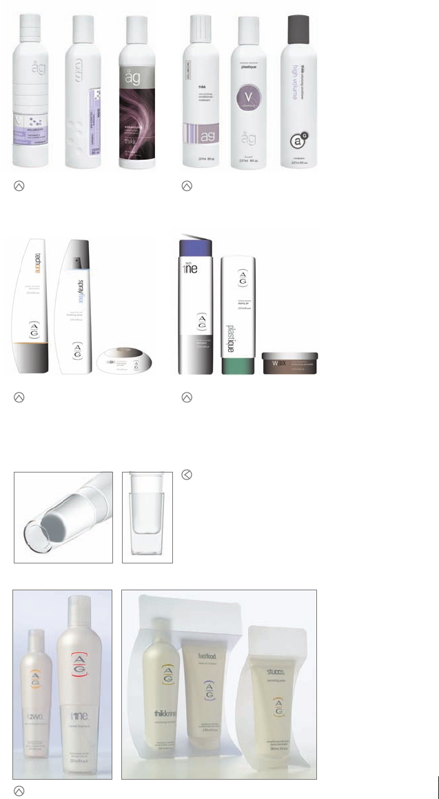
This design was anchored by an umlaut
over the letters “AG.” A system of dots
formed a matrix that, in turn, formed
letters, such as V for “Volumizing.”
This design incorporated an indented
area where a sticker, printing, or even
an imprinted rubber band could sit.
Although the designers liked this round
of designs, it proved to be ergonomically
inadvisable: The bottles were hard to
hold onto, especially when wet.
This trial showed how relating the
line through subbrands would work.
Although the Plastique line, Waxx
line, and 1ne lines would all have a
distinctive look and color, it is appar-
ent that the three products clearly
come from the same family.
One distinctive feature of this new
design is that the tallest bottles in
some lines have a clear plastic cap
that fits over the bottom of the bot-
tle. Right now, the cap is for appear-
ance only, but for future products it
may be functional as well, serving as
a measuring cup or mixing container.
Two examples of separate, but clearly related, subbrands.
96 97
THE LITTLE BOOK OF BIG PACKAGING IDEAS
(RAY)
Job:10-91261 Title:Rockport : Little Book Of Packaging Ideas
175#_P Dtp:44 Page:97
001-157_91261.qxp 10/16/06 1:30 PM Page 97
..................Content has been hidden....................
You can't read the all page of ebook, please click here login for view all page.
