(RAY)
Job:10-91261 Title:Rockport : Little Book Of Packaging Ideas
175#_P Dtp:44 Page:18
Designers at AdamsMorioka (Los Angeles) believed in the latter
philosophy when they created an extremely minimal packaging
system for Philip B, a high-end line of shampoo and other per-
sonal care products that can cost up to $65 per container.
“The people we are talking to don’t need to be sold to: They are
already in the mode of wanting an understated product for their
bath,” explains principal Sean Adams. He compares the Philip B
experience to patronizing the most exclusive restaurant in LA.
“It’s a sushi place that is not advertised and doesn’t even have a
sign on the door. You just have to know about it.”
When AdamsMorioka began working with the client, the product
had been in existence for several years and was selling well, but
in limited venues. The client, who had designed the original pack-
aging himself, was frustrated by not being able to convince high-
end retailers such as Barney’s or Sak’s to carry his lines.
Adams felt that the original packaging design might be a liability: It
just didn’t speak to consumers on the shelf, so the store’s buyers
would not place orders. Clearly, a revamp was needed.
The design team began by doing an audit of many different hair
care and personal care systems, from pricey to discount levels.
“We found out that the cheaper the brand was, the more flashy it
became, with silver and pink and fancy bottles. One thing we
knew about Philip B was that it was an honest product. He really
used organic ingredients: When the label said ‘avocado’ or ‘pep-
permint,’ those things really were in the product. It was important
to communicate that authenticity in the package design,” explains
Adams. “When you try too hard, it just ends up looking cheap.”
He felt that this quality could be conveyed through good typogra-
phy, decent but simple materials, and a basic design. The designers
went out of their way to select the most generic bottle form avail-
able. This also conveyed the idea that the spending went into the
product and did not need disguising. Adams says that he is highly
annoyed by bottles that are shaped like flying saucers or anything
other than what they are supposed to be. They smack of people
trying too hard to be hip and get attention.
The formal elements of the packaging, although minimal, were
chosen carefully. The typefaces Mrs. Eaves was chosen as the
basis for the Philip B word mark; Avenir is the primary font used
for all applications. In both instances, these faces are warmer and
more casual than other traditional fonts like Bembo or Futura,
Adams explains.
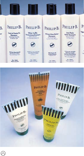
What kind of packaging appeals to consumers for whom
money is no object? Is it better to go
over the top in terms of
opulence and quantity of materials? Or is an understated
approach more engaging? Philip B could go either way.
AdamsMorioka’s bottle design for Philip B was under-
stated to the extreme, but at $50-plus per bottle, it is
sold to people who don’t need to be sold to. The tube
design took the concept to the next level: The clear
containers carried more elaborate patterning, still in
black and white. The product color showed through,
which added yet another dimension.
001-157_91261.qxp 10/16/06 9:36 AM Page 18
The black-and-white color palette was a nod to the client’s previ-
ous packaging, but it was also chosen for its strength. The client
had also alluded early on in the project to the essential nature of
Fornasetti plates and Aubrey Beardsley prints. “Although most of
us think of black and white as being basic, how often does it get
used in a final product?” Adam asks. “This combination stood off
the shelf amid the sea of color and became proprietary.” Another
consideration in selecting black and white, although minor, was
that the bottles look good in any bathroom, regardless of tile
color or decor.
The iconic system was set up to delineate the products in a subtle
way. The icons were designed not to be literal—as in showing a
white truffle for the White Truffle shampoo—but were organized by
inspiration and spirit. For example, when developing the Chai
Latte Body Wash, the client had been inspired by Eastern thought.
So a lotus leaf was used as the basis for its icon.
The bottle’s cap is nothing out of the ordinary—just a functional
stock item. Used on a white bottle, the cap is like the classic Chanel
suit that stands the test of time, as other products are repeatedly
recreating themselves in fashionable colors and typography.
Almost immediately after the new packaging was launched, the
client sales leaped nearly 300 percent, due in large part to new
distribution agreements with Barney’s, Sak’s, Fred Segal, and se-
lected high-end beauty supply stores, as well as an hour-long
segment on QVC. From this strong foothold, the client was able to
develop and release new product lines: lotions, styling gels, body
washes, and more, many of which would be packaged in tubes.
Carrying the black and white scheme through on the tubes would
be important, Adams recalls. The typography and graphics were
simple enough to translate well to the new package shape. And
what initially looked like a production problem turned out to be a
design opportunity that opened up the project in unexpected ways.
Tubes usually have some sort of graphics covering their sealed
end that hide the portion of the tube that is not filled: Some air
is necessarily left in the tube to allow for natural expansion of the
product due to changes in temperature or atmospheric pressure.
The designers felt that, in keeping with the product’s philosophy
of complete honesty, it would be better to leave the area com-
pletely clear. But the manufacturer prevailed.
The result was a compromise: a series of black and white stripes
that partially obscured and partially revealed the end area. The
stripes inspired additional designs for other products, including
dots, Kanji characters, and a dot pattern inspired by a Thai textile.
“The patterns match the personality of the product,” Adams ex-
plains. The Thai pattern was obviously designed for the Thai Tea
Body Wash, the falling drops worked with the Chai Latte Body
Wash, and the simple stripe was appropriate for a base product
like the conditioner. Says Adams, “I can only explain that if you
use the Body Wash, you’ll understand why the drops slowly and
quietly disappear.”
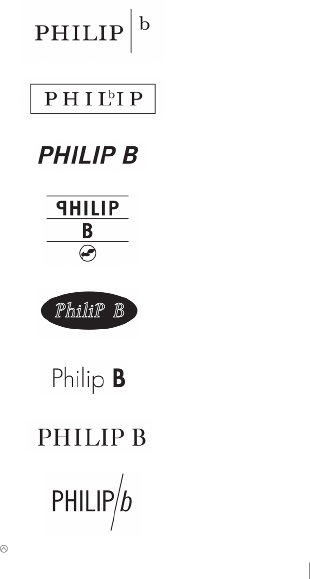
Because the word mark would be the centerpiece of the package design, the
designers spent a great deal of time experimenting with different personalities.
18 19
THE LITTLE BOOK OF BIG PACKAGING IDEAS
Job:10-91261 Title:Rockport : Little Book Of Packaging Ideas
175#_P Dtp:44 Page:19
(RAY)
001-157_91261.qxp 10/16/06 9:36 AM Page 19

The simple bottle designs not only looked elegant but were also basic enough to be combined with other
patterning and effects, some of which were quite exotic. Various marketing materials picked up on the pat-
terning, some in dramatic ways.
Each package design was minimal from the start.
(RAY)
Job:10-91261 Title:Rockport : Little Book Of Packaging Ideas
175#_P Dtp:44 Page:20
001-157_91261.qxp 10/16/06 9:36 AM Page 20

Where the design of the Philip B packaging is extremely simple,
the materials that support sales of the products—ads, postcards,
and other marketing materials—go in a completely different
graphic direction. A postcard designed for a new body wash, for
example, has everything in it but the kitchen sink, Adams says—
lots of color, Asian cues, photos, different patterns, even the word
“new” called out in small bursts. It is decidedly more forward.
“In the store, the products need to look consistent and clean,”
Adams says, “but in the home environment, the products need
more sales support.” The combination of simple and complex
also reflects the client’s personality: He is completely serious and
committed to the integrity of the product, but he is also one of
the most unique and exuberant people Adams knows. The client
embraces the dichotomy of this situation and pushed the designers
to explore it.
The whole system is essentially contradictory, Adams says. It is
not an approach a designer could get away with for a Fortune 500
company product, but it has worked for Philip B, which had at
this writing just opened its own store on très chic Robertson
Boulevard in Los Angeles.
“When we first started working with the client, he was still work-
ing out of his living room, so to see his growth is really wonder-
ful. He already had a really good product: We just made it
possible for people to notice it,” Adams says.
The various products carried many symbols that were representative of the person-
ality of the package’s contents. These symbols formed yet another design resource
for the client. Here the designers used the symbols to form a mandala on the
storefront window of the client’s new store in Los Angles, California.
20 21
THE LITTLE BOOK OF BIG PACKAGING IDEAS
(RAY)
Job:10-91261 Title:Rockport : Little Book Of Packaging Ideas
175#_P Dtp:44 Page:21
001-157_91261.qxp 10/16/06 9:37 AM Page 21
..................Content has been hidden....................
You can't read the all page of ebook, please click here login for view all page.