Would the design be more successful if it was covered with pri-
mary colors and cartoon characters, or would it have more impact
if it referred to flatulence, bad breath, and other bodily disorders?
Designers at Brandhouse WTS chose the latter alternative for
Tesco Kids, a new line of goods for the largest grocery retailer in
the United Kingdom. With more than 150 products in the line—
and the possibility of many more if the idea was a success—the
design assignment could have been huge and unwieldy. Instead,
designer Gary Utting found a way to make the design for the
£250 million brand not only controllable but also fun.
“Tesco Kids was a new line. One of Tesco’s competitor’s had
bought out a whole range of kids products recently and had
aimed the design of the line at parents. We weren’t sure that was
the right way to go,” says David Beard, creative director at Brand-
house WTS, a London-based consultancy. “We wanted to create
an umbrella design for all of these products, and push it at moth-
ers and kids. That was going to be difficult, because these are re-
ally opposite concerns.”
For moms, the packaging design would have to speak of healthy
eating for their children. But this type of design would be boring
for the kids.
“Children would like something a bit more naughty and even
rude,” says Beard. Even more, the brand would have to feel that
it belonged to the kids alone: No grownups. “If the design talked
to kids through some adult voice, it would be like Bart Simpson
telling them to wash behind their ears—no good,” notes Utting.
The Brandhouse WTS designers explored three directions. In the
first, the product contained inside the packaging was included in
whimsical illustration. For instance, for a pasta label, the art
might show a person climbing up long strands of spaghetti. For a
can of beans, the same character might be luxuriating in a bath-
tub full of beans. Here, the product was hero.
In the second approach, a short, witty poem would grace the
front of each package. The design team liked the approach quite
a bit, but they could see themselves being painted into the cor-
ner from two directions: First, although some products were
amusing—beans, for instance—others weren’t quite so funny.
Also, writing poems that were consistently funny for all 150-and-
counting SKUs could prove to be not so amusing.
The third experiment was the preferred direction almost from the
beginning. Here Utting turned the packages themselves into char-
acters by using a different set of expressive cartoon eyes, the
product name, and a cheeky remark on the front of each package.
All of the “boring stuff”—the nutritional information that mothers
want—is pushed to the side of the package.
If you were designing a line of grocery retail packaging
that was expressly for kids—in this case, Tesco Kids—
would it be
naughty or nice?
Rather than create a cartoon character that would
be printed on the 200 to 300 SKUs in grocer Tesco’s
new Kids brand, the design consultancy Brandhouse
WTS turned the packing itself into a charming, change-
able character. Every SKU has a different expression
and comment.
The designers considered other fun ideas for the pack-
aging, including showing the product come to life on
the label—someone sitting in a bathtub full of baked
beans, for instance. Another idea was to run a short,
witty poem on the front of each package (shown here).
The trouble with these approaches was although some
products are inherently funny, others aren’t.
(RAY)
Job:10-91261 Title:Rockport : Little Book Of Packaging Ideas
175#_P Dtp:44 Page:140
001-157_91261.qxp 10/16/06 1:43 PM Page 140
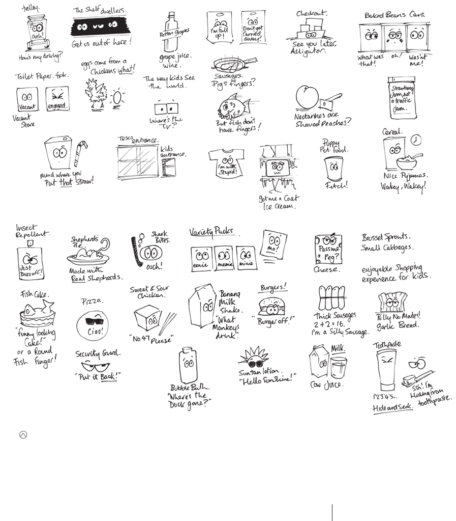
The idea that really had legs—or should we say,
eyes—was using pairs of expressive eyes together
with a wise-guy comment to communicate what a
kid might say about the product. Designer Gary Utting
sketched out hundreds of thumbnails for situations
as disparate as restroom doors to fish fingers.
140 141
THE LITTLE BOOK OF BIG PACKAGING IDEAS
Job:10-91261 Title:Rockport : Little Book Of Packaging Ideas
175#_P Dtp:44 Page:141
(RAY)
001-157_91261.qxp 10/16/06 1:51 PM Page 141
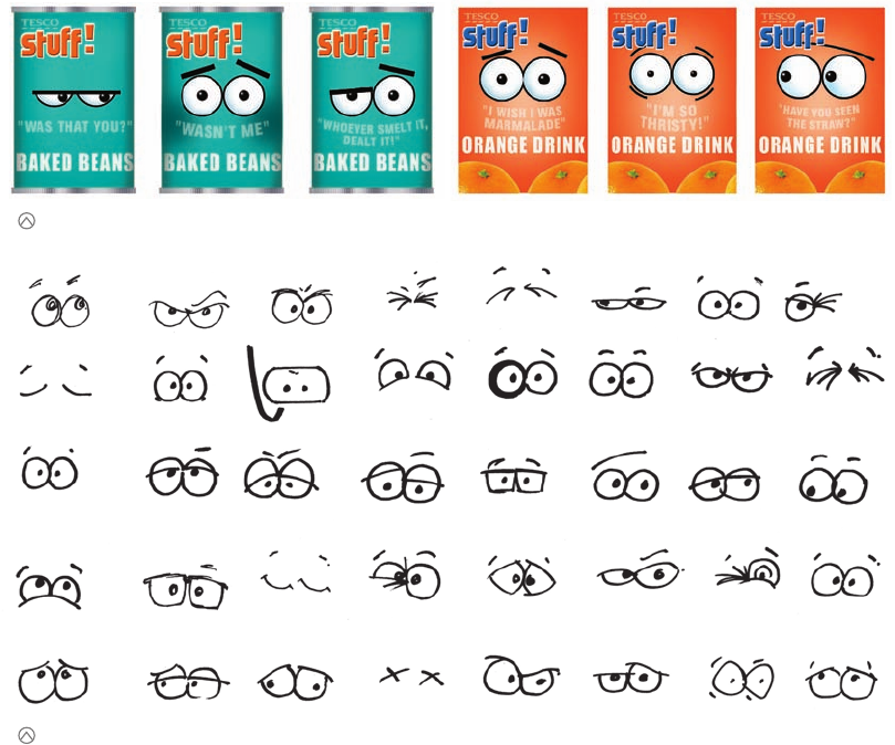
“Many products use cartoon characters to engage children. We
tried to make the character an actual part of the brand,” explains
Utting, who created dozens of pairs of eyes. The designer scoured
stock photo books for inspiration on expressions. He even studied
his own face and got himself on the apple packaging.
The designer wants every package to behave differently. Each is
essentially in a different mood. Even within a single line, there
might be 11 bottles arguing with each other like siblings, or a pair
of boxes whispering like best friends.
“For example, the toothpaste doesn’t really get along with the
toothbrush, even though you might think otherwise. Or there can
be big bottles looking after the small bottles, like big brothers tak-
ing care of smaller brothers,” he says.
The lovely thing about this project, Utting notes, is that although
designing 150 different packages seemed quite daunting at the be-
ginning, it has turned out to be easier than he expected. By look-
ing at the packaging by category, he can imagine all sorts of
scenarios for the eyes.
About 30 to 35 related colors are used for the palette for the pack-
aging—a broad color scheme, but one that is tied together by a
gradation that emerges from the center of the front of each con-
tainer. Beard says it is easy to see how the packaging works to
unify products across the Tesco stores.
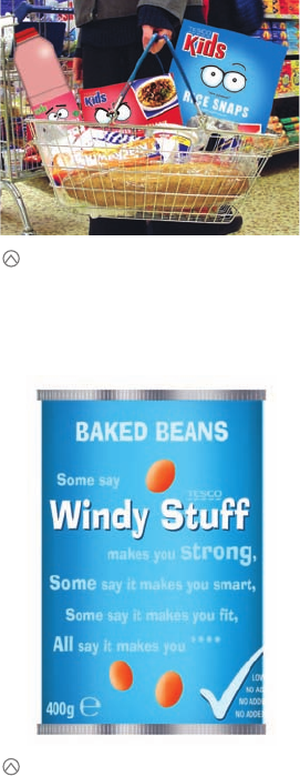
The eyes are making appearances elsewhere in the store, up to all
kinds of wild behavior—hanging in pairs from the ceiling, looking
out from the end of shopping carts and making comments about
the driver, and hiding in freezer cases. The Tesco Kids brand is
now being expanded to 200 to 300 SKUs, but the designers are
not worried: They can see how the character would behave on
everything from yo-yos to duvet covers. Essentially, he would act
like a kid.
A secondary benefit to the new design is that it keeps kids en-
tertained in the stores while moms shop. If the child does not
get bored and whiny, then the parent is less likely to get angry
and annoyed. Everyone is having a better experience under
Tesco’s roof.
These comps demonstrate how, within the same SKU, packages might say different things. All of the comments are slightly cheeky, and oftentimes, the packages seem
to be talking to each other, even arguing, just as siblings or young friends would do.
Utting studied stock photo books, his own face, and the faces of family, friends, and coworkers for the inspiration he needed to develop a menu (more expansive than
those shown here) of eyes that covered hundreds of emotions and situations.
(RAY)
Job:10-91261 Title:Rockport : Little Book Of Packaging Ideas
175#_P Dtp:44 Page:142
001-157_91261.qxp 10/16/06 1:51 PM Page 142

In addition to being applied to
packaging, the eyes are popping
up all over in the Tesco retail set-
ting. The funny little character is
even being expanded into other
consumer products, such as lunch
boxes, T-shirts, and toys.
(RAY)
Job:10-91261 Title:Rockport : Little Book Of Packaging Ideas
11-AC38143 175#_P Dtp:44 Page:143
001-157 DS_C38143.qxp 11/9/06 10:07 AM Page 143
..................Content has been hidden....................
You can't read the all page of ebook, please click here login for view all page.