These were the questions that Annette Harcus and Sydney-based
Harcus Design asked as they created packaging for Tea Tree, a
new line of skin-care products created by Trelivings. To achieve
more presence and claim more real estate on store shelves, it
would make more sense to cant the box into a diamond-shaped
footprint and let it sit corner-side-out. As the project progressed,
the idea held other benefits as well.
Harcus Design works regularly with Trelivings, having designed
various ranges of packaging for the client in the past eight years.
“Most are collections of body and beauty products based around
a certain fragrance or flower—either endowed with great beauty
or some kind of beneficial or restorative quality,” Harcus explains.
Organic Tea Tree was no exception—although the actual scent of
the tea tree, a graceful native Australian shrub, isn’t widely ac-
knowledged as having a desirable fragrance. It has a strong, bush
smell, as eucalyptus does, but is highly regarded for its natural
healing properties. Aboriginal mythology actually relates a tale of
a warrior who finds his loved one by following a trail of tea trees.
Tribes also sought healing by bathing in tea tree–infused water-
ways. Captain Cook, the explorer who navigated the east coast of
Australia in 1770, brewed a beverage from the tiny leaves, and
ever since, the family of shrubs has been named “tea tree.”
The plant’s aroma was not so appealing to modern tastes, so the
new Trelivings’ range was augmented with an additional scent of
light fruity tones, which soothes and calms, making its benefits
more appealing as a beauty-aid product.
The plant also has a flower. “It is a sweet, petaled bloom that
ranges in color from white to pale rose-pink, but it is a very small
flower,” Harcus says. “They make up for their size with their pro-
fusion of flowers; they actually resemble peach blossoms.”
Before Harcus and her designers presented the initial round of
graphic work to the client, they decided to investigate a different-
shaped box—not the usual rectangular shape. A diamond-shaped
box would hold the container just as securely, and it would create
a unique presentation on the shelves of department stores, gift
shops, and boutiques. This diamond-shaped direction also gave
designers the benefit of having two face panels for graphics. But
the double face also meant they would have to contend with run-
ning graphics over a fold. The diamond theme would also have to
be extended to create a family of boxes that could hold containers
of various shapes—a bottle, a tube, a tub.
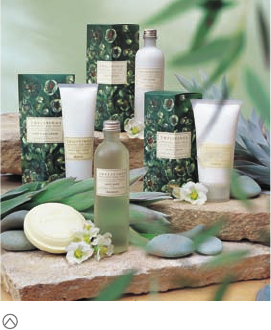
Who wrote the rule that dictates that when boxes are lined up
on a shelf,
they must line up flat and face side out, like a row
of stiff soldiers? You say it is not a rule. Then why does everyone
do it? Everyone, that is, except
Tea Tree skin-care products.
The package design for Tea Tree, a new line of skin-
care products, accomplishes two challenging goals:
First, it visually explains a native Australian ingredient
to consumers in other parts of the world, and second,
its diamond-shaped box grabs the shopper’s attention
with its unusual, corner-out orientation.
(RAY)
Job:10-91261 Title:Rockport : Little Book Of Packaging Ideas
175#_P Dtp:44 Page:42
001-157_91261.qxp 10/16/06 9:38 AM Page 42

To help gauge her client’s visual propensities for a project, Annette Harcus of Har-
cus Designs likes to present a number of very different ideas for early review. This
approach suggested the use of a scan of paper, homemade with actual pieces of
the tea tree embedded in it. It is perhaps the most Australian and earthy of the
three early designs.
42 43
THE LITTLE BOOK OF BIG PACKAGING IDEAS
(RAY)
Job:10-91261 Title:Rockport : Little Book Of Packaging Ideas
175#_P Dtp:44 Page:43
001-157_91261.qxp 10/16/06 9:38 AM Page 43

With the shape decided, the Harcus team could move to round one
of the graphic presentations. Because Harcus likes to begin such
projects with an understanding of what visual direction the client
wants to take, she will present many different visual cue starters.
The first design she presented in several variations was minimal: It
was at the extreme end of the modern scale. It used a silhouette
of a sprig of the plant, together with a calligraphic version of the
name of the product, plus a brief descriptor.
“The client is very knowledgeable about the extracts and the
botanical variants used in his products, but to highlight the prob-
lems of illustrating the flowers in a luxuriant manner we brought in
real flowers to the meeting,” Harcus says.
The second design was unusual. A wraparound scan of handmade
paper that contained embedded foliage of the tea tree plant was
used to form the background. This had a contemporary feel that
exuded peacefulness and comfort. It was, Harcus points out, dia-
metrically different from the first, sleek design.
“It felt the most ‘Australian,’ because it evoked its natural, plant
origins,” she adds.
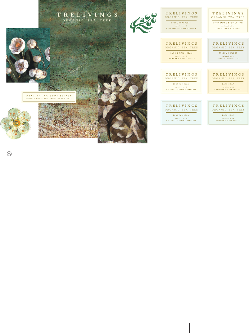
The final design presented in the first round was built on soft
lines that radiated from the corner of the box. The only flower or
reference to the plant in this trial was a small sticker that carried
a simple, silhouetted graphic representation.
After viewing all designs, the client indicated that he would like to
go in a more traditional, feminine direction. Highlighting the flower
was very important to him. To further gauge his interests, Harcus
showed him a series of reproductions of Dutch Still Life paintings
(veritas) from the 1600s. These hyperdetailed fruit and botanical im-
ages reveled in their own beauty and were exactly what he wanted.
“To heighten the sense of scale for the flowers, in the painting we
came in very close—focusing on them in minuscule detail,” Harcus
says, “exaggerating them so the leaves also became large fields of
green, filling in the background and giving the whole pack a dark,
rich look. The white flowers with their yellow stamens pop out
from the dark background.”
This trial balloon is on the modern edge of
possibilities. It is a graphic approach that
emphasizes the small size of the tea tree
flower. Note how even the name is given a
more daring twist with a new spelling.
This is another streamlined design that
takes advantage of the two exposed faces
of the carton. The radiating lines add the
suggestion of a leaf, indicating that this is a
natural product.
The scale of the tiny tea tree flower is
greatly exaggerated in this design, which
mixes classic design cues with an overall
modernist approach. The bottle has a very
different feel here, too.
(RAY)
Job:10-91261 Title:Rockport : Little Book Of Packaging Ideas
175#_P Dtp:44 Page:44
001-157_91261.qxp 10/16/06 9:38 AM Page 44
The dark green also made an excellent ground for a cream-colored
sticker that wrapped around the corner of the diamond-shaped
pack. Whereas their earlier trials used large type to pull in the at-
tention of the shopper, this design relied on the attraction of the
simple, cream label centered on the rich, verdant field of foliage.
With the delicate, restrained typography, the effect is under-
stated elegance.
“These products are big in the gift market, so they need to ex-
press quality values, which also reflects the values of the person
buying the product,” Harcus says. The packaging not only looked
beautiful but also felt sensuous to the touch with its matte, lami-
nated finish. The inside of the boxes are dark green, and the bot-
tles have a sand-blasted effect. Outside their boxes, the simple,
translucent containers maintain their fresh appeal.
On the shelf, the innovative boxes take more space width-wise,
as single units, but less space as a group when the packs are
overlapped. With a dimensional front panel, they project forward:
Shoppers are presented with a box face no matter from which di-
rection they approach.
“The challenge of this project was the tea tree plant itself. We
worked around its physical limitations and concentrated on evok-
ing the essence of the flower—its inner and outer grace. We
achieved this by commissioning an artist who painted with oils
on the canvas. The artist, Paul Newton, recreated the atmospheric
and textural detail of the veritas paintings, with a rich layered
palette that highlighted the delicate beauty of the plant.
“It is the combination of the old world and the new world—the
referential style of the painterly image with the contemporary
shaped packs—that creates the shelf presence,” Harcus explains
of the design, which successfully and visually explains a uniquely
Australian fauna to the international market, where the product
has sold well.
After reviewing Harcus’ preliminary comps, the client indicated that he wanted to take a more classic, feminine approach. Harcus showed him a series of reproductions
of Dutch Still Life paintings (veritas) from the 1600s. The hyperdetailed botanical images were exactly what he wanted. The simple, mostly open label design was even-
tually selected: It provides a ready and restful target on which the eye can focus.
44 45
THE LITTLE BOOK OF BIG PACKAGING IDEAS
(RAY)
Job:10-91261 Title:Rockport : Little Book Of Packaging Ideas
175#_P Dtp:44 Page:45
001-157_91261.qxp 10/16/06 9:38 AM Page 45
..................Content has been hidden....................
You can't read the all page of ebook, please click here login for view all page.