
(RAY)
Job:10-91261 Title:Rockport : Little Book Of Packaging Ideas
175#_P Dtp:44 Page:246
Ciao Bella
DESIGN
Wallace Church, New York, New York
MARKET
United States
before
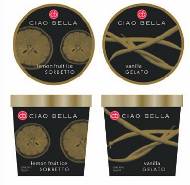
Ciao Bella’s former packaging was not
aimed at consumers at all—it was
food-service packaging simply meant
to get the product from the factory to
the restaurant deep freezer. When the
company decided to make a push
for consumer sales, it needed a new
design for its pints of gelato, sorbet,
and frozen yogurt.
236-352_91261.qxp 10/18/06 8:18 AM Page 246

246 247
THE LITTLE BOOK OF BIG PACKAGING IDEAS
(RAY)
Job:10-91261 Title:Rockport : Little Book Of Packaging Ideas
175#_P Dtp:44 Page:247
after
The pints, sold in upscale food markets,
are too bright, quirky, and fun to miss—
and the bold design embodies the quality
and innovation of the icy treats within.
236-352_91261.qxp 10/18/06 8:18 AM Page 247
(RAY)
Job:10-91261 Title:Rockport : Little Book Of Packaging Ideas
175#_P Dtp:44 Page:248
Ciao Bella started out twenty years ago
as a tiny gelato shop in New York City’s
Little Italy and grew by word of mouth
into an in-demand supplier of gourmet
gelato and sorbet to some 1,500 gourmet
restaurants around the country. The
handmade treats incorporate inventive
and exquisite ingredients such as
Tahitian vanilla, Belgian chocolate,
fresh fruit, spices, and imported Italian
flavorings—formulas that discriminating
chefs can’t resist.
Reason for Redesign
The company also dabbled in retail, but the owners
wanted to expand their reach more broadly into retail to
complement its thriving food-service business. Ciao Bella
packaging, which had been focused strictly on the trade
market, was little more than a white carton with black
lettering. To develop a presence in the natural food
markets where the company planned to sell the products,
Ciao Bella hired Wallace Church, a strategic brand imagery
and package design consultancy in New York.
Redesign Objectives
• Design graphics for the company’s new pint containers
that were as unique, exciting, and innovative as the
products themselves
• Create a packaging system and structure to accommo-
date the constantly growing number of fun flavors
• Help the emerging consumer brand stand out next to
the category leaders, Nestle and Unilever, as well as
look at home among gourmet and natural food brands
in upscale retail environments
The Results
The results have been very good since the August 2003
launch. In fact, according to Ciao Bella cofounder and CEO
F. W. Pearce, sales have nearly doubled since the company
began marketing to consumers.
Ciao Bella Design Process
1
236-352_91261.qxp 10/18/06 8:18 AM Page 248

1
To create the new visual brand for Ciao
Bella, the designers at Wallace Church
experimented with many ideas, all based
on fun, unique color combinations and
shapes. In this comp, X-ray images of the
products’ main ingredients against a black
background call attention to the products’
natural origins and lend a more upscale look.
2, 3
These designs keep the black background
but opt for brighter, more abstract shapes
to provide eye-catching contrast.
4, 5
The bright colors were working, especially
because they embodied the brand’s innova-
tive spirit and unique flair. Designers explored
color combinations and symbols that would
best suit the front of the pint cartons.
6
The design finally selected features simple
but striking symbols of the product inside:
a C-shaped swirl for the gelato and a
snowflake for the sorbet. Contrasting, but
harmonious, product colors were selected
as pairings for the product families.
2
5
6
3
4
248 249
THE LITTLE BOOK OF BIG PACKAGING IDEAS
(RAY)
Job:10-91261 Title:Rockport : Little Book Of Packaging Ideas
175#_P Dtp:44 Page:249
236-352_91261.qxp 10/18/06 8:18 AM Page 249
..................Content has been hidden....................
You can't read the all page of ebook, please click here login for view all page.