The brand is even the holder of three royal warrants, which
means that it supplies its goods to the royal household, an un-
mistakable mark of standing.
But even with all of these pluses, the brand was not growing. Its
customers were generally mature and wealthy, but even more cru-
cial, they knew what they wanted. They were confident in their
choice of cheesemonger and their shopping experience. Purchas-
ing truly fine cheese, it turns out, can be as intimidating as shop-
ping for wine, especially if you are not knowledgeable about
cheese provenance. And the original packaging for the product
was doing nothing to invite new customers into its unique shop,
located right off Piccadilly in London.
“There were many people who would not enter the shop to buy
cheese because they were not confident about what to buy. All the
cheese is cut personally for individual customers in the store,
which means you have to commit to a conversation with the
cheesemonger behind the counter,” explains Peter Windett, princi-
pal of Stratton Windett, the firm that was brought in to repackage
the brand and broaden its appeal.
The plan was two-part: First, the store itself would be redesigned
so that a small range of prepackaged cheeses and grocery foods
could be sold in a self-purchase environment: Those who were in
a hurry or who did not want to converse with the cheesemonger
would no longer have to do so. Modern shop fixtures were to be
introduced and contemporary colors and materials were selected
to brighten the store.
Second, the packaging for all products would be remade to be
more friendly, descriptive, educational, and appealing to a
broader base of customer. The intention was to produce a prod-
uct range that would be sold in premium stocklists as well as the
Paxton & Whitfield shop.
“The existing packaging was about 10 years old, and it was all
printed in a tasteful dark green and cream. But it didn’t make a
bold or individual statement about the company. It didn’t indi-
cate that its main product was cheese,” Windett points out. “In
fact, the packaging could have been for a wine merchant or
florist—actually any establishment that was a tasteful purveyor
of goods. The identity needed to be more cheese-specific.”
The store already had a lot going for it: an excellent reputation,
the royal warrants, a distinctive storefront with three-dimensional
gilded letters in a desirable part of town, a brand with plenty of
personality, and a loyal customer base. Stratton Windett needed
to find a way to communicate all of these pluses to the new con-
sumer while still honoring and not alienating the existing cus-
tomer base.
Paxton & Whitfield is the oldest cheesemonger in the
United Kingdom, having
been in business for more than 200
years. Its
products are of the finest quality, and it has an
unparalleled reputation.
Paxton & Whitfield has been in business as a cheese-
monger for more than 200 years. It is a brand of un-
paralleled reputation, but it was also apparently a bit
intimidating for some customers who felt they didn’t
have the knowledge they needed to come in and make
an educated purchase. Stratton Windett helped the
firm make it more contemporary and broaden its ap-
peal through new packaging.
(RAY)
Job:10-91261 Title:Rockport : Little Book Of Packaging Ideas
175#_P Dtp:44 Page:92
001-157_91261.qxp 10/16/06 1:30 PM Page 92

They began by studying the gilded sans serif letters on the store’s
front. It said a lot about the store’s personality, and in keeping
with updating the Paxton & Whitfield’s identity, it felt modern in a
traditional manner, rather than the serif type that was being used
throughout the store’s existing system. The designers decided to
bring the face, a three-dimensional Grotesque-based font, into
the new design for packaging as the main logotype.
For example, on the wrapping paper and transit boxes that were
used in the retail setting, the original design repeated a Paxton &
Whitfield seal over and over. On the boxes, an uninspired rectan-
gle repeated the store’s name, showed the royal warrants, and de-
livered the matter-of-fact tag line, “Cheesemongers since 1797.”
In the redesign for these pieces, the designers changed a number
of things. First, they freshened up the color scheme by adopting a
cheese-related palette—a cheddar yellow and a gray-green, repre-
senting the cheese rind, were used on all retail-related packaging
and supplies. The wrapping paper carries an unexpected bit of
whimsy: a repeat pattern of romantic cheese-type names, and the
business cards are shaped like a wedge of cheese.
The tag line was also strengthened. “We changed it to ‘Excep-
tional Cheese since 1797.’ It’s a punchier statement that they have
to live up to. This is not just any cheese you could buy at the su-
permarket: This is exceptional cheese from Paxton & Whitfield, a
mouth-watering, seasonally changing selection, matured to per-
fection, and individually cut to any size,” he points out.
The boxes received even more specialized treatment. The box that
is used to carry Stilton cheese, for example, incorporates the dis-
tinctive veining texture of the cheese—as it would look when
cut—and is used as wallpaper to cover the container. “It’s treated
in an abstract manner, like a pattern, but it is specific to Stilton,”
he explains. The boxes for cheddar cheese are printed with the
distinctive cheddar texture; other boxed cheeses incorporate pho-
tographs of the cheese rinds, giving visual clues to the cheese
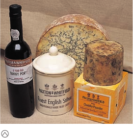
This is a selection of the client’s packaging before the redesign project. The products were
not unified with a single and consistent look.
Before (right) and after (left) designs for the Stilton product. Although the pre-
vious box made plenty of supportable claims, it did not actually say what the
product inside was like. The designers wrapped the box with the Stilton tex-
ture and added information about how the cheese could be enjoyed.
Here are two mockups of cheddar cheese packaging that were considered. These show the
development of a color palette and of textured backgrounds that would be used for product
identification.
92 93
THE LITTLE BOOK OF BIG PACKAGING IDEAS
(RAY)
Job:10-91261 Title:Rockport : Little Book Of Packaging Ideas
175#_P Dtp:44 Page:93
001-157_91261.qxp 10/16/06 1:30 PM Page 93

(RAY)
Job:10-91261 Title:Rockport : Little Book Of Packaging Ideas
175#_P Dtp:44 Page:94
type inside and differentiating one cheese from another, making it
easier for the customers to locate what they are looking for.
On all boxes, more information is added as an educational service
for consumers. When is a cheese ripe and ready to serve? When
should it be taken out of the refrigerator in preparation for serving?
Which foods should the cheese be served with? These are ques-
tions that might be asked of the cheesemonger, as well as ques-
tions that may have previously caused a consumer not to buy a
certain variety: Some buyers just don’t want to seem ignorant when
it comes to something so apparently commonplace as cheese.
“In all packaging, past the main title of the product, we are try-
ing to bring out salient features of the products—whether it is
vegetarian-appropriate or pasteurized, whether the rind be
eaten, how it can be used in cooking, what wines can be served
with it, and so on—so that consumers are getting real informa-
tion about the diversity of cheese. There is also a small booklet
underway that gives even more detailed information on cheese
types, producers, and recipes,” Windett says.
The store also carries a number of other foods and beverages
that might be served with cheeses, such as jarred chutneys, mus-
tards, biscuits, crackers, and wines. The packaging for these com-
panion products also needed to be addressed.
The bottles in the original scheme bore little familial resemblance
to each other. Statton Windett designed a simple label format that
could be applied to any bottle shape, at any place in the bottle’s
height, and still visually relate one to the others. Across the board,
the redesign is much cleaner, more simple, and decidedly more
modern, while giving appropriate visual product category clues.
The biscuit boxes were originally made from a stiff corrugated
board that was functional but not terribly emotive. The designers
decided to apply the texture of the food here, as they did with
the cheeses, but in a slightly different manner. For this, they cre-
ated grainy photographs of the crackers inside and used these as
all-over texture for the new boxes. A window in the front of each
box allows the shopper to see the product inside.
The same labeling and texture concept was used on jars for
products as disparate as jarred olives, pickles, and goat cheese
in oil: An abstract photo is used as texture on part of the label.
When differentiation is not needed—such as for jarred honey-
comb, which is recognizable through the glass jar—the photo is
not used.
This was an enormous project to manage, Peter Windett says—72
products, a new corporate identity, 16 suppliers, endless food
safety regulations, and ongoing print and production management.
“With the various products all demanding different packaging
containers, materials, shapes, and sizes, the application of the
design concept across the range has to develop organically, to
grow to suit each product group or type. It is not possible to
rigidly apply a constant brand application,” he says. Changes and
refinements were made right up to the last minute. Stepping back
and looking objectively at each product or category and its rela-
tionship to the whole sometimes required that.
“The criteria was always to emphasize their point of difference—
from the customer’s point of view,” he adds.
Mockups of different alcohol-content products show a direction toward strong
and consistent branding while retaining the personality of each product type.
Jarred products presented different challenges. Here the designers explored al-
ternative positions for type and illustration, as well as the use of different ma-
terials. Eventually, a clear PVC was selected because it provided the best
product visibility.
001-157_91261.qxp 10/16/06 1:30 PM Page 94

94 95
THE LITTLE BOOK OF BIG PACKAGING IDEAS
(RAY)
Job:10-91261 Title:Rockport : Little Book Of Packaging Ideas
175#_P Dtp:44 Page:95
Another exploration, this time for the biscuit packaging. As on the cheese boxes, the
designers wanted to wrap the box with the biscuits’ texture, so as to give the consumer
a better idea of what was inside.
The final bag design was printed on polypropylene for added
strength. The softer photographic image prints well on this
material.
The designers also created a second bag for trade promotion
packs and public relations purposes. When compared with the
original packaging, it’s clear how much the packaging system
and identity has changed.
The top right package shows the client’s original design. All other designs are explorations
for the new design, starting at the lower left, bright yellow sample and proceeding to the
right to the final design, with used soft, textured photographic images.
The original concept for the shopping bag showed many different types of cheeses. This
bag would have been paper for the best printing reproduction, but ultimately, paper was
not deemed to be a good choice: It had to hold a heavy product, and it was easily weak-
ened by rain.
001-157_91261.qxp 10/16/06 1:30 PM Page 95
..................Content has been hidden....................
You can't read the all page of ebook, please click here login for view all page.