Parham Santana (New York) managed these challenges and more
when it took on the packaging program for the Discovery Chan-
nel. The client puts its name on thousands of toy, learning, health
and beauty, and convenience items for men, women, and chil-
dren. These products are sold in venues as disparate as high-end
specialty stores to large retail outlets. The variables for the proj-
ect seemed endless at the start.
But the Parham Santana team did have a head start. Five years
ago, the firm helped Discovery launch its first licensed program in
Target stores nationwide. In addition, principal John Parham re-
calls that Discovery’s retail program for kids was fairly well coor-
dinated already; although the adult products were being
packaged manufacturer by manufacturer. So his team began
thinking about how to coordinate the adult’s and women’s prod-
uct lines within themselves as well as with the children’s lines.
The client had four objectives at the start of the project. First,
Parham reports, Discovery wanted to emphasize the product over
the package or the brand.
“The product needed to be the hero,” he says. “The color on the
front of the package could not compete with the product, only
frame it, for example. We needed to create a stage for the prod-
ucts where different types of stories could be told.”
Second, Discovery wanted total flexibility in terms of cross-
merchandising between children’s, adult’s, and women’s prod-
ucts in the store setting.
“For example, at the front of a store, they may create a vignette
where they want to promote a particular telecast. The in-store
merchandising might bring together a pair of adult binoculars and
a kid’s archeology kit in one display,” Parham says. Both products
would need to sit comfortably together.
The third objective was to create the notion of a family destina-
tion or theme. From a design standpoint, this meant showing that
the Discovery line had something for everybody.
“A lot of this has to do with the friendliness of the type we chose,
as well as the approachability of the copy we included. Colors
would have to be fun and upbeat, and of course, the product mix
had to be sufficiently diverse,” Parham says.
Finally, the fourth objective required Parham Santana to make it
possible for Discovery Channel to gracefully promote its sub-
brands: TLC, Discovery Health, and Animal Planet. The challenge
How do you maintain a brand’s star quality while downplaying it
at the same time? Make an identity
concrete but endlessly
flexible?
Translate a normally RGB, on-air brand—in this case, the
Discovery Channel—to hundreds of CMYK-printed packages?
(RAY)
Job:10-91261 Title:Rockport : Little Book Of Packaging Ideas
175#_P Dtp:44 Page:76
001-157_91261.qxp 10/16/06 1:26 PM Page 76

here, Parham says, was to create a brand story that was unique to
Discovery Channel but broad enough to accommodate individual
members of its family.
He explains: “In a store, you might see a TLC poster there, pro-
moting a series, and the Discovery packaging would have to feel
comfortable with it.”
From the beginning, Parham and his design team were influenced
by what Discovery was doing on-air. They wanted to get at the
essence of the Discovery way of doing business—a special sense of
energy, excitement, and color—and translate that into packaging.
“We studied many different retailers to see how they presented their
brands, but the Discovery brand was already distinct. We decided
that the channel should be the driver for the feeling and tone of the
package,” Parham says. The channel’s naturally “smart” sensibility
could be graphically translated into “smart, simple, and clean.”
Parham Santana first concentrated on establishing a universal
color palette that would be gracious hosts to all consumers, no
matter their age, sex, or interests. An eight-color palette of white,
silver, red, orange, yellow, green, blue, and black was suggested.
This extensive palette was selected for its flexibility. For the adult
market, the main colors would be blue, green, and red, with yel-
low, orange and lighter shade of the same blue specified for ac-
cent colors. For children, the palette was flipped: The main colors
would be yellow, orange, and the lighter blue, whereas accents
would be pulled from the deeper, adult palette.
Women’s product packaging colors pulled from the children’s
palette, but in a more sophisticated way. “A stereotypical, pastel
take on the women’s market would not have been appropriate:
Discovery is just not pastel anyway. Market studies showed that
women really identify more with a vibrant color palette,” Parham
says. As a result, the women’s palette uses the Discovery Kid’s
bright colors, but in a more sophisticated way.
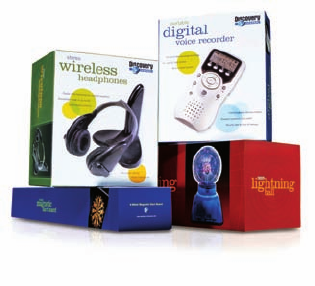
Parham Santana was faced with a formidable challenge when it designed
packaging for Discovery Stores. Not only were there thousands of SKUs, but
the products were sold in various venues, from high-end specialty stores to
large retail outlets. By using background pattern and a related color palette,
the design firm was able to relate the disparate products, yet still provide
distinction between adult and kid products.
Color and pattern were the key elements the designers used to tie the product lines to-
gether. The blueprint-like “tech” pattern is used on goods for grown-ups, while the “orbit”
pattern signals products for children. The same color palette is used across the board for
adult, child, and women’s products, but in different configurations.
76 77
THE LITTLE BOOK OF BIG PACKAGING IDEAS
(RAY)
Job:10-91261 Title:Rockport : Little Book Of Packaging Ideas
175#_P Dtp:44 Page:77
001-157_91261.qxp 10/16/06 1:26 PM Page 77

The design of the Ladybug Shelter illustrates
how Parham Santana balanced many different
package components. Here the designers have
used bursts in the forms of a paintbrush and
an arrow, and they have placed a white glow
behind the product to make it pop off the box.
The logo is moved to the upper right-hand corner
to make it more visible to shoppers. The glow
was removed, being deemed difficult to produce
for the number of products that the line contains.
The “bursts” are simplified here, again to simplify
future production.
To make the product jump off the box without a
white glow, the designers introduced a “Discovery
ring” graphic and placed the product on top of it.
More icon “bursts” are introduced.
This comp shows a type variation that was even-
tually used in the final design. The description
line was also moved above the title so it wouldn’t
run over the product image. Also, the “Discovery
ring” now has two outer rings.
More type variations. In this design the final “burst” choice emerges.
The swirl would be easier for the designers to
execute.
The designers also experimented with using a
white front on the package, to make it stand out
in the retail setting. The solid front also starts to
“color code” product groups.
A busier type treatment, but one that is still con-
sistent with the adult packaging program. (Both
use Clarendon.)
The designers felt that this type treatment was
too busy. They tried a gray orbit pattern, which
was more neutral and less obvious than color
orbit patterns.
(RAY)
Job:10-91261 Title:Rockport : Little Book Of Packaging Ideas
175#_P Dtp:44 Page:78
001-157_91261.qxp 10/16/06 1:26 PM Page 78

The new package design also permits every
product in the Discovery Channel universe to live
comfortably together on the shelf. Note how
these TLC, Animal Planet, and Discovery Channel
DVDs bear a strong family resemblance.
No details were overlooked, even the gift wrap
incorporates the “tech” pattern for a seamless
presentation.
In addition to creating a unifying color palette, the Parham Santana
designers also used silver as a background in several ways. On
some packaging, a solid silver background is a simple, classic de-
sign accent that allows the product photography to star as hero on
the box. On other designs, a blueprint-like “tech” pattern is printed
in silver on a white background. On children’s packaging, where
vibrant color is commonly used as a background color, an “orbit”
pattern that complements the “tech” look is reproduced. Placed
side by side, the familial connection between the silver “orbit”
and “tech” backgrounds is evident.
Other connecting factors were the typefaces the designers speci-
fied. Clar
endon Light and T
rade Gothic Condensed were chosen, a
serif and sans serif face, respectively, that are recognized for their
friendly, energetic nature. The copy, too, has the same feeling,
says Parham. “The voice is informative, but friendly,” he notes.
Parham Santana also invented Discovery Facts(tm), which appears
on every package back. This panel enhances the shopper’s appre-
ciation of the product while providing “current and mind-boggling
truths about the world.”
In the end, the designers provided their
client with a set of building blocks with
which any product or customer could
be addressed. The system is now being
applied to hundr
eds of SKUs b
y various
manufacturers, who now have the visual
information they need to stay within the
Discovery brand parameters.
78 7 9
THE LITTLE BOOK OF BIG PACKAGING IDEAS
(RAY)
Job:10-91261 Title:Rockport : Little Book Of Packaging Ideas
175#_P Dtp:44 Page:79
001-157_91261.qxp 10/16/06 1:26 PM Page 79
..................Content has been hidden....................
You can't read the all page of ebook, please click here login for view all page.