a unique line of therapeutic oils that can be used in the bath,
for massage, or even burned in an oil burner (when diluted
with water).
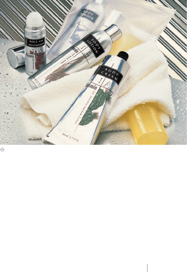
The oils were an offshoot of a much larger line of skin and
body care products called Vitamin Plus. These products were
based on specific vitamins—A, B, and E, for example—each
combined with other beneficial plant extracts, such as aloe
vera, sea kelp, and cactus. The two ingredients in each product
were chosen to harmonize their benefits. The range is based on
the simple philosophy of “feeding the skin” and replenishing
the body’s basic nutrients.
The other products produced by the brand owner, Trelivings,
tended to be directed to an older demographic (traditionally fe-
male based). The company wanted a range of skin and body
products that would attract younger consumers of both sexes and
would be marketed under a different brand name. So evolved the
concept for Vitamin Plus, and subsequently Vitalizers to increase
their market share.
The packs, in line with appealing to the younger target market,
were based on the contemporary approach of recyclable, light-
weight, aluminum containers and tubes.
“Typographically there was a lot of information to express on the
packs, so a hierarchical system was developed where the product
type—such as Body Lotion—and the vitamin were the heroes.
The plant extracts were highlighted by illustrative means rather
than typography. Each product was attributed a color palette that
gave it individuality, but that still coordinated it with the family.”
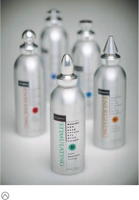
The growing awareness of aromatherapy had given rise to the
Vitalizers line—a series of organic oils enriched with vitamins and
plant extracts. Each product would be packaged in an aluminum
container, only 5 inches (12.5 cm) tall. The minute size of the pack-
age predetermined a number of design factors for Harcus Design,
a Sydney, Australia–based design firm tapped to handle the proj-
ect. A metal container was a must for protection because the oils
degrade quickly when exposed to light.
“Whereas the original range Vitamin Plus implemented detailed
plant drawings on the packs, the limited scale of the oil flasks
didn’t allow us to illustrate the individual variants of each oil,”
says principal Annette Harcus, “so we concentrated on heralding
the resulting therapeutic effect. The individual ‘moods’ became
the product names—such as “Stimulating,” “Harmonizing,” “En-
ergizing,” “Meditating,” and “Enhancing.”
As the saying goes, good things come in small packages.
But in today’s crowded retail environment, small packages
could easily be overlooked, no matter how fine their
contents might be. This was definitely the case with Vitalizers,
Faced with a preordained package shape and material
for a new aromatherapy product, Vitalizers, the team at
Harcus Design had to find another point of differentia-
tion. The solution was to change the shape of the lids.
(RAY)
Job:10-91261 Title:Rockport : Little Book Of Packaging Ideas
175#_P Dtp:44 Page:58
001-157_91261.qxp 10/16/06 9:45 AM Page 58
The lengthy line names would also have to be run vertically if they
were to be run at a readable size. But the packages still needed
something extra to distinguish them from other products and from
each other: After all, the metal containers were sleek, but they
looked tonally homogenous as a group. That’s when the design
team considered the container’s lid. What if each variety had a dif-
ferently shaped lid?
Because of their tiny scale, in the first design schemes, the de-
signers suggested lids that enhanced their preciousness, making
them look jewel-like. The lid shapes were based on the essential
basic shapes of triangle, circle, square, and their three-
dimensional forms—cone, tetrahedron, and sphere.
Custom-designing a lid brings with it a host of headaches, says
Harcus. “Of course, products have to close efficiently. A perfect
seal is so important,” she notes. The exterior shape of a lid has er-
gonomic ramifications, as well. “Any shape we designed had to be
easy for the fingers to grasp.”
The first designs required a lot of hand assembly and finishing
and therefore proved too costly. In the second round of concept
drawings, the designers wanted the lids to match the polished
metal of the containers. The team designed a number of shapes,
then presented them to a metal fabricator for production feasibil-
ity assessment. The designers’ specifications and guidelines were
to result in a series of lids that were easy and comfortable to
hold on to, that were not too difficult to produce, and that were
cost efficient. The fabricator also provided some variations of the
shapes, based on the production capabilities of the lathe.
The result was a differently shaped lid for each of the five oils in
the line. Viewed as a group, there is no question that the bottles
are part of a family.
“We had great fun attributing each of the product names with a lid
shape,” says Harcus. “The color differentiation that we initially
were trying to impart in the lid was implemented into the pack
graphics—a signature color for the product name and the vitamin
circular device. The graphics in the form of a self-adhesive, clear
label were applied 350 degrees around the containers.”
The ranges have been a success, particularly in the younger demo-
graphic that the client was hoping to attract. “The oils are sold in
drug stores, beauty shops, and homeopathy stores, not just the
traditional gift market stores—so they are presented in an envi-
ronment more accessible and more relevant to young people and
those interested in aromatherapy.
Another successful product line, Vitamin Plus, preceded Vitalizers. The design of this line established a number of parameters for the second project: polished silver
metal, a sloped-shoulder bottle, and a relatively small size. The Vitalizer containers would only be 5 inches (12.5 cm) tall.
58 59
THE LITTLE BOOK OF BIG PACKAGING IDEAS
(RAY)
Job:10-91261 Title:Rockport : Little Book Of Packaging Ideas
175#_P Dtp:44 Page:59
001-157_91261.qxp 10/16/06 9:45 AM Page 59

(RAY)
Job:10-91261 Title:Rockport : Little Book Of Packaging Ideas
11-AC38143 175#_P Dtp:44 Page:60
The new package’s extremely diminutive size meant that any labeling or type on
the containers would be small. This might make it difficult for customers to find the
right variety on the shelf. That’s when the designers suggested making each lid a
different shape. Here, the designers experimented with various possibilities.
001-157 DS_C38143.qxp 11/9/06 9:58 AM Page 60

Here the designers experimented with the
labeling for the containers, working hard
to get the type as large as possible.
The new lids gave the varieties a precious, jewel-like appearance. Settling on these
shapes was a challenge, because they not only had to look good, but they also
had be practical in terms of production and ergonomic: The buyer would have to
be able to grasp the lid comfortably with his or her fingers.
As on the front of the finished design,
subtle changes in text and text direction
helped to organize information in a very
small place.
60 61
THE LITTLE BOOK OF BIG PACKAGING IDEAS
(RAY)
Job:10-91261 Title:Rockport : Little Book Of Packaging Ideas
175#_P Dtp:44 Page:61
001-157_91261.qxp 10/16/06 9:51 AM Page 61
..................Content has been hidden....................
You can't read the all page of ebook, please click here login for view all page.