Mention clamshell packaging to most designers, and a weary look
will come over their faces. These hard plastic containers are a ne-
cessity for many products, whether they provide protection and
an easy display method, discourage shoplifting, contain multiple
pieces or whatever. Unfortunately, they can be as dull as they are
practical. Plus, they can cause even a quality product to look
somehow chintzy.
Even more challenging than the dull nature of the packaging,
Sandstrom project director Kelly Bohls, creative director Jon
Olsen, and their team had to deal with 27 different graphic looks
within that population, the result of going from an in-house at
Gerber, to a design group at Fiskars, which bought the company
in the late 1980s. Here and there, an American flag or a photo
would be added by different people, until the entire line had an
uncoordinated feel.
The multiple clamshells were not only inadvisable from a design
and identity standpoint but also expensive to produce and a
nightmare to warehouse, Bohls points out. A standardized box
would have accommodated many of the SKUs, which also in-
cluded other tools, such as its 700 Series Multi-plier. But Target
and other large retailers demanded clamshells in return for shelf
space, so the designers would have to find another way.
But they didn’t abandon the idea of a box altogether, Olsen re-
calls. They considered using corrugated boxes that were vacuum
sealed in plastic, as well as making the boxes out of a thicker but
still transparent kind of plastic.
“Then we started looking at different forms of boxes, boxes that
could accommodate 5 to 10 different SKUs. We knew that retailers
love clamshells for their visibility, durability, and security, so we tried
to figure out how to use the clamshell in a new and different way.”
A more interesting shape, no matter what that shape is made
from, would be more intriguing than the awkward shapes of the
previous clamshells. So why not shape the clamshell around a
box? The product would still be secure and easily displayed, but
it would have stronger, more elegant personality when displayed
against the clumsy packaging of competing products.
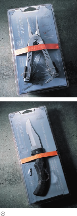
That’s when the design team began developing a board-stock
tray—essentially, the J card—that would form the interior box.
Most knife products fold but are displayed open. When open,
they have a cavity in their backs into which the die for the card-
board could be fitted. It would hold the knife in place inside of
the clamshell. But for added security and for a striking design
touch, an orange rubber band was wrapped around the knife and
Imagine being faced with redesigning 150 clamshell packages.
This was
the unenviable task faced by designers at Portland,
Oregon–based
Sandstrom Design when they began working
with Gerber Legendary Blades.
Designers at Sandstrom Design, through clever pack-
age architecture, discovered how to create clamshell
packaging for Gerber knife and tool products that is
safe, attractive, eminently shippable, easy to display in
the store, and, in terms of simple style, miles beyond
the competition.
(RAY)
Job:10-91261 Title:Rockport : Little Book Of Packaging Ideas
175#_P Dtp:44 Page:80
001-157_91261.qxp 10/16/06 1:26 PM Page 80
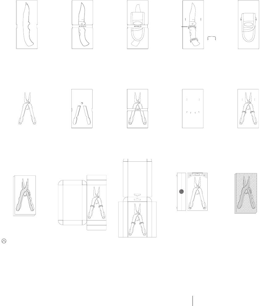
The various products that Gerber offers spawned 27
different looks among 150 different clamshell packages.
So the Sandstrom designers spent a great deal of time
thumbnailing designs that would accommodate multiple
SKUs. They even looked at ideas that revolved around
corrugated boxes and vacuum-sealed plastic.
Custom Chip / corrugate board -
A. Common clamshell
B. Shrink wrapped
Custom Plastic tray -
Inside common clamshell
Custom Plastic tray -
Common clamshell
1a.
Custom Chip / corrugate board -
A. Common clamshell
B. Shrink wrapped
Custom Chip / corrugate board -
A. Common clamshell
B. Shrink wrapped
Corrugate box -
A. Common clamshell
B. Shrink wrapped
Corrugate box -
A. Common clamshell
B. Shrink wrapped
Custom Plastic case -
Custom Foam insert
Custom Foam insert
Custom Chip / corrugate board -
A. Common clamshell
B. Shrink wrapped
Common Chip / corrugate board -
A. Common clamshell
B. Shrink wrapped
Common Chip / corrugate board -
A. Common clamshell
B. Shrink wrapped
Common Plastic tray -
A. Common clamshell
B. Shrink wrapped
1b.
3a.
5a.
5a. 5b.
6a.
6b.
3b. 4a. 4b.
Custom Chip / corrugate board -
A. Common clamshell
B. Shrink wrapped
1c (Back).
Custom Chip / corrugate board -
A. Common clamshell
B. Shrink wrapped
2a.
Custom Plastic tray -
A. Common clamshell
B. Shrink wrapped
2b (Back).
Metal clip
80 81
THE LITTLE BOOK OF BIG PACKAGING IDEAS
(RAY)
Job:10-91261 Title:Rockport : Little Book Of Packaging Ideas
175#_P Dtp:44 Page:81
001-157_91261.qxp 10/16/06 1:28 PM Page 81

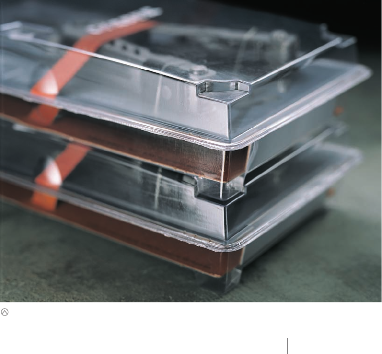
The finished clamshell design had an open area where
shoppers could actually touch the tool, as well as several
debossed areas that directed people to important informa-
tion on the enclosed J card. In addition, the packaging
was designed so the “feet” on the back of one package
would sit neatly into the front of the package below it
when they were stacked. This feature prevents packages
from shifting during shipping, which had caused damage
in the original designs.
Clam Size:
10
1
⁄8"
4
1
⁄8"
Clam Width:
1
5
⁄8"
FRONT
RAISED SHAPES (EMBOSS)
ON OUTER SURFACE
DIE CUT
DEBOSS
MALE
FEMALE
SIDE
CHIP BOARD
(RAY)
Job:10-91261 Title:Rockport : Little Book Of Packaging Ideas
175#_P Dtp:44 Page:82
001-157_91261.qxp 10/16/06 1:28 PM Page 82
the J card. The color is a nod to the predominant color of many a
hunter’s clothing—blaze orange. In the plastic of the clamshell di-
rectly above the rubber band, the designers debossed the Gerber
name, and this casts a shadow onto the orange field, creating a
three-dimensional effect.
Another problem that the designers addressed was the way the pre-
vious clamshells scratched and scarred each other in shipment. They
designed feet into the bottom of the new box, so the clamshells are
stackable, but do not rub together or shift during shipping.
Other new features included finger holes in the clamshell where
shoppers could touch the knife handle, which historically had
proven important to making the sale. The designers also debossed
several shapes in the top of the clamshell that direct people to im-
portant information on the J card, such as the length of the blade
or the number of the series.
The J card is slate blue, which is quite different from the wild pat-
terning, American flags, and alligators that the competition uses.
The look is technical and precise.
“Most products in this category seem to have to scream that this is a
hunting product,” says Bohls. “The people shopping for this already
know what it is, though. We didn’t have to make it look like a hunting
knife: We wanted people to know that it is a precision instrument.”
“We made the product the hero and didn’t add too much design
on top of it,” adds Olsen.
In the retail setting, the combination of the orange rubber band
and the slate blue backer card is strong and dramatic and pro-
vides a unique branding statement for the category. In particular,
the horizontal orange stripe draws the eye immediately. There’s no
question about which products are Gerber’s.
Amazingly, the designers were able to reduce the number of Gerber
clamshells from 150 to only 6, an enormous, long-term cost-
savings for the client, even with the price of the new dies. “The
boxed product looks much more sophisticated than the competi-
tion, it is engineered to fit the product, and it functions effectively
for retailers,” says a proud Rick Braithwaite, Sandstorm Design
president, of his group’s efforts.
This close-up of the clamshell design shows how
the packages fit together when stacked. It is both
a functional and highly dynamic design.
82 83
THE LITTLE BOOK OF BIG PACKAGING IDEAS
(RAY)
Job:10-91261 Title:Rockport : Little Book Of Packaging Ideas
175#_P Dtp:44 Page:83
001-157_91261.qxp 10/16/06 1:28 PM Page 83
..................Content has been hidden....................
You can't read the all page of ebook, please click here login for view all page.