

(RAY)
Job:10-91261 Title:Rockport : Little Book Of Packaging Ideas
175#_P Dtp:44 Page:14
The company has been in business since 1872 and is among the last
of the independent, locally owned breweries left in the country. At
one time, hundreds of establishments brewed their own beers and
served the beverages in their own pubs. But today, large corpora-
tions have swept through the market and have eliminated nearly all
these historic companies. Adnams is one of the few strong, inde-
pendent, regional brands left and is determined to stay that way.
The company’s identity had remained essentially untouched for
20 years. Although the company’s chair is a progressive thinker
who wanted the company to do something different from any
other regional brewer, Design Bridge, the London-based company
brought on board to handle the ID and packaging redesign, knew
that any redesign would have to be done with great care.
“This redesign was a big move for the company,” says Jill Marshall,
executive chairman for branding and packaging at Design Bridge.
“The brewer is rooted in Southwold, a historic and charming part
of the English countryside and coastline. It was important for them
to feel whomever they entrusted with handling this untouched
brand would treat it with a great deal of respect.”
One thing to avoid, Marshall says, was making a patent play on
the brewer’s history to create an old-world feel. “We had to re-
spect the actual history,” Marshall says, “not treat it like it was
some sort of bogus version of history.”
Adnams’ competition could be characterized in one of two ways:
those that used the old-world approach (many are as old or older
than Adnams) or those that remained completely static. Creative
director for the redesign project Graham Shearsby compares the
appearance of these identities to the metal badges from old
steam engines—cold, unemotional, inflexible. Design Bridge felt
that something with more life and movement—something with a
more sculptural quality—would be more fitting in Adnams’ pack-
aging and mark.
After extensive conversations with the client on what it needed
(Adnams includes 90-odd pubs, three hotels, and a wine busi-
ness, as well as a full suite of beers), Shearsby visited Southwold
to get a better feeling for the place. The visit turned out to be a
meaningful one.
“It’s flat there, with big beaches and big skies. Fishermen bring
their boats right up onto the shore. You can imagine the winds
coming across the beaches in winter, when you would want to
find yourself tucked up in a pub with a pint of beer,” he says.
A brand with the good bones of heritage can be a wonderful
project for a designer. But a brand with good bones whose owners
have a vision for the future is even better. Such was the case
with Adnams Brewery of Southwold in the East Anglia region
of England.
Design Bridge of London re-created the identity and
packaging for Adnams, a brewery in the East Anglia re-
gion of England, founded in 1872. Both the labeling
and the bottle shape were reworked.
The company’s identity had not been touched in more
than 20 years, and each product in the line had a dif-
ferent look.
001-157_91261.qxp 10/16/06 9:36 AM Page 14

Initial sketches include visual references to flags and include icons that are representative of the area—a lighthouse, a crab, a ship, a flying fish.
The overlapping sail design eventually won out. It had a three-dimensional feel
that was adaptable for other uses.
Two unique finds helped to drive the redesign of the new Adnams bottle:
While visiting Southwold to get a better feeling for the place, Design
Bridge creative director Graham Shearsby took a walk on the beach and
found the fragment of thick glass shown here. The bottle was found in a
wine cellar beneath the brewery. The appearance and heft of the items
were combined in the new bottle shape.
In these sketches, the designers explored the relationship between the bottle shape and the label.
Here the sail idea moves into a more literal interpretation.
14 15
THE LITTLE BOOK OF BIG PACKAGING IDEAS
(RAY)
Job:10-91261 Title:Rockport : Little Book Of Packaging Ideas
175#_P Dtp:44 Page:15
001-157_91261.qxp 10/16/06 9:36 AM Page 15
(RAY)
Job:10-91261 Title:Rockport : Little Book Of Packaging Ideas
175#_P Dtp:44 Page:16
On a walk on the beach, Shearsby found a thick fragment of old
glass. “Inspiration for the entire project came from that piece of
glass. It had a timeless feel, like when you pick up shells or peb-
bles on the beach. They are somehow imbued with memories of
other times and places. They tell a story. We felt that we could
use those qualities to inspire the redesign.”
So the redesign of the core logo began. The old marks (each beer
label had its own shape and illustration) had charm, but they also
had the feel of a badge removed from an old engine. Shearsby’s
experiments centered on creating a single distinctive shape that
could be used anywhere, from labels to buildings.
One of his first ideas was a pair of crossed flags, which came from
the idea of using flags to send signals and was therefore closely
linked to the town’s maritime history. He chose a small crab, very
much part of the company’s coastal location, as a potential brand
icon and positioned it between the flags. Although Adnams loved
the idea of the flags, the company’s representatives felt the crab
was a step too far away from the brewery’s heritage and asked
Design Bridge to rethink the symbol.
So the designers delved deep into the history of Southwold and
came up with a series of icons and imagery from the area—a ship
from a well-known battle right off the coast in 1692, a lighthouse,
a longshoreman, and a 500-year-old carved wooden figure named
Southwold Jack, who rings the bell at local St. Edmond’s Church
to announce services.
The latter was chosen as the symbol for the core brand and com-
pany identity; the others were used on individual beer products.
The images were reproduced as linocut illustrations rendered by
Chris Wormwell, an artist who knew and had a passion for the
area.
The crossed flags were redrawn with more life and movement
so they looked like ribbons, giving them an identifiable shape
that would be recognizable on bottles, signage, pump clips,
trucks, and more. Even better, the ribbons could be picked up
alone and used elsewhere, such as on the company’s wine bot-
tles and collateral.
“This mark has movement and color, rather than being flat, dull,
and dark. The imagery came from the notion of sails, and their
curves suggest motion. When you walk into a pub and see the
mark, it almost looks as if it is moving,” the designer says.
For the packaging of individual products, Wormwell customized
the ribbon with linocut-like illustrations, using the icons and im-
agery from the Southwold area created before.
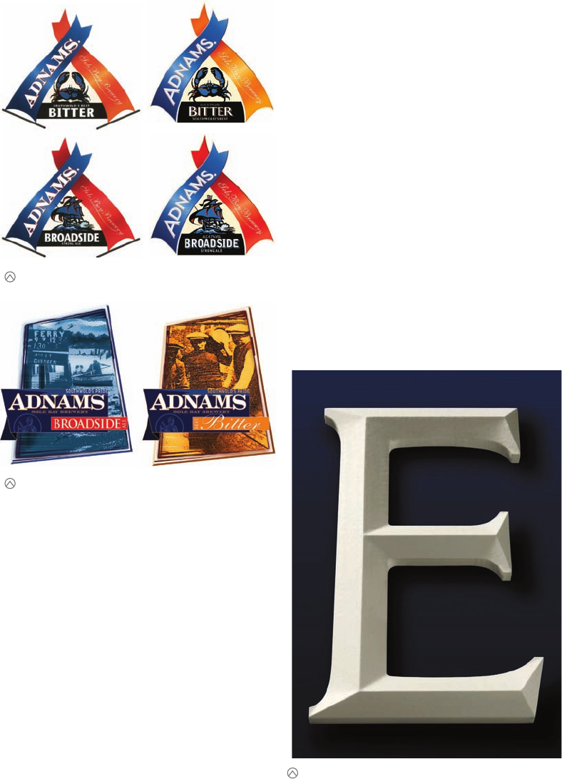
The Design Bridge designers commissioned an entire alphabet, based on an
old Adnams’ font, for the new identity.
Here the label design has been refined; although the client asked that the crab
be replaced with a more local image. The flag design was developed into the
sail design.
Another option that the designers explored was photography based.
001-157_91261.qxp 10/16/06 9:36 AM Page 16

Also part of the new packaging is a special Adnams’ font, designed
by freelancer Ken Wilson, especially for the company’s new iden-
tity. The new type is based on the original Adnams’ font, only
crisper and more contemporary.
A new bottle was also created for the rejuvenated brand. Its shape
was based on the strength and curve of an old beer bottle that the
design team found while looking at old Burgundy wine bottles in
a wine cellar beneath the Adnams’ brewhouse.
Once the new core mark—the crossed flags—was designed, it had
to be translated for use onto bottles and cans. The pump clips
needed to be contained in their shape, but the designers had
some freedom interpreting the mark for individual containers. So
they decided to use only one flag for these applications, which al-
lowed them to make the Adnams’ name as large as possible and
give the individual product names more prominence.
“It’s almost as if you are taking a close-up, cropped view of the pump
clip. It really emphasizes the movement and three-dimensional qual-
ities of the identity,” says Marshall.
The final packaging and logo work as well in a cozy country pub
as they do in a smart city bar, says Shearsby, but the proof is in
the business sense of the solution. Adnams reports that even with
only limited advertising in the East Anglia region, sales have risen
more than 30 percent. Sales of the Broadside beer alone have in-
creased as much as 67 percent.
Shearsby is pleased with the outcome of the project for these and
other reasons. “Together, Design Bridge and Adnams have chal-
lenged conventions and still captured the spirit of this unique area of
England. These people love what they do—this isn’t just some indus-
trial project. This solution reflects their passion and involvement, as
well as the human element of an independent company,” he says.
The new (above left) and old (above right) pump handles reveal how progressive the new identity is.
The one-sail design is used on cans and bottles, where the shape of the pack-
age is well defined. Just using one sail allowed the designers to make the name
of the brand and the product larger.
The contained, two-sail design is used on trucks, signage, pump clips, and other
places where a defined shape is necessary.
(RAY)
Job:10-91261 Title:Rockport : Little Book Of Packaging Ideas
11-AC38143 175#_P Dtp:44 Page:17
001-157 DS_C38143.qxp 11/9/06 10:00 AM Page 17
..................Content has been hidden....................
You can't read the all page of ebook, please click here login for view all page.