“Designing wallpaper has never been our business,” says Joanne
Thomas, creative director of design for the Cape Town, South
Africa-based design and advertising agency.
Her office’s work is strong in its concept and direct in its delivery.
It’s unusual “packaging” program for Foschini, a large, women’s
fashion retailer in South Africa, is a case in point. The client came
to Jupiter suffering from a dowdy image. Its customers, aged from
their early 20s to late 30s, were drifting away. An earlier corporate
revamp had helped only marginally to convince consumers that
Foschini was a purveyor of fashion, not a mere clothing retailer.
The Jupiter team started by improving the company’s image
through advertising and point-of-sale in the store. “This was done
through a campaign that used fashion illustration. Whereas the
competition had used the typical fashion shots featuring models
on location, suddenly Foschini stood out with a style that imme-
diately strikes you as fresh, modern, and fashionable,” says
Thomas. “It was brave of Foschini to break the mold in this way,
and this bravery doesn’t go unnoticed by the public.”
The packaging project grew out of this bold move forward. The
company needed special bags for the summer season—the Christ-
mas season in South Africa, when tens of thousands of dollars
worth of goods would be packaged into store bags and carted
home for gifts. The shopping bag would essentially become an ef-
fective delivery mechanism for the revamped, illustrative brand.
The new bag could use only two colors, and it had to be plastic.
The bag the store had been using was a white plastic bag with
the Foschini logo printed on it in black and gray. It wasn’t a very
exciting package. The client wanted something different—but
with no extra costs.
Thomas’s initial ideas were to reuse some of the images and copy
lines that Jupiter had developed for the advertising campaign.
“But the two-color limitation meant that the illustrations—nor-
mally in glorious full color—just looked cheap and nasty,” she
recalls. The creative director and Jupiter’s creative director of
advertising Graham Lang had to come up with something else.
They knew that there was no reason to remain perfectly conven-
tional. So why not put the concept of what a bag is on its ear?
Why not turn the bag into another kind of bag—a handbag? They
began to explore how they could print the image of fashionable
handbags onto plastic so that the carrier would actually look as if
she were carrying a real handbag.
Initially, they imagined photographs of the handbags printed on
the plastic package, but the color limitation would make that im-
possible. So they turned to illustrations.
A reaction is good. That’s the Jupiter Drawing Room’s mantra.
Whether the person at the
receiving end of the design firm’s
work
laughs or cries, it means success, as it did for Foschini.
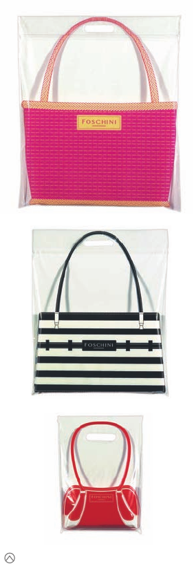
The final packaging is very convincing. It’s hard to
believe that each bag is printed with only two colors.
(RAY)
Job:10-91261 Title:Rockport : Little Book Of Packaging Ideas
175#_P Dtp:44 Page:50
001-157_91261.qxp 10/16/06 9:38 AM Page 50

Initially, Jupiter Drawing Room creative director of design
Joanne Thomas thought she would design bags directly
off of the graphics her team created for a summer
poster program for Foschini, a large fashion retailer.
Converting the poster graphics into two-color graphics
for the new package, however, was not tremendously
successful. Thomas says that the art just didn’t have the
same punch.
In considering a different form of art for the bags, the
Jupiter design team had an inspired idea: Why not make
the bag mimic a handbag? They studied various styles
that were in fashion that season.
50 51
THE LITTLE BOOK OF BIG PACKAGING IDEAS
(RAY)
Job:10-91261 Title:Rockport : Little Book Of Packaging Ideas
175#_P Dtp:44 Page:51
001-157_91261.qxp 10/16/06 9:45 AM Page 51
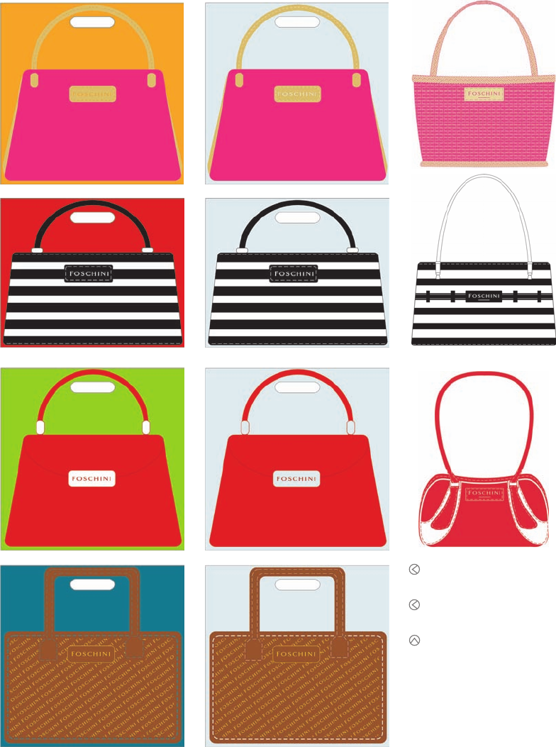
Left column: The new bags had to be two
color, and Thomas thought she might gain
a third color by printing on colored plastic.
Center column: But she soon realized
that printing on clear plastic furthered
the illusion that the bag was a handbag.
Right column: The final art for the bags.
(RAY)
Job:10-91261 Title:Rockport : Little Book Of Packaging Ideas
175#_P Dtp:44 Page:52
001-157_91261.qxp 10/16/06 9:45 AM Page 52

“The final solution of illustrating the bags seems obvious now,
especially considering that was the same illustration style that we
used for the advertising. But it took us a while to realize that by
illustrating the bags, we could achieve the desired look with only
two colors. I could keep the colors flat and not have to halftone
anything,” Thomas says.
Now the idea had to be executed. Thomas at first thought about
printing the two colors of ink onto a third color—that of the plas-
tic—but she soon recognized that putting the design onto trans-
parent plastic would enhance the illusion of someone carrying the
“handbag” even further.
The client loved the idea immediately as a fun, fashionable way
to communicate their brand in an unforgettable package. Eventu-
ally, three bags that were in style for the season were designed
and printed. “The handbags were designed with the dimensions
of the shopping bag in mind—that is, the large shopping bag has
a basket-style handbag printed on it,” Thomas explains.
The bags were an enormous success. They were only used for one
season, but one full year later, Thomas still sees people walking
around town with a Foschini bag in hand. The reuse of the pack-
age is especially satisfying to her.
“It is important to me that the bags are reused. If a package is
desirable enough, it will be kept and reused rather than thrown
away,” she says. “The Foschini bags definitely seem to have
fallen into that category.”
Rather than produce a mundane shopping bag, The Jupiter Draw-
ing Room created a one-of-a-kind package for Foschini’s bought
goods. Customers not only use the bags to bring goods home but
also continue to use them past the day of purchase.
To illustrate the straw bag, the team experimented with building
different types of textures.
Foschini purchases, lunches, homework, and more—the new bags
are reused again and again because customers like them so much.
52 53
THE LITTLE BOOK OF BIG PACKAGING IDEAS
(RAY)
Job:10-91261 Title:Rockport : Little Book Of Packaging Ideas
175#_P Dtp:44 Page:53
001-157_91261.qxp 10/16/06 9:45 AM Page 53
..................Content has been hidden....................
You can't read the all page of ebook, please click here login for view all page.