
Odette Pol Roger was a famous beauty who enchanted Winston
Churchill, who drank only Pol Roger. As a result, his name is given
to one of the family’s most celebrated wines—Cuvée Winston
Churchill. Odette was a regular guest at the British Embassy. This
was a glamorous period in history, and the design of the Pol
Roger brand is reminiscent of elegant formal invitations of the
time, with their fine handwriting and sensual lines.
But the wine’s packaging was no longer a good match for this top-
of-the-line brand image and quality. The White Foil variety illus-
trates the challenges the brand faced. As Pol Roger’s benchmark
wine, White Foil is the soul of the company’s five-wine portfolio,
explains Mary Lewis, principal of Lewis Moberly, an accomplished
design consultancy based in London and the firm challenged with
realigning the brand image with its packaging and identity.
White Foil’s white capsule or top neck foil is distinctive in the va-
riety’s sector. Its packaging design, as well as that of the other
varieties—Chardonnay, Rosé, Vintage, and Demi Sec—had be-
come disparate over time through inconsistent use of the house
marque, different logo styles, and confused range organization.
“Brands with a heritage must be altered with care, but equally
they must move forward, remaining salient with contemporary
consumers and their changing appreciation of luxury,” Lewis ex-
plains. “The balance of tradition and modernity is important. The
Pol Roger archives were an excellent starting point to understand
the brand spirit.”
In the client’s archives, Lewis Moberly designers found early labels
that revealed sensuous, refined script, reminiscent of formal invi-
tations. These would be an enormous help in redesigning the
brand marque and script.
Today, the brand’s owner describes the brand as “vivacious, pleas-
urable, and exciting.” With knowledge of the past and the present
in hand, Mary Lewis and her team could begin the redesign. They
started with the house marque, which had been represented in
four different ways. A single marque needed to be reestablished.
Inspired by the archive images, which are rich in detail, the team
created a molded, elaborate marque that projected the Pol Roger
deep blue house color, the brand name in entwined initials, the
company’s year of founding, and majestic lions.
The next element to examine was the brand name script. “It was
important to retain the signature branding of Pol Roger, which is
both distinctive and personal,” Lewis explains. “In the context of
global abstraction, these attributes are to be valued.”
Pol Roger is known as the wine writers’ champagne. Wine
aficionados regard it highly, and it has a glamorous, romantic
history that
appeals even to those who know very little
about fine wines.
Pol Roger is a premier champagne, but its brand
image had not stayed as relevant as it should have
over the years. Lewis Moberly redesigned the product
packaging so that it reflected the brand’s history yet
allowed Pol Roger to move forward.
(RAY)
Job:10-91261 Title:Rockport : Little Book Of Packaging Ideas
175#_P Dtp:44 Page:148
001-157_91261.qxp 10/16/06 1:51 PM Page 148

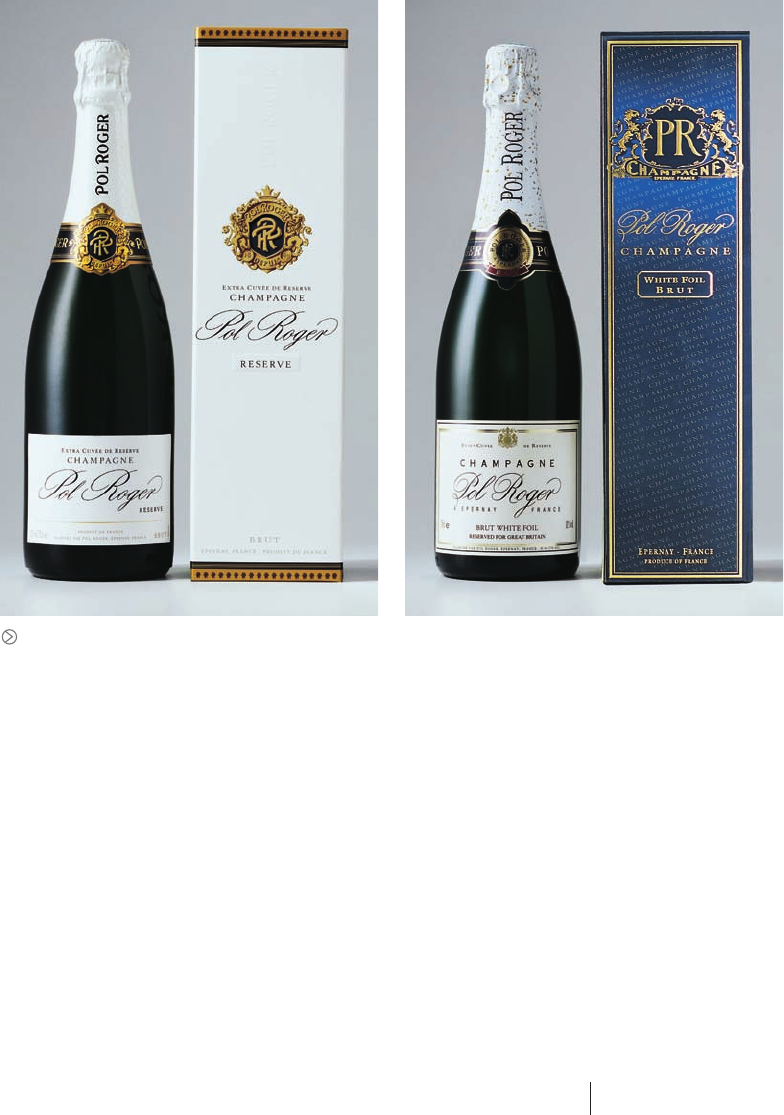
Left: The original White Foil package design.
Center: The Lewis Moberly design team
found beautiful samples of Pol Roger
labels from the past in the company’s
archives. The script in particular inspired
the designers.
Above: The old house marques were
rather generic and said nothing about
the elegant history of the Pol Roger brand.
Left: A pencil sketch of the new marque
showed the detail and richness that be-
spoke the Pol Roger brand.
Right: The new marque included the
brand’s deep blue house color, the com-
pany’s initials, the year of the company’s
founding, and lions. Each element spoke
of the brand’s genteel heritage.
148 149
THE LITTLE BOOK OF BIG PACKAGING IDEAS
(RAY)
Job:10-91261 Title:Rockport : Little Book Of Packaging Ideas
175#_P Dtp:44 Page:149
001-157_91261.qxp 10/16/06 1:51 PM Page 149

The designers explored several handcrafted scripts, some ex-
tended, some traditional, some more modern. They decided on a
style that was eminently legible, elegant, and simple.
With these basic design elements determined, Lewis Moberly
could begin the White Foil redesign. The designers began by re-
moving the gold speckles from the packaging—a common design
element among sparkling wines—and replaced them with a re-
peat pattern of the “PR” initials. This distinctive, ownable brand
detailing on the neck foil was handled in a subtle way, by printing
pure white on an oyster metallic foil: The effect is simple, yet so-
phisticated with the new and particular Pol Roger logo in place.
“The capsule bottle label echoes ‘the party,’ the vivacious, exu-
berant part of the design. The new body label is the ‘invitation’ to
the party,” Lewis says.
The project team decided to rename the product “Reserve,” be-
cause White Foil was really an affectionate trade name used only
in the United Kingdom. Furthermore, because the brand was inter-
national, “Reserve” would travel better. The reinforced name
takes center stage on the new main label, surrounded by re-
strained, formally positioned type. The label itself is also smaller,
and therefore, more precious, Lewis says.
From here, the designers moved on to the Vintage line, described
as the “heart of the brand,” which originally was too similar in
appearance to the old White Foil line. A more revolutionary ap-
proach was needed.
Using the same basic design structure they had implemented on
the new Reserve line, the designers moved the Vintage design to
a gold and black palette, which immediately distinguished it. The
The marque lettering and the prod-
uct name typography matched well:
classic, yet modern.
Far right: The designers explored a
number of different scripts for the
main label.
Right: A detail of the new White
Foil neck dressing and of the new
Reserve label.
The new Reserve and Rich designs. Clear differentiation is now made between
the two varieties, and each now has its specific flavor attributes communicated
through subtle visual cues.
(RAY)
Job:10-91261 Title:Rockport : Little Book Of Packaging Ideas
175#_P Dtp:44 Page:150
001-157_91261.qxp 10/16/06 1:51 PM Page 150
The product’s boxes also needed to be addressed. A comparison of new (left) and old (right) designs shows a clear upgrade in elegance. Although the brand identity
was also heightened, the design remained classic and simple.
neck foil retained the subtle detailing of the repeat PR branding,
but in black, through a tactile surface change of a mix of gloss
and matte inks.
The original design for the Chardonnay—the brand’s “spirit”—
and Rosé—its “body”—lines was too shiny and overstated. The
Chardonnay labeling was gold and the Rosé labeling metallic
dark pink. The color choices communicated the correct values for
the champagnes, Lewis explains, but they needed to be tem-
pered in both hue and finish to fit in with the more sophisticated
brand image.
So the Chardonnay went back to a pale satin gold finish, and Rosé
adopted a pale satin, desaturated pink. These refined colors involved
several print trials before they were mastered, Lewis reports. Again,
the PR initials repeat was used on the capsule foils.
The final member of the portfolio, Demi Sec, suffered from a lack
of differentiation from the old White Foil line: It is richer than Re-
serve, but closely related. This product needed both connection to
and differentiation from the Reserve, so the project team renamed
the product “Rich.” In addition, placing a metallic, deep oyster di-
agonal in the label as well as using a dark gold capsule foil com-
municated a more intense image for the new Rich variety.
Mary Lewis is pleased with the completed design. “Our focus was
to ensure that the new design reflected Pol Roger as the pinnacle
of champagne—you taste what you see. Visual expectation now
met product quality head on. This contemporary, elegant design is
rooted in the rich history of the brand. This brand is talking the
same language across the portfolio, exuding the brand’s personal-
ity,” she says.
Lewis takes two lessons away from the project, lessons that she
has witnessed and learned from in many other projects. First, she
says, to successfully move a brand forward, a designer must first
completely understand its past. Second, as many designers know,
it is best to have a direct line of contact with the brand owners
and the people who make the decisions. Both factors were in
place for Pol Roger.
150 151
THE LITTLE BOOK OF BIG PACKAGING IDEAS
(RAY)
Job:10-91261 Title:Rockport : Little Book Of Packaging Ideas
175#_P Dtp:44 Page:151
001-157_91261.qxp 10/16/06 4:13 PM Page 151
..................Content has been hidden....................
You can't read the all page of ebook, please click here login for view all page.